07 October 2016
Critique: On spec(trographic)
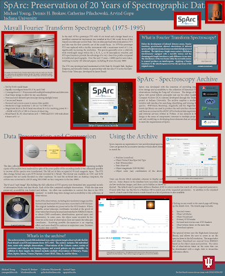
Today’s contribution come from Michael Young. This will be shown at this year’s Astronomical Data Analysis Software and Systems conference, but he’s given me permission to show you as preview. Click to enlarge!
Because the poster is intended to show off the website, it features near the middle of the poster, which is appropriate placement.
Michael’s own assessment of the poster is that despite much editing, it is still too wordy. I agree, but the good news is that the typography is clean and understandable, apart from a tenuous touch of the institution name with the title bar. The descender on the “y” in “University” is killing me.
I also the colour combination of blues and tans. It’s consistent throughout. The blues provides a good contrast to the logo, appropriately situated out of the way, unobtrusive and quiet.
The underlying structure of this portrait style poster is a solid two row grid:
I might have preferred a little more space between the rows to separate them, but the space between each row is not the biggest problem here. You might not notice the simple two row layout because of the placement of everything in those rows. Let’s highlight the pictures and sidebars:
Just to make it a little more obvious, here’s the position of all those elements without the distraction of the poster contents:
Now it looks just a bit like a Mondrian painting.
The point, though, is to highlight that there’s no underlying plan for those pictures. Almost no two are the same size. They’re only aligned if they happen to be along the poster’s edge.
Consequently, the reading order of the poster, while clear (thanks to the underlying two row grid), is circuitous. You have to wind and wend your way around all those pictures.
What might have helped this poster is a stronger secondary grid. How is the row going to be divided? Could it be quartered, or otherwise sectioned into smaller pieces?
Related posts
Avoid the tenuous touch
Subscribe to:
Post Comments (Atom)


No comments:
Post a Comment