Look, we’re scientists, not artists, and rats are hard to draw so you might just have to settle for a rat made out of ovals.
This is the lead example in this great Twitter thread on scientists making figures as best they can.
• • • • •
Goodsett and colleagues have suggestions for creating online conferences, based on their experiences in conference planning for Association of Academic and Research Libraries. Here’s how they handled posters:
Each presenters recorded a short 1 to 3 min introduction about their poster. The overall format of the poster was left open to presenter creativity. Feedback, comments, and questions were submitted and answered asynchronously using a discussion board.
A notable addition to their planning was creating contact personnel that they called “shepards.”
The CPC adopted a “shepherd” support system for presenters... Shepherds served as the (programming committee) contact for each presenter, shared important details, and answered questions, especially any related to media creation and file formats, since pre-recorded videos and online poster presentations had not been required of previous... presenters.
Some participants asked for the online component to be kept when conferences move back to face-to-face:
“The online posters (especially those with recorded descriptions) were very helpful for me (it's hard for me to see physical posters at times, so we might want to keep this option when we move back to a physical conference).”
• • • • •
Marvel comics character or font? Take the quiz! See if you can beat my score of 17 out of 20. 😉 Hat tip to Melissa Vaught.
I don’t like this expression as it applies to poster design.
I have this memory of watching an interview with songwriter Jim Steinman. I think it was for Bat Out of Hell II: Back into Hell.* I have never been able to find it again, but from memory, Steinman said something like:
Less can never be more. Less is always less. Only more can be more.
I suppose the problem I have with the “less is more” aphorism is that there’s too much emphasis on the “less” and not enough on the “more.”
Just hacking away at poster content with no rhyme or reason so that there is “less” will not do anything.
Rather than prioritizing “less content”, think about how to deliver:
More focus.
More efficiency.
More value for the reader.
* Maybe I associate this quote with Bat out of Hell II because it contains a song that so perfectly describes Steinman’s style, “Everything Louder Than Everything Else.”
Today’s poster comes from Nicolas Le Guillarme. This was presented at the S4Biodiv workshop.
As always, you can click to enlarge!
My first reaction was, "Ooh, this is really nice.” The bold use of colours and moving the dividers a little off the horizontal give the poster a lot of energy.
In fact, there is so much life here that I didn’t notice there is still quite a bit of text. I would like to see that edited back a little if possible.
My second reaction was to look at the title and headings. The typeface is open, so the colours of the background and the foreground of the text are the same. This can make it a little hard to read some of the letters, and I particularly worry about readability from a distance.
Here’s a quick and dirty attempt to fill some of the letters.
The white fill in the “Introduction” heading works very well, but I didn’t find the right colours for the other headings. I do think that this revision shows that filling the letters increases the visibility, though, even though I didn’t take the time to optimize the colours.
Similarly, I would like to see a little more contrast in Figure 1.
The labels overlap parts of the figure, and makes some of the labels hard to see. In particular, I’m looking at the “Tropic assignment” label over the spiralling arrow. I might try to stick a semi-transparent box under the labels. You can see the technique in the graphic I made for this post:
Notice how the books are light and sharp by the elbow but darker and blurry where the quote is? That’s the kind of effect I’m thinking of. Something to make the text a little more distinct from what it sits on top of.
Some of the labels in the network diagram over on the right are also nearly impossible to read. The “Resources” label is almost the same colour as the background. While under most circumstances, having the text and dot be the same colour reinforces the connection, that should not come at the cost of readability.
So in the revision above, I just made all the labels black.
Nicholas wrote:
This is my first attempt to create a poster that is both
informative and visually appealing. I am quite satisfied with this
first draft, but I am pretty sure that there is plenty of room for
improvement.
I think Nicholas is right on both counts. It is very satisfactory – more than satisfactory – but constant improvement is The Way!
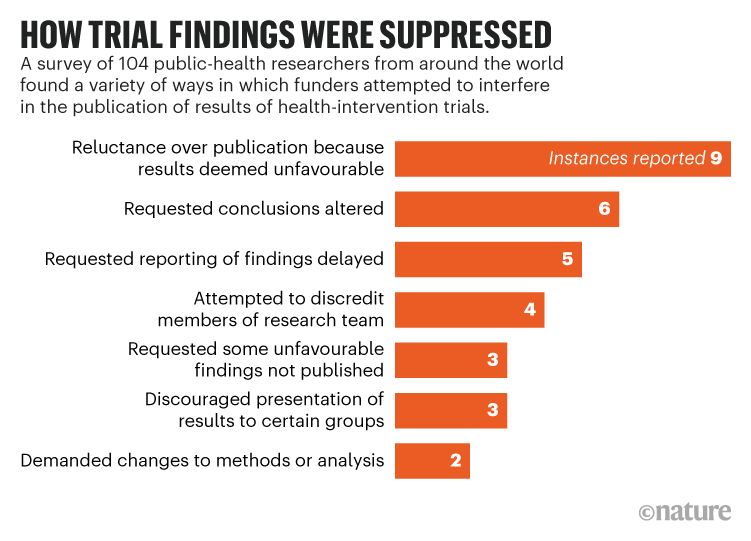
Health researchers report funder pressure to suppress results
Eight words. It’s shorter than the article title, even if you took out the quote. It’s clearer than the article title.
Revised data:
The table has been replaced by an easy to read bar graph. The graph has a clear and bold take-home message. Yes, there is less information. It’s effectively a 2×8 table, but it is easier to read and understand.
Too many conference posters look like the journal article. Posters will be better if they look more like the Nature article.
In the Better Posters book, I wrote about how poster makers could learn lessons from advertising. Advertisers have clear metrics of whether a headline is effective or not: cold hard cash dollars. 💰
This Veritasium video tackles the same question: what makes an effective title? And there are a lot of takeaways for poster makers.
First, the more you are in this game, the more you realize how important titles are. Host Derek Muller says:
I always thought my job was to make great videos. And then a title and thumbnail that adequately represented what the video was about. But now I've realized that making the title and thumbnail is at least half the job.
YouTubers can now measure their success in ways that old school advertisers who worked in print could only have dreamt of. YouTube creators have an incredible array of real-time metrics at their fingertips. In short, they have data.
And data shows that titles make a huge difference in the attention videos get. “Asteroids: Earth's Biggest Threat,” (Muller estimates it might have gotten 1.5 million views) “Asteroid Impact: What Are Our Chances?”, and “Asteroid Impact: What Could We Do?” all underperformed compared to “These Are the Asteroids to Worry About” (now with 14 million views).
There are a few other things worth pulling out from Muller’s video.
First, there can be a big difference between what people say they want and what they actually do.
Now, there seems to be a paradox when it comes to clickbait. People almost universally claim to hate it, but you also see it everywhere. ... - So, why is clickbait everywhere? Well, because it works.
In conference posters, this crops up with people who insist they want to see all the data as though they were going to sit down and read it like a journal article. But people also say they want to be able to spend about 5 minutes at a poster.
Another complaint some academics make about posters is that some posters or other is “mere” advertising. Muller tackles this in his discussion of what people mean when they refer to video titles as “clickbait.” There are at least two mainings to the word.
(W)e don't all agree on the definition of clickbait.
When I google it, the top definition is, on the internet, content whose main purpose is to attract attention and encourage visitors to click on a link to a particular webpage. We could call this type I clickbait, and there doesn't seem to be anything wrong with it. I mean, if you didn't try to attract attention and get people to click on your links, then you wouldn't really be doing your job (Emphasis added. - ZF).
But there is a second definition. One that I think more people ascribe to, which is something such as a headline designed to make readers want to click on a hyperlink, especially when the link leads to content of dubious value or interest.
Muller later calls these two styles “legitbait” and “clicktraps.” Muller goes on to say that are good reasons to strive to create legitbait titles.
First, it opens up the work to more people. Second, Muller has found that his “legitbait” titles end up being more accurate descriptions of the video.
But then we come to the challenge. With all of these real time metrics at their disposal, YouTuber can treat the matter of “What title should I use?” as an empirical problem. Muller compares it to natural selection: you throw out a bunch of variations and see which perform the best.
Poster creators don’t have that luxury. You can’t release three versions of a poster at a conference on day one, see who visits, then leave up the best performinng poster for the rest of the week. It’s another factor that makes conference posters such a challenging format.
But the moral of the story remains: Put a lot of thought into your titles. Try them out on other people. And if someone calls your title “clickbait,” you might be on the right track – if you think it’s legitbait and not a clicktrap.
Academic conference posters are often ugly, with tiny text, confusing layouts, and dubious colour schemes. This blog and book is about making posters informative and beautiful.
This blog usually updates on Thursdays.
Not the viral video. That’s #BetterPoster (singular) on social media.
“Great blog with constantly updated resources.” - The Scientist magazine
“The ‘Go To’ place to send students when they start preparing posters for their first scientific meetings” – Bora Zivcovik
“I wish there were more blogs on this subject(.) Mostly because most scientific poster presentations are absolutely ghastly. Not just bad, or unseemly; ghastly.” – RobertSOakes
“I want to passive-aggressively run around poster sessions putting up Post-it notes with his url on every poster.” – Dominque
“Better Posters blog is A - MAZE-ING” – A. Roehrich
“I find the Better Posters site comforting. I can’t possibly be as bad as some of them there.” – Anne Jefferson
“@DoctorZen's Better Posters Blog is blowing my mind. Love it! #useful” – Elizabeth Sargent
“It’s @DoctorZen’s better poster blog’s fault as to why my poster looks classy & timeless.” – Ricardo Vilain
“Was man alles beachten muss, um ein gutes Poster abzuliefern, an dem die Kollegen auch stehen bleiben, kann man im Blog Better Posters lernen(.)” – Alles was lebt
“recommending reading @doctorzen Better Posters Blog to sci presenters. And anyone who will listen.” – @andrea1
“Should be compulsory reading for academics.” – @sthcrft
“Better Posters blog dispenses solid (much-needed) advice; recognises synergy between aesthetics+info” – Jason Priem
“I’m loving @DoctorZen’s http://betterposters.blogspot.com/ & happy to find I’ve been following the rules! Will show this to ALL students.” – @_modscientist_
“Just put up my poster, it looks fab thanks to @DoctorZen!” – @_modscientist_
“Make sure you read http://betterposters.blogspot.com” – @boris_gorelik
“Conference season is descending upon us, and @DoctorZen's blog will save scientists a lot of grief” – Andrea Wishart
“It's super useful especially to those of us who have a hard time figuring out what is awesome and what is eye-bleedingly terrible.” – Miriam Goldstein