

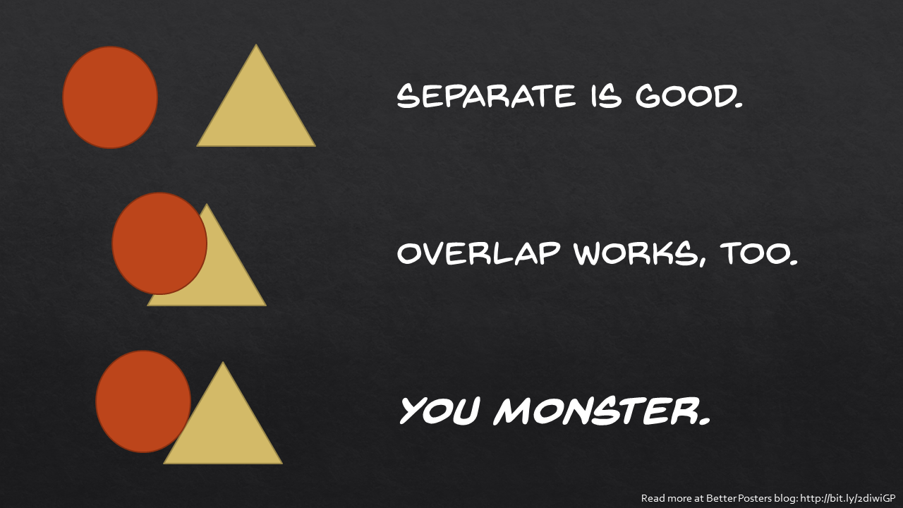
Or you can overlap them.

But it’s a bad option is to have two objects almost touching...

Or just barely touching.

Of course, it can be worse. Having sharp edges and round edges almost touching creates a discomfort to your eyes that you can almost feel. You’re just waiting for the balloon to pop.

You get the same effects with the rectangles you see more often on posters. Having objects very close, but with neither clear separation or overlap, feels much less comfortable

Than clear overlap...

Or distinct separation.

Unless you are going for visual tension, make a choice. Split them apart or have one cover the other. Don’t have any tenuous touches. To sum up:


No comments:
Post a Comment