27 February 2020

Link roundup for February, 2020

The Smithsonian has created a huge archive of material that is now open access for anyone to use.

This includes photographs. 3-D models. Datasets. Ever needed a high quality image of the first airplane?


How about Lt. Uhura’s uniform?


Smithsonian’s got you covered. Incredible resource, with lots of potential applications for poster makers.

• • • • •

How did I miss this at SICB?


 Not the first flipbook I’ve seen, but always a nice reminder of what you can do!

• • • • •

Jane Ferguson wrote:
Not only is a fabric poster super easy to pack, it makes an excellent toddler playmat!


Tweeted out a couple of years ago, but new to me and the blog. Hat tip to Real Scientists.

20 February 2020

Pronouns on posters

My given name (Zen) is an ambiguous gender signal. I know both men and women with the same first name as me. I understand that other people often want to know someone’s gender, and that people may want to explictly state how they like being referred to.

For those reasons and others, some conferences have started adopting the practice of putting pronouns on conference badges. The point is to try to reinforce that different people might have different ways they want to be addressed, thereby creating a more welcoming environment to all.

Nelson Stauffer suggests extending this practice to posters.

Approach to pronouns on a poster? Just add more superscript characters.

Nelson tweeted this image as an example.

Poster title and author list, with pronouns indicated by special characters

I’m not crazy about this particular implementation of the idea, because the symbols that Nelson used (a dagger and a double dagger) are hard to distinguish in this particular font, particularly at small size.

Is this a good idea more generally?

Probably.

Adding pronouns adds visual complexity. You have to match the symbols, the pronouns, and the names, and do a dance back and forth between the three for each author. That’s a lot of cognitive load to ask someone to take on in a busy poster session.

The suggestion here is to put the symbols and pronouns in the title bar, part of the poster which can be overloaded with authors’ names and affiliations.

A good general rule in graphic design is, “Put information at the point of need.” People are most likely to want to know preferred pronouns when they are having a conversation with someone. That makes an excellent case for putting pronouns on name tags because if you can read someone’s name tag, you’re close enough to be having a conversation with that person.

If pronouns are already on name tags, putting pronouns on the poster is duplicate information. If pronouns are not on name tags, the argument for putting those pronouns on the poster is much stronger.

Similarly, adding pronouns for the poster presenter makes a lot of sense. Again, knowing pronouns can be valuable when you are conversing with someone, which is most likely when you are speaking to a presented.

Adding the pronouns for all presenters may be overkill. If you have a poster with a long author list, there may be many authors who are not at the conference at all. So on the one hand, adding pronouns for all authors is consistent. On the other hand, are the pronouns of all the individuals participating in a project – who may or may not be at the conference – something that a viewer needs at that moment?

Some authors may not want their preferred pronouns on the poster. Authors who are not at a conference may not want to disclose something about their pronoun use to everyone in attendance.

Star Trek original series title card showing "Written by D.C. Fontana"Some people have argued for going in the opposite direction (more with scientific papers than posters) on pronouns. That is, some prefer to display only initials rather than given names to downplay gender and minimize bias. Many women writers (like Star Trek’s Dorothy Fontana) used their initials for their author credit for this reason.

If you want to include pronouns, many of the tips regarding showing institutional affiliations might be helpful here.

Related posts

Showing authorship on posters

13 February 2020

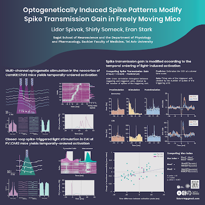
Critique: Opto mice

Today’s contribution comes from Lidor Spivak. The poster was presented in the Israel Society for Neuroscience 2020 annual meeting in Eilat, Israel. Click to enlarge!

Poster titled, "Optogenetically induced spike patterns modify spike transmission gain in freely moving mice"


The poster was designed by Eden Spivak. Yes, the same last name is not a coincidence: Eden and Lidor are married.

While I tell people that you don’t have to draw to do graphic design, a quick browse at her website shows Eden certainly can draw! It is intimidating to be asked to comment on someone who has skills.

Some signs that this was done by a pro include:

  • Consistent colour palette, in cool blues and greens.
  • Consistent font use.
  • Wide margins.
  • Nothing pushing in touching, or almost touching, anything else.

My main concern is whether this poster can be understood without a presenter. Particularly on the right side, there are descriptions that cover four separate diagrams, none of which have explanations. I do neuroscience, and even I would have to guess at what is going on in the individual graphs more than I’d like.

There are a few points where a few more edges might be aligned. For instance, there's no reason the right edges of these two graphs couldn’t be aligned. Yes, it would take some fiddling with the aspect ratio, but it could be done.


Finally, while I admire the consistency of the colours used, I am a bit concerned as to whether it might be visible to someone with colour blindness. Here’s that panel above run through a colour blindness simulator, using the “green blind” setting:


It’s probably interpretable, but the differences between the two curves at top don’t pop out very much. A little more variation in brightness might be useful.

Always nice to see a pro at work!

External links

Eden Spivak - Illustration and Writing

06 February 2020

Critique: Intensive care neural networks

Today’s contribution comes from doctoral student William Caicedo. This was presented the Medical Devices and Technology satellite meeting in New Zealand last September. Click to enlarge!


William writes:

Despite being kind of an oddball there (my research deals with machine learning at the software level while most of the presentations where about medical hardware), I was awarded second place in the student poster competition, and I heavily suspect the design played an important role - all of the other posters used the traditional, overstuffed, word heavy design.

This is the “billboard poster” format in portrait mode. As I’ve mentioned before, when you have a big take home message, I don’t see the point of also having a “formal” title. I would remove the title so everything else could be bigger.

In particular, the results would benefit from being much bigger. The labels of the small multiples in the lower right side of the results section are unreadable.

The rest of the results are not much better. The condensed font used for the top diagram looks okay when I see it full size on my laptop are normal computer working distance, but not if I stand back a couple of feet. The lines in the graphs are all narrow and not particularly high contrast.

The top “take home” message has some inconsistent capitalization.

Interpretable Convolutional Neural Networks over-perform traditional techniques for the prediction of mortality in Intensive Care Units

Neither “convolutional neural networks” nor “intensive care units” are proper nouns, so there is no clear reason to capitalize them. Either of these would be more consistent, although I prefer sentence casing:

Interpretable Convolutional Neural Networks Over-perform Traditional Techniques for the Prediction of Mortality in Intensive Care Units (Headline casing)

Interpretable convolutional neural networks over-perform traditional techniques for the prediction of mortality in intensive care units (Sentence casing)

I’m also curious as to the choice of works to emphasize, which William does using colour. I get emphasizing “over-perform” (the result) and “intensive care units” (the setting). But “interpretable”? Why emphasize just one of two adjectives instead of the noun (“neural networks”)?

Similarly, the body of the poster highlights things that didn’t always make sense to me. Highlighting the neural network name, “ISeeU,” is helpful because it draws out the network the poster is describing.

I am guessing the reason for highlighting William’s name was that William was presenting the poster. I’m less clear on the reason for only highlighting William’s given name, rather than his full name.

And the last of these is the changing colour of headings: black for Introduction and Discussion, but red for Methods and “References.”

Would these changes have pushed William’s poster to the first place finish in the poster competition? Alas, we can never know. (P.S.—But if you won the competition and are reading this now, I’d love to see your work, too!)

Related posts

Critique: The Morrison billboard poster