16 March 2023

Canva revisited

I reviewed Canva back in 2020. Canva has introduced many new features since then, so here are a few quick updates on the platform. 

Size seems to have increased, but is still limited. I still can’t make a poster that’s 6 feet wide by 4 feet tall. But now it seems to have a limit on total area. I think when I reviewed it before, it had a hard limit on height and width. I can now make a poster that’s 6 feet wide by 2 feet tall, which I don't think I could before.

There are now university research poster templates. (They may have been there before, but I don’t think so.) Search the templates for “Research Posters” and you get about 20 or so different templates. 

Poster template with large grey title bar and sans serif type.


 A couple are recognizably based on Mike Morrison’s billboard style posters.

Poster template with large central text and sans serif type.


 Many have the same boilerplate text that doubles as a guide.

How to make a research poster: A guide for students

Many technologies and breakthroughs would not be possible without research.
It is important to keep members of the community informed about the latest updates. One way to do that is through research posters.

Most of the templates are good on colour and typography. 

Poster template with light background and serif type.

But most have too much fine text. 

Poster template with half black, half light background and sans serif type.

Some have confusing layouts.

Poster template blue title bar and sans serif type.

Canva has certainly improved as a platform for making conference posters. It would still not be my “go to” for posters, because the size limitations bother me.

Related posts 

Canva review

09 March 2023

Don’t make your figures like journal figures

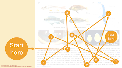
I’ve written about the importance of respecting reading order on this blog many times. English readers generally look at the top left of a page first, because that’s where we have learned that text starts.

Rectangle with "Start here" in upper left and "End here" in lower right.

Lately, I’ve been thinking a lot about how scientific journal articles break information apart. But I didn’t realize another shortcoming of typical journal figure layouts.

You are supposed to start reading in the middle. It’s not necessarily clear if you will end up at the last image in the figure or the end of the figure legend.

A figure from a scientific journal, showing "Start here" pointing at the start of the figure legend under the images.

Not only that, you have to look back and forth from the legend to the images. Your eyes are constantly travelling. 

Multi-panel journal figure with overlay showing reading pathway back and forth from text to figure and back to text.

But graphics from news organizations (like the New York Times, FiveThirtyEight, Nature or Science magazines, and so on) do things a different way. The title goes at the top.

A graph from news in Nature, with "Start here" pointing at the title above the figure..

Rather than having the description underneath, the graph is annotated. This makes the graph less compact, true, but reading it is more in line with our reading expectations.

The more I think about it, the more I think this format is a much better model for figures on posters..

Conference posters in movies: Awake

The opening minutes of the Netflix movie Awake (2021) take place in a secured research building. How do I know?

Posters!

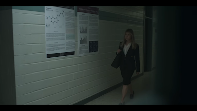
You can see them in the right side of all of these screen shots.

Screenshot from Awake 2021, showing hallway with posters on right.

There are a few posters in this tracking shot, but the one closest to the edge of screen is the only one where the components are visible. Solid two column layout. This is the only poster we see with any colour: some orange in the section headers.

Screenshot from Awake 2021, showing hallway with posters on right.

The two posters in the shot above drove me a little nuts. Typical academic poster, far too much tiny text. At least the one on the left has a good “hero” figure in the upper left. Two columns again, which is a little unusual, since three columns are more common.

Screenshot from Awake 2021, showing hallway with posters on right of Gina Rodriguez opening a door.

As star Gina Rodriguez enters the room, we see two more in the background. Two columns again, clearly with a lot of small text. Neither appears to have any graphics, although there are some shaded boxes in the right one, perhaps highlighting tables.

 Finally...

Screenshot from Awake 2021, showing room with posters on right, as Gina Rodriguez opens door.

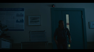
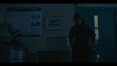
While the shot is a bit dark, this is the only poster whose title can be seen.

Screenshot from Awake 2021, showing room with posters on right, as Gina Rodriguez opens door.

Appropriately enough for a movie about people not being able to sleep, the poster is “The impact of caffeine”!

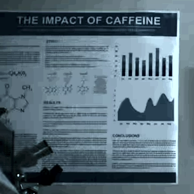
Here’s a close-up, brightened up for visibility:

Poster titled "The impact of caffeine."

The only poster using the classic three column layout.

At first, I thought the posters must have just been there in the location they were filming in. But this is so on point with the movie that I am thinking that maybe the art director dressed the space with posters? At least this one? 

That the posters have such a consistent design and so little colour also make me think these are set decorations. You wouldn’t want brightly coloured posters in this dimly lit scene.

Maybe I’ve been at this too long when I’m paying more attention to the posters than the end-of-civilization plot...

External links

Awake on Netflix

Awake on IMDb


02 March 2023

Plastic octopus

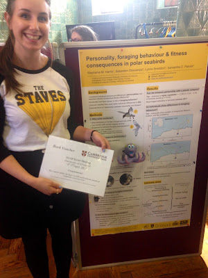
This is not timely post. But join me and step into the Wayback Machine with me, to go back to 2017. I stumbled across this award winning poster from Stephanie Harris. This is from the Association for the Study of Animal Behaviour Easter meeting from that year.

Stephanie Harris holding a certificate for her poster prize, with her poster in the background. A plastic octopus is attached to the poster.

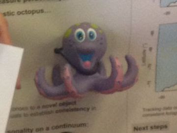
I was looking at is, and thought... “Wait, what is that just to the right of her certificate?” I zoomed in.

Plastic octopus attached to poster.


It’s a plastic octopus. But not some plastic octopus randomly attached to the poster for no reason. It was actually used in the research project to test birds’ personalities.

So I just wanted to make this very short post to remind people that you can use your poster space to do more than just put up a sheet of paper.

01 March 2023

The annual tradition continues: the Better Posters blogiversary

We made it. Fourteen years, my friends! That’s a lot!Birthday cake with "14" cake topper.

Having been in a pandemic for a few years, I don’t take it for granted that a project will make it another year. So I’m glad this one has.

One of the reasons I started this blog was that I thought there was so much more to say about posters than was normally being said. And I think the fact that this has made it for 14 years shows that was something to that hunch.

Whether what I have to say about the topic is valuable or interesting is a decision I will leave to you. 😉

As always, I thank you for your attention.