28 May 2020

Link roundup for May 2020

An old PowerPoint or Keynote slide deck won’t protect you in a pandemic. But an old poster can.


Hat tip to Janet Stemwedel for realizing:
Thing I haven't seen yet this pandemic but which I suspect already exists: cloth face masks made from old cloth conference poster.
Possibly with matching sundresses.
When I tweeted I would pay money for that, Alexandria Hughes replied with the picture above. Outstanding!

• • • • •

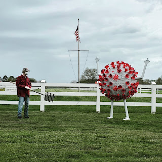
And the end of April, Amy Frietag posted some art that cropped up in her neighbourhood, saying “Sure is a sign of the times.”

Sculpture of person in field facing large SARS-CoV-2 sculpture.

I’m fascinated by this, because it shows the power of a visual.

The sculpture is obviously showing the SARS-CoV-2 coronavirus. But SARS-CoV-2 didn’t really exist in the public imagination even a few months ago. If you had put up a white ball with red spikes in February or even March, I doubt people would have thought, “coronavirus.” It’s because of the illustration made by CDC illustrators Alissa Eckert and Dan Higgins that we now have a shared visual “identity” for the virus.

And it is definitely the Eckert and Higgins illustration that is the source material here. Because a virus doesn’t have colours. There is no particular reason to make a sculpture of the virus white with red spikes, except because the CDC illustration is white and red. Eckert and Higgen chose those colours to signal that the virus was a serious threat, not because there was any scientific reason to pick them.

• • • • •

So research conferences are cancelled. Now what?

Hat tip to Melissa Vaught.

• • • • •

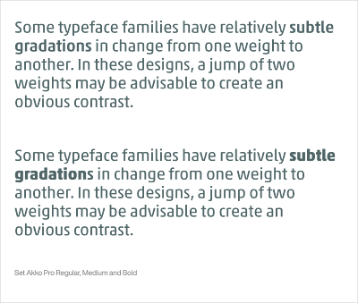
How to use bold type effectively.

Some typeface families have relatively subtle gradations in change from one weight to another. In these designs, a jump of two weights may be advisable to create an obvious contrast.

That’s only one example; the article has more!

• • • • •

Make your own Penguin Classic book cover.


This was only done as a demonstration! I have been loving working with Pelagic Publishing!

21 May 2020

Lessons from make-up

In theater, the viewers are often far from the action, and lighting is not always perfect. To make sure everyone can see what’s going on – even the people in the last row who might not be paying that close attention – theaters around the world have developed distinct styles of make-up to communicate performances clearly to people in the back.

Beijing opera in China.


Kabuki theatre in Japan.


Commedia dell’arte from Europe.


Broadway in the US.


And burlesque.


The task faced by posters is much the same. You have to communicate to people in the “back row.”

This is a graph with no make-up. Click to enlarge!


This graph might be just fine in a printed journal. Everything is there. It’s high resolution, and would probably look just fine if professionally printed. But put that on a poster, and it will vanish, just like a stage performer without make-up seen from the back row.

This is a version of the graph that reaches out to the person in the back row.

The biggest change is filling the box with a colour, so now the box reads from a greater distance. The symbols are bigger. The lines are thicker both around the box and in the very wide whisker caps.

But the graph above might be a case of “everything louder than everything else” (to borrow a phrase from Jim Steinmann). It is definitely visible from a distance, but might be too much. There is no visual hierarchy that emphasizes the point.

The point of make-up isn’t to make everything bigger. It focuses and emphasizes. Usually that means drawing attention to the eyes and mouth. Make-up isn’t supposed to emphasize your lines, your pimples, your age spots, or pores. Indeed, de-emphasizing some features is one of the major attractions of make-up for many people.

Make-up and graphic design bring emphasis using some of the same tricks: colour, contrast, and size. Whatever you want to highlight, might it colourful, high contrast, and a little bigger.

Let’s say that you wanted people to be able to quickly see the averages in your box plot. You might make a graph a little more like this.
The saturated red symbol for the average pops out from the background. You can see those symbols from the back row.

Reordering the bars helps to show a pattern in data.

The boxes are still filled and still visible from a distance, but the making them more pale means that they are more visible in a close read: someone who comes right up to the poster and wants to see details.

The whisker caps are thin for the same reason.

But what if you wanted to emphasize the range of data instead of the central tendency? You would emphasize different parts of the box plot.
The whiskers end in high contrast symbols that bracket the range of data. Now your attention is drawn to the maximum and minimum.

The boxes are still filled, but are thinner to emphasize continuity with the whiskers.

I did not tinker with the axes at all in any of these. I wanted to focus on the presentation of the data. There is surely more that could be done to make-over the axes and labels so they would be more appropriate for a poster.

So when you are doing “make-up” on your graph, ask yourself:

  • What do you want to emphasize? (“Everything” is not a valid answer!)
  • Does it reach the person in the back row?

Beijing opera picture from here. Commedia dell’Arte photo from here. Kabuki photo from here. Nala makeup from here. Burlesque make-up by Frankie Fictitious.

This post inspired by Justin Stewart.

14 May 2020

Lessons from Pac-Man

Shiz Aoki of BioRender sometimes gives this tip when discussing posters:

Imagine Pac-Man being able to travel between the sections of your poster without getting stuck.

Classic Ms. Pac-Man screen

This is good advice, but I want to run with it a little more. I think some people will read this and think that “blocking” is the problem. Poor Ms. Pac-Man has nowhere to go here.

Ms, Pac-Man screen altered so Ms. Pac-Man cannot run.

But there is more to this it than ensuring there is enough space.

Here is an example where Ms. Pac-Man has all the space she needs to get anywhere on the screen... but it is still a frustrating screen to view and would be impossible to play.


The problem here is not the amount of space, but the alignment of it. There is always “enough” space in the sense that Ms. Pac-Man and the ghosts can get around the screen, but the width of the maze is always changing and none of the edges of the walls line up any more.

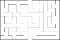
If you look at mazes, the corridor width is often kept absolutely consistent.

Rectangular maze

This can be true regardless of the overall shape of the maze.

Circular maze
Or what the maze is made of.

Garden maze

Mazes like these (including Pac-Man) are fundamentally grid systems. It is not enough to just have “at least” a certain amount of space between elements. It should be the same amount of space whenever possible.

Garden maze from here.

07 May 2020

You’d miss serendipty if poster sessions went away

I miss the art of record flipping. When music was released on vinyl, flipping through albums in bins was part meditative in its rhythm combined with occasional rushes of pure joy when you found something you were looking for, or, better yet, didn’t even know existed. That new album by a favourite artist.

(Even shopping for CDs wasn’t as good as albums. The CDs were clunkier and noisier than albums.)

I was reminded of this almost lost art when I recently stumbled across an album released seven years ago that I would have bought seven years ago – if only I knew it existed.

I love the portability of digital media, but digital media is often kind of terrible at those lucky discoveries. The things you see and instantly want in your life.

We are in the middle of a year of most academic conferences being postponed or cancelled. This preprint argues that it’s probably a good thing: they advocate moving most conferences online because of the carbon costs of traveling. (See also here.).

A couple of weeks ago, I pondered whether the poster format was right for online meetings. This prompted the question of whether posters are right for regular meetings. After all, lots of people don’t like the poster format, so it’s a fair question of what we’d miss if you took the poster session away.

What poster sessions do better than multiple tracks of slide talks or other formats is create serendipitous opportunities to learn and meet new people.

In my experience, abstract books or online collections (like the one #TAGC20 has on Figshare) do not facilitate browsing. You tend to perform very targeted searches instead for specific people you know or topics that are relevant to you.

I wondered if this was just me, so I asked this question on Twitter.

Do you discover new people and projects at poster sessions in conferences that you probably wouldn’t have encountered otherwise (searching abstracts, etc.)?

Well over 80% of respondents (71 votes) said this happened to them.


ResponsePercent
Often53.50%
Sometimes35.20%
Rarely8.50%
Never2.80%

So before we rush to get rid of poster sessions for live conferences, or as we develop alternatives for poster sessions in online settings, it’s worth asking: how can we facilitate the lucky accidents that happen in convention center hallways and hotel event rooms all the time?

Related posts

Are posters right for online meetings? Thoughts from The Allied Genetic Conference virtual poster session #TAGC20

External links

Evaluating features of scientific conferences: A call for improvements

Comment on “Evaluating features of scientific conferences: A call for improvements”