29 April 2021

Link round-up for April 2021

My fellow biologists will be interested in BioIcons, a library of free to use icons from Simon Duerr. Over 1,600 icons so far.

BioIcons landing page

• • • • •

René Campbell shows off the before and after of one of her old posters:

Left: Pencil sketch of poster. Right: Comompleted poster titled "Sizing up crab invaders".

She noted that she didn’t remember doing the sketch at all!

• • • • •

As goes Microsoft, so goes academia. At least in regard to design. 

For years, we’ve looked at a lot of posters and slide talks that looked kind of similar because they all used Calibri, because it is Microsoft’s default font in Office.

Calibri’s days as default are numbered. Microsoft has announced it will be retiring Calibri as their default Office font. Click to enlarge to see the candidates to replace it.

Chart comparing Calibri with teh five candidates to replace it: Skeena, Grandview, Bierstadt, Tenorite, and Seaford.

Skeena looks closest to Calibri. 

Bierstadt looks like a Helvetica imitator (and the name doesn’t exactly roll off the tongue). 

Grandview looks tiring for extended blocks of text because of its angles and high x-height. 

Tenorite’s geometry appeals to me in the way Futura does.

Seaford is my current favourite.

• • • • •

An instructor shares students’ comics about making comics.

Color for emotion

• • • • •

Fog City Gothic is a new typeface based on San Francisco street signs.

FOg City Gothic sample

Not in contention to replace Calibri.

• • • • •

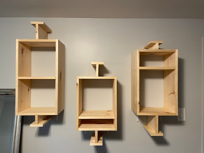
We know that graphs be be art. But did you know they can also be furniture?

Shelves in the shape of box plots.

 Made by Deneuse Andamidiya.

• • • • •

Next month: The Better Posters book arrives in your hands!


27 April 2021

Variable fonts: A quick introduction

Variable fonts are here
 

Recently, I talked about type as a form of technology. I was more interested in the idea of the shapes of the letters and numbers and the amount of special symbols, so overlooked something kind of obvious. 

Fonts are technology, too. And more obviously so.

(Aside: Typefaces are styles and shapes of letters. The fonts are the way those style get implemented. Type is like a song, font is like the recording of a song.)

One of the biggest additions to type technology is the addition of variable fonts.

The issue that variable fonts can solve is that because of various optical effects, you can’t make a thin letter into a thick letter just by thickening the lines. Well, I suppose you can but it doesn’t look right. And two letters that should be the same point size no longer are the same height.


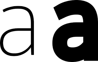
Thin letter "a" and thick letter "a"

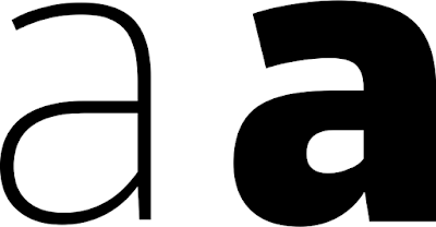
Type creators go to great lengths to tweak letter forms so that thick and thin letters both “work.” In the example below, notice how the width of the lines making up the thin letter are uniform, but the lines making up the thick letter vary. It’s particularly noticeable where the bottom loop connects with the right vertical.

Thin letter "a" and black letter "a"

Here’s another way of comparing the light and black weights.

Thin "a" superimposed on black weight "a".

In the past, you were limited in your choices by the number of specific weights a type designer decided to create and release. If the designer made medium and black weights, too bad in you wanted a thin weight. If their “thin” was too thin and the next step up was too thick, you had no options.

Variable fonts let you change the weight of letters as little or as much as you want. Instead of buying half a dozen separate fonts, you can buy one and scale it to your needs.

In the examples above, the letter “a” came from “Thin” and “Black” weights. But a single variable font lets me go all the way from one to the other.

In CorelDraw, variable fonts are controlled by a simple sliding bar that appears when a variable font is selected.

Corel Draw menu showing variable font drop down menu

For this particular font (Goldman Sans VF), the “Weight” goes from 200 to 900. I do not know what those numbers signify. They vary from font to font.

But wait! It gets even better! Some variable fonts allow you to control the width, too!

The word "Thinner" with descreasing width and weight with each letter

Again, the numbers presented as options have seemingly arbitrary high and low points. Width for this font, Bahnschrift, vary from 75 to 100. I think those numbers are set by the type designer.

But wait! There’s more! Some variable fonts allow you to control the slant, too! I don’t have an example myself, but it is mentioned in the description for Sharpe Variable

Photoshop, Illustrator, and Indesign: Powerful variable font technology. Use sliders to set any weight and slant

Snare is a variable font where you can control the height of the typeface.

Snare typeface sample

 The price for variable fonts is, not surprisingly, higher than individual fonts. But you have to realize that a single variable font can take the place of two, three, or more fonts and give you finer control over the letters.

I happen to have used a couple of fairly conservative sans serif fonts here, but more and more variable fonts are being released. Some new, elaborate, beautiful script and display fonts are coming out. Some old classics like Univers have been upgraded with variable fonts. You can filter Google Fonts to show only variable fonts.

The font names usually specifically say, “Variable” in them. So searching for that word in a font shop will usually bring up fonts with that option.

Having said all this, you probably would not need to use variable fonts on a poster very often. Usually I’m telling people to pull back on the variation in their text, not add even more. But it is always nice to know what your options are.

Related posts

Type as technology

22 April 2021

Posters from before they were famous: A dream project

 Recognize the woman below? (It might be easier if you’re American.)

Alexandria Ocasio-Cortez with her Intel 2007 science fair project.

Alexandria Ocasio-Cortez with her Intel 2007 science fair project and Yorktown high school teacher Michael Bluegrass.

Alexandria explaining her project to Craig Barrett, retired Chief Executive Officer/Chairman of the Board, Intel Corporation and Society Board of Trustees member.

It’s federal politician Alexandria Ocasio-Cortez, eleven years before she was elected to the American House of Representatives in 2018. When she was in high school, Ocasio-Cortez was a second place finisher in her category in the 2007 International Science and Engineer Fair.

Yes, technically she is not presenting a poster, she is presenting a tri-fold. But I will let it go to make my point.

Lots of people present posters at conferences. Some of them go on to become better known than the average student. 

Ocasio-Cortez is unusual but not alone in being a politcian in her science background. German Chancellor Angela Merkel had a scientific career. Before that, Margaret Thatcher did an undergraduate chemistry dissertation.

I once spotted a poster co-authored by filmmaker James Cameron (whose interest in deep sea exploration is well known; pretty sure he only contributed samples and was not involved in making the poster).

Many well-known scientists have probably given posters at some point in their careers, too. Nobel prize winners have given posters. Science communicators who write books and appear on late-night talk shows have given posters. You know, the “rock star” scientists.

I wonder if Carl Sagan ever gave a poster.

I would love a project that showed these people with their posters. I would love to hear them talk about their poster session experiences. I would love to show students, “Look, what you’re doing is something that even science ‘celebrities’ did. They made posters, too.”

External links

Alexandria Ocasio-Cortez won a prestigious science-fair prize for research involving free radicals

Alexandria Ocasio-Cortez puts Yorktown Heights on the map 

Intel ISEF alumna headed to Capitol Hill


18 April 2021

Sunday scraps: Third book cover draft

 We went through a few iterations of the “icon” cover that I showed last week.

Unused Better Posters cover concept in yellow


I asked to see a few colour variations and got them.

Unused Better Posters cover concept in blue

The red was my favourite.

Unused Better Posters cover concept in red

Some subtleties that I appreciated: 

The crayfish / lobster icon, a nod to my own area of biological research.

The flow of icons from top to bottom sort of follow the poster making process. The things you observe as a scientist are up at the top. The tools that you use to make a poster are down at the bottom.

The cover designer went back more to the concept of “make the cover a poster” is a less literal way than I had first tinkered with.

16 April 2021

Conference posters books: the numbers

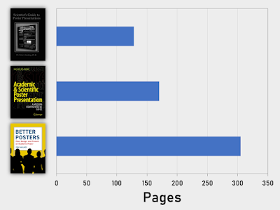
Scientist’s Guide to Poster Presentations: 128 pages. Academic & Scientific Poster Presentation: 170 pages. Better Posters: 305 pages.

As far as I know, there have only been three books specifically about conference posters ever. I wondered how they compared.

Title Author Year Pages Figures
Scientist’s Guide to Poster Presentations Peter J. Gosling 1999 128 ?
Academic & Scientific Poster Presentation: A Modern Comprehensive Guide Nicholas Rowe 2017 170 26
Better Posters: Plan, Design, and Present an Academic Poster Zen Faulkes 2021 305 153

I’m not saying mine is the best. But it it is the biggest to date.

Related posts

Review: Scientist’s Guide to Poster Presentations

Review: Academic & Scientific Poster Presentation: A Modern Comprehensive Guide

References

Gosling, PJ. 1999. Scientist’s Guide to Poster Presentations. Kluwer Acedmic / Plenum Publishers: New York. https://doi.org/10.1007/978-1-4615-4761-7.

Rowe N. 2017. Academic & Scientific Poster Presentation: A Modern Comprehensive Guide. Springer: Cham, Switzerland. https://doi.org/10.1007/978-3-319-61280-5

15 April 2021

What the HEIC? WEBP is going on with image formats?

A while ago, I wrote about how fonts are technology. And like any technology, it changes. Same is true for images. 

I just learned about HEIC images. (I’ve read this is supposed to be pronounced “heek,” but I think “hike” or “aych-ee-eye-see” should be equally acceptable.) Strictly speaking, HEIC is a file extension, and the actual format is HEIF (High Efficiency Image File).

I hadn’t heard about HEIF images before, because:

  1. The format is not supported by any web browser yet.
  2. The format is almost exclusively being used by Apple.
  3. The format isn’t supported by much graphics software yet.

Webp logo
I also have increasingly been running into WEBP images on the web. These are super frustrating, because almost nothing else supports them, so you can’t easily take a *.webp image and paste it into PowerPoint or most other kinds of standard productivity software. I can’t import them into Corel PhotoPaint. I’ve become a regular visitor to this online WEBP to PNG converter.

How do these two new formats stack up to the older formats, particularly in print?

Format Colours Transparency
JPG 8 bit No
PNG 24 bit Yes
HEIF 16 bit Yes
WEBP 24 bit Yes

It seems the major impetus to create even more image formats was file size. Both HEIF and WEBP files are smaller than either of the more common formats, JPG and PNG. If you are running a huge corporate website with zillions of images, like Apple and Google do, this is incredibly important. 

For creating a single user creating print content like a poster, this advantage is probably not terribly important.

For most academics, I think your best bet to to convert HEIF and WEBP images to PNG format. Looks like those online image converters will be getting a real workout in months to come.

External links

A new image format for the web

14 April 2021

How a scientist wrote a book on graphics: Some things never change

Starlog magazine #133 cover with Bob Hoskins and Roger Rabbit

Buried in the back of Starlog magazine #133, you’ll find one of my earlier appearances in print. And what am I doing? 

Complaining about graphics.

Some things never change.

A letter given the title “Beasty covers” by the editors reads in part:

… Let’s take the first thing that anyone sees of a new issue: the cover. They are getting progressively more cluttered with copy, which is getting obtrusive. The cover layout is unattractive and confusing because of the excessive amount of copy. However, the recent Ron Perlman cover was very nice (even if it also suffered from being too crowded). It's the sort of cover that the magazine used to have more of.

For context, this was the cover I liked:

Starlog magazine #128 cover with Ron Perlman

I guess if things had been different, the Better Posters blog could have been the Better Covers blog.

(I also complain about Doctor Who not getting enough attention. Fortunately, that is less of a problem now.)

13 April 2021

Little things make messes

Sometimes, I bet people wonder about why my critiques so often make fiddly little adjustments to posters. Surely such tiny little things don’t matter that much, right?

Finger lifting off dust from table
Ever been someplace where everything is neatly laid out and organized... but it’s dusty?

Dust particles are tiny. No one speck of dust is a problem. But en masse, they make a place look bad. Even if the big things are perfectly in place.

All those little errors on a poster – the misaligned edges, the objects almost touching, the awkward spacing in fully justified lines – all add up and all make a poster look messy.

Unfortunately, for poster design, there is no simple “sweep” that is equivalent to dusting. You have to attend to each of those details individually.

12 April 2021

Designing The Perfect Invader website logo

Graphic design walkthrough! Not a poster, but still.

A while ago, biologist Julia P.G. Jones asked on Twitter if anyone would be up for a simple little graphic design project. I said I might be able to help.

She needed a logo for a new website about marbled crayfish. This is a subject near to my heart, since I’ve published several papers about this species and curate a website of my own that compiles as much information about the species as I can find. So of course I said, “Let me try.” Here’s the process I went through.

Julia said they were looking for something that combined a marbled crayfish, Madagascar, and a little bit of text in both English and Malagasy.

I went looking for ideas, and googled the capital city of Antananarivo, where marbled crayfish were first found. I spotted this hillside sign with condensed, chunky letters. I thought they would work well for a logo.

Antananarivo sign on hillside

I found some great colourful pictures of the city. I thought about pulling colours from the city as colours for the logo, but went for something more direct. I searched for the Madagascar flag for colour inspiration,

Flag of Madagascar
 

White, red, and green was a simple colour scheme, but I was a little concerned that it might be tricky to make it not look like Christmas.

I found a public domain outline of Madagascar and marbled crayfish (the latter at Phylopic), opened up CorelDraw, and got working.

I’m happy with how version 1 of the logo turned out.

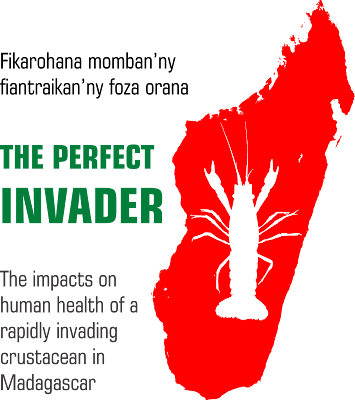
The Perfect Invader logo, version 1


The outlines were clearly a crayfish and clearly Madagascar.

I liked the chunky letters on “The Perfect Invader.” The text sort of had to go on the left (west coast), due to the shape of the words and the island. The relatively straight diagonal on the right (east coast) made it harder to fit text on that side and keep the logo relatively compact.

It’s nice when you stumble upon a strong foundation early in the design process. This basic combination of shapes, colours, and text was kept throughout.

I showed Julia several options for text. In the version below, the website title in green is in a font named, appropriately enough, Crayfish.

The Perfect Invader logo, version 2

 And here is another text variant.


The Perfect Invader logo, version 3

Julia was very happy with the basic concept, but had a couple of notes.

She didn’t want the combination of two different text styles, and particularly not the pairing of serif and sans serif fonts.

More importantly, she thought the crayfish outline didn’t look enough like Marmorkrebs. So I created a new outline by tracing a picture of a marbled crayfish I’d spotted in a news story. This was the original.

Marbled crayfish against black background

To get rid of the black background, I inverted the picture in Corel PhotoPaint. Which turned the marbled crayfish bright blue!

Marbled crayfish with colours inverted so it appears blue

Then I used the trace function in CorelDraw to turn my bizarre blue crayfish into an outline, and plunked it on to the island outline.


The Perfect Invader logo, version 4

I liked the island being red, which I liked even more when Julia told me sometimes Madagascar is called the “Great Red Island.”  But Julia asked for alternate colours, so I flipped the red and the green in the version below.

The Perfect Invader logo, version 5

The taglines were too skinny and hard to read, so thickened them up in version below. I made them gray so that they wouldn’t overwhelm the main text.

The Perfect Invader logo, version 5

Julia still wasn’t happy with the crayfish outline. Crayfish are famously decapod crustaceans – ten legs! But in the photo I traced, some legs were positioned under the body or claws so that it looked like it had eight legs (two claws and six walking legs). We didn’t want anyone visiting the site to think we didn’t know how many legs crayfish had.

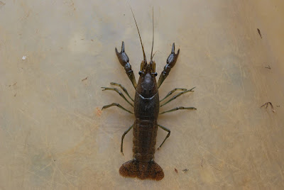
Julia’s colleagues sent me new pictures of crayfish. Fortunately, it was a plain background, though not quite as stark as the news photo. That plain background made it easier to manipulate the image.

Marbled crayfish
 

As before, I had to turn the image into an outline. I rotated the image to straighten the crayfish up to a vertical line. I used contrast enhancement to turn the image of the crayfish almost black.

Marbled crayfish in black and white
 

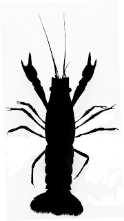
I didn’t want the white highlights – just the outline. I painted out the highlights in PhotoPaint.

Silhouette of marbled crayfish

 Then, as before, I traced my blackened crayfish in CorelDraw so I just had an outline.

I also moved the crayfish so that the edges of the animal didn’t overlap with the island. I removed some of the small outlying islands in the north. I also think I have finally solved the typeface problem: it is now compact but still dark enough to be read. Both the title and the taglines are part of the Square721 font family.


The Perfect Invader logo, version 6

I delivered both versions of the colour scheme: island red and island green. The team opted for the “island green” version below. They wanted the project to be about positives, and felt that the red could have too many bad connotations. Red is too often used to signal crises and emergencies for their liking. 

This is the final version now on the website. 

The Perfect Invader logo, version 7

If you were to zoom in very closely (which you probably can’t do effectively on this image), you might find my initials and year down in a corner.

I also did a couple of alternate versions for different purposes. One was just the island and crayfish outlines with no text. Another (below) was a “wide” version that shrunk the island down in proportion to the text. I thought it might be useful for a letterhead or some other purposes.

The Perfect Invader logo with text stretching wide to the right.

There are some little “clean up” changes I would like to make, but they can wait for another time.

The lessons here?

Design is always a process of refinement. 

It’s good to work with other people to get their feedback.

External links

The Perfect Invader

Picture of sign from here.

11 April 2021

Sunday scraps: Second book cover draft

This is another early cover concept for the Better Posters book.

Much better than my “cover that looks like a poster” effort. But more iterations were to come...

09 April 2021

Poem for my publisher

I was a little miffed when I saw this book coming out from my publisher, Pelagic Publishing.

A Natural History of Insects in 100 Limericks book cover

I was like, “Whoa. I never knew rhyming verse was an option!”

I might have written a very different book if I’d known that.

There was a publisher named Pelagic
Whose name just might have been tragic

“What's the wide open seas

Got to do with books, please?”

“Who cares? We'll still work our magic!”

08 April 2021

Respect for posters

This is what respect looks like.

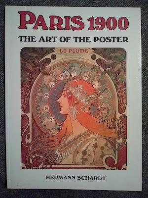
"Paris 1900: The Art of the Poster" book cover

I stumbled across this retrospective book that examines the advertising posters of Paris’s Belle Époque. It includes the work of artists like Alphonse Mucha and Henri de Toulous-Latrec. 

We often separate work done for art work done for galleries or museums as “fine art” (or simply “art”) and work done for advertising as “illustration.” But with time, those distinctions dissolve somewhat. It didn’t matter that these posters were created as advertisements for products and theatrical shows instead of fine art meant to hand in a gallery or a home.

Imagine the loss if only the work these artists created for galleries was deemed worthy of that treatment. We got lucky that these works were preserved at all. We can thank French poster collectors for that.

Likewise, in academic work, we separate work published in journals or books from work presented at conferences, particularly posters. But while the Parisian posters are now recognized as work worthy of preservation, curation, and scholarship – both as a window on history and as artwork of interest in its own right – academic posters are not so recognized.

While the Better Posters book is primarily a “how to,” I hope that one of the secondary purposes is that it starts to create some kind of record of conference posters. We need more.

06 April 2021

The unboxing of the Better Posters book

 Advance copies arrived yesterday!

Better Posters book in box

Love to say more, but I have lectures to prepare!

05 April 2021

Writing a “forever book”

It's only forever, not long at all
One of the things I aspired to do in the Better Poster book was to come as close as I could to writing a “forever book.” 

I think I spotted the phrase in something written by Edward Tufte; maybe in his forum. Certainly his book The Visual Display of Quantitative Information (1982) feels valuable more than 40 years on.

So in the Better Posters book, I tried as much as possible to think about general principles. I didn’t want to delve into the details of how to align things in PowerPoint. I wanted this book to have a long shelf life. I didn’t want it to be like the first book on poster design I reviewed in the early days of this blog: it hadn’t aged well and felt horribly dated.

I knew “forever” was going to be impossible. But I had my eye on the long game. I was hoping I could write a book that would still feel current and useful in, say, 2030. At least.

Of course, we all know that pandemic hit in 2020 and that conferences (and therefore poster sessions) as we knew them stopped. The pandemic accelerated trends that I thought might be ten years away and pushed them to now.

So it will be very interesting to see if the book will be overtaken by events. Can any book about pre-pandemic events still feel fresh and relevant in a post-pandemic world?

We shall see.

Related posts

Review: Scientist’s Guide to Poster Presentations

04 April 2021

Sunday scraps: First book cover draft

“The cover should look like a poster,” my editor said.

“That’s... a completely logical idea,” I said.

I mocked up this.

Needless to say, this is not a very good book cover. I doubt I would have sold a single copy if this had been the cover. This is why you work with professionals, people!

02 April 2021

Rejected blog names

For a while, I thought about whether I should give the Better Posters book a different title. Ultimately, I decided it made sense to keep the phrase “better posters” as the title. Enough people have visited this blog that I thought it made sense to keep the little itty-bitty brand. 

But if things were a little different twelve years ago, I might have a different title for the book.

Poster Bliss
This blog almost got called Poster Bliss instead of Better Posters.

One of the big inspirations for this blog was Garr Reynold’s Presentation Zen blog. I liked the idea of trying to do for posters what Garr was doing for presentations. And that led me to think about naming the blog similarly to Garr’s: [Presentation form] [Word indicating calm and enlightenment].

I kind of liked the title (still do!), but I decided against it. From imperfect memory, I thought it was maybe a little too presumptuous and ambitious. Plus, it was a little too similar to Garr’s blog.

That Mike Morrison converged on the phrase when he created the #BetterPoster hashtag on Twitter was kind of proof positive that the phrase was a good one – even if people sometimes muddled his efforts and mine!

I think “better” ended up encapsulating the spirit of this project. I’ve said from time to time that this blog isn’t Perfect Posters or Excellent Posters, it’s Better Posters. I never try to destroy someone’s style, but I try to find ways to improve what is already there. It’s just about trying to make posters a little better than they are now. Constant improvement is the samurai way.
01 April 2021

David Tennant in places where he shouldn’t be, poster edition

Better Poster book cover with David Tennant added

Happy April Fool’s Day!