Wouldn’t it be nice if there was a quick way to know if people will walk past your poster, or to know if all your friends are just too polite to tell you that your poster needs an intervention?
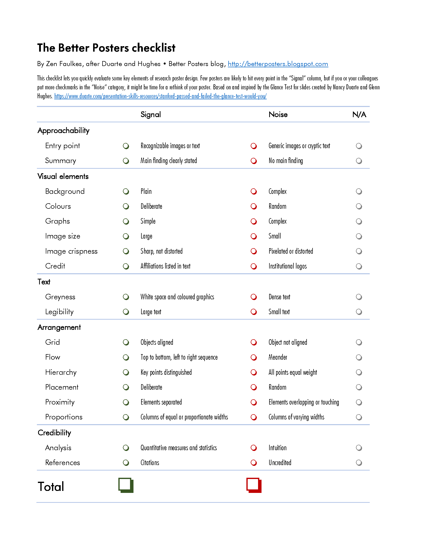
To help diagnose whether your poster is ready to print or ready to trash, I’ve devised a Better Posters checklist. You can click to enlarge. The enlarged checklist is readable, but I suspect what you really want is the high quality, printable PDF version.
This checklist was based on and inspired by the Glance Test for slides created by Nancy Duarte and Glenn Hughes. Steal from the best, I always say.
I hope that this tool will help you fulfill what should be a New Year’s resolution:
“No more ugly conference posters!”
Updated, 27 September 2017: Link to PDF repaired! Thanks to Natalia Asari for the nudge! I suppose I should also point out that this might be a useful starting point for judges who want to rate posters for a competition.
31 December 2009
24 December 2009
Breathing design
17 December 2009
Hold that spot: Placeholder text

There’s a solution for you. It’s called “Lorem ipsum.” It’s somewhat corrupted Latin text that has roughly the average length of words in typical English paragraphs, so it makes a good temporary stand-in for text that hasn’t been written yet. The Straight Dope provides a summary of its use, history, and meaning.
There are various “Lorem ipsum” generators that can give you the amount of text you think you need for a particular task.
10 December 2009
Leading thoughts

The space between lines in known in the typography business as leading (rhymes with “sledding”). What should you consider when looking at leading on a poster?
First, look at how long your lines of text are. The lines are often quite long on posters, even though this can be mitigated by the reader being some distance away. When you reach the end of the line you’re reading, you have to scan back and down to the next line. The further you have to scan back to the beginning of the next line, the more likely it is that you will lose your place. Increasing the leading helps make each line distinct in long text.

Lowercase letters can pose more a subtle problem. If you have a typeface where the lower case letters are very close to the upper case letters in height (known as a large x-height), again, you’ll want to increase the space between the lines. Letters with a large x-height tend to form swaths of gray if placed too close together.
Incidentally, one more reason not to use PowerPoint to make a poster is that it tends to automatically squish the leading down to make text fit. If you’re not paying attention, your single-spaced text will change without warning to 0.9 spaced text or smaller.
03 December 2009
The eye loves the circle

The human eye loves the circle and embraces it.
While I am a strong advocate of laying out posters on a grid, you can end up with a poster that is relentlessly rectangular. A circle can be a strong antidote to a poster filled with right angles.
Circles can be used to draw attention. It is no accident that circles are used in those ubiquitous bullet lists.
Circles can create tension. Like a ball, they suggest something that is mobile and not static.
Circles can be used to create white space. As everyone knows, a round peg will not fit into a square hole without leaving spaces.
Because they do tend to break, rather than reinforce, grids, circles are probably best used in small doses on a poster. A poster without a circle will not be noticeably missing anything. But it’s a useful exercise to consider how you might work a circle into a poster grid.
Reference
Elam K. 2004. Grid Systems. Princeton Architectural Press: New York. Amazon
Photo by user Oranguthingy on Flickr, used under a Creative Commons license.
01 December 2009
Compare and contrast: Japanese advertising posters
“With clutter ubiquitous, emptiness gets attention.”
Check Garr Reynold’s Posterous blog for a look at two very different approaches to getting attention with posters.
Conferences are visually frantic environments. Everyone is competing for attention. People’s typical response is to go for louder, bigger, brighter... and those work. But sometimes, going against the grain may be effective, too.
Subscribe to:
Posts (Atom)