Showing posts with label reviews. Show all posts

24 July 2026

Illustrae website review

Illustrae is software for creating scientific illustrations. Let me hit what might be the most relevant feature of this product for many readers right at the top:

There’s no free version to try.

For that reason, I cannot review the software. I am not able to throw down money for a subscription to try this product right now, not even a temporary subscription. But I wanted to write a post pointing to this product, because it is relevant to this blog’s mission.

The main poster-related feature is the promise of turning an abstract into a poster. 

Turn your abstract into a graphical abstract or academic poster in 1 click


This feature, as far as I can tell, is a generative AI tool. And the rest of the website seems to support this idea, because the illustrations look very much like most other generative AI figures, like the ones that you see all over LinkedIn and other sites. The graphics on the site uniformly feel like generic slop created by generic generative AI tools. So many images against a faded, yellow-ish background. 

I cannot say how good a job this does, but if I were testing it, I would be very interested in:

  1. How similar the results were from different abstracts.
  2. Whether the results follow the best practices they list on their own site (see below). 
  3. How much tweaking and checking typically needs to be done. 

Other features don’t appear to be generative AI, but it is hard to tell. Several screens show libraries elements that remind me of BioRender tools and icons, but the aesthetic is very different to BioRender. BioRender tends towards minimalist icons, but Illustrae images are more visually complex. I wonder if generative AI was used to create those common stock elements?

The site contains two blog posts specifically about posters. One is a guide about the overall design of the poster. This is a decent short summary. 

The other is about creating the figures within the poster. This one has some points that are not as well explained. For example, in discussing figure resolution:

As cited, “High-quality figures should have a resolution of at least 300 dpi to ensure clarity and readability.”

It is not clear which of their sources are being cited here. It’s true that 300 dpi is more than enough, but the post doesn't mention that the 300 dpi measure has to factor in the final printed size of the poster, not just what it is on a screen.

Another bit of strangeness in the post comes when it says:

If the text is too small, attendees won’t be able to read your labels or legends from a reasonable distance. Remember, “The title of a poster should be at least 100 pt font size to be readable from a distance.”

But this post is about the individual figures? Why is the poster title being brought up here? I worry that someone will read this and think each individual figure needs a 100 point title, which would not leave much room for anything else.

Both posts do have some useful links out to other resources. 

I noted a couple of other things on the website that don’t sit right with me. A bunch of blog posts with have 2025 dates but claim to be “2026 guides.” I’m guessing the title was updated while leaving the content the same search engine optimization.

And let us not forget that to the degree that this is a generative AI tool, there could potentially be issues around intellectual property. The company FAQ notes:

By using the app, you grant us a limited license to store, display, and process your content in order to provide and improve the service. We do not claim ownership of your work, though we reserve the right to feature your images in marketing or educational materials.

I don’t know if “improve our service” might mean, “We use your stuff to train our model.” Other people have found that material uploaded to generative AI services is often not secure, and generative AI can spit that content back. And the company being allowed to feature your images, apparently without your consent, could result in work being released before the researcher wanted it released.

I would also like to see an “About us” section on the website. With all the hype around generative AI, showing the team would generate some good will and trust.

 If you have used Illustrae, I would love to hear from you. Email me at BetterPosters at gmail! 

External links

Illustrae

What To Include In Conference Poster Figures: Essential Elements and Common Pitfalls 

How To Make A Conference Poster For Your Research: 2026 Guide  

16 September 2023

Review: The Little Guide to Giving Poster Presentations

Cover to "The Little Guide to Giving Poster Presentations"
The Little Guide to Giving Poster Presentations is well named. It is, indeed, little.

Perhaps too little.

John Bond’s book weighs in at 150 pages, and they are kind of small pages, too. A fast reader can probably skim through this in a day without too much trouble. That this is a quick read is not necessarily a bad thing. Part of it is because Bond’s prose is clear.

Unfortunately, the book’s treatment of its subject also encourages skimming, because sometimes there isn’t as much depth as you would hope for.

Posters are a visual medium, so you might that a book about posters would be illustrated. But you don’t get to a diagram until Chapter 11. There’s one more figure in that chapter, and then nothing. And they aren’t in colour, either.

Sometimes, Bond even draws attention to the “little” of the title. In Chapter 21, he writes:

Information regarding color choices for charts and graphs could fill a whole chapter or even a book (and likely does).

But then, having drawn our attention to the rich subject of colour use in data visualizations, Bond ends the chapter a couple of pages later. Without pointers to other resources. (The book’s references are few and far between.)

There are some bright spots. This is the first book about conference posters that mentions the changes to the academic conference scene wrought by the ongoing covid pandemic. I also appreciated a section about how to estimate costs of attending conference, which I don’t remember seeing in other poster making resources.

While I craved more depth, I don’t fault most of the recommendations that Bond makes. The advice is consistently good. Bond feels more comfortable with writing: the book devotes three sections about planning and writing, but only one section to design, and one to presenting.

Bond’s book will help those who read it, and I am sure some readers will appreciate its readily digestible format. And the book contributes to the push to try to get people to take posters more seriously. There were next to no books to conference posters for so long that I’m pleased to see more arriving in this space.

References

Bond J. 2023. The Little Guide to Giving Poster Presentations. Rowman & Littlefield: Lanham. https://rowman.com/ISBN/9781475870152/The-Little-Guide-to-Giving-Poster-Presentations-Simple-Steps-to-Success

04 May 2023

Review: Academic Posters – A textual and visual metadiscourse analysis

Cover to "Academic Posters" book.
One of the downsides of working in a small, niche field is that the literature is scattered and easy to miss. So with this, I apologize for not recognizing that a very relevant book was published several years ago.

Academic Posters is only the fourth book I know of that is specifically devoted to posters. But it is different than the other three. Rather than being a “how to,” D’Angelo’s book is an analysis of posters.

D’Angelo analyzes forty posters each from physics, clinical psychology, and law for their linguistic and graphic style. She also interviews about a dozen practitioners in each field to see how different fields use poster presentations.

The analyses and comparisons here are useful, but getting to them takes time. Maybe it is another difference in fields – me coming from science, D’Angelo working from the humanities – but I kept thinking this useful information could have been presented in a much more compact format.

You have to have introduction and methods. But some sections like, “Principles underlying corpus design” start with very generic considerations of selecting work to analyze that feel more at home in an introductory textbook than presenting new work.

It takes 150 pages to get to the results in Chapter 5. When we get to the results, the results of each field are discussed separately, then there is another section that compares the three disciplines, which requires repeating much of the information we just read through.

Another sixty pages of the book at the end are raw data. As much as I am in favour of archiving raw data for reuse, archiving raw data online in CSV files somewhere would be much more practical than trying to extract the data from printed pages.

Even the index seems protracted. Instead of showing a range of pages (“5-9”), the index lists each page individually (“5, 6, 7, 8, 9”). There seem to be little omissions (the listed sources of physics posters doesn’t add up to the 40 analyzed?) and errors (one figure has the Microsoft Office “hey, there’s a spelling error here” red underline still on the page). 

The entire volume would have benefited from more engaged editing and book design.

I recently published an analysis of poster designs that is similar to the analyses in this book, and I appreciate that extracting data on poster design and writing is difficult. The level of analysis on the language and graphics is detailed, and are a useful preliminary snapshot of academic poster styles.

See also Rowley-Jolivet’s review of Academic Posters.

External links

D’Angelo, Larissa. 2016. Academic Posters – A textual and visual metadiscourse analysis. Bern: Peter Lang. 367 pages. ISBN 978-3-0343-2083-2. https://www.peterlang.com/document/1053534

Rowley-Jolivet E. 2016. « Larissa D'Angelo, Academic Posters – A textual and visual metadiscourse analysis », ASp, 70: 141-145. https://doi.org/10.4000/asp.4858

20 April 2023

Review: Building Science Graphics

"Building Science Graphics" book cover

If I hadn’t written a book on poster design, Building Science Graphics might be the book I would recommend to people who wanted help creating posters.

The book is not about posters, no. It’s not about data visualization, either. Jen Christiansen calls the work that she is writing about “illustrated explanatory graphics.” But I am interested in this book because it points the way forward for how a lot more posters could be.

The default format for most conference posters is a three column mini journal article in IMRAD format. There are advantages to this format, but it is both limited and limiting. I would like more people to consider making their posters like this “illustrated explanatory graphic” from Scientific American, where Chistiansen works. Click to enlarge!

Graphic showing data from 100 years of bird banding.

This is the sort of visual that I think would absolutely rock as a conference poster. It’s immediately obvious what it’s about (birds), but has dense, detailed data that wouldn’t be easy to convey as a series of slides.

With this book, I can get to see how those sorts of print illustrations are created. Christiansen noted on Twitter this this graphic was the combined work of three people, excluding herself. (This is in stark contrast to many posters, which might be largely the responsibility of a single grad student.)

If you look at an illustration like that and think, “But I can’t draw realistic birds like that,” the point is not how realistic the birds are. Sure, they add a professional gloss to it, but probably 80% of the effectiveness of the graphic is the understanding and presentation of the content. You could use bird silhouettes from Phylopic or something, and you could still have a winner.

One of the concepts introduced in the book early on is a phrase that I know I will use a lot when I’m discussing graphics: visual jargon.

It’s tempting to proclaim that visual languages are more universal than spoken and written languages, and that the very act of presenting information in the form of a drawing instead of words makes it more accessible. But that’s not necessarily the case. Visual jargon, for example, is just as prevalent as written jargon. Symbols that carry highly specific information within a certain context can be a really efficient way to communicate with others that are fluent in that visual language, like a peer group of scientists. But they are simultaneously a brick wall to outsiders.

“Visual jargon” is a perfect encapsulation of a pattern I notice a lot in scientific graphics. Box plots, raincloud plots, and violin plots are all visual jargon. Protein structure diagrams with ribbons and spirals are visual jargon. Phylogenetic trees are visual jargon. But while we recognize written jargon and there have been many justified critiques of it, visual jargon is often actively encouraged (“Friends don’t let friends make bar graphs”) without recognizing the costs that it brings.

Many chapters will be familiar to readers of this blog and book. The first several chapters, particularly 4 through 9, cover graphic design building blocks like use of contrast and typography. Even in these chapters, there are some insights that you don’t often see covered in other works. For example, her exploration of how to use arrows in illustrations (pages 66-67) is insightful and not something I’d seen elsewhere.

For those looking for something new, Chapters 10 (Visual style), 11 (Visual storytelling), and 13 (Special consideration) cover new territory. The tips and examples of how a graphic can become not just and explanation, but a story, are particularly insightful.

I have to highlight Chapter 7 (Organization and emphasis), because it ends on pages 90-95 with a section on conference posters! Christiansen presents three posters, and gives each a makeover, much like critiques I often do here on the blog. The first two are quite good examples of typical posters and the revisions are helpful and welcome. The third poster (the one with a butterfly) presented as needing a makeover is better than most posters I see! While the makeover is better, I think anyone who put up the first version would be crushing it compared to the competition.

The book ends with a series of “How to” chapters. Several are elaborate flowcharts that try to codify Christiansen’s decision tree and workflow. Chapter 18 (Collaborations) is also an important chapter, because too many people in science try to “go it alone” when creating graphics. 

The book is full colour and has many examples throughout, with a lot drawn from Christiansen’s experience commissioning and developing graphics for Scientific American.

Page 4 from "Building Science Graphics."
Christiansen also designed the book herself, and the book itself exemplifies many of the graphic design practices Christiansen talks about in the book. For instance, there is a lot of direct line labels that connect the image to its place in the text. There are lots of sidebars and clever use of grids so that the appearance of the pages is ordered but not dull.

Clearly, Jen Christiansen is a person after my own heart. Not only graphically, either. She has crustaceans in her background! She even helped describe a new shrimp species

Highly recommended.

Update, 28 November 2023: Jen has put up Chapter 3 for free on her website.

Reference

Christiansen J. 2022. Building Science Graphics: An Illustrated Guide to Communicating Science Through Diagrams and Visualizations. CRC Press: New York. https://doi.org/10.1201/9781003217817
External links

Building Science Graphics (The “More to explore” provides a useful and detailed bibliography)

Jen Christiansen home page

Jen Christiansen on Twitter

What scientists have learned from 100 years of bird banding (graphic)

PolicyViz Podcast #235 Interview with Jen

Data Viz Today #85 Interview with Jen

13 April 2023

Review: Creating Effective Conference Abstracts and Posters in Biomedicine: 500 Tips for Success

Cover of 'Creating Effective Conference Abstracts and Posters in Biomedicine: 500 Tips for Success"

I started this blog back in 2009. But unbeknownst to me, a trio of authors published a book about conference posters around the same time. Somehow, Creating Effective Conference Abstracts and Posters in Biomedicine escaped my notice for all these years! Why did nobody tell me? Goodness knows I looked for books on this topic when I started blogging.

In many ways, this book is similar to mine: a “walk through” of advice on the poster presentation experience, from initial planning to presentation.

Chapters 2 through 5 cover conference abstracts, and Chapters 6 through 21 – more than three-quarters of the book! – are about posters. So this really is a conference posters book, much more than the title lets on. 

It’s not clear why the book title mentions biomedicine specifically. The advice here is widely applicable to any academic conference.

The style of the book is literally a series of tips. Most pages have about three or four headings, with a brief paragraph – sometimes a few – under each. This has the advantage of making the book skimmable, but can also make it harder to get into reading flow.

The book’s biggest shortcoming is that there are almost no illustrations. This is fine for the chapters on abstracts, but baffling for the chapters on poster creation. There are a few examples of posters way back at the very end of the book, tucked away in appendices. The poster examples are mundane and don’t get much explanation of why they are showcased.

This is touted as an example of a “creatively designed landscape poster.”

Poster titled "Cytokine release from alveolar epithelial cells: A role for thioredoxin?"

I wouldn’t have counted as cutting edge poster design – even in 2009.

I generally agree with most of the advice here. I do disagree with a few things, like, “Put most of the text in bullet points.” They also lean too much into templates for my taste.

The book references online resources in several places, but because the book is more than ten years old now, there is a lot of link rot. Even the author’s home page, shown early on, has succumbed to link rot. Likewise, many specific suggestions on how to do things in PowerPoint 2007 seem quaint, even if the you would do it the same way in modern PowerPoint. But overall, the book has aged well. Most of the advice is still solid.

When gearing up to write my book, one of my incentives was that I didn’t think a book like Creating Effective Conference Abstracts and Posters in Biomedicine existed! If I knew of this book, would I have written mine? I think so. This book has solid advice, but the lack of illustrations and example, plus that it has “aged out” a bit, left space for a new book on the topic.

Reference

Fraser J, Fuller L, Hutber G. 2009. Creating Effective Conference Abstracts and Posters in Biomedicine: 500 Tips for Success. CRC Press. https://www.routledge.com/Creating-Effective-Conference-Abstracts-and-Posters-in-Biomedicine-500/Fraser-Fuller-Hutber/p/book/9781846193118

16 March 2023

Canva revisited

I reviewed Canva back in 2020. Canva has introduced many new features since then, so here are a few quick updates on the platform. 

Size seems to have increased, but is still limited. I still can’t make a poster that’s 6 feet wide by 4 feet tall. But now it seems to have a limit on total area. I think when I reviewed it before, it had a hard limit on height and width. I can now make a poster that’s 6 feet wide by 2 feet tall, which I don't think I could before.

There are now university research poster templates. (They may have been there before, but I don’t think so.) Search the templates for “Research Posters” and you get about 20 or so different templates. 

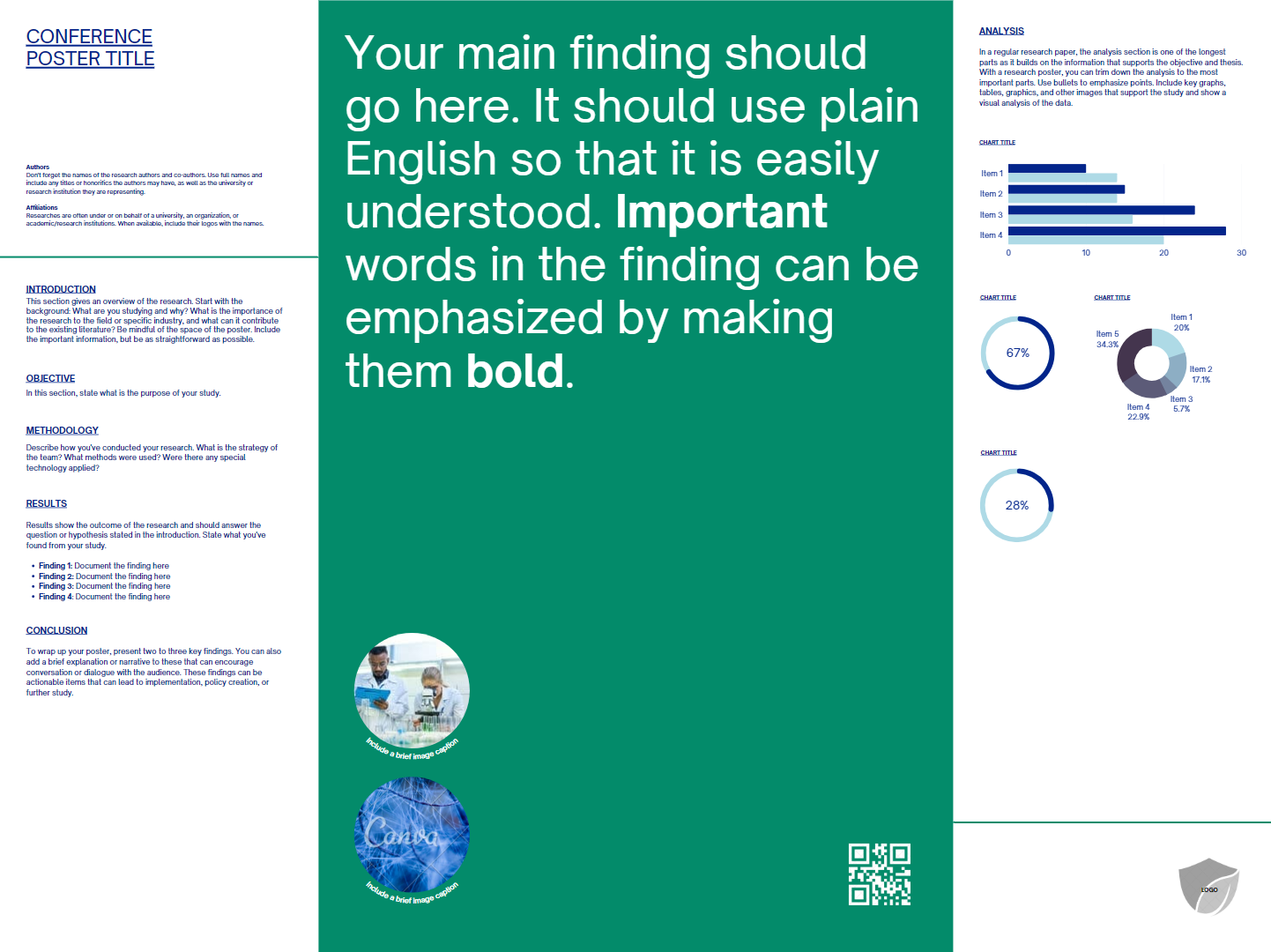
Poster template with large grey title bar and sans serif type.


 A couple are recognizably based on Mike Morrison’s billboard style posters.

Poster template with large central text and sans serif type.


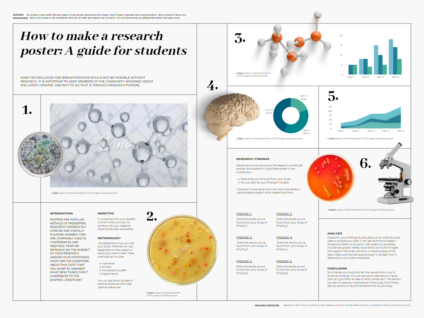
 Many have the same boilerplate text that doubles as a guide.

How to make a research poster: A guide for students

Many technologies and breakthroughs would not be possible without research.
It is important to keep members of the community informed about the latest updates. One way to do that is through research posters.

Most of the templates are good on colour and typography. 

Poster template with light background and serif type.

But most have too much fine text. 

Poster template with half black, half light background and sans serif type.

Some have confusing layouts.

Poster template blue title bar and sans serif type.

Canva has certainly improved as a platform for making conference posters. It would still not be my “go to” for posters, because the size limitations bother me.

Related posts 

Canva review

19 January 2023

Review: Academic Conference Presentations

Cover to book "Academic Conference Presentations"We have a new addition to the “academic advice” genre! Academic Conference Presentations has a 2022 publication date, but was released early January 2023.

This book is aimed at conference novices, and is short and breezy.

The text isn’t burdened by citations. Mark Freiermuth is giving personal advice based on his experience, not giving a data driven analysis of presentation effectiveness. He isn’t afraid of using an exclamation point or two once in a while. There are even occasional appearances of triple exclamation points!!!

Nanase Iwahori add to the fun with manga styled artwork for each chapter.

Two women fist bumping, drawn in manga style.

I suspect that most readers of this blog are in the sciences and allied fields, so it is refreshing to get an insight into practices from something more in the humanities. Freiermuth uses many examples from linguistics, particularly working with Japanese students.

Readers of this blog will know I read this looking for advice on posters, and I found it. Three pages worth (Chapter 4, pages 45-47) out of 156 pages in the main section of the book.

I tend to agree with his assessment:

(M)ost presenters’ posters look unprofessional—actually crappy—well in excess of 50%.

But Freiermuth admits that he never, ever opts to give posters. He describes his one time presenting a poster as his presentation being “semi-rejected.” This, unfortunately, indicates how many people see posters as a second rate form of presentation, even though Freiermuth goes on to say that he had a good time presenting his poster. 

His three point summary of poster advice:

  1. Make it look nice.
  2. Protect it when you’re traveling.
  3. Stand by your poster during you allotted time.

I wouldn’t recommend this book for someone looking for advice on posters, but it is worth a look if you are expecting to do oral presentations.

Reference

Freiermuth MR. 2022. Academic Conference Presentations: A Step-by-Step Guide. Palgrave Macmillan Cham. https://doi.org/10.1007/978-3-031-21124-9
 

18 August 2022

Review: Storytelling with Data

Cover to book "Storytelling With Data"

Some scientists might pass over Storytelling With Data (2015) because they have an incredible aversion to the word “storytelling.” Author Cole Nussbaumer Knaflic might drive off some people when she writes things like, “The magic of story.” It can sound a little hippy dippy trippy sometimes.

If “story” and “storytelling” freak you out, let me make a pitch for this book and give you another way to look at it.

Most of the book is about annotated data visualization. Fully seven of the book’s ten chapters are devoted to picking apart and recreating graphs. 

For example, Knaflic takes a mundane bar graph like this:

Bar graph of annual retail prices per year.

And shows the process to get to this:

Annotated line graph of annual retail prices per year.

Same data set. But one has a much clearer focus on what information is critical to the viewer.

I sometimes do similar things with graphs here on the blog, and some of the principles will be familiar to readers of the Better Posters book. But this book drills down into making a single graph in a much deeper way, with many more examples.

How to take a single graph from an Excel default and into something more targeted and informative has been on my mind a lot lately, and this book is the best I have found on the subject so far. Recommended.

Related posts

Same graph, different narratives

External links 

Storytelling with Data website

14 July 2022

Review: The Visual Story

Cover to "The Visual Story" by Bruce Block
The Visual Story is a book about the visual language of movies. Why am I reviewing it here? Because Bruce Block goes way down into the basics of what makes up visual communication.

When he write there are only three basic shapes (circle, square, triangle), you can tell he has cut way back on complexity to try finding the core principles behind visual storytelling.

Sure, some of the book deals with things like camera movements, but there is still lots here that applies to posters.

Block lists seven visual elements.

  1. Space
  2. Line
  3. Shape
  4. Tone
  5. Colour
  6. Movement
  7. Rhythm

For the purposes of posters, “movement” rarely comes into play, since we are typically dealing with a static document.

The remaining six elements – with one exception – may be familiar to readers of this blog. The chapter on colour, for instance, has a lot of parallels to the chapter on colour in my own book.

The one element that sounds weird to apply to a static image is rhythm

Think of rhythm as how often something changes as you look across an image.

Illustration of different visual rhythms. Slow regular rhythm represented by widely and evenly spaced lines. Fast irregular rhythm reprsented by narrowly and unevenly spaced lines.

Most conference posters have a high visual rhythm, and often an irregular one. Conference sessions, even more so, because you scan from poster to poster, each of which alone has a high rhythm. With the cumulative effect, it’s not surprising that poster sessions are tiring.

Block points out that all seven of these visual elements vary. Using colour as an example, red, pink, and orange are more similar to each other (which Black calls “affinity”), and blue is very different. Blue is a contrasting colour to the others.

To go back to the list of visual components, the contrasting “end points” might be:

  1. Space: Deep versus flat
  2. Line: Horizontals versus diagonals
  3. Shape: Circles versus triangles
  4. Tone: Dark versus light
  5. Colour: Hue and saturation
  6. Movement: Vertical versus horizontal
  7. Rhythm: Slow versus fast

From there, Block notes that elements that are the most different – that is, have a high contrast with each other – are the most visually intense

Contrast increases visual intensity, but affinity decreases visual intensity.

And changing that level of visual intensity can be used to support a visual story, like a movie. On a poster, I’ve written before about how contrast can be used to draw attention to things, which is a variation on Block’s idea. Visually intense things hold our attention.

In a movie that is mostly saturated bright colours, a scene that is mostly pastels is going to be visually intense. Even though we typically think of pastels as quiet and calming, if pastels are so different from the rest of the movie, it can be an intense visual experience.

Despite the depth Block brings to this subject, the book is a relatively quick read. Block uses tons of examples from movie still frames, which are quick to grasp and make his points easy to understand.

For most conference poster makers, you might not need a copy on your shelf. But it is worth checking out a copy of this book from a library. 

Reference

Block B. 2021. The Visual Story Creating the Visual Structure of Film, TV, and Digital Media (Third Edition). Routledge: New York. https://www.routledge.com/The-Visual-Story-Creating-the-Visual-Structure-of-Film-TV-and-Digital/Block/p/book/9781138014152

External links

ABT Time Episode 17: USC film professor Bruce Block and Directors Jason Ensler and Greg Tillman

28 April 2022

Link round-up for April 2022

How many visitors can you expect to your poster in a virtual conference? This paper suggests about 10.

Six hundred ninety electronic posters (ePosters) were visited by over 7,000 unique visitors. Each poster was viewed on average by 10 ‘visitors’. Visitor number per poster concentrated in the range between 6–20: 344 posters received 6–10 visitors and 244 posters were viewed by 11–20 visitors. Posters across the tracks received quite even attention with the exception of Track 9, which was for student ePoster competition and increased visits from judges(.)

It’s not clear how generalizable that number is. This analysis is from exactly one conference with a little under 2,000 attendees. The authors do note, however, that any number is better than an in person conference, where organizers have zero knowledge about what posters and sessions were popular.

• • • • •

A paper on creating an inclusive online poster session.

(O)ur survey data indicate that 70% of 198 survey respondents attended the virtual poster session. Of these respondents that attended the session, 100 attended as viewers only (72%), 7 as presenters only (5%), and 32 as both viewers and presenters (23%). Most survey respondents (96% of viewers and 77% of presenters) indicated that their experience either met or exceeded their expectations. While in-person poster sessions were still preferred (slightly or strongly) by both attendees (45%) and presenters (54%), surprisingly, some attendees and presenters (23%) enjoyed virtual sessions and in-person sessions equally. Furthermore, 32% of respondents who viewed posters and 23% of respondents who presented posters expressed either a strong or slight preference for virtual poster sessions.

Their tips:

  1. Use combined asynchronous and synchronous sessions
  2. Use short video or audio introductions
  3. Use Zoom features that allow attendees to enter and exit breakout rooms for synchronous sessions
  4. Use video and live demonstrations on how to use the different poster platforms
  5. Expand poster submission timeline to enable organizers to share virtual poster sessions with conference attendees earlier
  6. Have a smaller number of posters per session or topic room
  7. Incorporate volunteer attendees and topic-based virtual synchronous sessions
  8. Provide online etiquette guidelines

• • • • •

What drives changes in the “look” of graphics? The article, “DALL·E 2 and The Origin of Vibe Shifts”, argues that for websites, great photos suddenly became easy to get... and were promptly abandoned, because they no longer signaled “high end.”

• • • • •

The new book A Roadmap to Successful Scientific Publishing has one section of one chapter about conference posters. I can’t say that the illustration of a poster “sketch” fills me with confidence:

Generic poster layout

I understand this isn’t meant to be a fully formed poster, but it wouldn’t have been difficult to at least align the sections.

The text is a little better. It does emphasize simplicity, but promotes things like a “lead sentence” under the title to grad attention (can’t that just be... the title?) and bulleted lists.

23 July 2021

Review: How Design Makes the World

Note: Author Scott Berkun recently announced to his email subscribers that he has had a medical event that has seriously affected his voice. This is a concerning set back for someone who makes a living in part by public speaking. I wish Scott well and hope he eventually return to public speaking. He has a list of ways you can help him at this difficult time.


• • • • •

How Design Makes the World delivers a big, serious subject in a short, breezy book.

Scott Berkun takes a very high level view of design. He is not interested so much in how to design in a nuts and bolts sense. This is more about general processes and, importantly, their impacts. Berkun asks early on, “Why are so many things seem to be badly designed?”

I appreciate that Berkun’s answer to that question acknowledges things like power dynamics and economics. People who might make good design decisions don’t necessarily get to make the decisions or get the resources they need to make them. 

For example, the borders of Middle East were drawn by mid-level bureaucrats who were not from the region. We have been living with the consequences of those decisions ever since.

That example is just one of many historical anecdotes in this book. Berkun has a good nose for finding these, and they are consistently interesting. And he casts a wide net. So while I have spent a lot of time thinking about graphic design on this blog, I learned a lot about other kinds of design. “Norman doors” are going to be part of my vocabulary forever now.

Is there anything here for a poster maker? Maybe. Scott includes four key questions to evaluate designs:

 
The four questions of design. 1. What are you trying to improve? 2. Who are you trying to improve it for? 3. How will you ensure you are successful? 4. Who might be hurt by your work? Now or in the future?
 

What are you trying to improve? Who for? How will you be successful? Who might be hurt by the work?

Let me take a stab at applying them to conference posters.

1. What are you trying to improve?

I see two things poster designers are often striving for. 

The first is efficient use off time spent making the poster. Berkun addresses that: “Efficiency is often taught to mean working in a straight line, but the trap is that efficiency is not the same as quality.“

The second is maximizing the information information content on the poster.

Why I think these are both dubious improvements lie in the answer to Berkun’s second question.

2. Who are you trying to improve it for?

People trying to minimize time on creating posters and maximizing information on posters are usually trying to improve those things for themselves, not other people.

3. How will you ensure you are successful?

I think a lot of poster makers don’t have an answer for that beyond having a supervisor say it’s okay. I don’t know how many people show off drafts of their poster or rehearse their poster presentation  to others before they head to a conference. 

4. Who might be hurt by your work? Now or in the future?

Luckily, posters are mostly harmless. The content of the posters might not be, but that’s another issue for a different blog. Perhaps a more helpful way to frame this question is, “Who might be left out?” Who might not be able to benefit from your data and insights because of how you have made your poster?

This book is not essential for poster makers. It’s not a “how to” and lacks the nitty gritty details that someone looking for concrete advice on graphic design might want. But if you are interested in stepping back and looking at that bigger picture, Berkun paints a rewarding view.


08 July 2021

Review: Better Data Visualizations

Cover to "Better Data Visualizations"
I ran across Jon Schwabish’s book, Better Data Visualizations, when my editor pointed out how uncomfortably close it looked to an unused cover design for Better Posters.

Once I finished smiling at the “separated at birth” similarities, I realized I should actually read Jon’s book because it was, as they say, “relevant to my interests.”

Better Data Visualizations is very useful.

The bulk of the book is a big ol’ list of different graph types. The charts range from the common (bar charts, scatter plots, and tables) to the more esoteric (Voronoi diagrams, Marimekko charts). It’s not quite an “encyclopedia of charts,” but it is thorough.

There are usually multiple illustrations (in full colour) of each type of chart so you can see them “in action,” as it were. Almost all the illustrations are in full colour.

Every entry has a series of tips of how to avoid pitfalls and maximize the effectiveness of that particular chart type. I particularly appreciated the concise guidelines for making tables presentable. 

Readers of this blog who work in the humanities occasionally ask about techniques for their fields. If that is an interest of yours, you’ll be pleased to know Schwabish has a section on qualitative visualizations. It is slimmer than the section on quantitative visualizations, but given that this is an area that is often ignored completely, this is an extremely welcome addition to this book.

There is a section showing “before and after” revisions of charts that is quite fun.

Lastly, there is a section on developing a style guide. While this is aimed at organizations that make a lot of charts, I realized that it could be extremely helpful for a poster maker to draw up a short style guide for their poster. One of the biggest problems I see on posters is inconsistency. This is usually because people use different software tools for different parts of the poster, and they don’t check to harmonize the graphs and the rest of the poster.

While I was reading, I was wondering, “But how could someone know how to make some of these non-standard charts?” While the appendices are often considered to be extra material that can be removed, the appendix on data visualization tools was extremely helpful for me. (“Microsoft has a graphing site called Charticulator? Cool.”)

Because data visualizations are often the heart of conference posters, there is definitely some overlap in Jon’s book and mine. But Better Data Visualization covers much more territory there than mine does.

External links

PolicyViz

Related posts

Solving the Pokemon problem for posters


03 June 2021

Poster sessions in street view: Review of Artsteps

Artsteps logo
TL;DR: Artsteps provides some nice features for virtual poster sessions, but it is hampered by clunky navigation and limited resolution to view posters.

• • • • •

When many conferences flipped to online events starting in 2020, I have been trying to track how academic conferences have tried to handle poster sessions. Not only is this an issue for large national and international conferences, but individual institutions are trying to deal with how to hold their own poster sessions.

Artsteps provides a service to host “virtual reality exhibitions.” It was used by the student research office at The University of Texas Rio Grande Valley to host showcases of undergraduate student research.

Click any of the images below to enlarge!

The session takes place in a three-dimensional virtual environment.

Virtual room with student posters on walls.

You click and drag the window to look left, right, up, or down.

The navigation experience using the mouse reminds me most of the “Street view” in Google Maps. It’s not smooth scrolling through an environment, as with you might get with a first person video game like Doom or Metroid Prime (yep, going old school for those references).

Instead, if you look down at the floor, you can click to place “footprints” to indicate where your want to got next.

Virtual room with footprint icons in lower right corner of the virtual floor.

This is a somewhat frustrating way to navigate. It’s incredibly difficult to judge the placement of the feet so that you are a reasonable distance from a poster. It’s easy to come in way to close, and there isn’t (as far as I can see) an easy command to take a step back. You have to turn the room around, walk away, turn the room around again, and look at the poster.

(Edit: I discovered you can use the arrow keys on the keyboard to navigate, which is a significant improvement. It provides smoother movement through the environment. It’s just not immediately obvious that you can do that.)

I think this ability to see something from many angles would be awesome for something like a virtual sculpture. But for posters, you mostly want to see them dead on, not from an angle.

Poster in virtual room.

The photographs of the presenters are a nice touch.

The posters are clickable. Clicking a poster brings it to the foreground and “flattens” it so it’s facing the screen dead on. Clicking the poster also open a pop-up window that allows you to click to play narration recorded by the presenter.

Virtual poster showing media controls.

This media window initially overlaps the full screen poster. A little frustrating, because you probably want to see all of the poster while you’re hearing the presenter’s tour.

Virtual poster with smaller media window on top of it.
 You can enlarge the media window / narration window to “full screen”, but somewhat unexpectedly, the “full screen” view of the poster in the media window is smaller than the “full screen” in the virtual room.

Poster in media player window at fuill screen.

Once you have made the poster full screen, there is no option to zoom into a particular section. This was frustrating, because I found a lot of posters had detail that was difficult to see. I am viewing this session on a laptop, which may have a lower screen resolution than many people are using for desktops now. Even so, it’s not like I am viewing these through my phone. 

Not being able to resolve detail could be solved by good design for this specific platform, but a “zoom” or “magnify” tool would be super helpful.

Some presenters worked around this by presenting what appeared to be a slide deck of rotating images rather than a single static poster.

There are chat boxes and other features that you can presumably use during scheduled presentation times. Unfortunately, I did not see this during the scheduled presentation time. It suspect that it would work okay for small groups, but I don’t know if this experience would scale to, say, the hundreds or thousands of posters needed for a medium or large conference.

As the name implies, Artsteps seems geared to reproducing the small, intimate feeling of walking through a little art gallery with paintings, photographs, and scultures. I’m not sure that experience is quite what is needed for online poster sessions.

External links

Artsteps

UTRGV Engaged Scholar showcase November 2020

UTRGV Engaged Scholar showcase May 2021

Related posts

Link round-up for October, 2020

17 May 2021

Online posters at National Biotechnology Conference

Speaker, National Biotechnology Conference

This week, I am pleased to be speaking at the National Biotechnology Conference! I’ll be presenting on Thursday, 20 May, at 8:00 am Eastern Daylight Time on poster design.

Some of the conference content was available last week, so I went in and looked at how this meeting is handling posters.

As I’ve mentioned before, the concept of a “poster session” in an online space is an interesting thing. Different meetings have handled them in very different ways.

Below is a screenshot of one sample poster, just pulled by happenstance. I have blurred the title and authors, and at the preview scale, the rest is not really readable.

The conference provided a limited number of poster templates, so my focus is not on the poster design, but the viewer experience.

Sample online poster from National Biotechnology Conference 2021

How it works is that when you click “View eposter,” a preview screen pops up that shows you an overview of the entire poster. 

You can see controls for the poster – menu, forward and backward arrows – down in the lower left corner.

Media controls

If you read comics using an app like Comixology, the poster experience is rather like their “Guided view.” You step through each individual panel of the comic or poster, then advance to the next one.  In the poster situation, though, you have the option of playing narration.

The poster is scattered with little “sound” icons. These are obviously added in by the software, because the icons cover parts of text and graphs. There was clearly no consideration of where the icons would fit into the design.

Every section with an icon has a pre-recorded message.

Sound icons

When you click play, you can hear narration recorded by the presenter. There is no “autoplay” through the entire poster. You have to click to advance to each section.

Judging from a few posters picked haphazardly, if you just listen at normal presentation speed, it takes about six to eight minutes to listen to a presenter walk you through a poster.

Luckily, the “speedometer” icon allows you to play it faster (unspecified, but I think it might be 1.5×, 1.75× and 2× regular speed). A nice touch.

I have not made a comprehensive review of all posters, but I will say that sometimes listening to the narration is an odd experience. On text blocks, many presenters start reading the text exactly as written on the poster, but then deviate from it at unpredictable points. The transition from following along to trying to parse the difference between what is written and what is said is jarring. 

It feels a lot like people reading PowerPoint slides. And we know what crushing experience that is. Most people read faster than presenters talk. 

Eposters mimic one aspect of some paper posters. Despite seeing only one panel at a time, it’s often hard to read the text because people write too much stuff that is too small. Even when I’m viewing a a single panel full screen, I see sections that I cannot hope to read without learning in uncomfortably close to my screen.

You can also download the poster as a PDF.

So while this is technically a kind of interesting way of presenting, I’m still unsure why this should even be called a “poster.” In practice, it feels like it would be much more natural either to have people record slide talks or upload a single static document, like a manuscript.

External links

National Biotechnology Conference


16 July 2020

Review: DesignCap


Having reviewed a couple of online graphic editors this month, I got an email from a company, DesignCap, asking me to do a third. I created an account and logged in.

Wow, it’s a lot like Canva (reviewed last week, here). The user interface, the templates... these two services are clearly trying to occupy the same space.

Lots of features are locked for paid membership. You can only save five designs at a time. You are limited to five image uploads (that would be a big problem for many posters). You can export to JPG but not PNG or PDF. You can only expert in “Small” size.

Some features are missing entirely. There is no “space evenly” button, paid or not.

I try a poster template. They are all 420 by 594 mm (16.5 by 23 inches). That’s really the size of a flyer to me. Too small for a conference poster.

I tried to create a poster to a custom size. Hm, can’t enter size in inches, only pixels. And the maximum number of pixels is 4,000. Too small for a conference poster.

DesignCap can’t make a conference poster. We’re done here.

09 July 2020

Canva review

Canva logo
TL;DR: Canva is great for simple things like an Instagram post, but I would hesitate to use it for a conference poster.

In January (before we knew that 2020 would be a dystopian hellscape, remember?), one of my contributors mentioned making a poster in Canva. I’ve been playing around with it on and off since then, and am here to report what I've learned.

Note: All my comments are based on the free version of Canva. There is a Canva Pro that you pay a subscription fee to use.

One big advantage of Canva is that this is a cross platform app. I suspect many people will run it in a desktop web browser (which seems to be its native form). But there’s a desktop version. There are tablet and smartphone versions for iOS and Android. With an account, your work is stored online and accessible from all your different devices.

This is nice, because it means you can sketch out designs away from your desk. You can tinker with a project standing in a socially distanced line to deal with the cable company.

The big selling point, I think, is the templates. I’ve been using Canva mainly for creating Instagram posts. Here’s one I made to promote a post from a couple of weeks ago:


This was derived from a haphazardly picked Canva template, removing the text, and replacing it. For quick, small, simple things like this, I like Canva a lot.

For more complex tasks like a poster, I like it less. When you look for a poster template, the size is 18 by 24 inches. Too small for a conference poster. You can create a custom size, as long as it’s smaller than 64.5 by 38.7 inches. That is smaller than I would like, but given that many conferences seem to be trying to squash posters into smaller and smaller space, it may be all you need.

Typography is a critical point for any poster. Navigating the font selection is challenging. First, fonts you use on your desktop are not on the Canva list. No Times Roman, Arial, Gill Sans, Helvetica.

Second, the list of fonts you have is kind of huge. Forget trying to scroll through them all to find one you like.Your best bet is to search with a term like “serif,” “slab,” or “semibold.”  How these are tagged is not clear to me. I’m not sure what makes these “decorative.”

Decorative fonts in Canva

Even with a search, you are often still presented with a damn long list to scroll through.

You can upload pictures from your computer (such as graphs, etc.). But there is no serious integration with standard desktop products like Microsoft Office. You can’t upload an Excel spreadsheet and get a graph from it. You will need to make a PNG, JPG, or SVG file to import into Canva.

You cannot create guidelines. Instead, there is a lot of automatic “snap to” features that help align elements. You can also space elements evenly by selecting multiple objects.

You can create a grid, but only sort of. You click “Elements” in the left sidebar, and search for “Grid.” You don’t get a grid in the usual sense of a series of lines diving the page. Instead, you get another template that divides up the page and lets you “drop” elements into those spaces.

Here is an image with a three column “grid” with pictures dropped in.

Three side by side images in a square. The images reach top to bottom.

You can resize the grid, and it resizes everything within it giving different crops.

Three side by side images in a square. The images do not reach top to bottom.

Notice that hairline space between elements has stayed the same. I can’t see anything that allows you to set margins between elements.

As far as I can tell, you cannot set anything in Canva to a certain size. You cannot easily take an image and force it to be six inches wide, say. For an Instagram post with maybe two to four elements, that’s not a problem. For a conference poster with maybe dozens of elements, that’s a problem. You may want to make sure all your text boxes and graphs are five inches wide, for example. That’s very difficult in Canva.

Related posts

Critique: Dangerous LDL

External links

Canva

02 July 2020

Vectr review

I often use Pixlr as a quick online photo editor, and recently noticed a new product, Vectr. I was intrigued because it made vector based graphics. (If you don’t know what those are and why you should use them, here’s a post that explains.)

I tested out Vectr by trying to make a version of my new blog heading.

I soon noticed was that picking typefaces from the dropdown menu was a nightmare. Because this is an online app, you can’t add new fonts. You take what you’re give. Fortunately, there’s a huge variety of typefaces, but unfortunately, few familiar ones. You can’t filter for “serifs” or start typing a name. You have to scroll down laboriously. You want a substitute for Times New Roman? Happy hunting.

In Firefox, the name of the typeface was duplicated, once in a plain sans serif and a second time in the typeface itself. It was near impossible to read and know what you’re getting.


I thought that couldn’t be right. On a hunch, I opened up and tried Chrome. The typeface list was displayed correctly.


(Aside: I am deeply annoyed that we’ve had web browsers for over twenty years and I still run into pages that render differently on different browsers.)

You can pick colours for everything, but you either need to be happy with eyeballing the colour or work out a hex value. You cannot input RGB or CMYK values directly. And I didn’t see the “Recently used” button did anything.


You can import images in several formats, both pixel based (*.jpg and *.png) and vector based, including *.svg, Adobe Illustrator (*.ai) and *.eps. By the way, the import of an *.svg file I tried was more accurate than CorelDraw 2020.

You get a much more limited range of export options, though. Just three: *.svg, *.jpg, and *.png. It is a bit weird that this bills itself as a vector based illustration program and two of the three export options are pixel-based.

Some features, like alignment, are buried in “right click” menus rather than being visible on the main page. In fairness, I did not run through the tutorials.

The end result of my tinkering:


Not horrible, but I could not duplicate some elements I had created in CorelDraw, notably the shape I used for “Soon to be” and the strike throughs.

Related posts

Will it scale?

18 June 2020

Review: Academic & Scientific Poster Presentation: A Modern Comprehensive Guide

Full disclosure: This book was published after I had started the process of writing my own book on posters. I wanted to write my book my way, and didn’t want to imitate Rowe’s work. I bought Rowe’s book, but put it aside until my manuscript was handed over to my editor and my book was well along its own path to publication. That’s why there has been no review until now.

That I have my own book coming out means I am not exactly a dispassionate observer here. You may gauge my comments about this book accordingly.

Nicholas Rowe’s Academic & Scientific Poster Presentation is only the second book I have found specifically devoted to academic conference posters. The first, from 1999 (reviewed here), hasn’t aged well, so it was past time for a new book on the topic.

Near the end, in Chapter 12, Rowe admits the book is the end result of his own frustration:

(T)he author (tired and mildly disappointed after a mediocre poster session) began to wonder about the actual benefits of poster presentation and what could be done to improve the current situation. ... This book is one output of the research(.)
 
It’s telling that Rowe describes the book as a research product. The style of the book is conceptual, theoretical, and analytical. (There is even an equation.) Here’s a taste of the style:

Figure 3.3 shows the way that poster presentation facilitates transactional exchange around a given topic (for a more detailed discussion on this subject, see Rowe 2012). No robust empirical studies have been conducted into the level of knowledge transfer that is achieved by the poster medium...

This is more a book of scholarship about posters more than it is advice on how to create posters. For example, Rowe reproduces one of the earliest examples of something that might have been at a “poster session” from 1946!

Rowe repeatedly mentions how little research has been done into conferences in general and posters in particular. The lack of research is strange, he notes, given that the cost of making posters probably reaches into the billions of US dollars per year, and is the second most common form of academic communication.

There is some “how to” advice. If you pick up this book looking for advice on how to make a poster, chapters 6 to 9 on design, and chapter 12 on presentation, are the most relevant. Like most of the book, the advice tends to be on the theoretical side. The advice sometimes delivers very specific details on how to do things in PowerPoint, which is can be a somewhat jarring shift in gear.

The book has 26 figures. Most appear to have been made in PowerPoint. This would not be surprising, since many of Rowe’s specific recommendations concern how to do things in PowerPoint.

Figure 5.1 The needs of parties involved in poster sessions

As you can see here, most of the figures are low resolution mock-ups of posters, not final, polished versions. Chapter 6 has examples of completed posters, but they almost thumbnails (4 and 7 examples to a page) where the detail is hard too see.

One of the ways I check for “currency” is whether links still work. Some diagrams have QR codes, so I scanned a couple of those. They still work!

There is only detail which I disagreed with.

(T)he annual convention of the Modern Language Association of America, the MLA, is said to be the largest academic conference in the world, and in 2014, it had more than 10,000 attendees and 810 sessions and lectures

This is in no way near the largest. The 2014 American Geophysical Union fall meeting had 25,920 registered. The 2014 Neuroscience meeting had 31,250 in attendance. This claim was, unfortunately, on page 2! Fortunately, this did not auger ill for the rest of the book.

Rowe’s book is alone in its scholarship of poster presentations, and ends with several potential research topics for the future. I absolutely agree with his point that posters and poster sessions have been an overlooked topic for research. Rowe’s book is an excellent starting point for any scholar who wants to start examining an untapped vein of research about research.

Related posts

Review: Scientist’s Guide to Poster Presentations

Reference

Rowe N. 2017. Academic & Scientific Poster Presentation: A Modern Comprehensive Guide. 170 pp, 26 figures. Springer: Cham, Switzerland. https://doi.org/10.1007/978-3-319-61280-5