25 February 2021

Link roundup for February 2021

Today in, “Please don’t.”

Complex 3-D bar graph

Spotted by Ben Bolker. Hat tip to Dani Rabiotti.

• • • • •

Because so many people make their posters in PowerPiint, I see a lot of SmartArt on posters.

SmartArt button in PowerPoint

Echo Rivera picks apart the problems with the tool. Why use this...

Standard process development SmartArt

When you could have this?

Animated process development slide

• • • • •

New to me: the Everything Hertz podcast has an interview with Mike Morrison talking about the billboard poster design.

• • • • •

A new paper looks to reignite debate on where to start the Y axis on bar graphs. Excerpt:

(W)e investigate the practice of truncating the y-axis of bar graphs to start at a non-zero value. While this has been called one of “the worst of crimes in data visualization” by The Economist, it is surprisingly common in not just news and social media, but also in scientific conferences and publications. This might be because the injunction to “not truncate the axis!” may be seen as more dogmatic than data-driven.

Hat tip to Roger Giner-Sorolla.

• • • • •

You’re not an artist, so why not work with someone who is? Virginia Gewin at Nature looks at how to create a good scientist / artist collaboration. The takeaways?

  • Do your homework.
  • Define “success” and expectations.
  • Make research multi-sensory.
  • Create a two-way experience.
  • Take risks.
  • Add emotion to science.

Of course, graphic design is not art, but there may be some ideas here to use.

• • • • • 

How the New York Times visualizes the first half a million deaths in the United States from COVID-19. They showed every dead person in their plot. Every one.

Front page of New York Times for 21 February 2021, showing half a million deaths from COVID-19 in the US.

Hat tip to Alexandra Witze and Marc Abrahams.

• • • • •

A few weeks ago, I suggested you look at your design and ask, “What’s it for?” 

Krstel Petrevski in Melbourne AFLW indigenous jumper for 2021

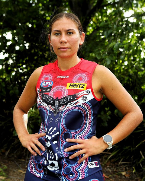
This is Australian footballer Krstel Petrevski modelling a jumper she designed for the Melbourne Demons featuring indigenous art. The league has an indigenous round to celebrate Australian and Torres Strait Islander indigenous culture.

Here’s a close-up:

Indigenous art on Melbourne Demons AFLW jumper.

Krstel talks about the design in the YouTube video below. Her talk is a great lesson in, “What’s it for?” Everything you see in that design has meaning. The exact number of circles down the sides, the hand prints, everything.

(And by the way, can you imagine a professional sports league in North American having a week where every team in the league played in uniforms designed by Native American artists? I can’t. Alas.)

24 February 2021

Four critiques, on video

Last week, I gave a presentation online to the University of New Hampshire. They recorded it, and have generously made the recording not only available to their campus community, but to everyone.

Screenshot of Zoom call for University of New Hampshire poster workshop

You can find the workshop here. As of now, I don’t know if there is a way to embed the video.

Thanks to the four rugged individuals who agreed to let me review their posters. I gave each poster a nickname:

  • The kitchen drawer poster
  • The “Too much coffee” poster
  • The tombstone poster
  • The “Just a trim” poster

The video is extra convenient, because you can listen to it at one and a half or even double speed, pause, or rewind it – unlike me!

External links

2021 Research Communications Academy: Better Posters with Dr. Zen Faulkes

Coming to National Biotechnology Conference #NBC2021

National Biotechnology Conference 2021 logo

I’ll be talking about making conference posters (and other graphics!) at the National Biotechnology Conference in May! Specifically:

Better Posters: How to Design and Present a Conference Poster
9:00 AM - 10:00 AM
Thursday May 20, 2021

This is an online event. I look forward to presenting to all you drug scientists out there! 

I am available for other events, too. My email is in the sidebar at the right!

External links

American Association of Pharmaceutical Scientists

18 February 2021

“What’s it for?” and other questions

What's it for?
Today, I am going to be a lazy blogger and mostly point to ideas in other people’s books.

In The Practice: Shipping Creative Work, Seth Godin returns to this question repeatedly:

“What’s it for?”

This is a great question to stop and ask yourself occasionally when designing something. It helps ensure that whatever you’re doing is deliberate (or intentional, as Godin puts it).

Those logos around the title? What are they for?

That abstract on the poster? What are they for?

Those acknowledgements at the end? What are they for?

If you can’t answer that, why is it on the poster?

Scott Berkun has another book that I want to read, How Design Makes the World, but haven’t yet. However, he just shared a blog post about how to look at designed things more critically. And, like Godin, Berkun has questions. Here are a few questions that got my attention and that I think are relevant for posters.

  • Is it clear what it does? Is easy to learn? Does it work reliably?
  • What message is its style sending to you?
  • Who is included or excluded from participating in using it?
  • What systems is this design a part of? Are those systems working well?
  • Does this design create flow or conflict?
But there are more! Check the full post for more.


12 February 2021

The Cosmo rule is dead

For years, I’ve used covers of Cosmopolitan magazine to illustrate a point.

Cosompolitan magazine cover, featuring "sex" headline in the upper left.

Cosompolitan magazine cover, featuring "sex" headline in the upper left.

Cosompolitan magazine cover, featuring "sex" headline in the upper left.

Cosmo always had a sex story, and it was always featured in the upper left corner of the cover. That’s where people who read in English look first. Sex sells, so of course that’s where you want to put a sexy headline.

But I can’t use Cosmo as my example any more. I went looking for more recent examples and found the newest cover:

Cosompolitan magazine cover from February 2021, featuring "The acne issue" in the upper left.

Acne?!

A search through the magazine’s Twitter feed for the last year shows this is no aberration. The sexy headlines seem to have been mostly banished from the cover for a while. 

Clearly Cosmo is under the control of a new editorial staff or new graphic design staff. Can’t tell which. Or maybe it’s a reflection of more of its readers being online, so the “gotta compete for attention on the supermarket check-out rack” need is less pressing. 

If that’s so, that’s worth noting. Graphic design changes with time. Being viewed on the supermarket checkout is different than being seen on a screen. 

As conferences moved online in the last year, similar forces are at work today for conference posters. Many design principles are the same, but the design demands of choosing which physical piece of paper on a board in a hallway to view are not the same as navigating menus on screen.

The Cosmopolitan rule (put your sexiest stuff in the upper left) is DEAD.

Now I have to come up with a new, more au courant metaphor to describe the importance of that upper left part of the page.

Related posts

The Cosmo principle

04 February 2021

Pre-order Better Posters and get 30% off!

The Better Posters book continues to inch closer to reality! Today, Pelagic Publishing showed the first teaser images of the inside of the book:


Better Posters book cover and four sample pages.
 

And even better, they announced that you can pre-order the book for a generous 30% off! 

30% off!
That’s right, 30%! Enter the code POSTERS30 when you visit the page here!

I am a first time author, and everything I have heard from other people who have written books in the last couple of years is that pre-orders help a book tremendously. There has never been a better time to be one of the first to get this long awaited and long needed book.

Thank you for your support!