29 December 2022

Link round-up for December 2022

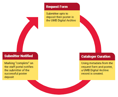
In November, Sarah Weirich gave a conference presentation titled, “Managing conference posters: A lifecycle overview from printing service to digital repository discovery.”

Loop from "Request form" to "Cataloger curation" to "Submitter notified" back to "Request form."

Alas, this is a PowerPoint deck, not a poster. But it points to a powerful role for librarians to archive the conference poster output of their university systematically so that posters aren’t just thrown away,

• • • • •

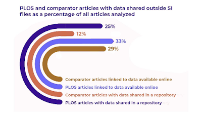
I guess this is a seasonal graph because it’s in the shape of a candy cane? Or maybe it’s a holiday game? “Count all the problems with this graph”?

Curving bar graph comparing data shared outside supplemental information.

This is a very complex way of showing four numbers inaccurately.

Hat tip to Carl Bergstrom. I can’t find a link to the original, though.

• • • • •

James Kirchner writes about the typical 2022 conference experience in Nature. Namely, getting sick.

Two days after the conference ended, I tested positive for COVID-19(.) Within 10 days after the event, 28% of respondents came down with COVID-19... I, for one, will be assuming that the risk of getting sick (with COVID-19 or something else) at any large meeting is roughly 20–40%, until I see data that convince me otherwise.

Kirchner says conference organizers should be checking the health of attendees after their conferences and communicating those risks to attendees.

• • • • •

Ferlin and colleagues have an arXiv preprint on at the challenges of online conferences. Posters are part of it, and the authors write that poster sessions in online conferences suffer from two main problems compared to walking around a conference floor:

  1. Navigation: Finding posters of interest is harder than walking the conference floor.
  2. Social awkwardness: This is not a comment on the social skills of academics, it’s a comment on the impossibility to skim a poster. Joining a virtual room, looking for a few seconds, then leaving seems more rude than glancing around on a conference floor. 

They go on to compare a few different platforms, and offer more thoughts and suggestions!

• • • • •

That’s it for this month and this year!

22 December 2022

2022 in review: Face-to-face poster sessions return but covid never goes away

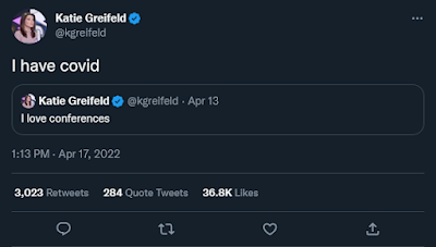
When I think about posters, poster sessions, and academic conferences this past year, all I can think of is this pair of tweets.

Katie Greifeld tweeting "I love conferences" and then "I have covid."

“I love conferences,” then, “I have covid.”

I just can’t get forget that.

I saw a lot of variations on those tweets over the year. 

The virtual element of conferences that emerged in the last two years was almost entirely absent from conference tweets. Instead, I saw a lot of people happily sharing pictures of themselves at their posters, at meetings, often in large groups, with no masks on.

Most conferences did not communicate risks or infections to their attendees.

I didn’t go to any conferences this year for a couple of reasons, but part of it was that I didn’t think it would be particularly safe for me to do so. 

Many other people also feel like going to a conference without clear public health guidelines is far too risky for them. This is particularly true for people who are immune compromised or who live with such people. They rightly feel extremely excluded and shut out of a key part of their professional circles.

This was in stark contrast to a lot of discussion about inclusion and accessibility of science.

A few conferences were exemplary in their approach to public health. But most took the “We are back to normal” approach that seem to be the working policy of many governments, despite a lot of evidence to the contrary.

In some places in North America, 2022 was the deadliest year of the pandemic so far. Covid deaths in the US were lower than 2020 or 2021, but that country still racked up over a quarter of a million deaths. New Inquiry is running a series of articles about how the United States pretended the COVID-19 pandemic was over even though over a quarter of a million people died from it in 2022.

I was also listening to the Taproot podcast this morning (Taproot podcast, season 6, episode 2), which also discussed conferences. Hosts Ivan and Liz said one of their themes for this season is, “Have we learned from the covid pandemic? Can we do things better?”

I am still hoping that the answer to that is “Yes, we can learn,” but I am not feeling optimistic.

I want to see poster sessions in person again next year. I would like conference organizers to make that less risky to do.

External links

Track post-conference COVID infections

The year the “ended” (Part 1)

Taproot S6E2: The Tension Between Robustness and Efficiency in Biological and Human Systems  

15 December 2022

Making the cut: Compression is not the solution

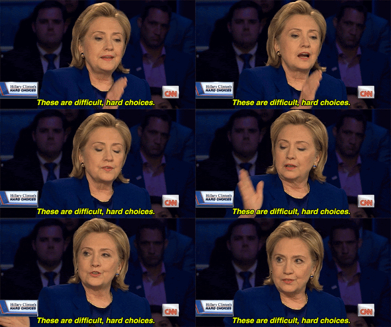
Imagine you’re a filmmaker. You have made a two hour documentary. Then the producer comes back and says, “Sorry, but we will want a one hour documentary.”

This is an unfortunate situation to be in. What to do? There are a few possible solutions, but I can guarantee you that there is one method that is not going to work:

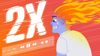
Just run the video at double the playback speed so you can see everything we put in.

2X playback speed

I say this as someone who listens to podcasts on an increased playback speed (1.5× is my sweet spot). But even with audio only, this does not work for most people. I bet less so for video. But I would never want to watch a movie at an increased playback speed.

But this is exactly the strategy that a lot of poster makers use: they try compressing what they have so they can keep everything. They shrink graphs, they shrink text, and posters become the infamous “wall of text.”

Sorry, but when you are faced with limited space or time, you have to cut. Nobody’s saying it’s going to be easy.

HIlar Clinton saying, "These are difficult, hard choices."

External links

Does skim-watching videos on 2X speed hurt or help your brain?

08 December 2022

Artifical intelligence gives good poster advice

I asked a new natural language artificial intelligence (AI), ChatGPT, “What are some best practices for academic conference posters?”

This is the response from the AI:

There are several best practices that should be followed when creating an academic conference poster. These include:

  1. Keep the poster simple and easy to read: Use clear and concise language, and avoid using too much text or complex graphics.

  2. Use a clear structure: Organize the content of the poster into distinct sections, and use headings and subheadings to guide the reader through the poster.

  3. Use a consistent font and font size: Choose a font and font size that is easy to read and consistent throughout the poster.

  4. Use high-quality images and graphics: Use clear and high-resolution images and graphics to illustrate your points and make the poster visually appealing.

  5. Leave space around the edges: Leave some white space around the edges of the poster to make it more readable and visually appealing.

  6. Proofread the poster carefully: Before printing the poster, proofread it carefully to ensure that there are no spelling or grammar errors.

  7. Practice presenting the poster: Practice presenting the poster to make sure that you can explain the key points clearly and concisely.

By following these best practices, you can create an effective and professional-looking academic conference poster.

This is good basic advice – and that alone is impressive. But the more I play around with this language AI, the more impressed I am. 

I asked it, “How can I make a bar graph in Python?” and it gave me usable code with good explanations.

Shirley Bassey
I asked it how many songs Shirley Bassey sang for the James Bond films, and it listed all of them plus an unused demo.

I wrote, “Tell me the incubation period for covid in the style of a regency romance novel.” After a mundane answer, the next paragraphs went:

As the sun rose on a new day, the people of the kingdom went about their lives, unaware of the danger that lurked among them. Though they went about their daily routines, the invisible enemy had already taken hold in the bodies of some, silently incubating and waiting to reveal itself.

As the days passed, the incubation period came to an end for some, and the first symptoms of the illness began to appear. Coughs and fever, shortness of breath and fatigue, these were the signs of the novel coronavirus, and they struck fear into the hearts of all who saw them.

But even as the illness spread, the people of the kingdom did not give up hope. They followed the guidance of the wise and learned doctors, washing their hands and staying home, and slowly but surely, the incubation period came to an end for all. And as the last symptoms faded away, the kingdom was able to breathe a sigh of relief, grateful to have survived the ravages of the deadly virus.

The ability to ask ChatGPT for a certain style has since been removed, because it allowed people to bypass certain restrictions imposed on the AI.

This thing can do a lot.

DALL-E generated image of "photo realistic woman presenting a poster about lobsters at an academic conference"
Previously, I wrote that AI systems described for poster generation seemed very limited: you needed to have most of the analysis and writing done before you could get the expert AI to help you. But ChatGPT has changed my mind on that somewhat. 

Combine natural language AI with AI image generators like MidJourney and Dall-E (which made the image at right), and the landscape for communication is going to change very rapidly.

Related posts

Photo from “Classic Tracks: Shirley Bassey 'Goldfinger'

01 December 2022

A poster in the round

When I was stumbling around Figshare for non-English posters, I found this poster. It is in English, which i not what I was looking for, but is unlike any other poster I have ever seen.

The authors describe it as a “tondo,” and I had to look that up. It means a round piece of art. Which this poster is.


Whether the team somehow managed to print this as a circle, or printed it on a white rectangular background, I could not tell you. Regardless, it makes for a striking design that would stand out from all the other rectangles in a typical poster session.

The poster also benefits from a disciplined colour palette, and containing mostly data visualizations and not much text.

The Figshare page notes this won a second place price at the Digital Humanities im deutschsprachigen Raum (Digital Humanities in German-Speaking Countries) conference where it was presented.

External links

Orlova T, Faynberg V, Fischer F, Lashchuk S, Palchikov G, Pozdniakov I et al. 2018. Chekhov Tondo (Poster Contribution to DHd2018). figshare. Poster. https://doi.org/10.6084/m9.figshare.6410909.v1