Posters are a visual medium, but I am always looking for ways that people with visual impairments can get data in a poster session. This paper describes a technique for creating structures that can be felt in the mouth. And people’s recognition is about on par with visual structures.
24 June 2021
Link roundup for June 2021
17 June 2021
Poster or talk? Decide based on your content
If I was going to present this research by Francisco Guerrero at an academic conference, I would never want to give it as a slide talk.
Click to enlarge!
This single image along would make a great poster with very little change. And that’s because of the type of data visualization that is shown.
Here you have a single image that is quite rich. There are well over 100 data points in this grid, and to get the most out of it, you really have to look at it for a while. It helps to be able to come in to see some of the fine details, like the labels.
I just don’t think this graphic would work as well on a slide. There’s too much detail to absorb in the typical minute that a slide is on screen. I suppose you could try to break this down into a series of slides – one for each category on the Y axis, maybe – but that makes it hard to compare categories.
A poster would be the superior format for this kind of data. It would communicate more effectively.
Here’s an example of a data set that would be better broken down on a series of slides.
These eleven panels are probably much better presented as a series of eleven individual slides, where you can quickly address each one in isolation. Each one individually makes a complete point.
Too often, though, the decision whether to try to present a project as a talk or a poster is not based on the type of data shown. It’s based on criteria like:
- The career stage of the presenter. People earlier in their careers get posters, people later get the talks. I think there are many questionable assumptions about why this should be.
- The ego of the presenter. Some people just want to be on the stage. It’s fun to be the center of attention for a few moments. But it’s not focused on the needs of the audience.
If your project has a series of many experiments, each with its own results, push to give a talk even if this is your first academic conference.
If your project generates a single, high resolution visualization that contains a rich set of data, swallow your pride and do the right thing by your data. Give a poster.
Hat tip to Liz Neely for sharing the top graphic.
08 June 2021
Better Posters book reviews
In this post, I’ll be compiling reviews of the Better Posters book.
Reviews are extremely helpful to get the word out on books. I thank everyone who takes a few moments to review or rate the book.
June 2021
Better Posters: Zen Faulkes on ways to rescue the poster session by Stephen B. Heard at the Scientist Sees Squirrel blog. Excerpt:
I’ll cut to the chase here: this book is great.
Better Posters aims to be a definitive reference on the academic conference poster... and I think it succeeds.
August 2021
Better Posters is featured as “7 Best New Academic Research Books To Read In 2021.”November 2021
Jon Schwabish says:
Even though it’s specific to this one part of data communication, I think there’s a lot going on here that a lot of us can learn about data communication.
• • • • •
December 2021
David Schulz writes:
I believe it will become my go-to recommendation for those who are creating scientific posters. No other book (even mine) has this depth of analysis(.)
Catherine Scott says:
I highly recommend this book(.) I credit award winning posters made by me an my mentees with the advice given therein!
It should be a must read for graduate students and researchers.
Sarang Park, manager of the I Am SciComm account (where I have hosted), said, completely unprompted:
His book Better Posters is fantastic - I can’t recommend it enough.
February 2024
If you spot a review to include here, please email me the link at BetterPosters@gmail.com!
07 June 2021
About that frontispiece...
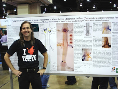
I want to explain something about the frontispiece to the Better Posters book.
The poster shown there is bad. I’ve said as much in this blog post.So why, in a book about improving posters, is the very first one a reader is likely to lay eyes on, a bad example of the format?I included that picture not because of the poster, but because of the presenter, which is to say me.
The picture is not a recent one, so I suppose some people might think I picked it because of ego: that I wanted to show myself younger than I am today. (Maybe there is a little of that. I do like how I look in that picture! And it’s got a favourite nerdy T-shirt that I don’t have any more.)
But I chose that picture as the frontispiece because that photo captured how I feel in a poster session. Happy, excited but not tense, and just... in my element. (And was even before I started blogging about conference posters!)
For many people, presenting posters is not a happy experience. For one reason or another, hey are stressed, they are tense, they are frowning.
I chose that photo because it shows the feeling I want anyone to have during a poster session. It’s the enthusiasm for the poster session that I wanted to share in the book.
Related posts
Critique and makeover: Shrimp MoGs (rhymes with “rogues”)06 June 2021
Join me on IAmSciComm starting 7 June 2021!
I have just taken over the reigns of the @IAmSciComm rotating curator Twitter account! This is my second time hosting, and am gratified to be asked back.
Here is a rough schedule for the week.
- Monday, 7 June: Show me a poster, graphic, or dataviz!
- Tuesday, 8 June: Why streaks matter!
- Wednesday, 9 June: From blog to book!
- Thursday, 10 June: Posters for everyone!
- Friday, 11 June: Posters reviewed!
- Saturday, 12 June: The randomizer!
Join me, won’t you?
Related posts
External links
03 June 2021
Poster sessions in street view: Review of Artsteps
TL;DR: Artsteps provides some nice features for virtual poster sessions, but it is hampered by clunky navigation and limited resolution to view posters.
• • • • •
When many conferences flipped to online events starting in 2020, I have been trying to track how academic conferences have tried to handle poster sessions. Not only is this an issue for large national and international conferences, but individual institutions are trying to deal with how to hold their own poster sessions.
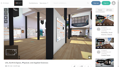
Artsteps provides a service to host “virtual reality exhibitions.” It was used by the student research office at The University of Texas Rio Grande Valley to host showcases of undergraduate student research.
Click any of the images below to enlarge!
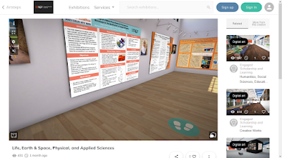
The session takes place in a three-dimensional virtual environment.
You click and drag the window to look left, right, up, or down.
The navigation experience using the mouse reminds me most of the “Street view” in Google Maps. It’s not smooth scrolling through an environment, as with you might get with a first person video game like Doom or Metroid Prime (yep, going old school for those references).
Instead, if you look down at the floor, you can click to place “footprints” to indicate where your want to got next.
This is a somewhat frustrating way to navigate. It’s incredibly difficult to judge the placement of the feet so that you are a reasonable distance from a poster. It’s easy to come in way to close, and there isn’t (as far as I can see) an easy command to take a step back. You have to turn the room around, walk away, turn the room around again, and look at the poster.
(Edit: I discovered you can use the arrow keys on the keyboard to navigate, which is a significant improvement. It provides smoother movement through the environment. It’s just not immediately obvious that you can do that.)
I think this ability to see something from many angles would be awesome for something like a virtual sculpture. But for posters, you mostly want to see them dead on, not from an angle.
The photographs of the presenters are a nice touch.
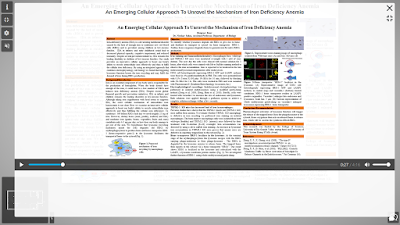
The posters are clickable. Clicking a poster brings it to the foreground and “flattens” it so it’s facing the screen dead on. Clicking the poster also open a pop-up window that allows you to click to play narration recorded by the presenter.
This media window initially overlaps the full screen poster. A little frustrating, because you probably want to see all of the poster while you’re hearing the presenter’s tour.
Once you have made the poster full screen, there is no option to zoom into a particular section. This was frustrating, because I found a lot of posters had detail that was difficult to see. I am viewing this session on a laptop, which may have a lower screen resolution than many people are using for desktops now. Even so, it’s not like I am viewing these through my phone.
Not being able to resolve detail could be solved by good design for this specific platform, but a “zoom” or “magnify” tool would be super helpful.
Some presenters worked around this by presenting what appeared to be a slide deck of rotating images rather than a single static poster.
There are chat boxes and other features that you can presumably use during scheduled presentation times. Unfortunately, I did not see this during the scheduled presentation time. It suspect that it would work okay for small groups, but I don’t know if this experience would scale to, say, the hundreds or thousands of posters needed for a medium or large conference.
As the name implies, Artsteps seems geared to reproducing the small, intimate feeling of walking through a little art gallery with paintings, photographs, and scultures. I’m not sure that experience is quite what is needed for online poster sessions.
External links
UTRGV Engaged Scholar showcase November 2020
UTRGV Engaged Scholar showcase May 2021
Related posts


