29 December 2022

Link round-up for December 2022

In November, Sarah Weirich gave a conference presentation titled, “Managing conference posters: A lifecycle overview from printing service to digital repository discovery.”

Loop from "Request form" to "Cataloger curation" to "Submitter notified" back to "Request form."

Alas, this is a PowerPoint deck, not a poster. But it points to a powerful role for librarians to archive the conference poster output of their university systematically so that posters aren’t just thrown away,

• • • • •

I guess this is a seasonal graph because it’s in the shape of a candy cane? Or maybe it’s a holiday game? “Count all the problems with this graph”?

Curving bar graph comparing data shared outside supplemental information.

This is a very complex way of showing four numbers inaccurately.

Hat tip to Carl Bergstrom. I can’t find a link to the original, though.

• • • • •

James Kirchner writes about the typical 2022 conference experience in Nature. Namely, getting sick.

Two days after the conference ended, I tested positive for COVID-19(.) Within 10 days after the event, 28% of respondents came down with COVID-19... I, for one, will be assuming that the risk of getting sick (with COVID-19 or something else) at any large meeting is roughly 20–40%, until I see data that convince me otherwise.

Kirchner says conference organizers should be checking the health of attendees after their conferences and communicating those risks to attendees.

• • • • •

Ferlin and colleagues have an arXiv preprint on at the challenges of online conferences. Posters are part of it, and the authors write that poster sessions in online conferences suffer from two main problems compared to walking around a conference floor:

  1. Navigation: Finding posters of interest is harder than walking the conference floor.
  2. Social awkwardness: This is not a comment on the social skills of academics, it’s a comment on the impossibility to skim a poster. Joining a virtual room, looking for a few seconds, then leaving seems more rude than glancing around on a conference floor. 

They go on to compare a few different platforms, and offer more thoughts and suggestions!

• • • • •

That’s it for this month and this year!

22 December 2022

2022 in review: Face-to-face poster sessions return but covid never goes away

When I think about posters, poster sessions, and academic conferences this past year, all I can think of is this pair of tweets.

Katie Greifeld tweeting "I love conferences" and then "I have covid."

“I love conferences,” then, “I have covid.”

I just can’t get forget that.

I saw a lot of variations on those tweets over the year. 

The virtual element of conferences that emerged in the last two years was almost entirely absent from conference tweets. Instead, I saw a lot of people happily sharing pictures of themselves at their posters, at meetings, often in large groups, with no masks on.

Most conferences did not communicate risks or infections to their attendees.

I didn’t go to any conferences this year for a couple of reasons, but part of it was that I didn’t think it would be particularly safe for me to do so. 

Many other people also feel like going to a conference without clear public health guidelines is far too risky for them. This is particularly true for people who are immune compromised or who live with such people. They rightly feel extremely excluded and shut out of a key part of their professional circles.

This was in stark contrast to a lot of discussion about inclusion and accessibility of science.

A few conferences were exemplary in their approach to public health. But most took the “We are back to normal” approach that seem to be the working policy of many governments, despite a lot of evidence to the contrary.

In some places in North America, 2022 was the deadliest year of the pandemic so far. Covid deaths in the US were lower than 2020 or 2021, but that country still racked up over a quarter of a million deaths. New Inquiry is running a series of articles about how the United States pretended the COVID-19 pandemic was over even though over a quarter of a million people died from it in 2022.

I was also listening to the Taproot podcast this morning (Taproot podcast, season 6, episode 2), which also discussed conferences. Hosts Ivan and Liz said one of their themes for this season is, “Have we learned from the covid pandemic? Can we do things better?”

I am still hoping that the answer to that is “Yes, we can learn,” but I am not feeling optimistic.

I want to see poster sessions in person again next year. I would like conference organizers to make that less risky to do.

External links

Track post-conference COVID infections

The year the “ended” (Part 1)

Taproot S6E2: The Tension Between Robustness and Efficiency in Biological and Human Systems  

15 December 2022

Making the cut: Compression is not the solution

Imagine you’re a filmmaker. You have made a two hour documentary. Then the producer comes back and says, “Sorry, but we will want a one hour documentary.”

This is an unfortunate situation to be in. What to do? There are a few possible solutions, but I can guarantee you that there is one method that is not going to work:

Just run the video at double the playback speed so you can see everything we put in.

2X playback speed

I say this as someone who listens to podcasts on an increased playback speed (1.5× is my sweet spot). But even with audio only, this does not work for most people. I bet less so for video. But I would never want to watch a movie at an increased playback speed.

But this is exactly the strategy that a lot of poster makers use: they try compressing what they have so they can keep everything. They shrink graphs, they shrink text, and posters become the infamous “wall of text.”

Sorry, but when you are faced with limited space or time, you have to cut. Nobody’s saying it’s going to be easy.

HIlar Clinton saying, "These are difficult, hard choices."

External links

Does skim-watching videos on 2X speed hurt or help your brain?

08 December 2022

Artifical intelligence gives good poster advice

I asked a new natural language artificial intelligence (AI), ChatGPT, “What are some best practices for academic conference posters?”

This is the response from the AI:

There are several best practices that should be followed when creating an academic conference poster. These include:

  1. Keep the poster simple and easy to read: Use clear and concise language, and avoid using too much text or complex graphics.

  2. Use a clear structure: Organize the content of the poster into distinct sections, and use headings and subheadings to guide the reader through the poster.

  3. Use a consistent font and font size: Choose a font and font size that is easy to read and consistent throughout the poster.

  4. Use high-quality images and graphics: Use clear and high-resolution images and graphics to illustrate your points and make the poster visually appealing.

  5. Leave space around the edges: Leave some white space around the edges of the poster to make it more readable and visually appealing.

  6. Proofread the poster carefully: Before printing the poster, proofread it carefully to ensure that there are no spelling or grammar errors.

  7. Practice presenting the poster: Practice presenting the poster to make sure that you can explain the key points clearly and concisely.

By following these best practices, you can create an effective and professional-looking academic conference poster.

This is good basic advice – and that alone is impressive. But the more I play around with this language AI, the more impressed I am. 

I asked it, “How can I make a bar graph in Python?” and it gave me usable code with good explanations.

Shirley Bassey
I asked it how many songs Shirley Bassey sang for the James Bond films, and it listed all of them plus an unused demo.

I wrote, “Tell me the incubation period for covid in the style of a regency romance novel.” After a mundane answer, the next paragraphs went:

As the sun rose on a new day, the people of the kingdom went about their lives, unaware of the danger that lurked among them. Though they went about their daily routines, the invisible enemy had already taken hold in the bodies of some, silently incubating and waiting to reveal itself.

As the days passed, the incubation period came to an end for some, and the first symptoms of the illness began to appear. Coughs and fever, shortness of breath and fatigue, these were the signs of the novel coronavirus, and they struck fear into the hearts of all who saw them.

But even as the illness spread, the people of the kingdom did not give up hope. They followed the guidance of the wise and learned doctors, washing their hands and staying home, and slowly but surely, the incubation period came to an end for all. And as the last symptoms faded away, the kingdom was able to breathe a sigh of relief, grateful to have survived the ravages of the deadly virus.

The ability to ask ChatGPT for a certain style has since been removed, because it allowed people to bypass certain restrictions imposed on the AI.

This thing can do a lot.

DALL-E generated image of "photo realistic woman presenting a poster about lobsters at an academic conference"
Previously, I wrote that AI systems described for poster generation seemed very limited: you needed to have most of the analysis and writing done before you could get the expert AI to help you. But ChatGPT has changed my mind on that somewhat. 

Combine natural language AI with AI image generators like MidJourney and Dall-E (which made the image at right), and the landscape for communication is going to change very rapidly.

Related posts

Photo from “Classic Tracks: Shirley Bassey 'Goldfinger'

01 December 2022

A poster in the round

When I was stumbling around Figshare for non-English posters, I found this poster. It is in English, which i not what I was looking for, but is unlike any other poster I have ever seen.

The authors describe it as a “tondo,” and I had to look that up. It means a round piece of art. Which this poster is.


Whether the team somehow managed to print this as a circle, or printed it on a white rectangular background, I could not tell you. Regardless, it makes for a striking design that would stand out from all the other rectangles in a typical poster session.

The poster also benefits from a disciplined colour palette, and containing mostly data visualizations and not much text.

The Figshare page notes this won a second place price at the Digital Humanities im deutschsprachigen Raum (Digital Humanities in German-Speaking Countries) conference where it was presented.

External links

Orlova T, Faynberg V, Fischer F, Lashchuk S, Palchikov G, Pozdniakov I et al. 2018. Chekhov Tondo (Poster Contribution to DHd2018). figshare. Poster. https://doi.org/10.6084/m9.figshare.6410909.v1 

24 November 2022

Link roundup for November 2022

This month’s contestant for the coolest poster ever:

That’s a legitimate contender for the title. Every icon making up the wolf is something wolves have eaten.

From Voyageurs Wolf Project, at The Wildlife Society conference, spotted by Roland Kays. (Roland’s tweet puts the year at 2012, not 2022). More pictures by Trish Brockman.

• • • • •

I have been reliably informed that some time ago, someone knit their conference poster.

And it won a prize.

And I am deeply disappointed that nobody told me this before now! And that I don’t have any pictures to share.

It’s an indictment of our collective amnesia about posters that even something so outside the box is not well known in the academic community. That was an epic achievement that should be shared!

• • • • •

I generally recommend sans serif type for posters, but am always keeping an eye open for research on typeface performance. A new paper by Vecino and colleagues finds no differences in reading speed or user preference between a sans serif typeface (Roboto)...

Roboto text sample reading, "Sphinx of black quartz, judge my vow!"

and a serif typeface (Roboto Serif).

Roboto Serif text sample reading, "Sphinx of black quartz, judge my vow!"

There are always many qualifiers with studies like this. For instance, despite what the title says, the researchers did not test “serif versus sans serif” generally. They tested one particular pair of typefaces.

Another important consideration is that the viewing conditions for a website, and presumably one that was mainly viewed on phones, are very different than those for a poster!

Vecino S, Mehtali J, de Andrés J, Gonzalez-Rodriguez M, Fernandez-Lanvin D. 2022. How does serif vs sans serif typeface impact the usability of e-commerce websites? PeerJ Computer Science 8: e1139. https://doi.org/10.7717/peerj-cs.1139

• • • • •

It seems most conferences in 2022 in North America having decided not to require mask mandates, it’s important to ask what the air quality on poster session floor is. Friend of the blog Dr. Becca tweeted that the carbon dioxide level on the floor was almost 1,000 parts per million (ppm).

Carbon dioxide meter reading 997 on Society for Neuroscience poster session floor.

This inspired me to search Twitter for other similar posts, and found one from Rommie Amaro reporting a Gordon Conference poster session with very high carbon dioxide levels.

Little did I know that LI-COR has been in the habit of tracking carbon dioxide concentrations at poster sessions because they have the tech sitting right in their booth!

Searching their Twitter archive for “poster” and “carbon or co2” is fascinating. The lowest recorded carbon dioxide level was 615 ppm, and their highest was 1,300 ppm. It looks like somewhere between 800 and 1,000 is the average.

• • • • •

A short paper about creating on online poster sessions. The solution, according to this? Short videos.

• • • • •

And that’s it for this month! Thanks for dropping by!

23 November 2022

Can you give the same poster twice? And should you?

Don’t let the “Twitter is dying” talk stop you, there are still many valuable discussions on the bird site!

Luisa Turbino Torres asked if people thought it was okay to present the same poster twice at conferences.

People had... opinions. They ranged close to a full 180­° from, “Sure, totally okay” to “That’s misconduct!”

Turbino Torres summarized the responses in this thread. Here is an edited excerpt:


Short answer: it depends.

Social sciences use conferences to workshop ideas in different stages. Other fields present ready-to-publish research (that is often officially published in conference proceedings).

If you present something that is in progress, as long as there is progress (i.e., posters are similar, not identical. - ZF), it should be okay to present at another one. But if you present a final draft that just needs a few tweaks before publishing, it seems less productive.

It is not a bad idea to present (a poster) in more than one space because you are making your work known and disseminating it to different audiences. If you do interdisciplinary work, it seems okay and desirable to present to different audiences.

(But) maybe don’t present the exact same abstract at the exact same conference in a consecutive year. Some conferences ask you not have presented the same abstract previously (emphasis added). 

Some institutions and organizations might not fund the same abstract twice. But they might only check the title or actually check the abstract, it depends on the institution.

The best advice I got from this from Keith Schnakenberg: “You should keep presenting the same paper until the comments are almost all predictable and then you can submit the paper.”

TL;DR: Familiarize yourself with the unspoken rules of your discipline and department / institution (by asking a mentor or advisor, for example), but do not be too attached to them.

I discuss this in the Better Posters book. Chapter 25 begins with a short section on “Encore presentations” (pages 248-249). I wrote that reusing the exact same identical poster is not ideal. It’s good to be up front about it if you do.

Since we are coming up on the holiday season, this is a good time for me to remind you that the Better Posters book makes a great addition to your wishlist or your giving list!

17 November 2022

An interactive poster with sound and paper magic: Q & A with Nicola Harman

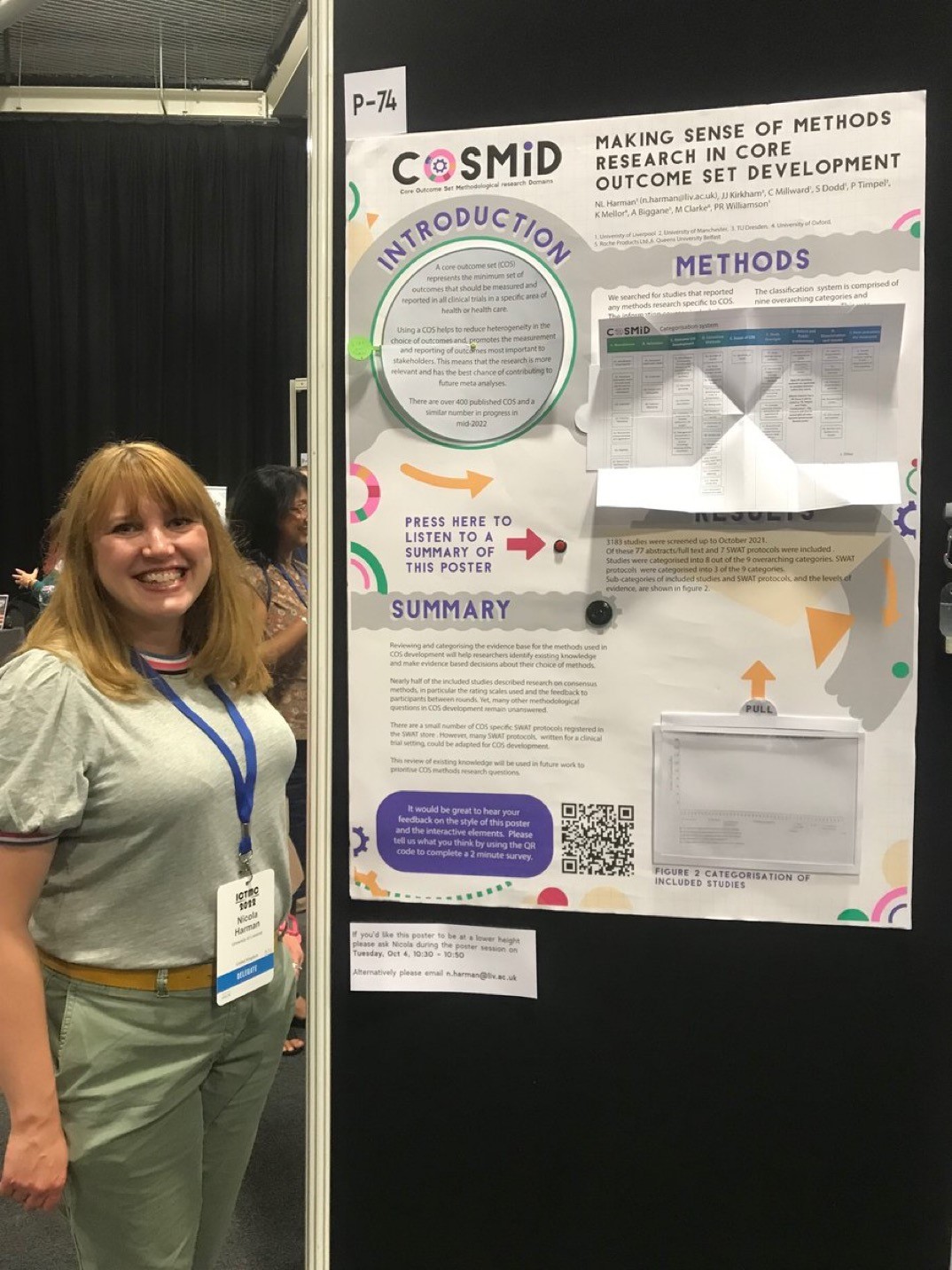
Nicola Harman recently tweeted a short video of a poster that invited the viewer to reach out and touch it.

This year my poster is interactive and has a voice recording of the poster walk through.” Take a look:

I reached out to Nicola for more information, and she graciously took the time to answer some questions (lightly edited).

• • • • •

Nicole Harman presenting her poster.Q: What has your conference and poster session experience before this meeting?

A: I’ve presented both oral and poster presentations at national and international conferences. I also won a poster prize back in 2008 just after finishing my PhD. Although I’ve been to a few conferences now I’m always revisiting how best to share information and this extends to my current research in clinical trials methodology too.

Q: The recorded tour was something I’ve never seen done before. What was the inspiration and how did you do it?

A: I think accessibility of information is really important. A typical poster relies on someone reading the information, but offering an audio description opened the poster content up to people who preferred to listen or found listening easier. It also meant that someone could listen even if I wasn’t at the poster at the time.

I kept the recording to just under 2 minutes assuming that’s about as long as someone has to spend with each poster. 

The kit I used was an mp3 chip from a UK company called Talking Products, it costs around £12, is really easy to use and can hold a 4 megabyte file (about 4 minutes of playback). You could also use an mp3 module with a microcontroller like an Arduino or Raspberry Pi if you wanted a longer recording.

Q: Can you tell me about the inspiration for the papercraft and how you created it?

Cover to "Paper Magic" by Harry Houdini
A: I really enjoy making stuff and paper is a great medium to work with. I’ve been reading Harry Houdini’s book Paper Magic and felt inspired by how simple paper folds and cuts could create a sense of wonder and excitement. I thought it would be interesting to see how this might work on a poster and what sorts of paper methods I could use. I essentially wanted things that created excitement, made things easier to read, and were a little bit magic.

I used three different techniques on the poster:

The Introduction section had a circular reveal. I hoped that this would have the exciting magic element and also make things easier to read as I could maintain a good font size by essentially doubling the space available.

The Methods section used a Turkish map fold to share a categorization system. Again, this method meant that I could have extra space and make the table much larger.

The Results section used an acetate reveal (I’m not sure if that’s actually what it’s called!). Essentially, the results table was layered so that the graph was empty until you pulled it up to reveal the content. I think this was mostly magic!

I designed the poster to scale in Adobe Illustrator, printed components using a Canon ip8750 that could print at A3, cut some elements using a Silhouette portrait and then printed the main poster at A0 using the university printing services.

Everything was mounted on a foam core board so that I could embed the speaker and mp3 chip together with some magnets that helped keep the Turkish map table open and hold up the Results tab.

Q: Interactive features could fray or fail with repeated use. The video makes it seem that the “voice tour” button was a bit hard to press because the board wobbled. How long did the poster session run for, and how well did the poster hold up?

A: The poster was available to view over two and a half days. It was in the same room as the coffee breaks so typically had the most footfall then. I was worried about the paper elements too, so tested a few out before finalizing the design. 

One technique that I loved was a woven paper reveal but that wasn’t going to hold up over the conference, so I put it to one side. 

Overall the poster held up really well, the circular reveal was the bit that needed a little bit of repair afterwards but if constructed a little differently this shouldn’t be a problem. The other two elements were fine and didn’t need any repair afterwards.

The battery pack did mean that the poster wasn’t flush to the board so I’d probably re-think its positioning next time. There was also a tiny delay in the audio file starting after pressing the button which is why my colleague pressed it again, the third time was to switch it off.

Q. I tried to see the survey, but it was closed. What was on the survey?

A: I’m a trials methodologist so I was keen to evaluate the methods used in the poster. I used a QR code to link to an online survey that had twelve short questions with a five point Likert scale response. The questions were grouped into two main categories:

Questions about the poster design: For example, did the interactive elements help to highlight information? Did you enjoy engaging with the elements? Did the interactive components motivate you to talk to colleagues about the poster?

Questions about the content: Was the content easy to understand? Did it flow well? Did the interactive elements help you to remember the content/key messages?

Q: How many people clicked on the QR code and did the survey?

A: There were fifteen responses to the QR code survey which was quite a low response rate taking into account the conference size and the number of people that I spoke to. It was still valuable information though and the response rate has also given me a few things to think about in terms of methods to collect feedback in this sort of busy environment, especially when competing with coffee, pastries and chatting to friends!

Vistors to Nicole Harman's COSMID conference poster.
Q: What was the audience reaction like on the poster session floor?

A: The audience reaction was great, lots of people engaged with the poster and then told their colleagues about it so they could try it out too. It created a really fun atmosphere. Reflecting on it personally I engaged with more people than ever at a poster session/conference. It helped to establish a two way dialogue with others, including those who’s research area was very different to my own, so was a great way to share my research, learn about others research and make new connections.

Q: Your tweet got thousands of likes and the video in it was viewed tens of thousands of times. Did you expect that much of a reaction? Was that online response been similar to the face-to-face response?

A: I did not expect that reaction to the tweet. If I had known I might have spent a little more time on the video! It was fantastic to get such a positive reaction both online and face-to-face and I feel inspired to take this further and think about academic applications beyond poster presentations. I’m currently working on a zine about it to summarize what I did but also share some more inspiration and resources. 

• • • • • 

Thanks again to Nicola for sharing your experience and for daring to be different!

Book cover from here

External links

Turkish map fold with a square sheet of paper

Houdini’s Paper Magic summary 

10 November 2022

Wanted: Posters not in English

I’ve been interested in seeing (and showing) posters in languages other than English for a while. No contributions so far. Jay Patel suggested I search Figshare. There, I stumbled upon this poster in Russian by Pozhvanov and colleagues:

Conference poster in Russian

And a pretty interesting one in graphic design terms, too. Do I know what it’s about? From the graphics, maybe space agriculture?

Google Translate says the title is, “Organization of the actin cytoskeleton in the root of Arabidopsis in microgravity simulation.” Okay, so the visuals were reasonably helpful!

But I would love to show many more posters in languages besides English! If you know of one or have made one, please let me know. Email me at BetterPosters@gmail.com.

External links

Pozhvanov G, Sharova E, Medvedev S. 2019. Организация актинового цитоскелета в корне арабидопсиса при моделировании микрогравитации. figshare. Poster. https://doi.org/10.6084/m9.figshare.11028815.v2

27 October 2022

Link roundup for October 2022

A quick and animated guide to typography. Hat tip to Biochem Belle.

• • • • •

And that’s it for this month!

08 September 2022

Box plot makeover

This is a figure in a journal.

Box plot with four boxes, each a different colour. X axis categories are "Unwashed control, washed control, unwashed experimental, washed experimental."

This is simple data that is much harder to interpret than it needs to be.

At a glance, it looks like it’s showing one variable with four groups. But it isn’t. To get that, you have to read each of the four labels on the horizontal axis very carefully.

Then you realize that the graph is showing two variables. It’s a 2⨉2 experimental design. One variable is environment and one variable is washing.

To make the relevant comparisons, I have to keep checking the axis label, because there is no other clue as to which box pairs with any box.

Significant differences are shown by three lines with asterisks above them. But the differences can be summarized in one statement: “Third from the left is higher than all the others.”

Here’s a quick and dirty graph makeover. As is so often the case, problems are solved by making things simpler.

Box plot with 4 groups. X axis: "Control" under two left boxes, "experimental" under two right boxes. Blue boxes labeled unwashed, purple boxes labeled washed. All boxes have an "a" above them except the third from the left.

First, I reduced the axis labels from four to two, one for each “environment.” Fewer labels also means larger labels, both of which make the axis easier to read. It more clearly shows what the adjacent boxes are comparing.

Second, I reduced the number of colours from four to two, one for each “wash” condition. This more clearly shows which non-adjacent boxes should be compared. (The colour and legend could be better. Remember, this is a quick makeover.)

Third, I swapped the lines for letters. The rule is, “groups with the same letter don’t differ.” This does lose a little information. The original has some comparisons with three asterisks, some with two, which usually indicates different p values. But that level of detail can be put in the text if it’s that important. It usually is not.

(Aside: The graphing program OriginLab has “paired comparisons” as a built in option.)

The design principles at play in this makeover? 

First, be cautious of templates. The original graph looks like someone just used the default settings in a graphing program. (R studio, maybe ggplot2?) 

Second, simplify. 

Third, make related things similar. Usually, I say, “Keep related things together”, referring to similar positions in space. That is in play here with the axis labels. But related things are also shown by other similarities: colour, shape, and so on.

External links

Original Twitter thread

01 September 2022

One class of pharmacy students preferred online poster sessions

We spent two years mostly having conferences online. Many people see advantages to that format and want conferences to keep online options. But would online conferences be just a better-than-nothing kludge for people who would normally be left out? A roughly equal experience to traditional conferences? Or could it be that the online experience is actually superior to face-to-face presentations?

These questions matter more for poster sessions than oral presentations. Oral presentations online are a reasonably solved problems. TED talks have shown for years that a good recorded presentation can have impact.

A new paper compared students’ preference for online and face-to-face poster sessions. Axon and Whaley (2022) found people liked online poster sessions more.

If the graph below, the blue on the left shows people who preferred online, the tan in the middle shows people who preferred face-to face, and the purple on the right is no difference. Click to enlarge!

Student pharmacists’ preferences for a virtual versus in-person research poster session. Figure legend: Acquire development skills: I would acquire more poster development skills if the research poster session is. Acquire presentation skills: I would acquire more poster presentation skills if the research poster session is. Acquire participating skills: I would acquire more skills participating in the poster session if the research poster session is. Enjoy developing: I would most enjoy developing a research poster if the research poster session is. Enjoy presenting: I would most enjoy presenting a research poster if the research poster session is. Enjoy participating: I would most enjoy participating in a research poster session if the research poster session is. Able to develop: I would be most able to develop a research poster if the research poster session is. Able to present: I would be most able present a research poster if the research poster session is. Able to participate: I would be most able to participate in a research poster session if the research poster session is. Effectively communicate findings: The most effective way to communicate findings from a research project is. Effectively evaluate findings: The most effective way to critically evaluate findings from a research project is. Effectively participate: The most effective way to help ensure everyone has the opportunity to participate in the research project poster session is. Overall preference: Overall, if I had to choose one approach for developing a research poster, presenting a research poster, and participating in a research poster session, I would choose.

More people preferred online over face-to-face in every category except one. People thought they had more ability to acquire presentation skills in a face-to-face setting (second bar from top). But even there, the advantage is not huge.

But there are many issues that need to be pointed out here!

This paper is the result of surveying one class of pharmacy graduate students. And I don’t mean, “a single course that has been taught multiple times,” I mean one group of students in one semester. The sample size is 63.

Critically, those students did not have experience with both formats in their class. They had to give their posters for their class in an online format. This is a “How would you know you liked it if you never tried it?” situation. Maybe some students had experience with face-to-face poster sessions before they took this class, but the survey didn’t ask.

It’s unclear what the online poster session for these students was like. This is the whole description:

The virtual format required students to record a presentation of their poster and provide a link for their peers to review and comment on during the research poster session.

Online poster presentation platforms vary wildly. Some are good, some are not so good. Maybe the team teaching this course managed their online poster session extremely well, and that was reflected in students’ responses. Opinions don’t exist in a vacuum.

It’s great that people are open to the possibilities of online poster sessions. But this paper tells us little about whether people who have experience with both formats prefer. And that seems like an important question to ask.

References

Axon DR, Whaley M. 2022. Student pharmacists' perspectives of in-person versus virtual research poster presentations. Pharmacy 10(5): 104. https://www.mdpi.com/2226-4787/10/5/104

31 August 2022

“Design a poster” interview with Tullio Rossi

Friends of the blog Tullio Rossi and Echo Rivera (who penned the intro to Better Posters) talk posters!

This should have been in the last month’s link round-up. Whoops. But I don’t want to wait several weeks to get it into the next one, so it gets a stand alone post!

25 August 2022

Link roundup for August 2022

There’s a lot of device on making graphs, but sometimes research on whether the advice works is harder to come by.

This research paper on graph design tries to assess whether “decluttering” (Edward Tufte’s “data to ink ratio”) and “focus,” which is annotation of graphs. I have to say “try” because the sample size for the experiment is just 24 people, which seems small for a topic like this.

Dot plot showing ratings for the three visualization design on a scale from 1 to 5 on aesthetics, clarity, professionalism, and trustworthiness. Focused graphics rates highest in all four categories.

“Focusing” on a graph was very effective in helping people remember. 

Removing clutter had a smaller effect, but people generally liked those graphs a little better.

Ajani K, Lee E, Xiong C, Nussbaumer Knaflic C, Kemper W, & Franconeri S. Declutter and focus: Empirically evaluating design guidelines for effective data communication. IEEE Transactions on Visualization and Computer Graphics: in press. https://doi.org/10.1109/TVCG.2021.3068337

This is a plain English summary of the paper

• • • • •

People like to attack graphs with a lot of noise in this. Stuart Ritchie reminds us, “Noise is why we use statistics

 And that’s it for this month!

18 August 2022

Review: Storytelling with Data

Cover to book "Storytelling With Data"

Some scientists might pass over Storytelling With Data (2015) because they have an incredible aversion to the word “storytelling.” Author Cole Nussbaumer Knaflic might drive off some people when she writes things like, “The magic of story.” It can sound a little hippy dippy trippy sometimes.

If “story” and “storytelling” freak you out, let me make a pitch for this book and give you another way to look at it.

Most of the book is about annotated data visualization. Fully seven of the book’s ten chapters are devoted to picking apart and recreating graphs. 

For example, Knaflic takes a mundane bar graph like this:

Bar graph of annual retail prices per year.

And shows the process to get to this:

Annotated line graph of annual retail prices per year.

Same data set. But one has a much clearer focus on what information is critical to the viewer.

I sometimes do similar things with graphs here on the blog, and some of the principles will be familiar to readers of the Better Posters book. But this book drills down into making a single graph in a much deeper way, with many more examples.

How to take a single graph from an Excel default and into something more targeted and informative has been on my mind a lot lately, and this book is the best I have found on the subject so far. Recommended.

Related posts

Same graph, different narratives

External links 

Storytelling with Data website

16 August 2022

Conference presentation accessibility

SurveyMonkey logo
I am helping with a project on conference accessibility. I was brought on board because of my interest in posters, but this research is about oral presentations, too.

To get us started on data collection, we have a short (~10 minute) survey on how presentation format impacts people with accessibility needs at academic conferences.

You can take the conference presentation accessibility survey here: https://www.surveymonkey.com/r/2DNJ2NX

Or you can use this easier to remember shortened link: https://bit.ly/ConfTalkAccess (Short for “Conference Talk Accessibility.”)
 
Or you can scan this QR code:

QR code leading to conference accessibility survey

This survey will be available through 6 September 2022.
 
Please take the survey. Please share the survey with others who might go to conferences. Thank you for your support! 😁

11 August 2022

Expectations and visual noise: Lessons from washing machines

“How do I turn this on?”

I was visiting, trying to use the washing machine, and was confronted with this.

Washing machine button with instructions in fine print at the bottom.

When you want to turn on something with a knob, you look for something around the dial that “Start” or “On,” right? Nope.

But maybe this was more a button, and when you want to turn on something with a button, you press it, right? Nope.

I couldn’t get the washer to start. I literally gave up on fiddling with the machine. Instead, I:

  1. Opened my phone
  2. Typed in the maker and model of the washing machine
  3. Found an owner’s manual online
  4. Downloaded the PDF of the manual
  5. Skimmed through the first few pages until I found the instructions to turn on the machine.

No joke. And I did all this even though the answer was staring me in the face.

If you look at the button above, you will see the instructions to turn it on. And there’s the first problem.

“Pull start.”

You mean, the complete 180° opposite of the usual thing that people do to turn on machines? Maybe something that runs so counter the norm is important!

Lesson #1: Warn people – loudly – if something works differently than the way most other things work, warn people. Not in a whisper.

But even putting that aside, why could I not see the instructions that were helpfully right by the button? There’s the second problem. The instructions are in fine print, surrounded by a lot of other information about four other wash cycles, at the bottom.

Lesson #2: More information can make a task harder, not easier.

This washer button reminded me of so many conference posters I have seen over the years. Things are not in places readers expect them to be. There is so much information and so little emphasis that readers are struggling to find what they want.

My case was unusual, because I was using this machine for the first time. You do expect the same person to be using a home appliance over and over again. The “fine print” instructions are normally only going to serve as a reminder.

But I had no problem turning on the dryer.

Dryer buttom with ““Push to start” in large bold letters.

Less information, and what is present gets some emphasis using size, bolding, and colour.

This is more like what a conference poster should aspire to be.

Drake turning away from hard to use washer button and approving of easy to use dryer button.

A shorter version of this originally appeared as a Twitter thread.

04 August 2022

Remove one thing: Lessons from Chanel

Coco Chanel
Coco Chanel is to fashion what Albert Einstein is to science: a lot of stuff gets attributed to these people that they never said.

This quote is often attributed to Chanel:

Before you leave the house, look in the mirror and remove one accessory.

Nobody seems to be able to point to an original source where she said this, which is the usual sign that the quote has somehow attached itself to a person because of their fame. 

“Too much stuff” is probably the most common problem plaguing posters and poster sessions. I am always trying to find ways to help people simplify their posters.

What I like about applying the advice attributed to Chanel is that it turns what can seem an overwhelming task – cutting down to the absolute bare bones, throwing out the cluuter – into a manageable task.

Take out one thing. Just one. That’s not so hard, is it? Surely you can find one thing on your poster you can do without.

I would write more about the application of the “Chanel rule,” but Alec Nevala-Lee beat me to it. He wrote:

What makes the Chanel rule so powerful is that when you glance in the mirror on your way out the door, what catches your eye first is likely to be the largest, flashiest, or most obvious component, which often adds the most by its subtraction. It’s the accessory that explains too much, or draws attention to itself, rather than complementing the whole(.)

The poster version might be:

Before you print your poster, look it over and remove one thing.

External links

The Coco Chanel rule

28 July 2022

Link round-up for July 2022

One of the things I tried to do in the Better Posters book was to think about how a poster session feels for someone who is not a young healthy white man. I wish I had read this article on stuttering / stammering in conference settings before the book went to the editor.

Excerpt:

Conferences that value more than just talks are pretty cool. By this I mean ones that give travel support to poster presenters, not just those who give talks. These conferences build decent poster halls, and they don’t encourage meals during poster sessions.

From this article, it’s not clear if a poster or an oral presentation is better for people who are not fluent in speaking. On the one hand, poster presentations do not limit time. On the other, you are often trying to manage several conversations in front of a poster at once, and you can’t as easily plan and practice a talk.

But thinking about this is so important. Because issues with verbal fluency isn’t just about people who stutter. It’s about people who are not familiar with the language the conference is being held in, or any number of other issues that can lead to speech issues.

Speaking of overlooked access issues... 

• • • • •

Chartability is a tool for working with web page accessibility. But there might be a few lessons to think about with posters. The background provides substantial evidence from the academic literature that accessibility tends to focus strongly on visual accessibility. Everything else barely gets a mention.

You might want to check this out if you ever want to archive your poster online. Have you ever tried to read one of your works with a screen reader? I tried once, and it was informative.

• • • • •

New paper on teaching how to make posters dropped:

Belilos E, Kamande S, Morrison M, & Malmut L. 2022. Teaching poster design to enhance research presentation quality at academic conferences: a guide for educators. Postgraduate Medical Journal: postgradmedj-2022-141889. http://dx.doi.org/10.1136/pmj-2022-141889

Paywalled, unfortunately.

• • • • •

Backgrounds on posters are tricky. I’ve seen many that try to make it far to complicated and it quickly becomes unreadable (text on top of photos, for instance). I avoided backgrounds and just went with white for a long time, but that’s kind of boring.

Lisa Muth has analyzed backgrounds in data visualizations, and many of the lessons apply for posters.

Graph showing backgrounds of data visualizations, clustered around very light and very dark.

TL;DR:

Your background color should be desaturated, and either very bright or very dark. If you want to be sure, use a warm, very bright, desaturated background color.

• • • • •

Speaking of colours, this Twitter thread points out that the world appears to be less colourful than it used to be. Monochrome cars used to be less than half of cars sold, but are now three quarters of cars sold.

Bar chart showing car colours from 1990-2020. Grays now predominate.

Big losses in green and big gains in white. Having owned a white car, I cannot quite see the appeal. Dirt shows up instantly!

Many more examples in the thread. I may be guilty of contributing to this, because I so often see colours used so badly that I tend to warn people to tone them down.

• • • • • 

Free book! Free, I say! 

Fundamentals of Data Visualization by Claude WIlke

And it’s Fundamentals of Data Visualization.

• • • • •

A Twitter thread on why so many designs are looking alike

This is a complex issue, related to industrialization, pervasiveness of internet, style trends, and just that some designs work better than others.

• • • • •

The Dead Zone
I have seen a lot of badly used colour gradients on posters. This article describes how to make your gradients look better. The secret is to avoid a grey-ish “dead zone” in the middle.

Fin Moorehouse also wrote a Twitter thread elaborating some of these ideas about how to make good gradients. Many comments that are also informative, such as how gradients look to colourblind individuals.

• • • • •

 And that’s it for this month!

21 July 2022

Cognitive load in a poster session

How hard do you have to think to “get” something? The technical term for that difficulty is cognitive load. It’s a useful concept for any sort of communication. Sinbinga and Waldron have a nice article on the concept of cognitive load as it applies to data visualization. Click to enlarge their one page summary below.

Cogintive load guide. AMount of cognitive load depends on the data, the audience, and the visualization.

I encourage reading the whole article before continuing on with my commentary.

The amount of cognitive load imposed by the data and the visualization used will vary from project to project, so I just want to zoom in and think about how the audience at a typical conference affects the cognitive load.

Connection 

“How will your audience end up looking at your work?” At some level, you’re both attending the same conference, which pushes toward intentional seeking out of work, implying low cognitive load.

But the bigger the conference, the less likely it is that your audience has come for your work, your topic, or even your field. Many people will come across your poster just browsing.

Pace

 “How long do you have the audience’s attention?” Most audience members are looking to get in and out in about five minutes. So not quite as short as someone scrolling through a social media feed, but that short timeline probably pushes the cognitive load towards “heavy.”

Knowledge 

“How much does the audience know about your data?” Like “Connection,” this can vary widely, particularly at bigger conferences. Generally, you can assume someone at the same conference has a working knowledge of the topic, but most academic posters tend to be on particular sub-fields that only a few might know about in depth.

Confidence

“How much experience does your audience have getting information from this format?” Most people attending a conference are likely to have seen something like it that mixes text and visuals. But some may not be familiar with how to interact with a poster presenter to get the most out of the conversation.

There can be differences in personality and culture that can also reduce an audience member’s confidence.

Three of these four factors – connection, knowledge, and confidence – all look like they should trend towards “light” cognitive load. But almost every conference has people who are going to an academic conference for the first time

Their connection to the discipline may be new. Their knowledge may not be extremely broad or deep yet. They may be facing imposter syndrome. All of these can push the cognitive load towards “heavy” for those people. I suggest trying to develop your poster with those attendees in mind as much as you can.

External links

Cognitive Load as a Guide: 12 Spectrums to Improve Your Data Visualizations

14 July 2022

Review: The Visual Story

Cover to "The Visual Story" by Bruce Block
The Visual Story is a book about the visual language of movies. Why am I reviewing it here? Because Bruce Block goes way down into the basics of what makes up visual communication.

When he write there are only three basic shapes (circle, square, triangle), you can tell he has cut way back on complexity to try finding the core principles behind visual storytelling.

Sure, some of the book deals with things like camera movements, but there is still lots here that applies to posters.

Block lists seven visual elements.

  1. Space
  2. Line
  3. Shape
  4. Tone
  5. Colour
  6. Movement
  7. Rhythm

For the purposes of posters, “movement” rarely comes into play, since we are typically dealing with a static document.

The remaining six elements – with one exception – may be familiar to readers of this blog. The chapter on colour, for instance, has a lot of parallels to the chapter on colour in my own book.

The one element that sounds weird to apply to a static image is rhythm

Think of rhythm as how often something changes as you look across an image.

Illustration of different visual rhythms. Slow regular rhythm represented by widely and evenly spaced lines. Fast irregular rhythm reprsented by narrowly and unevenly spaced lines.

Most conference posters have a high visual rhythm, and often an irregular one. Conference sessions, even more so, because you scan from poster to poster, each of which alone has a high rhythm. With the cumulative effect, it’s not surprising that poster sessions are tiring.

Block points out that all seven of these visual elements vary. Using colour as an example, red, pink, and orange are more similar to each other (which Black calls “affinity”), and blue is very different. Blue is a contrasting colour to the others.

To go back to the list of visual components, the contrasting “end points” might be:

  1. Space: Deep versus flat
  2. Line: Horizontals versus diagonals
  3. Shape: Circles versus triangles
  4. Tone: Dark versus light
  5. Colour: Hue and saturation
  6. Movement: Vertical versus horizontal
  7. Rhythm: Slow versus fast

From there, Block notes that elements that are the most different – that is, have a high contrast with each other – are the most visually intense

Contrast increases visual intensity, but affinity decreases visual intensity.

And changing that level of visual intensity can be used to support a visual story, like a movie. On a poster, I’ve written before about how contrast can be used to draw attention to things, which is a variation on Block’s idea. Visually intense things hold our attention.

In a movie that is mostly saturated bright colours, a scene that is mostly pastels is going to be visually intense. Even though we typically think of pastels as quiet and calming, if pastels are so different from the rest of the movie, it can be an intense visual experience.

Despite the depth Block brings to this subject, the book is a relatively quick read. Block uses tons of examples from movie still frames, which are quick to grasp and make his points easy to understand.

For most conference poster makers, you might not need a copy on your shelf. But it is worth checking out a copy of this book from a library. 

Reference

Block B. 2021. The Visual Story Creating the Visual Structure of Film, TV, and Digital Media (Third Edition). Routledge: New York. https://www.routledge.com/The-Visual-Story-Creating-the-Visual-Structure-of-Film-TV-and-Digital/Block/p/book/9781138014152

External links

ABT Time Episode 17: USC film professor Bruce Block and Directors Jason Ensler and Greg Tillman

07 July 2022

Same graph, different narratives

People who make data visualizations often talk about “storytelling with data visualizations.” This is something that I think can be hard for people to wrap their heads around. Let me try an example.

Here is a run of the mill scatterplot.

Scatterplot with generally increasing Y values as X values increase.

There are at least four different points you can make with that data. Probably more, but I’m just going to limit myself to the obvious ones.

First, you might be most interesting in communicating the trend.

Scatterplot with generally increasing Y values as X values increase. A regression line shows the increase. Text in the graph reads, "Overall growth."

But it’s also possible that you want to make people aware of the variation. In that case you would want to remove or minimized the trendline. If this was a timeline or other continuous record, you might join the dots.

Scatterplot with generally increasing Y values as X values increase. The individual data points are joined by a line. Text in the graph reads, "Substantial fluctuation."

Or it might be that the key point of the graph is even more focused on a small number of data points. In many cases, the most extreme data points are of interest.
Scatterplot with generally increasing Y values as X values increase. Arrow points to largest Y value and text reads, "Record high."
Low extremes can also be interesting, and annotations help contextualize what the value means.
Scatterplot with generally increasing Y values as X values increase. Arrow points to smallest Y value and text reads, "HUmble beginnings."

A graph is always intended to persuade, so why not make it easier for a viewer to see the same thing you see?

P.S.—If the graph looks familiar, it’s because it’s the first in Anscomb’s quartet.