29 October 2020

Link round-up for October, 2020

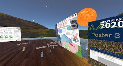
The 29th International Conference on Neutrino Physics and Astrophysics poster session looked like it came from Second Life:

Virtual poster session

Apparently nobody has heard that Second Life is a very niche community these days. Some people just can not let go of the notion of virtual spaces. 

But the organizers were happy with the outcome:

Del Tutto says the poster session was “absolutely a success.” But in the moment, it was a risky choice. Organizers, including Del Tutto himself, were “skeptical” that the VR format would work, he says. To improve its chances, Del Tutto ran a beta version for a couple dozen users about a week before the conference. Had it gone badly, they had a backup plan to run the poster session on Zoom.

The virtual format made discussion for some attendees much easier. Because the avatars’ appearances were devoid of race or gender, some expressed that they found it easier to meet and talk to new people, says Del Tutto.


• • • • •

Did you know there are fonts specifically meant for titles? Below is the same font (Perpetua) in its regular weight (black) and titling weight (white).


Perpetua Titling and regular Perpetua at the same point size.

MyFonts continues dispensing typographic wisdom in another one of the occasional primers. They write:

(Titling fonts) were specifically designed to look best in predominantly larger sizes. Titling fonts often have a more pronounced weight contrast, tighter spacing, and more condensed proportions than their text-sized cousins.

PDF here.

• • • • •

A few months back, The Word Lab featured a session on conference posters. You can now download the slides here

• • • • •

PosterPresentationLabs is a commercial design service for conference posters. Their website says they have been making conference posters for scientists since 2008, although their Instagram account started late September.

Their work looks good, although text heavy. That may be the fault of the researcher and not the designer, however.

• • • • •

The business of scientific conferences may never, ever be the same. This article in The Scientist examines the stresses that have been building on conferences for a long time, notably the carbon costs of conferences.

And people like a lot of the convenience of meetings on screens.

• • • • •

Given what appears to be the imminent death – or at least irrevocable change – of conferences, Laura Helmuth pulled a quote from this Scientific American article.

“The two scientists began collaborating in 2011, after meeting at a conference in Puerto Rico where they went to a café and talked about the overlap in their work.” Who else has started a collaboration during a conference break? I miss that part!

Andy Revkin responded:

Great observation/question - and relates to what is missing in conventional zoom-a-thons. Space to chill and explore. Anyone out there doing zoom walk-and-talk breakouts via phone? Anything sustaining this capacity? I'll do a #sustainwhat #thrivingonline episode on your ideas.

Similarly, in an unrelated thread, Guillaume Lobet wrote:

What I am missing is the interaction with colleagues over a cup of bad coffee and cheap biscuits. Interactions and networking have always been a big part of conferences for me. This is the part I miss the most! (I do not care much for fancy locations and nice hotels)

Lobet suggests a hybrid format that combines the physical meeting (for some) and recorded content (for many.

• • • • •

The Scientist article above also links out to an article co-authored by Mike Morrison (he of the billboard style poster) about boosting the impact of conferences.


The article’s bottom line: Everything in a scientific conference should be easily viewable online for free.

• • • • •

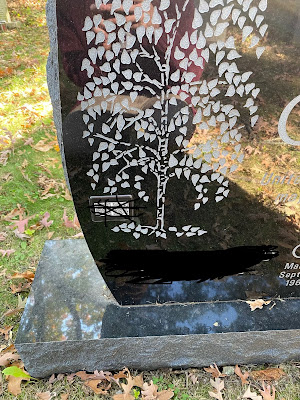
Justin Joque spotted a headstone with a QR code linking to the deceased list of papers and citation metrics.

Gravestone with QR codes obscured for anonymization.

Published and published and still perished.

• • • • •

Update, 30 October 2020: Normally, I don’t add entries to month link round-ups. Anything that I miss normally just goes into the next month’s compilation. But this New York Times article on US election maps is too timely to wait until the last week of November. 

Close-up of US election map in red and blue demonstrating how colours "pop" because of stereopsis.

Great discussion about how visualizations can deeply misrepresent reality, while purporting to be “objective.”

Also shows how unfortunate it is that political parties used bright primary colours for their branding.

Hat tip to Bethany Brookshire.

23 October 2020

Submit your scientific graphics to Better Posters!

I find myself in the embarassing position of having no blog post about this week. Unsurprisingly, the number of poster submissions for review hitting the inbox has been down. It’s been a long, hard year in the scientific conference world. The submissions have become such an integral part of this blog, and I really miss them. So despite the title of this blog being about posters, I just want to say specifically that I would love reader contributions showing any kind of scientific graphic! Illustrations, photos, graphic abstracts, you name it. Email me at BetterPosters@gmail.com!

17 October 2020

Critique: Dawn of the mammals

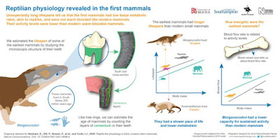
This infographic by Nuria Melisa Morales García could just as easily go onto a poster board at a conference. Click to enlarge!

"Reptilian physiology revealed in the first mammals" infographic

The highlight of this is clearly the skill of rendering. I love the mammal head and teeth over on the left. I love how callouts and arrows are used to guide you through the left half. I love the hand being used for scale to show the size of the animals. I love the icons in the line graph on the right. 

The left and right feel a little disconnected, in part because the title ends very close to the central divide. I would like to see the title bigger and running further across the top. This might means the logos got the bottom instead of the top.

Under the title is a summary:

Unexpectedly long lifespans tell us that the first mammals had low basal metabolic rates, akin to reptiles, and were not warm-blooded like modern mammals. Their activity levels were lower than modern warm-blooded mammals.

Currently, this mainly says the same thing as the title, just in several sentences instead of one. I might reword this to a narrative:

Modern mammals are warm blooded and have shorter lifespans than modern reptiles, but ancient mammals had longer lives, from which we conclude their metabolism was like modern reptiles.

Over on the right, the two graph have many nice parallels. They are both line graphs (even with similar trendlines!), both use the same colour scheme, both have icons for the animals. I wish they were even more similar.

The leftmost graph sits higher than the rightmost graph. I so badly want the graphs to be aligned, so they two X axes sit at the same height. I just want to grab the rightmost graph and move it up so it sits side by side with its left partner.

The leftmost graph has a summary statement above it, but the rightmost graph has a question above it. 

The left graph has a picture above and below the graph, but the rightmost graph only has a picture above it. 

I might tackle this by removing the Kuehneotherium in the left graph. It doesn’t appear anywhere else in the graphic, so its role is a little bit unclear. The would create the space to move the left graph down to the same height at the right one. A little text editing would be able to make the text above and below the graphs fit the new space better.

Reference

Newham E, Gill PG, Brewer P, Benton MJ, Fernandz V, Gostling NJ, Haberthür D, Jernvall J, Kankaanpää T, Kallonen A, Navarro C, Pacureanu A, Richards K, Brown KR, Schneider P, Suhonen H, Tafforeau P, Williams KA, Zeller-Plumhoff B, Corfe IJ. 2020. Reptile-like physiology in Early Jurassic stem-mammals. Nature Communications 11: 5121.https://www.nature.com/articles/s41467-020-18898-4

08 October 2020

Picking up a poster

A couple of years ago, I was out of my usual surrounds and up in the northeast of the US. I had a conference coming up, and no access to the department’s printing services. So I have a poster printed commercially by MegaPrint. They do a lot of research posters. 

I looked at the address, and realized it was... pretty close by, all things considered. Cheaper and more fun to get it instead of having it shipped by courier.

So I drove over and picked up the poster, because I was kind of curious to see a place that handled so many conference posters.

I missed the sign the first time and had to turn around and go back.

MegaPrint sign by highway surrounded by trees

Their business is a little ways out of town, nestled into trees.

Inside, calm, unassuming, with rows of large format plotter printers.

I got a chance to talk briefly to their founder Jay (since retired) about how they got into doing so many research posters. A friend of his mentioned scientists were always making posters, so that became a big part of their business. 

And I got my poster!

Poster laying on table

It was nice to have a moment of connection to a business that has, in a quiet way, been so integral to so many presenters at scientific conferences.

01 October 2020

Journals need to set a better example for posters

I recently ran across a figure in a journal (and a journal I respect) that made me look sideways at it. I am suspicious of composite, multi-panel figures at the best of times. But oh boy.

First, this was the layout of the elements in the figure.

Nine elements should be easy to lay out. Make a three by three grid heights and widths. Instead, we get this bizarro layout where only two elements are the same height or width (bottom right corner). The five and eight sided polygons in the middle are making me cringe. 

But based on the blocking of the elements, I thought I might be able to go through the figure in a sensible way. It looked to me like I should go across, then down.

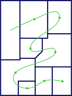
But no. When I looked at the numbering and figure legend, I found I was supposed to read the figure in this order.

So the actual reading order for this figure is a drunkard’s walk that includes right to left transitions and backtracking across previously covered terrain.

At least the ordering starts in the upper left and ends in the lower right.

I can understand authors making a figure like this. Scientists are not graphic designers. But what I can’t understand is why a journal editor didn’t have something to say about this. Something to say as in, “Redo that figure.”

Posters are deeply influenced by journal articles. They almost always have the same elements as a journal article, even though there is rarely a need to imitate the format. So slipshod graphics in journals have a ripple effect. They sets a poor example that readers who later make posters might imitate. People think it’s published so it must be okay.

It could be so much better.

I get the impression that a few journals have dedicated graphics staff who often work with authors on their illustrations. I wish that professional graphics designers were employed more widely by journals, and that the journals advertised that.