28 November 2019

Link round-up for November, 2019

Caroline Bartman made me laugh:

Poster sessions are wild

It's like, do you like papers?

In that case you will really like traveling hundreds of miles to look at rough drafts of paper figures in a large ballroom

The responses are also interesting, mostly from poster haters.

• • • • •

Speaking of conference haters, ELiot Berkman answered the question, “What is something you believed to be true earlier in your career that you no longer think is true?” with this:

I now believe that travel (e.g., for conferences) is almost never worth it because of the incredibly high opportunity cost. No talk or poster is worth what ends up being a full week of otherwise productive work time.

This response is interesting in two ways.

  • It defines “work” very narrowly.
  • It comes from someone whose lab is publishing about ten papers a year. It’s easy to forget that not everyone has that long a CV.

• • • • •

Shawn McGuirk has a request for conference organizers:

Public Service Announcement: It’s not OK to cut the poster session at a conference if talks are going way over time.

That’s 90% of conference content (of mostly trainee work) being squashed to make space for the 10% (of mostly tenured profs) who did not keep to time.

Whatever this happened, for shame. I have never had this experience, after many years of going to one or two meetings a year. But Shawn has seen this multiple times.

The one exception was a Keystone conference last February... However at that conference all the PIs decided to completely skip the poster session on day 2 to go out for dinner together.

The more I heard, the more I was like, “Rise up comrades! Reclaim your glorious poster session time!”

• • • • •

More things for conference organizers to be aware of: what you put in “graveyard slots” in conferences.

The ‘graveyard slot’ at a conference is a session which, due to the timing of the session, has a high probability of low attendance.

A new paper describes authors who organized a session that was put into a “graveyard slot,” and it was ultimately cancelled.

This is not sour grapes. Pretty much every meeting I go to has a huge drop in attendance on the last day, and someone has to present there. The Animal Behavior Society gave out “Omega awards” for the last talk of the conference, in recognition that the last speakers kind of got screwed by being scheduled there.

There is a clear equivalent for poster sessions: the “dead zone” at the back of the hall,” furthest from the doors. At Neuroscience, these are sessions like “History and teaching of neuroscience.” It’s a shame, because sometimes those posters are some of the most offbeat and intriguing ones.

So it’s worth program organizers to be transparent about how where posters are placed and how events are scheduled.

Hat tip to Ben Marwick and Kristina Killgrove.

• • • • •

Margaret reminds us that it’s important to include people in conference conversations:

Conference pro tip: If in a group setting and you see someone having difficulty joining the convo, make an effort to include them. It’s usually easy to say “I don’t think we’ve met, I’m X. What’s yours?” OR if you know them, “Hey X, tell me what you’ve been up.”

• • • • •

There is a free font based on the handwriting of the forty-fifth American president.


You can download the font, Tiny Hand, here. Hat tip to John Wick.

• • • • •

Speaking of type, I mentioned an episode of Abstract on type design last month, featuring Jonathan Hoeffler. Emerging from that episode is a compendium of visual illusions that affect type design.

Hat tip to Melissa Vaught.

21 November 2019

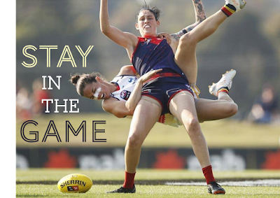
Why established academics should make their own posters

Stay in the game. Women fottballer getting tackled.

This one is for the people who are now full time academics, scholars, scientists, and “PIs.”

Keep making your own posters.

For many people, a poster is their first presentation. But sometimes there is a tendency to think of posters like the kiddie table. As people “grow up” (academically), there’s an expectation that you’ll progress to slide talks and oral presentations. The senior people sometimes give very few talks, unless of course they’re invited to give a keynote.

This pattern contributes to why so many conference posters are so awful.

My first poster presentation was in 1991, and I made them regularly since then. When I look back to some of the posters from the 2000s – posters I made with the benefit of more than fifteen years of experience but before I started this blog – some of them posters are pretty shocking.

This poster, for instance, was the twenty-eighth poster listed in my CV:

Poster abou crayfish with lots of text.

All that experience, and my posters were still intimidating blocks of text that looked like a journal vomited on a page. And I started this blog in part because I had some confidence that I maybe had a slightly better handle on design than average, had something useful to say, and could help others. But my skill level wasn’t that high.

And the moral of the story is: Design takes practice.

If you stop making posters after grad school, you are missing the opportunity to keep improving your posters and skills.

It stops posters from getting more polished and sophisticated, and makes everyone unhappy when they go to a poster session and see a bunch of poorly thought out posters that nobody wants to look at.

That’s not only a disservice to yourself, but a disservice to the research community and particularly a disservice to your students.

The poster format can become better, but only if the most experienced practitioners stay in the game and don’t foist the job off to students.

14 November 2019

Critique: Cells grow after fly sex

This week’s poster comes fro Josephine Hellberg. This work was recently published (Leiblich et al. 2019), so Josephine was able to set her poster free for others to see! Click to enlarge!


Josephine wrote:

I wanted to keep the poster to-the-point and only highlight the one, key result that came out of my PhD work, and keeping it as simple as possible. I was quite pleased with the poster at the time, but now, when I look over it with fresh eyes, I realise that I probably didn’t go far enough in making the poster self-explanatory. But I like how little information I managed to put onto it and still tell a story: I’m more interested in the stories than the background when looking at posters myself, and I wanted to reflect this. (In case of interest, people can always go to the research paper(s) themselves.)

Josephine put lots of good principles in play here. You have a big graphic up at the top left, where people look first. That it’s circular helps make it stand out more.

Following the circle, the boxes have rounded corners. The fortunately, the corners are rounded by about the same amount, so there is consistency across the entire page. Likewise, the colour scheme seems to draw from the microscope images and is consistent throughout.

There is a very high proportion of visuals to text. The images within individual boxes are generally aligned well.

The bottom right has a clearly labelled conclusion, and the logos and fine print are also down at the bottom, not competing for space in the title bar.

And this biology pedant gives 1,000 points for listing the name of the fly with its specific epithet, not just “Drosophila.” Though I’d have given 5,000 points if the genus name was spelled out in full, and 10,000 points if the title included a plain English name like “fruit flies.” (But don’t worry, the points don’t matter, as they always said on Whose Line is is Anyway?)

Drew Carey saying, "That's right. The points don't matter."

There aren’t too many things I would try to do differently.

The title of the poster is a little under emphasized, for two reasons. First, the image right next to it draws the eye more effectively than text. Second, the type for the title and headings is Century Gothic (or a close relative). As I’ve mentioned before, this typeface has some issues for posters: the strokes are thin and the shapes of different letters are very similar.

At the very least, using a bold weight might have been worth a try. Bold weight would have probably required some finessing for the section headings, given that the heading isn’t much narrower than the box it is in.

Related posts

Critique: Cubic slip-systems

Reference

Leiblich A, Hellberg JEEU, Sekar A, Gandy C, Mendes CC, Redhai S, Mason J, Wainwright M, Marie P, Goberdhan DCI, Hamdy FC, Wilson C. 2019. Mating induces switch from hormone-dependent to hormone-independent steroid receptor–mediated growth in Drosophila secondary cells. PLOS Biology 17(10): e3000145. https://doi.org/10.1371/journal.pbio.3000145.

07 November 2019

Critique: Crayfish cell culture

“Here’s one we did earlier,” as they say on the cooking shows. This was a poster I did in 2018 for the International Crustacean Congress in Washington, DC, and the paper is now out as a preprint. Click to enlarge!


I had seen lots of posters that used white text on black effectively. I decided this was my turn to try it. The background is not a “pure” black, however. It’s more a very dark brown. I used the eyedropper tool to pick a dark colour from the central picture of the crayfish. Likewise, the large text is not pure white, but a slightly off-white picked up from some of the gravel. The consistence of colour helps tie the poster together.

The amount of text on the poster is higher than I would like. But because the point of this poster is to describe a method, it’s either a set of instructions written in sentences, or a flowchart. I took the coward’s way out and wrote it out.

The combination of a lot of text with the square format necessitated some tough choices in typography. I either needed a small point size or a narrow width font, and I chose the latter (Noto Sans Condensed Light). I think the white text on the dark background “pops” enough to make the ext readable.

The typeface for the title and headings is Bernhard Modern, which has been the logo for the Marmorkrebs.org website for many years. Since Marmorkrebs is the species featured on the poster, might as well have consistency.

You might wonder why there is a figure in the right column above the “Results” heading. The figure is a result, so shouldn’t it be under the heading? Logically, yes. Visually, I much preferred aligning the pictures. Here’s an earlier draft with the more traditional heading placement (and a more traditional “dark on light” colour scheme.


The final version looked more solid, because the tops of the pictures now align and the “Cell culture method” and “Results” headings align. The introduction, central picture, and left picture create a section running across the poster horizontally that doesn’t disrupt the column flow.

Having more than a year since I’ve worked on this poster, there are a few things I might do differently now.

The title is too ambiguous. One of the lessons I have recently learned about headlines is that they should always make sense out of context. “A new method for cell culture from a cloning crayfish” would be longer, but would stand alone more effectively.

In retrospect, I probably should have made the text ragged right instead of fully justified. And I’m sure that if I kept editing, I could have fit the text in using a regular weight font instead of light.

Reference

DeLeon H III, Garcia J Jr., Silva DC, Quintanilla O, Faulkes Z, Thomas JM III. Culturing embryonic cells from the parthenogenetic clonal marble crayfish Marmorkrebs Procambarus virginalis Lyko, 2017 (Decapoda: Astacidea: Cambaridae). Journal of Crustacean Biology: in press. https://doi.org/10.1093/jcbiol/ruz063

01 November 2019

The manuscript is done

As part of this blog’s tenth blogiversary, I mentioned that I was working on a poster design book. Yesterday, I submitted the manuscript of that book to my editor at Pelagic Publishing.

The book is mostly about design, but it expanded to be about more than just design. It became about the larger poster experience and how you can learn a lot about academia by understanding posters.

If all goes well, you will be able to buy Better Posters: The Poster Presentation Book sometime in the first three months of 2020. I’ll keep you updated here.