30 January 2023

Even award-winning posters don’t follow best practices

I have a short little project analyzing years of award winning posters from the American Geophysical Union (AGU), which hold some of the largest scientific conferences in the world.

Nothing against the science, but not a lot of posters followed commonly recommended “best practices” for graphic design.

The paper is open access, so free for all to read. And it’s short! Should only take you a few minutes to read.

Reference

Faulkes Z. 2023. The “wall of text” visual structure of academic conference posters. Frontiers in Communication 8. https://doi.org/10.3389/fcomm.2023.1063345

P.S.—Yes, I recognize a certain amount of irony in talking about the “wall of text” in a paper that has no graphics and is itself only text. But papers and posters are different formats, so leave me alone. 😉 

26 January 2023

Link roundup for January 2023

Michelle Francl asks why posters are second-class presentations. I could give many reasons to answer that question today, but Francl’s article finds some surprises about poster history.

The original intent was not for posters to become a second-tier presentation, but rather for them to supplant talks almost entirely.

This is an informative two pages. Recommend!

Francl M. 2023. Poster children. Nature Chemistry. https://doi.org/10.1038/s41557-022-01118-5

• • • • •

I like this photo of a scientist ironing her poster, which I spotted on Nature’s Instagram account.

This picture by Michela Milani won a special prize in a photo comp called “Scientists at work.”

• • • • •

The Atkinson Hyperlegible typeface is designed to remain readable by people with low vision. It should be great for posters.


Hat tip to Hilda Bastian.

• • • • •

Sigh. I know I’ve seen these two posters by Nevin Lawrence and Andrew Kniss before, and I even think they have been somewhere on the blog before. But I can’t find them by searching my blog so I am sharing them, either for the first time or again.

Two posters making contradictory claims.

Hat tip to Andrea Telatin for reminding me of these.

• • • • •

Here is a guide for organizing inclusive scientific conferences. It’s excellent, although there is nothing about poster sessions specifically. It’s a little more about guiding principles than nitty gritty details.

Thanks for joining me again in 2023!

25 January 2023

New research on conference presentation accessibility

International Society for Medical Publication Professionals logo
Today at the 2023 European Meeting of International Society for Medical Publication Professionals (#ISMPPEurope2023 on Twitter), new research was presented on conference accessibility. (Disclaimer: I’m a co-author on this project.) 

The major finding was that conference accessibility has a long way to improve. But the survey results also suggest ways to accomplish that. 

An unexpected finding for me was how important online conference resources were for people trying to meet their various accessibility needs.

What we learned about posters was that people want fewer words in bigger text. Not a particularly big surprise to regular readers!

You can view the poster, watch a video summary (11 minutes), and read supplemental data on Figshare.

This information is just the start. My colleagues and I are working on a more detailed paper.

External links

Conference presentation accessibility https://doi.org/10.6084/m9.figshare.21892881

19 January 2023

Review: Academic Conference Presentations

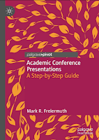
Cover to book "Academic Conference Presentations"We have a new addition to the “academic advice” genre! Academic Conference Presentations has a 2022 publication date, but was released early January 2023.

This book is aimed at conference novices, and is short and breezy.

The text isn’t burdened by citations. Mark Freiermuth is giving personal advice based on his experience, not giving a data driven analysis of presentation effectiveness. He isn’t afraid of using an exclamation point or two once in a while. There are even occasional appearances of triple exclamation points!!!

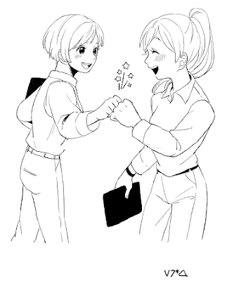
Nanase Iwahori add to the fun with manga styled artwork for each chapter.

Two women fist bumping, drawn in manga style.

I suspect that most readers of this blog are in the sciences and allied fields, so it is refreshing to get an insight into practices from something more in the humanities. Freiermuth uses many examples from linguistics, particularly working with Japanese students.

Readers of this blog will know I read this looking for advice on posters, and I found it. Three pages worth (Chapter 4, pages 45-47) out of 156 pages in the main section of the book.

I tend to agree with his assessment:

(M)ost presenters’ posters look unprofessional—actually crappy—well in excess of 50%.

But Freiermuth admits that he never, ever opts to give posters. He describes his one time presenting a poster as his presentation being “semi-rejected.” This, unfortunately, indicates how many people see posters as a second rate form of presentation, even though Freiermuth goes on to say that he had a good time presenting his poster. 

His three point summary of poster advice:

  1. Make it look nice.
  2. Protect it when you’re traveling.
  3. Stand by your poster during you allotted time.

I wouldn’t recommend this book for someone looking for advice on posters, but it is worth a look if you are expecting to do oral presentations.

Reference

Freiermuth MR. 2022. Academic Conference Presentations: A Step-by-Step Guide. Palgrave Macmillan Cham. https://doi.org/10.1007/978-3-031-21124-9
 

12 January 2023

Comedy is hard, especially for poster titles

I recently watched Vir Das’s comedy show “Landing” on Netflix. It was a real treat to discover such a sharp and funny comedian.

A good chunk of Das’s routine describes the outrage that was generated by a piece he performed called “Two Indias.” It was obvious that a lot of the audience knew about this. He tells a joke about the reaction on social media:


 “They start a hashtag, they’re like, ‘Vir Das is a slave!’”

“Which would be offensive to me except my last name is Das.”

And the crowd in the theatre laughed.

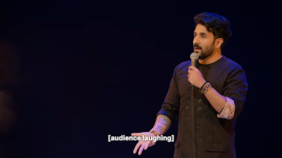
Vir Das with subtitles saying “Audience laughing.”

I was not laughing. Not because I was outraged, but because I was confused. There was clearly something I was missing. But I was not alone and Das knew it:

“I’ll translate. Don’t worry, non-Indians. Don’t worry. I got you.”

He explained that his surname, Das, means “slave” in Hindi.

That he was performing in English to an audience where a lot of people understood Hindi – but some did not know Hindi – became part of the act. Later, he did a routine describing Mumbaiker trash talk.

That line drew a huge roar of laughs from the crowd, who clearly got the reference.

Netflix translated the phrase as “Come and dare to battle me or else, fuck off!” But what was funnier was that Das – again aware that there were a lot of Anglos in the crowd – translated it as part of his set, and did so differently.

 “But in English, it literally translates into like...”

“‘Get on the field...’

“Or shove something up your ass.’”

The routine goes on from there, but by now you’re probably wondering what this has to do with posters.

Posters are a relaxed format. You can have more fun with them that in other academic communication. So people will often try to make their presentations more appealing by putting a joke in the title. 

But the risk is that the jokes exclude some viewers.

So much comedy refers to cultural touchstones that the comedian and the audience have in common. If you don’t have those shared references, the jokes don’t work.

Captain America saying, “I understood that reference.”

What kicked this off was seeing  poster that was partly titled, “The enemy of my anemone.” That made me smile. But then I thought, “Do other languages have a phrase like, ‘The enemy of my enemy is my friend’? Or that that just an English thing?” I didn’t know.

Trevor Noah talked about something similar. He described how much of his comedy came from his travels. (He described his comedy as a book report of what he learns when he travels.) Some jokes he only told in certain countries, because they just didn’t work anywhere else.

At a small local conference, this might not be that big a problem. But at a big international conference, it’s more likely that there will be someone who doesn’t get the pun because it only works in English, or who aren’t familiar with an English expression or idiom. Or a book title or whatever else you might want to riff off of.

Vir Das took the time to bring the Anglos along with him, but you know how it feels when you get a joke after someone has explained it to you. Sure, the joke might still be funny, but it’s not as funny as when you “get it” yourself.

These are just examples of an old truism: comedy is hard. While I hate to say it because I love having fun with conference presentations, I have landed on the side of generally advising people not to use wordplay and jokes in their poster titles. 

In the main body of the poster, there is more leeway for jokes. But the title is so critical and is the only thing seen by so many people, the need for clarity and concision is extraordinarily high.

05 January 2023

Critique: Smilin’ hydrozoans

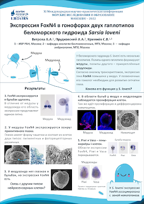
Last year, I was putting out a call for conference posters in languages other than English. This week, I can thank Alexandra Vetrova for answering the call with this blog’s second poster in Russian, and another in our roster of award-winning posters! Click to enlarge!

Poster on hydrozoan development written in Russian.

Can I just say this poster made me smile? I can’t resist those little illustrations of smiling critters, showing once again that the visual can have a wider reach than the written word.

To translate a little, this poster is about FoxN4 expression in Sarsia lovenii. Alexandra wrote:

I was forced to use a PowerPoint template with the conference logo, blue header, and footer, so I played around a little. If only I had more time to do better typing... It still won an award though.

Usually awards are given on the basis of content, but this is a good poster in design terms, too. There’s a consistent colour scheme, a signposted two-column layout, and lots of images. 

Some small changes that might benefit the poster might include:

Flipping text and pictures. Because paragraphs are numbered, I would try making is so that the numbers were in the upper left corner of every one of their sections. In sections 1 and 3, the numbers is pushed to the right by the photos. In sections 2, 4, and 5, the numbers are pushed down below by the photos.

Consistent spacing between pictures. The pictures above section “2” have very thing dividers compared to the pictures in all other sections.

This is my quick and dirty revision:

Poster on hydrozoan development written in Russian, with numbered paragraphs having numbers in the upper left corner of section.

I had to cheat a little with section 5. I couldn’t just reposition the elements, but had to shrink some of the pictures (now in the upper right of the section) to be able to fit. I think it improves the “scannability” of the posters, but the difference is not huge. That’s a testament to Alexandra’s design.

Спасибо, Alexandra!