

Bruce Kirchoff, author of Presenting Science Concisely, has a nice blog post on strong scientific posters. You know, the ones that can bench press twice their weight. He discusses two misconceptions:
- People read posters like papers.
- A title just introduces the work.
John Wagner’s illustrations from the book (above) are also lovely!
• • • • •
Very helpful design post by Lisa Muth on how to cut down on too many colours. Nine of her ten suggestions can apply to posters:
- Simply don’t show different colors
- Show shades, not hues
- Emphasize
- Label directly
- Merge categories
- Group categories, but keep showing them
- Change the chart type
- “Small multiply” it
- Add other indicators
I particularly think points 2, 4, and 8 are underused.
• • • • •
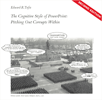
(J)ust had a peak teaching experience teaching Tufte's classic mega-rant, The Cognitive Style of Powerpoint, in my Tech & Design Ethics class. It went so good and I kinda want to teach it in my intro ethics class now.
Tufte says that PPT tends to get us to squeeze the really important details into small-font indented bullet points at the bottom, which de-emphasizes their importance. And I believe this from observation, but I was like: Why does it push that way? The students convinced me that it was really important that you didn't want the large-font lines in PowerPoint to wrap, and so you ended up writing very simple short things into the large-font headers, and saving the details for the tiny-font sub-points.
The default structure of PowerPoint templates asks you to constantly summarize. Bullet point structure asks you to have quick summaries of details. Every slide asks you to have a title-summary of all the bullet points. This mimics the management structure. Engineers have to give the “bullet-point” summary to middle-managers. Middle managers have to give the very compressed “action-summary” to upper administration. And PowerPoint is constantly looking over your shoulder, asking you to provide those summaries, and super-summaries. It wants your information already formatted into the right shape to be sent up the chain. Pre-digested.
Another way to put it: a lot of science, and other forms of reasoning, the details matter the most. In paragraph-narrative form, you can dwell on the details without summarizing until you choose to. But PowerPoint is constantly asking for the action summary of each slide. PowerPoint embeds the voice of management, constantly at your side, constantly demanding "the upshot, and make it snappy." (T)his also had the ultra-peak moment of us all wondering why people tended towards bullet points on PowerPoint, my firing up PowerPoint onscreen, picking the first template, and finding bullet-points as the default, and the whole class screaming “OH SHIT IT’S THE DEFAAAULT!”
(Lightly edited.)
Far from being a neutral container for information, PowerPoint (and other slideware) affects that information in specific ways.


