Showing posts with label interviews. Show all posts

04 March 2025

Reimaging posters on In Plain Cite podcast

In Plain Cite podcast thumbnail showing Doreen Valentine
Everyone has a podcast now. Even the International Society for Medical Publication Professionals . They just renamed their podcast to In Plain Cite, and their first real episode is about conference posters! They talk to Doreen Valentine. (She is listed as being affiliated with Bristol Myers Squibb, but I cannot find any active web page).

Valentine describes what she sees as trends in conference poster design.

  1. Plain language summaries.
  2. QR codes.
  3. Iconography. (It sounds like she just means more attention to graphic design.)
  4. Interactive posters.
  5. Augmented reality. (She mentions goggles, so I think she might mean virtual reality)

Host Rob Matheis asks how we can make posters more accessible to a wider audience. This struck me as a curious question. If a poster is in a conference hall, it doesn’t matter how you design your poster. You’re limited to conference attendees. A scientific conference is a walled garden. You can’t just walk into a scientific conference off the street. You have to register, and academic conferences are notoriously expensive. The audience is largely technical experts by design.

How would conference posters reach a wider audience? I suppose that in medical conferences, there will be some patients and patient advocates along with original researchers. I do see conference posters that have a second life in hospital hallways, much like scientific posters often end up decorating hallways outside university department offices. And finally, I have repeatedly suggested that posters should be archived online through repositories.

But I don’t see any of those three pathways being a very significant expansion of audiences to a wider audience that are not researchers.

The podcast goes on a bit of a tangent to mention best practices for medical publications. The discussants miss an opportunity, I think. Professional communication societies don’t have best practices for conference posters. Not truly.

The American Medical Writers Association guidelines do say, “The GPP guidelines cover... non‑peer‑reviewed communications such as posters, lectures, and book chapters.”

But the guidelines are all about text. They are about who gets to be an author, transparency, conflicts of interest, and when to submit. Those are useful. But it misses what guidance would be useful in making an effective poster.

Why not guidelines on visual accessibility for posters?

I understand that the publication guidelines are not Elements of Style. And maybe a national writers association is not the right organization to provide those guidelines. But plenty of organizations, like conference organizers, might be.

The absence of best practices from professional organizations is very conspicuous.

External links

Scientific Posters, Reimagined
 

04 July 2023

Five myths of poster design: The Hello PhD interview!

I’m on Episode 195 of the Hello PhD podcast! The subject, of course, is posters. We hooked the conversation around five “myths” of poster design, according to me.

We got a lot of mileage out of just five talking points, so head over and have a listen!

https://hellophd.com/2023/07/195-five-myths-of-scientific-poster-design-w-dr-zen-faulkes 

02 February 2023

Arts and disease

I was scrolling through the #SICB2023 hashtag for the 2023 Society for Integrative and Comparative Biology meeting. Among them was this gem from Kathleen Lu. Click to enlarge!

Kathleen is an undergraduate at The State University of New York Binghamton. I was struck by the unusual layout and topic. It’s a little rare to see a poster with the word “arts” featuring prominently in a biology conference.

I was more interested in how this poster came to be than critique it, so I had a few questions that Kathleen graciously answered.

Q: How did you arrive at the concept for the poster? Were there others you tried before settling on what you used?

A: When starting the design process, I knew I wanted it to be non-traditional. The topic is about how traditional science communication methods aren’t always the best, so I was trying to illustrate my point a little. I played around with a few ideas before settling on one. I sketched some out in pencil and showed them to my lab group and we decided on our favorite one. Another idea was a paintbrush and splotches of paint to divide each section.

Q: What software did you use? (People always ask.)

A: Text and figures were formatted in Google Slides. I used Krita (a free digital illustration program) to make the background.

Q: What response did you get at the meeting?

A: I was surprised at how positive the response was! I was surrounded by all these hardcore biology and chemistry posters so I was worried that people wouldn't really care about mine. But there were a ton of people interested in science communication and education. I had some teachers and artists approach me, and one was interested in writing an article about the project. Overall, it was a great experience and I had fun talking to all the researchers at the SICB conference.

Kathleen presenting her poster at the Society for Integrative and Comparative BiologyQ: Now that it’s done and you have a bit of perspective, is there anything you thought worked really well or things that you might want to change?

A: I thought the unconventional design worked out very well. The colours made it stand out. After going to a few poster conferences I’ve realized that being eye-catching really makes a difference. It was also a good idea to include photos of the art and exhibit in the QR code; I had a few interested people actually scan it.

If I could change something I’d probably try to make the text on the graphs bigger and in general make the graphs a little more aesthetically pleasing.

Thanks, Kathleen! (Kathleen also scores many points with me for presenting in a mask. Excellent public health practice!)

External links

Krita

17 November 2022

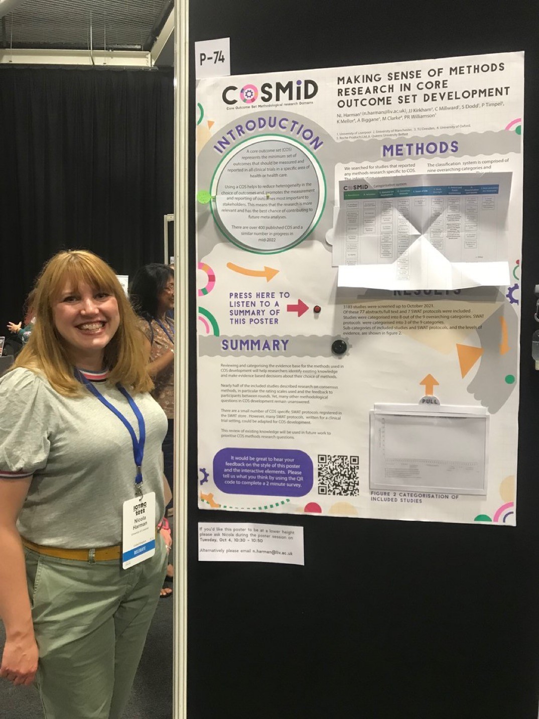
An interactive poster with sound and paper magic: Q & A with Nicola Harman

Nicola Harman recently tweeted a short video of a poster that invited the viewer to reach out and touch it.

This year my poster is interactive and has a voice recording of the poster walk through.” Take a look:

I reached out to Nicola for more information, and she graciously took the time to answer some questions (lightly edited).

• • • • •
Nicole Harman presenting her poster.Q: What has your conference and poster session experience before this meeting?

A: I’ve presented both oral and poster presentations at national and international conferences. I also won a poster prize back in 2008 just after finishing my PhD. Although I’ve been to a few conferences now I’m always revisiting how best to share information and this extends to my current research in clinical trials methodology too.

Q: The recorded tour was something I’ve never seen done before. What was the inspiration and how did you do it?

A: I think accessibility of information is really important. A typical poster relies on someone reading the information, but offering an audio description opened the poster content up to people who preferred to listen or found listening easier. It also meant that someone could listen even if I wasn’t at the poster at the time.

I kept the recording to just under 2 minutes assuming that’s about as long as someone has to spend with each poster. 

The kit I used was an mp3 chip from a UK company called Talking Products, it costs around £12, is really easy to use and can hold a 4 megabyte file (about 4 minutes of playback). You could also use an mp3 module with a microcontroller like an Arduino or Raspberry Pi if you wanted a longer recording.

Q: Can you tell me about the inspiration for the papercraft and how you created it?

Cover to "Paper Magic" by Harry Houdini
A: I really enjoy making stuff and paper is a great medium to work with. I’ve been reading Harry Houdini’s book Paper Magic and felt inspired by how simple paper folds and cuts could create a sense of wonder and excitement. I thought it would be interesting to see how this might work on a poster and what sorts of paper methods I could use. I essentially wanted things that created excitement, made things easier to read, and were a little bit magic.

I used three different techniques on the poster:

The Introduction section had a circular reveal. I hoped that this would have the exciting magic element and also make things easier to read as I could maintain a good font size by essentially doubling the space available.

The Methods section used a Turkish map fold to share a categorization system. Again, this method meant that I could have extra space and make the table much larger.

The Results section used an acetate reveal (I’m not sure if that’s actually what it’s called!). Essentially, the results table was layered so that the graph was empty until you pulled it up to reveal the content. I think this was mostly magic!

I designed the poster to scale in Adobe Illustrator, printed components using a Canon ip8750 that could print at A3, cut some elements using a Silhouette portrait and then printed the main poster at A0 using the university printing services.

Everything was mounted on a foam core board so that I could embed the speaker and mp3 chip together with some magnets that helped keep the Turkish map table open and hold up the Results tab.

Q: Interactive features could fray or fail with repeated use. The video makes it seem that the “voice tour” button was a bit hard to press because the board wobbled. How long did the poster session run for, and how well did the poster hold up?

A: The poster was available to view over two and a half days. It was in the same room as the coffee breaks so typically had the most footfall then. I was worried about the paper elements too, so tested a few out before finalizing the design. 

One technique that I loved was a woven paper reveal but that wasn’t going to hold up over the conference, so I put it to one side. 

Overall the poster held up really well, the circular reveal was the bit that needed a little bit of repair afterwards but if constructed a little differently this shouldn’t be a problem. The other two elements were fine and didn’t need any repair afterwards.

The battery pack did mean that the poster wasn’t flush to the board so I’d probably re-think its positioning next time. There was also a tiny delay in the audio file starting after pressing the button which is why my colleague pressed it again, the third time was to switch it off.

Q. I tried to see the survey, but it was closed. What was on the survey?

A: I’m a trials methodologist so I was keen to evaluate the methods used in the poster. I used a QR code to link to an online survey that had twelve short questions with a five point Likert scale response. The questions were grouped into two main categories:

Questions about the poster design: For example, did the interactive elements help to highlight information? Did you enjoy engaging with the elements? Did the interactive components motivate you to talk to colleagues about the poster?

Questions about the content: Was the content easy to understand? Did it flow well? Did the interactive elements help you to remember the content/key messages?

Q: How many people clicked on the QR code and did the survey?

A: There were fifteen responses to the QR code survey which was quite a low response rate taking into account the conference size and the number of people that I spoke to. It was still valuable information though and the response rate has also given me a few things to think about in terms of methods to collect feedback in this sort of busy environment, especially when competing with coffee, pastries and chatting to friends!

Vistors to Nicole Harman's COSMID conference poster.
Q: What was the audience reaction like on the poster session floor?

A: The audience reaction was great, lots of people engaged with the poster and then told their colleagues about it so they could try it out too. It created a really fun atmosphere. Reflecting on it personally I engaged with more people than ever at a poster session/conference. It helped to establish a two way dialogue with others, including those who’s research area was very different to my own, so was a great way to share my research, learn about others research and make new connections.

Q: Your tweet got thousands of likes and the video in it was viewed tens of thousands of times. Did you expect that much of a reaction? Was that online response been similar to the face-to-face response?

A: I did not expect that reaction to the tweet. If I had known I might have spent a little more time on the video! It was fantastic to get such a positive reaction both online and face-to-face and I feel inspired to take this further and think about academic applications beyond poster presentations. I’m currently working on a zine about it to summarize what I did but also share some more inspiration and resources. 

• • • • • 

Thanks again to Nicola for sharing your experience and for daring to be different!

Book cover from here

External links

Turkish map fold with a square sheet of paper

Houdini’s Paper Magic summary 

03 May 2022

Lecture Breakers #121

Lecture Breakers logo
I’m on the Lecture Breakers podcast this week!

I saw host Barbi Honeycutt on a YouTube video, and heard about her work with teaching in alternative formats besides lectures. I reached out to see if she was interested in chatting about using posters for teaching without realizing she had already a great blog post on the topic herself.

I had a blast talking with Dr. Honeycutt, and I hope the fun comes through on the show.

In preparing for the interview, I listened to a few episodes of the podcast, and I am now a regular listeners. If you are an educator, do yourself a favour and subscribe to this podcast. The enthusiasm is high, the questions are smart, and the guests are thoughtful educators. It’s a great listen for anyone teaching in higher education.

Related posts

Using poster assignments in courses

External links

Lecture Breakers #121 (link to podcast on Apple; also available on other podcast services)

6 Ways to Use Teaching Posters in Your Course to Increase Student Engagement (2019)

02 January 2021

Lessons from jigsaw puzzles

 For the holiday season, this showed up under the Christmas tree:

500 piece jigsaw puzzle, "Winter Friends," with wolf lying in snowy forest looking at red cardinal on tree

It’s going as well as can be expected.

Jigsaw puzzle pieces laid out on table

It occurred to me that puzzles have lessons for posters. Because puzzles tell us about how we make sense of images.

Here’s a slightly cleaner look at the image.

Wolf lying in snowy forest looking at red cardinal on tree

As soon as I saw the image on the box, I joked, “The bird will be the first thing done.” It was the only thing red, and I knew the bright red pieces would stand out in the box. And, as predicted, it was pretty much the first thing done.

Jogsaw puzzle pieces laid out on table

But it’s clear what else got done early on.

The classic way to solve a jigsaw is to start with the edges, because they have the only straight edges.

What do these things tell us? That we are good at detecting and paying attention to contrast. The bird is a contrasting colour. The edges have a contrasting shape.

The next thing that was done was the wolf’s face. This is probably because humans are very attuned to looking for faces. That the eyes are contrasting colours also help.

And after that, the legs got done. I searched for pieces with clear colour splits (that is, half white snow, half fur coloured).

And the moral of the story is: If you want people to pay attention to one particular part of a poster, us contrast – especially colour.


02 January 2015

Interview with visual information specialist Karen Nelson

Conference posters are typically made by amateurs (and boy oh boy, does that ever include me!). It’s rare to find someone who makes posters as part of their job, who is not an academic, and who has training in design.

This makes Karen Nelson rare as the proverbial hen’s teeth. Her email signature describes her asa “Visual Information Specialist” for the United States Forest Service. She graciously agreed to answer some questions and show a couple of her posters. (Click to enlarge the posters!)


Q: Tell us a bit about your background. How did you become a “visual information specialist”?

A: I graduated from the University of Wisconsin with a B.S. in Art (and an emphasis in typography and graphic design). After graduating, I was hired by the U.S. Forest Service, Forest Products Laboratory (FPL), as an entry level “Visual Information Specialist” (Graphic Designer). My skill sets improved over time, and I’m now a senior designer.

Q: Before you started designing posters, had you been to scientific conferences and seen the posters?

A: I did not attend scientific conferences before I started to design posters. However, I saw many research posters created by a former designer at the Forest Products Laboratory, who was my mentor before he retired.

Q: Do you go to conferences now? If so, what’s your general impression of the state of conference posters?

A: Due to budget constraints, I do not travel to conferences. However, I do review posters presented at conferences hosted on-site by my employer. My general impression of conference posters is that they are usually “journal articles on a large piece of paper.” Posters are overloaded with text, charts, tables, etc. Color choices are poor. Proofreading is overlooked. Primary messages are lost due to information overload.


Q: Describe the process of working with the researchers. How much of the text and graphs do they give you, and how much do you create?

A: The researchers are responsible for providing text and graphics. I ask researchers to provide (1) conference guidelines for the poster (2) text in Word, (3) charts (with data) in Excel (whenever possible), (4) tables in Word or Excel, and (5) original, unaltered, copyright-free photographs at the largest file size available. If it’s necessary to use a copyrighted image, the researcher must obtain permission for use. I specifically request that they do not embed photos, charts/graphics, and other elements in a Word or PowerPoint document. I work more efficiently when I receive individual files, and I think that quality is lost when I have to copy/paste an image from Word into Photoshop.

I begin the design process after I receive all content. I work directly with the researchers to eliminate unnecessary information. I’m a good proofreader and copy editor, but I consult with an on-site technical publications editor as needed. If the photographs are low resolution, I request different files (or I will look for them myself). I frequently re-create graphs and artwork (flow charts, diagrams, etc.), especially when I receive low-resolution image files that are not editable.

After a draft poster is done, I meet with the researcher(s) for review, corrections, etc. I usually output a small but readable print for markup. Sometimes, simply emailing a PDF will suffice for review.


Q: What is your poster design process like? Is it purely digital? What software do you use to put posters together?

A: Yes, the design process is fully digital. If a poster contains tables, I use Adobe InDesign for layout (InDesign is great for importing and editing tables). If a poster contains charts and vector graphics that need to be redrawn, I use Adobe Illustrator (Illustrator’s graphing tool is also very helpful when data is provided). I edit and color correct raster images in Adobe Photoshop. We have an in-house large-format printer.

Q: Do you have any advice to help a scientist making a poster? Putting it another way, what are the pitfalls that people not trained in design fall into over and over again?

A: KISS! In a room full of 100 or 200 or 300 posters, let yours stand out and attract attention. Portray the main message and important results – not all of the journal article details. Make the design process easy – use large, pertinent photographs, succinct graphics, and a minimal amount of text.

Don’t use dark or brightly colored backgrounds. Instead, keep the background white or use a light, neutral color so that your graphics and photographs can pop.

Don’t use boxes! Instead, leave plenty of white space between columns and sections of information. If you “need” boxes, you have too much information.

Please avoid 3D charts and gradient fill patterns! Remove all “chart junk.” Read Edward Tufte’s The Visual Display of Quantitative Information to learn more. Choose a limited color palette and a limited number of fonts and font sizes.

Consider a handout or a business card with links to sources for more information.


Q: What other kinds of visual information are you charged with making in your work? How do the design considerations differ?

A: My work is divided between technical/research-related items for the scientists and other design products for semi-technical and public audiences. I have designed technical manuals, including all graphics contained therein, figures for journal articles, technical brochures, research-related PowerPoint presentations, and some web graphics. On the other hand, I create items for public consumption such as semi-technical handouts, fact sheets, web graphics, PowerPoint files about Forest Products Laboratory, and posters/displays that again are general in nature. The design considerations (principles), to me, are the same for both audiences, yet designs for public consumption allow for more creativity.

Q: Straight graphic design geekery now: Do you have a favorite typeface?

A: No! It depends on the subject and audience. For research posters, I like Myriad Pro Semibold for titles and heads. It’s an easy-to-read sans serif face. I also like Cronos Pro (sans serif) and two serif font families (Minion Pro and Adobe Text Pro).

Thanks to Karen for taking the time to answer some questions!

Related posts

Combining art and science: Karmella Haynes interview
Critique: geese and swans

Cronos Pro sample from here.

22 September 2011

Combining art and science: Karmella Haynes interview

Back in June, Jonathan Eisen shared a poster unlike any I had ever seen before: a completely painted work of art.


I featured it here, and finally have a follow-up with the scientist behind it, Dr. Karmella Haynes.

Q: The obvious first question is, what gave you the idea to paint your conference poster? I know you’re an artist, but that’s still a fairly significant jump between the disciplines.

A: I've been painting and drawing since I was a kid; I keep a collection of my pieces on display at www.karmellahaynes.com. (“Traveling without moving” from that site pictured at right - ZF) Before I was certain that I wanted to be a scientist, I had already been doing some pretty advanced portraiture in oil and in acrylic. I continued to paint while in grad school, but only when I could find time. Today, I find outlets for artistic expression through my science. For instance, I design my own cover art entries. One was accepted by the Journal of Biological Chemistry (August 5 issue, “Synthetic reversal of epigenetic silencing,” shown below. - ZF)

Q: Were you nervous to have a poster that was so different from other conference posters?

A: Maybe a little. Some things that were going on in my career at the time emboldened me to try a painted poster. Although I was a postdoc in the Silver lab, I had acquired a position as a tenure-track professor (at Arizona State University) so I felt more independent. Also, the data on the poster had all been generated by me, so I didn’t have to get approval from a long list of co-authors. Pam (my P.I.) had always been supportive of my art and she’s a strong proponent of clever and bold ideas in general. Finally, I felt that a synthetic biology conference was the right place for it, since so many members of the syn bio community are iconoclasts, of sorts, and have an appreciation for creativity and aesthetics.

Q: Could you talk a bit about the process of making this particular poster? In particular, paint would not be a medium that I would have thought of as suitable for precise scientific data, like means with error bars. How did you do the graphs?

A:  I had an unused 3' × 4' canvas laying around and a set of nice acrylic paint I had not touched in a while (science had kept me pretty busy). I created a lot of sketches to get the layout just right. I decided to go with a sort of surrealist still life of single cells (inspired by a Chihuly exhibit in Boston) and a clear petri dish, where some cells had red nuclei, so that it would be relevant to the data. For the data, the challenge was to represent the science well without relying too much on text, just like any digital poster, but even more so for the painting. I sketched the graphs and diagrams with pencil and a ruler, trying to get the sizes of everything as accurate as possible. What a lot of people don’t appreciate is the fact that graphs that were published in high profile journals were hand drawn by technical artists. But, in order to accurately present my data (it was a science conference after all), I made mini-posters on 8.5" × 11" paper as handouts.

Q: We know Jonathan Eisen loved the poster; how was the response from other attendees?

A:  It got a lot of double takes and plenty of smiles and compliments. Many commented that it was the first time they had ever seen anything like it. It was very well received. I printed 50 handouts and ran out long before the poster session was over.

Q. Have you done more traditional posters, using illustration software? If so, what do you use?

A:  Yes, up until that point, for all 12 years I had been doing research it was nothing but printed posters; from “modular” poster board-backed panels hung by thumb tacks, to the large single sheet print-outs. I’ve used Photoshop and PowerPoint and/or a combination of both. I can’t wait until digital display screens get inexpensive enough to furnish every presenter with a monitor for showing digital posters with interactive animations. That could definitely end up in catastrophe, encouraging common PowerPoint offenses, but the best digital posters would help to set a good standard.

Q: How important is the aesthetic, the artistic quality, of a scientific poster?

A:  Art can do many things: please, provoke, challenge, and communicate to name a few. The most appropriate use for art in science posters is to communicate efficiently. When the symbols are consistent, the colors “logical” (e.g., complimentary colors showing opposing components of a system), the layout uncluttered with a logical flow, etc., the viewer is satisfied both intellectually and emotionally. I think science posters should strive to become technically beautiful (I also love the beauty in less rigid things, but that’s a different category).

Q: What advice do you have for scientists to make their posters more beautiful?

A:  Pick a standard visual language and stick with it (e.g., what shapes to use for proteins, cells, test subjects, etc.); don’t be afraid of abstraction; use complementary contrasting colors, not clashing colors (there’s a difference); look to commercial biotech posters for inspiration; if you have microscopy, show it off!

Thanks for the opportunity to share my poster-painting experience with your readers.

Thanks, Karmella, for taking the time to answer some questions!

Related posts

True artwork: the painted poster

External links

Karmella Haynes at Arizona State University
KarmellaHaynes.com
Karmella Haynes on Google+

Tree of Life blog:

25 August 2011

Critique: Geese and swans

At the recent Ecological Society of America meeting (covered here and here), this was one of the posters that “popped” out at me. Click to enlarge:


This poster interests me greatly, because there are many things that I would normally pick at on other posters, but don’t bother me here. For instance, I normally tell people to limit themselves to two colours; there’s at least four on display here. But it works.

When speaking to the presenter, Dan Brooks, about it, I discovered something unusual: he had not made it. It was made by Marcia Hoang, a professional graphic artist who works with the Houston Museum of Natural Science.

Marcia graciously agreed to answer some questions for me about this poster and design.

Q: Because you’re a designer, not a scientist, have you ever been to a scientific conference before and seen the posters?

A: I have never been to a scientific conference before, but I do work at the Houston Museum of Natural Science as a graphic designer for exhibits. I think that helped me a lot when designing this poster, knowing what points to emphasize and what points were less important for viewers to see at first glance.

Q: Could you describe the process of working with the researcher, Dan Brooks, on this? How much of the text and graphs does he give you, and how much do you create?

A: Dan Brooks was great, because he had all the information he wanted on the poster ready to go, as well as a resource of images and graphs. Although Dan provided me with graphs and pie charts, I wanted to redesign them so that they were more easily read and had the same look and colour scheme as the rest of the poster.

Q: What software did you use to put the poster together?

A: I used Adobe Photoshop and Illustrator.

Q: One of the things that is very striking about this poster is the use of colour. I often advise people to stay away from many colours on posters, because it seems easy to do more harm than good! Was there any sort of plan behind the choice and use of colours?

A: I think colour is very important to a poster if used correctly. I chose colours that came from the goose to inspire the rest of the poster. I then used these colours to separate sections of information from each other.

Q: I see on your website that you’ve done other science-based graphics, like “Biggest stars” and “Skull wall.” Is designing a scientific graphic any different than other projects?

A: Yes, both of the projects you named were for the Houston Museum of Natural Science at Sugar Land. Designing a scientific graphic, especially for education, has many restrictions. Often times, the type must be quite large for audiences of all ages to read it, and color schemes have already been set by the subject of the graphic, i.e., the stars in outer space already glow with certain colors. While certain design liberties are not accessible, it is part of a designers job to push these boundaries, to be creative, to be able to catch the viewer's eye.

Q: Do you have any advice to help a scientist making a poster? Putting it another way, what are the pitfalls that people not trained in design fall into over and over again?

A: I often see lack of hierarchy in text. Hierarchy is very important so that viewers may scan a large poster with an abundant amount of information and be able to know the general points it covers.

Another mistake many people make is putting photographs that are pixelated or are not well photographed onto their displays. We are very visual, so beautiful images tend to be the first thing to draw the eye.

Q: Straight graphic design geekery now: Do you have a favourite typeface?

A: I usually lean towards thinner typefaces. I am a big fan of Archer. And to add to the previous question: please stay away from Comic Sans, Papyrus, Courier, and the likes. Stick to something easy to read and you will be all right.


Thanks to Dan Brooks and Marcia Hoang for generously sharing this with me!

Related posts

Two rules of two