23 February 2023

Link roundup for February 2023

Even though online conferences seem to have lost almost all momentum in 2022, papers describing online conferences from 2020 to 2021 keep coming.

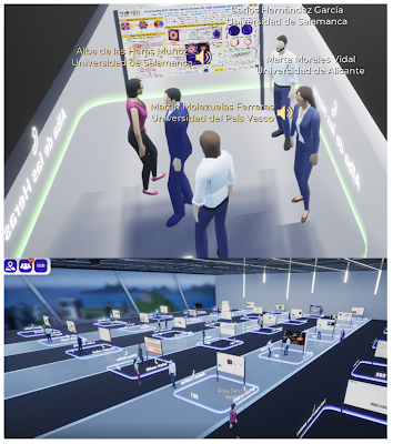
Secpholand vitural poster session

The poster session was important to the planning of the conference. In part because of the poster session, the organizers picked a platform called Secpholand.

This type of 3D virtual environment has been selected mainly for the possibilities of interactivity with other attendees... What is especially attractive is how posters are presented, which for us was very important given the high number of poster contributions and considering that many of the presenters were early-career researchers, sometimes at their first conference participation. The poster room is configured like a real poster room(.) Moving your avatar around, you can see the posters, zoom on them to check them out and especially, when entering in the dedicated area next to the poster, a voice call with the other people in the area is started(.) Thus, the platform is able to reproduce a traditional poster session in an online platform reaching more than 2600 poster visualizations.
de las Heras A, Gómez-Varela AI, Tomás M-B, Perez-Herrera RA, Sánchez LA, Gallazzi F, Santamaría Fernández B, Garcia-Lechuga M, Vinas-Pena M, Delgado-Pinar M, González-Fernández V. 2023. Innovative approaches for organizing an inclusive optics and photonics conference in virtual format. Optics 4(1):156-170. https://doi.org/10.3390/opt4010012

• • • • •

This is a real figure published in a book chapter.


Three crudely drawn turtles with three different shell shapes
 

Spangler M. 2015. Amphibians and Reptiles at the Ometepe and La Suerte Field Sites: Toward an Overview of the Evolution, Diversity, and Natural History of Central America’s Herpetofauna. In: Huettmann F, ed. Central American Biodiversity. Springer, New York, NY. https://doi.org/10.1007/978-1-4939-2208-6_12

Hat tip to Alexandra Phillips.

• • • • •


Apologies for this being a short link roundup. I deleted an earlier draft of the post and couldn’t recover it.

16 February 2023

Critique: Limpet or leave it

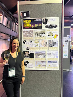
This week’s contribution comes from Louise Firth. It was presented at the International Tidal Reef Symposium (#ITRS2023) in January. Click to enlarge!

Poster titled, "Limpets in our lives."

I am a big fan of using the techniques of comics on academic posters. So when I spotted this comic-inspired poster (hat tip to J. E. Byrnes), I wanted to share it here on the blog.

Usually, posters are the first drafts of papers. But in this case, the poster arose out of a review paper that Louise wrote at the start of the pandemic.

The paper was my “Lock down project,” because I, like everyone else was struggling with work and this was a fun way to make me enjoy doing work in a bubble. As the paper was so long, I figured no one would read it so the poster was my way of summarising it and advertising it.

She also used the artwork in this poster in a summary of her limpet review paper on Twitter. I think this is another advantage of the comics format: it can be often broken apart into individual, sharable pieces for things like a Twitter thread.

Things that work on this poster:

The title. It reminds me of how many Sunday comic strips were laid out. The title of the strip would take up a good chunk of the upper left corner, and the action would usually start in the upper right corner.

Here’s an example from Dick Tracy, circa 1938:

Dick Tracy comic strip from Sunday edition.

A later example from Peanuts:

Peanuts comic strip from Sunday colour edition.

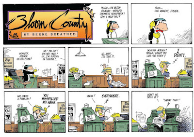
And an even later example from Bloom County:

Bloom County comic strip from Sunday edition.

That layout of the title very much enhances the comic feel of the poster.

The art. I think a lot of this was originally from a variety of sources, but I suspect that Louise did a little editing to harmonize the style of the artwork on most of the poster. The exception is the title, which stands out because of its dark background on a poster where most of the panels have a white background.

What works less well?

The lettering. Yup, it’s our friend Comic Sans, whose shortcomings have appeared in this blog many times before. If this used a professional level comic font like something from Comicraft or Blambot, it would just elevate the whole poster.

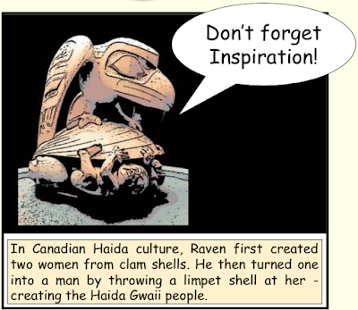
Here’s one original panel (snitched from the Twitter thread):

Poster panel reading, "Don't forget inspiration! In Canadian Haida culture, Raven first created two women from clam shells. He then turned one into a man by throwing a limpet shell at her – creating the Haida Gwaii people."

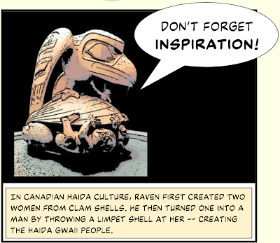
Here’s the panel using Ready for Anything, an outstanding general comic font from BlamBot:

Poster panel reading, "Don't forget inspiration! In Canadian Haida culture, Raven first created two women from clam shells. He then turned one into a man by throwing a limpet shell at her – creating the Haida Gwaii people."

And here is something a little more ambitious: using different type for the spoken words (Back Issues) and the captions (Manly Men).

Poster panel reading, "Don't forget inspiration! In Canadian Haida culture, Raven first created two women from clam shells. He then turned one into a man by throwing a limpet shell at her – creating the Haida Gwaii people."

Thought I like these revisions, I can’t so another element easily change...

Word balloons.The word balloons. These balloons are highly characteristic of Microsoft PowerPoint. Professional balloons in comics have pointers that are thinner and curved, and the proportions of the ovals are different. I didn’t think there was a simple solution at first, but then I found that Comicraft has word balloons for sale in Illustrator EPS format for a very reasonable price.

Blambot has word balloons for sale, too. 

Blambot Balloon Brushes v. 1 showing examples of balloons.

Blambot’s balloons are Adobe Illustrator paintbrushes, so maybe not quite as readily portable into other graphics packages.

Are these issues just me scratching my comic book nerd itch? Yeah, probably a little. But I think if you are going to use a form, it is worth leaning into it. The lettering, in particular, would not be hard to change. It would costs just a few bucks to buy a font, a few minutes to install it, and a few more minutes to change the text in the poster. 

Thanks to Louise for being this week’s contributor!

Reference

Firth L. 2021.What have limpets ever done for us?: On the past and present provisioning and cultural services of limpets International Review of Environmental History 7(2): 5-45 https://search.informit.org/doi/abs/10.3316/informit.190553729493929

09 February 2023

How fast do fingernails grow? A graphic makeover

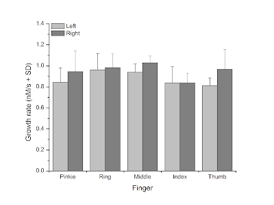
Years ago on my general blog, NeuroDojo, I wrote a post about how fast my fingernails grew. As part of that post, I made this graph: 

Bar chart showing fingernail growth in nanometers per second.

I created this graph in OriginLab, and it is clear enough. It’s very much the sort of thing you expect to create for a technical journal article.

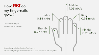
I recently looked at that post again, and got an idea for a more graphic way of showing the data. 

Graphic of hand showing growth in nanometers per second as a callout on each finger.

This does not have the same amount of detail as the bar graph, but is more more readily understood at a glance. It makes it more obvious what the numbers are showing: something related to each finger of a hand.

If I was more ambitious, I might have made the graphic even more personal by taking photographs of my own hand.

This approach (if not this particular quick and dirty graph) would be much better for a conference poster than the more traditional bar graph. 

Remember, graphs are anonymous. Photos and illustrations and icons have personalities.

Update, 12 February 2023: I should have mentioned I did this graph makeover and submitted as part of a Storytelling with Data challenge for January called “The quantified self.”

This then got featured on the Storytelling with Data podcast, episode #61: “AI, quantified self, and fingernails.” So yeah, those are my fingernails they’re talking about!

08 February 2023

“The Value of Visuals in Science Communication” by Mark Belan

Poster for Mark Belan's talk on "The Value of Visuals in Science Communication"

On February 8, illustrator Mark Belan gave a talk at McMaster University for the Sherman Center for Digital Scholarship. It was a wide ranging talk on design, and even contained a few slides about poster design.

You will be able to find a recording of Mark’s talk on visuals in science communication soon. 

If you want a preview, here is my thread live tweeting Mark’s presentation.

Update, 13 February 2023: The video recording of Mark’s presentation is now available. The closed captions have not been corrected as of this writing.

External links

ArtSci Studios, Mark Belan’s studio

07 February 2023

Upcoming presentations, early 2023

Incoming!

If you’re part of the University of New Hampshire community, I’ll be giving the first of two presentations on 15 February 2023 on poster and presentation design. This event was rescheduled from January.

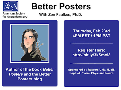
This month, I’m pleased to be talking to the American Society for Neurochemistry.

American Society for Neurochemistry workshop on 23 February 2023

The American Society Neurochemistry workshop is on on 23 February 2023. You can register for the event here.


02 February 2023

Arts and disease

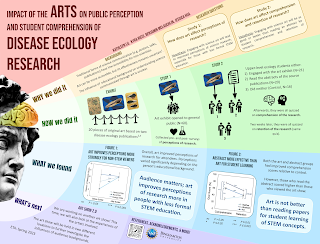
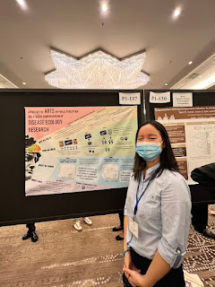
I was scrolling through the #SICB2023 hashtag for the 2023 Society for Integrative and Comparative Biology meeting. Among them was this gem from Kathleen Lu. Click to enlarge!

Kathleen is an undergraduate at The State University of New York Binghamton. I was struck by the unusual layout and topic. It’s a little rare to see a poster with the word “arts” featuring prominently in a biology conference.

I was more interested in how this poster came to be than critique it, so I had a few questions that Kathleen graciously answered.

Q: How did you arrive at the concept for the poster? Were there others you tried before settling on what you used?

A: When starting the design process, I knew I wanted it to be non-traditional. The topic is about how traditional science communication methods aren’t always the best, so I was trying to illustrate my point a little. I played around with a few ideas before settling on one. I sketched some out in pencil and showed them to my lab group and we decided on our favorite one. Another idea was a paintbrush and splotches of paint to divide each section.

Q: What software did you use? (People always ask.)

A: Text and figures were formatted in Google Slides. I used Krita (a free digital illustration program) to make the background.

Q: What response did you get at the meeting?

A: I was surprised at how positive the response was! I was surrounded by all these hardcore biology and chemistry posters so I was worried that people wouldn't really care about mine. But there were a ton of people interested in science communication and education. I had some teachers and artists approach me, and one was interested in writing an article about the project. Overall, it was a great experience and I had fun talking to all the researchers at the SICB conference.

Kathleen presenting her poster at the Society for Integrative and Comparative BiologyQ: Now that it’s done and you have a bit of perspective, is there anything you thought worked really well or things that you might want to change?

A: I thought the unconventional design worked out very well. The colours made it stand out. After going to a few poster conferences I’ve realized that being eye-catching really makes a difference. It was also a good idea to include photos of the art and exhibit in the QR code; I had a few interested people actually scan it.

If I could change something I’d probably try to make the text on the graphs bigger and in general make the graphs a little more aesthetically pleasing.

Thanks, Kathleen! (Kathleen also scores many points with me for presenting in a mask. Excellent public health practice!)

External links

Krita

01 February 2023

Please visit the gallery

After years of blogging, even I have a hard time tracking down some of the interesting posters that have appeared here.

So The Better Posters Gallery is now open.

This isn’t meant to be exhaustive compilation of all the great posters that have been on the blog or that I know about. Nor is it meant to be complete in any sense. It’s just meant to bring some cool posters into one place. 

Hat tip to Yorgles on Mastadon for this idea.

External links

The Better Posters Gallery