Note: Author Scott Berkun recently announced to his email subscribers that he has had a medical event that has seriously affected his voice. This is a concerning set back for someone who makes a living in part by public speaking. I wish Scott well and hope he eventually return to public speaking. He has a list of ways you can help him at this difficult time.
Scott Berkun takes a very high level view of design. He is not interested so much in how to design in a nuts and bolts sense. This is more about general processes and, importantly, their impacts. Berkun asks early on, “Why are so many things seem to be badly designed?”
I appreciate that Berkun’s answer to that question acknowledges things like power dynamics and economics. People who might make good design decisions don’t necessarily get to make the decisions or get the resources they need to make them.
That example is just one of many historical anecdotes in this book. Berkun has a good nose for finding these, and they are consistently interesting. And he casts a wide net. So while I have spent a lot of time thinking about graphic design on this blog, I learned a lot about other kinds of design. “Norman doors” are going to be part of my vocabulary forever now.
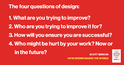
Is there anything here for a poster maker? Maybe. Scott includes four key questions to evaluate designs:
What are you trying to improve? Who for? How will you be successful? Who might be hurt by the work?
Let me take a stab at applying them to conference posters.
1. What are you trying to improve?
I see two things poster designers are often striving for.
The first is efficient use off time spent making the poster. Berkun addresses that: “Efficiency is often taught to mean working in a straight line, but the trap is that efficiency is not the same as quality.“
The second is maximizing the information information content on the poster.
Why I think these are both dubious improvements lie in the answer to Berkun’s second question.
2. Who are you trying to improve it for?
People trying to minimize time on creating posters and maximizing information on posters are usually trying to improve those things for themselves, not other people.
3. How will you ensure you are successful?
I think a lot of poster makers don’t have an answer for that beyond having a supervisor say it’s okay. I don’t know how many people show off drafts of their poster or rehearse their poster presentation to others before they head to a conference.
4. Who might be hurt by your work? Now or in the future?
Luckily, posters are mostly harmless. The content of the posters might not be, but that’s another issue for a different blog. Perhaps a more helpful way to frame this question is, “Who might be left out?” Who might not be able to benefit from your data and insights because of how you have made your poster?
This book is not essential for poster makers. It’s not a “how to” and lacks the nitty gritty details that someone looking for concrete advice on graphic design might want. But if you are interested in stepping back and looking at that bigger picture, Berkun paints a rewarding view.


No comments:
Post a Comment