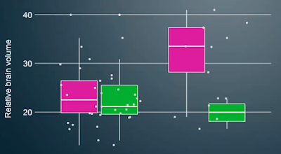
A lot of presentations showed data in box plots, like this:
I’m having a hard time understanding this graph.
This plot shows both the box plot and what I assume is raw data overlaid on top. But the raw data are so scattered in the horizontal, it’s hard to figure out which data points are supposed to be associated with which boxes.
But putting that aside, I’m wondering what people think the plot shows. Because none of the components are labelled.
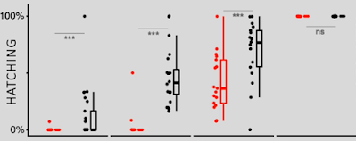
Here’s another example.
Nothing labelled here, either.
In looking at posters over the years, I have noted that one of the most common problems is that people show something like a bar graph of averages, and show error bars, but nowhere on the poster does it say what the error bars show. Even when I ask, presenters often turn back to the graph to look at it and make a face while trying to remember. They often can’t remember.
The whole advantage of box plots is supposed to be that they provide a more detailed view of the data than a simple average. But you don’t tell me what any of the components in the plot are, then there is no advantage.
That I kept seeing box plots with no description, nothing, made me
curious: what do people
think are being shown by those whiskers? (I asked on
Twitter, too; most replies
here.)
Obviously, the person making the graph thought it must be clear. They
probably think there is an “industry standard” for box plots, but there
is not.
And you can’t just assume that everyone draws box plots the same way you do! Wikipedia
notes:
(W)hiskers can represent several possible alternative values, among them:
- The minimum and maximum of all of the data
-
One standard deviation above and below the mean of the data
-
The 9th percentile and the 91st percentile
-
The 2nd percentile and the 98th percentile.
Any data not included between the whiskers should be plotted as an outlier with a dot, small circle, or star, but occasionally this is not done.
Some box plots include an additional character to represent the mean of the data.
On some box plots a crosshatch is placed on each whisker, before the end of the whisker.
Rarely, box plots can be presented with no whiskers at all.
I suspect this is another case of computers making it too easy to draw the wrong thing, as Dan Roam says. People just use the default box plot their graphic software creates and don’t critically examine the output.
I’m just surprised it’s a problem for box plots, since I would maybe expect that if you’re interested enough in showing variation in the data, you’d think about what people need to interpret the variation.
I am not sure what the best solution here is, There are several.
- Ask if you can replace the box plot with a bar graph, and put “SD” or “SE” or whatever in the Y axis label. Bar graphs cop way too much abuse. (Remember, the context is posters here, not journal articles.)
- Put the description in fine print under the graph. This is the simplest to achieve.
- Make a legend for the plot. (Origin 2020 does this automatically, so this can be fairly easy in some cases.)
- Label the elements on the graph the first time you show a box plot. This may be the most clear for a viewer, but is probably the most work for the presenter.
The last two options both have the advantage of putting information at the point of need, on the graph itself.
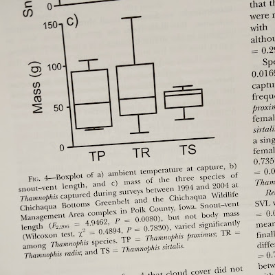
Update, 7 August 2020: I was surprised that the day after I post this, I pick up a journal from my mailbox, flip it open, and spot a box plot.
The figure legend contains no help whatsoever in deciphering the plots! There is no way to tell what anything means. All I can tell is that the averages are kind of around 50, and most of the data are somewhere between 25 and 150? It’s not useless, but it certainly could be more useful.


No comments:
Post a Comment