- Take it seriously. It’s easier than ever for people to spot errors.
- Promote it!
- Align your poster with other content you upload.
- Be ready for questions.
- Don’t be discouraged!
I keep asking for other people to talk about their experiences with virtual poster sessions, and this is the most I’ve seen so far. Please, if you have done an online poster session, email or tweet me about it!
• • • • •
Speaking of the Plant Biology meeting, there is now an archive of the workshop on illustrations. (Warning: Contains me.)
All the speakers went through the chat transcript and added many more comments to the questions, many of which we could not answer live during the session. So even if you were in the workshop (and thank you if you were!), this may be worth visiting!
• • • • •
Animate Your Science have turned their blog post on poster design into a free PDF (17 pages), which is a little more portable and polished than the original blog post. (Update, 1 October 2020: Link to PDF updated.)
You do have to give up your email address to get it.
Animate Your Science also wrote a guest post over on Echo Rivera’s blog.
• • • • •
Zoom is the Napster of the event industry, the ease with which you can put on good-enough virtual events with a global audience, almost for free, much to the undercutting of the underlying economics of the physical events world. All types of business event — conferences, trade shows, conventions — are in danger of their revenues streams of tickets, sponsorships, memberships, and other types of fees being eroded as the world gets used to digital formats and alternatives emerge to physical networking, matchmaking and other tasks we get out of these events.
I have been told that my study (currently under review as a Registered Report) isn’t eligible to be submitted for a conference presentation because the results are not known. Apparently the results are essential for the paper to be evaluated. This isn’t how science should work!
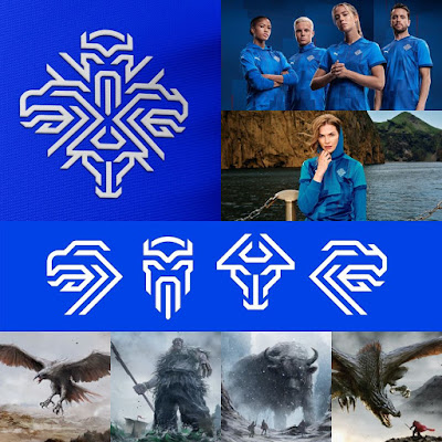
The abstract logo is kind of like those giant Japanes robots that combine to form one big robot. It has four parts that work individually: eagle, giant, bull, and dragon. But they are also combined into a single image.
• • • • •
Typography nerdery meets SF nerdry. The typography of Star Trek: The Motion Picture (with notes and comparisons to classic series, and newer movies, too!).
My love for sans serif fonts like Microgramma trace straight back to this.
This post is an extract from the book, Typeset in the Future.
• • • • •
Nature reports that most acronyms never make it into wide use. Stop making new ones. And especially don’t make up ones for a poster!
• • • • •
Speaking of Nature, remember how they redesigned their journal a while ago, including a custom typeface? The Atlantic did it, too. In June, Goldman Sachs became one of the first businesses I know to develop their own custom typeface: Goldman Sans (+1 typographic pun there, people).
There’s a New York Times article about it, too, with some fun jabs at the font from other type designers and good analysis.
This dual life is a lot to ask from a font: distinctive enough to please aesthetes, neutral enough to include in paperwork for an initial public offering.
You can download the font file (six roman weights, three italic weights, and two condensed weights) here. Hat tip to Geetesh Bajaj and Ellen Lupton.
• • • • •
In July, I reviewed a few online graphics editors like Vectr, Canva, and DesignCap. Another service in that space is Piktochart.
The user interface and features look very much like Canva and DesignCap. Like DesignCap, paper size is a potential dealbreaker. 40 inches wide and 52 inches tall are the maximums.
Hat tip to Sydelle de Souza.


No comments:
Post a Comment