28 February 2013

Link roundup for February 2013

On Quora, a great question and answer: can anyone recognize the difference between good design and bad design?

Tired of “lorem ipsum” for quick layouts? Blokk is the typeface for you.

I salute Alexis Rudd’s graphic talent, earned by photoshopping video game characters:


Who says all that time spent photoshopping Final Fantasy VII characters in high school was a waste? BAM! SCIENCE!
See, it doesn’t matter how you learn graphic skills. They will reward you sooner or later.

The AAAS / Science magazine awards for “visualization challenge” includes a poster category. This year’s winner triumphed, I think, because of the interesting question (“How can owls turn their heads around so far?”) combined with the craft necessary to make very good anatomical drawings.


Seth Godin on things we want from conferences:

Open, generous and connected(.) Isn't that what we seek from a co-worker, boss, friend or even a fellow conference attendee? ... Paradoxically, the fancier the conference, the more fabled the people around the table, the less likely you are to find these attributes.

If your at a desktop, this colour picker might not work for you. But if you have a touchscreen enabled, oh my, this is fun! Hat tip to Simon Bostock.

21 February 2013

Critique and makeover: Glow worms

The last few weeks on the blog, I’ve been talking about the power of using found objects to inspire design. This week, Bronwyn Carlisle provides us with another excellent example. It won third prize in the conference it was shown. You can click to enlarge:


Bronwyn’s commentary (slightly edited):

It was a horrible poster to have to design. The main problem was that monstrous table. It had to be there (it was the result), and it had to be legible. I had to use a narrow font to make it fit, and I rearranged the table itself to make it less confusing. Everything else had to fit around the table. But it was the last part of the poster, so it had to go at the end. I also had short wide tables that needed to fit in panels 2 & 3, along with taller, narrower, graphs. In general, it was a nightmare jigsaw.

I sympathize. Tall posters in portrait format are always difficult. The “nightmare jigsaw” problem was not quite beat in the layout. The lack of clear columns create a jagged split dividing the poster.


Unfortunately, this is problem that I don’t know how to fix quickly. One possibility would be to go back to the graphing software and redraw the graphs on the right hand side to make them fit the proportions of their space more closely. Making them wider would at least make the right edges align, enhancing the sense that there is an underlying grid.

A second issue I have is one where I do have a suggestion. As regular readers know, I’m not a fan of boxes. Here, the big, thick black lines that form the box in the upper right feels particularly heavy handed. Given that this poster overall has a light, almost airy touch to it, the box does not mesh with the rest of the poster.

My suggestion is to use a box implied by colour, rather than one described by thick lines. I used the eyedropper tool to grab the colour of the “antique” image of the animal just to the left of the box, drew a new rectangle with that colour, and put the text on top.


One benefit of this is that by tying the text box and the figure together with the same colour, it binds the top into a single row. The thick-lined box pulls away from the rest, and enhances the split between the left and the right.

Bronwyn continues:

You will notice that I departed from custom and put the authors at the very top. Personally, I really like it.

This works fine. Even though the authors are at the top, there is still a clear sense of hierarchy. The authors’ names and affiliation are small compared to the title, so the title is clearly the most important thing. Also, this brings the title a bit closer to eye level, which is also beneficial.

I think if I were to do it again, I’d put that bottom banner (containing the “punchline”) in the middle of the poster, above the interpretation section. It makes a nice bottom frame where it is, but is a bit too low for its importance.

Finally, the inspiration for this poster came from... jewellery store advertising emails!


And the moral of this story is: Design is everywhere, so inspiration is everywhere.


Additional: After I posted this, I got another email from Bronwyn with her own redesign. Click to enlarge:


Moving the banner to the middle of the poster turns out to solve several problems. It clearly clearly defines the reading order: go in rows. It also fixes the “break” running like a river through the vertical in the earlier version. Yes, there is still a box, but it is nowhere near as distracting as in the previous version, perhaps because the box is now in proximity to the two black bands above and below it, rather than out on its own.

14 February 2013

Critique: Protein biosynthesis

This poster was made by Michael Barton, and was originally posted here. It’s used with his permission, and you can click to enlarge:


Michael wrote about this poster:

I never enjoyed making posters that look the same as a 100 others. Something that reflects your personality is much better.

This poster is successful in looking different, and it does so by looking like something we all recognize: comics. Michael made it with a program called Comic Life.

This poster is a good example of the power of pastiche.

I remember Genevieve Gorder using this technique on Trading Spaces. She would pick some found object that was in the house already; dishes, decorations, object d’art, or what have you. If you had some sort of object that you liked, you know that the styles, and particularly the colours, just worked together. This took a lot of guesswork out of designing a room. You would design by matching instead of starting from scratch.

We’ve recently had another example of the power of using found objects here on the blog: a poster on passenger pigeons that was inspired by nineteenth century advertising. Like Michael’s poster, it was successful in part because it evoked a format that people are already familiar with.

Looking at Michael’s comic inspired theme,  there are a few things that work very well. He uses a typeface that looks like comic lettering (all caps, imitates hand lettering), but it is not Comic Sans. He’s got round word balloons, with pointers calling out the relevant data. The blue boxes are reminiscent of narration panels. The black lines around each panel are utterly right, because they are so characteristic of comics. (And I say this as someone who normally hates boxes on posters.)

My suggestion for improvement would be to reduce the number of overlapping elements. If you look at comic panels, the word balloons generally attach to the edges of panels, not overlap them.

The large number of overlapping lines makes the poster much more visually complicated than it needs to be.

Similarly, I would have toned down on the number of angles the boxes take. Column one is split by a quite severe angle, about 45°, rising to the right. Column two is divided by shallower angles, closer to horizontal, but rising in both directions. And most, but not all, of the blue header boxes rise to the right at yet a different angle. In many classic comics, the energy of the art overshadows that the layout of comic panels is often based on simple, non-overlapping rectangles (Jack Kirby here):


That said, artists didn’t always follow their straight edges so closely (Kirby again):


But even in this crazy layout, notice that the word balloons never overlap the panel edges.

The one inexcusable error is the letters touching the balloon in the “4. Methods” section of the center column. A comic letterer that made that mistake would not be asked back to do another issue.

If you are going for “found object” design, the lesson is simple: you have to commit to using the qualities of that design. The more you do so, the more successful your design will be.

Related posts

Critique: How a pigeon went extinct

07 February 2013

Science Online 2013: Impressions Matter #sciostyle

Last week, I attended Science Online 2013. There’s not much “online” about posters, but there was a relevant session, co-moderated by Liz Neely and Holly Bik: “Impressions Matter: balancing art & design in research and science communication.” Say design, and I’ll be there.

Luckily, we had the awesome Perrin Ireland in the room for the event, and she live-scribed it in her distinctive style (here and here). Click to enlarge!


The one thing that was a little frustrating to me was that there were at least two fairly distinct topics  that were mushed together. Some of the session was talking about fashion: the clothes you wear, the shoes you take to conferences. Science Online had more shoe angst than any other conference I’ve been to by a long ways. Some of the session was talking about graphics: the typefaces and colour choices and spacing decisions that you make when preparing a slide presentation or conference poster. Yes, there are some broad issues where these two things overlap, but they are different skill sets. I am almost as disinterested in my clothing choices as I am interested in my graphic choices.

The other frustrating this was that Better Posters didn’t make it on the “favourite resources” on the live scribe board. ;) (Just kidding, Perrin!)

You can get a recap of the session through the Storify below or here. Unfortunately, Twitter was hiccuping at the time, so the Storify is a bit slim compared to others.

31 January 2013

Link roundup for January 2013

New Scientist has an article about typefaces that covers issues like readability and judgment. (Registration or payment may be required to read).

More on how to dress at conferences.

Sometimes, we need to call out the bad stuff. Here’s one for bad figures in research papers.

I’ve often drawn lessons from comics to make better posters. Someone took it to the next level (hat tip to Craig McLean at the International Biogeography Society meeting in Miami):


Here’s some excellent thoughts on what makes a conference work. Hint: it has to be more than just information.

SlideRocket did a survey is about what people like about slide presentations and how they prepare for them, but has good information that would also be relevant to posters, too. One of the things that come through is that people love examples and templates; I'll see what I can do about that in the near future.

The “It’s not in my backyard” groan always drags, notes PZ Myers:

So don’t belittle cons if you can’t go. These events matter. It’s where community is built, where volunteers grow to play a bigger role in the progression of our goals, where everyone gets enthusiastic about some shiny new aspect of the subject.

And that’s absolutely why we have to do a better job of opening doors for everyone at these events. It’s the faces in the audience at the convention that will someday be leading the movement. It’s those faces that will go home afterwards and share the stories and get more people interested. And if we don’t make opportunities for participation by everyone, we will be limiting our growth.

So please, don’t complain. Your concerns are legitimate: a con may be too expensive, too far away, too inconvenient for you. You should instead try to think of ways to get one near you that you can afford and attend…and there are more and more of these things emerging all over the place.

New Scientist has a story about an analysis of Higgs boson gossip. I mention this because:

Unsurprisingly, the official CERN Twitter account got the most retweets during the monitored period. Second place was less predictable, however, going to Colin Eberhardt, a software consultant who still has relatively few followers.

Eberhardt managed to strike a nerve with one of his tweets - winning the prize for the single most-shared tweet. It read: “Possibly the biggest scientific discovery of our time, the #Higgs Boson, announced in glorious MS Comic Sans Font”, making reference to the odd choice of font used in the presentation from ATLAS, one of the two LHC experiments that discovered the Higgs.

This next is a poster for a conference (as in advertising it), rather than a conference poster (as in given at a conference), but still, I think it’s fair game for comment.


T. rex riding a comet having an acid trip” was my reaction. Hat tip to Alex Witze and Brian Switek for bringing that to my attention.

Font nerds! There is a new version of the old reliable standby monospaced font, Courier. It’s called Courier Prime, and it’s free. You can download it here.

24 January 2013

Saving your voice

NeuroPolarbear wrote:

In the real story that inspired the movie, the little mermaid lost her voice because she presented a poster the day before.

It doesn’t take much for some people to lose their voice, or have it severely impaired. Minor infections or stress can do it. Look at this list of things the National Institutes of Health recommends for taking care of your voice, and think of some of these in the context of a research conference:

  • Limit your intake of drinks that include alcohol or caffeine.
  • Try not to overuse your voice. Avoid speaking or singing when your voice is hoarse.
  • Get enough rest. Physical fatigue has a negative effect on voice.
  • Avoid talking in noisy places. Trying to talk above noise causes strain on the voice.

A conference with no coffee, no booze, where everyone is well-rested and talks in quiet surroundings is not like any conference I have ever seen.

Academics are not necessarily the chattiest people on the planet. You might be in your lab or office, dealing with a few people. But you’re probably not in a non-stop conversation from morning ’til night. But that might be exactly what you do at a conference: talk, talk, talk. It’s kind of the point, right?

Now imagine if you lose your voice after the first day of a four or five day conference. It might be caused by doing a poster presentation, or come before your poster presentation. In any case, it’s a bigger worry with a poster than a talk, since a talk normally has a microphone, and, good or bad, usually only lasts about 15 minutes, whereas a poster can go on for hours.

This ABC News story on laryngitis lays out some common cures for losing your voice that don’t work.

  • Drink tea with lemon and honey? Busted.
  • Slippery elm? Busted.
  • Hot toddy? Busted.
  • Whispering? Busted.


The one thing they do recommend is drinking lots of water. However, many of the websites I’ve seen talking about laryngitis also repeat the “eight glasses of water of daymyth, which doesn’t inspire confidence. A lot of the stuff that turns up in a quick Google search for tips on how to regain your voice looks extremely iffy.

I did find a journal article on the subject by Hanson and Jiang in Medical Problems of Performing Artists (artists get their own journal about their medical issues?). This article talks more about the possible causes, and less about prevention. They do note that acid reflux that occurs at night can cause voice problems. This is apparently something that can happen more at night than the day, so even people who don’t suffer heartburn during the day can have problems with digestive acids if they eat late at night. Hanson and Jiang recommend not eating for two or three hours before bedtime to minimize the chance of voice problems.

If anyone has suggestions and references for how to keep your vocal cords in good shape at a conference, and particularly peer-reviewed articles, I’d love to hear them!

Reference

Hanson DG, Jiang JJ. 1998. Laryngitis from reflux: prevention for the performing singer. Medical Problems of Performing Artists 13(2): 51-55. https://www.sciandmed.com/mppa/journalviewer.aspx?issue=1100&article=1104

Photo by Miikka Skaffari on Flickr; used under a Creative Commons license.

17 January 2013

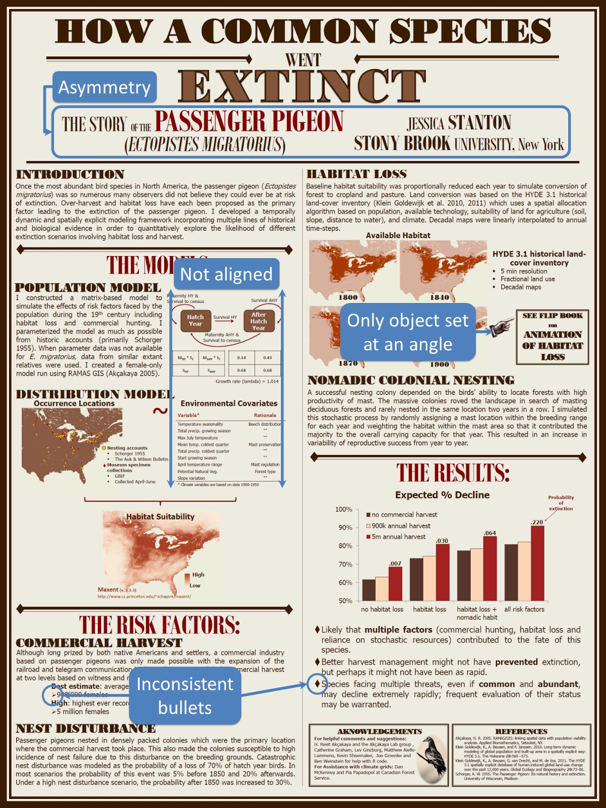
Critique: How a pigeon went extinct

Jessica Stanton was kind enough to send this poster, which she presented at Student Conference on Conservation Science in New York this past fall. She wrote:

I got a ton of really positive feedback on my poster. In fact, I won a Best Poster award!

I can see why. She made some bold design decisions here. Click to enlarge:


I asked Jessie if she would share a bit of her design process.

Because this species went extinct in the wild around 1900, I thought it might be neat to go with that time-period as a theme. I looked at pictures of old theatre posters and public announcements to get an idea of the font, spacing, and other details like borders and other little embellishments. I selected sepia toned colors to give it an aged look.

For comparison,  here’s a newspaper I found by searching for “nineteenth century American newspapers”:


Starting from a real “found” object is a good way to design something. It means you have a visual style that works, and that most other people will probably “get.” And it requires a little more active decision-making than a pre-set PowerPoint template.

I was a little nervous about it looking too kitschy and not professional so I tried to keep the more stylized fonts to the title and section headers so that the text would still be very readable.

If it had been me,  I would have gone much further in trying to match the nineteenth century style. I would have tried to go all the way. For instance, you don’t see sans serif typefaces very often in printing from that period. Jessie used the sans serifs for readability; I’d have used a serif typeface for more stylistic continuity. But the key thing is, she made a conscious decision about using those fonts, which is all I ever ask for.

Colour at the time was expensive and rare in printing. I might have tried going completely monochrome, besides the background.

The whole thing was done in PowerPoint.

I’ve always said you can get good results in PowerPoint, if you’re willing to be very slow and very meticulous about it. A few of the issues I often complain about with PowerPoint generated posters are there, though, notably a couple of places where things to not align:


The tables in the left hand column bother me, because they have lines that draw attention to themselves, and that they don’t line up with elements next to them. The title is less of an issue, though, I would have tried very hard to keep everything in that title box symmetrical somehow.

The poster session was in the hall of mammals at the American Museum of Natural History, and it seemed very appropriate to present this surrounded by mounted skeletons of extinct animals rather than in some conference centre ballroom.

A great example of how the venue affects the poster, in ways you might not expect.

There are lots of great choices on this poster, and I think it’s lovely and different and stands out from most that I see. I just wish I could see the flip book!

External links

What really killed the passenger pigeon

P.S.—I’d be lying if I wasn’t pleased by this part of Jessie’s email:

I spent quite a bit of time looking around your site before I made my last poster for the Student Conference on Conservation Science in NY this past fall. Your advice and examples really inspired me to try and make something memorable.

Thank you!

Sandusky Telegram from here.