I got a ton of really positive feedback on my poster. In fact, I won a Best Poster award!
I can see why. She made some bold design decisions here. Click to enlarge:
I asked Jessie if she would share a bit of her design process.
Because this species went extinct in the wild around 1900, I thought it might be neat to go with that time-period as a theme. I looked at pictures of old theatre posters and public announcements to get an idea of the font, spacing, and other details like borders and other little embellishments. I selected sepia toned colors to give it an aged look.
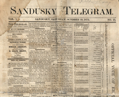
For comparison, here’s a newspaper I found by searching for “nineteenth century American newspapers”:
Starting from a real “found” object is a good way to design something. It means you have a visual style that works, and that most other people will probably “get.” And it requires a little more active decision-making than a pre-set PowerPoint template.
I was a little nervous about it looking too kitschy and not professional so I tried to keep the more stylized fonts to the title and section headers so that the text would still be very readable.
If it had been me, I would have gone much further in trying to match the nineteenth century style. I would have tried to go all the way. For instance, you don’t see sans serif typefaces very often in printing from that period. Jessie used the sans serifs for readability; I’d have used a serif typeface for more stylistic continuity. But the key thing is, she made a conscious decision about using those fonts, which is all I ever ask for.
Colour at the time was expensive and rare in printing. I might have tried going completely monochrome, besides the background.
The whole thing was done in PowerPoint.
I’ve always said you can get good results in PowerPoint, if you’re willing to be very slow and very meticulous about it. A few of the issues I often complain about with PowerPoint generated posters are there, though, notably a couple of places where things to not align:
The tables in the left hand column bother me, because they have lines that draw attention to themselves, and that they don’t line up with elements next to them. The title is less of an issue, though, I would have tried very hard to keep everything in that title box symmetrical somehow.
The poster session was in the hall of mammals at the American Museum of Natural History, and it seemed very appropriate to present this surrounded by mounted skeletons of extinct animals rather than in some conference centre ballroom.
A great example of how the venue affects the poster, in ways you might not expect.
There are lots of great choices on this poster, and I think it’s lovely and different and stands out from most that I see. I just wish I could see the flip book!
External links
What really killed the passenger pigeon
P.S.—I’d be lying if I wasn’t pleased by this part of Jessie’s email:
I spent quite a bit of time looking around your site before I made my last poster for the Student Conference on Conservation Science in NY this past fall. Your advice and examples really inspired me to try and make something memorable.
Thank you!
Sandusky Telegram from here.


1 comment:
Just found this blog via ChemBark. Awesome stuff. Keep up the good work!
Post a Comment