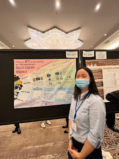
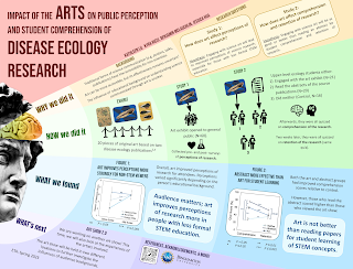
I was scrolling through the #SICB2023 hashtag for the 2023 Society for Integrative and Comparative Biology meeting. Among them was this gem from Kathleen Lu. Click to enlarge!
Kathleen is an undergraduate at The State University of New York Binghamton. I was struck by the unusual layout and topic. It’s a little rare to see a poster with the word “arts” featuring prominently in a biology conference.
I was more interested in how this poster came to be than critique it, so I had a few questions that Kathleen graciously answered.
Q: How did you arrive at the concept for the poster? Were there others you tried before settling on what you used?
A: When starting the design process, I knew I wanted it to be
non-traditional. The topic is about how traditional science communication methods aren’t always the best, so I was trying to illustrate my point a little. I played around with a few ideas before settling on one. I sketched some out in pencil and showed them to my lab group and we decided on our favorite one. Another idea was a paintbrush and splotches of paint to divide each section.
Q: What software did you use? (People always ask.)
A: Text and figures were formatted in Google Slides. I used Krita (a free digital illustration program) to make the background.
Q: What response did you get at the meeting?
A: I was surprised at how positive the response was! I was surrounded by all these hardcore biology and chemistry posters so I was worried that people wouldn't really care about mine. But there were a ton of people interested in science communication and education. I had some teachers and artists approach me, and one was interested in writing an article about the project. Overall, it was a great experience and I had fun talking to all the researchers at the SICB conference.
 Q: Now that it’s done and you have a bit of perspective, is there anything you thought worked really well or things that you might want to change?
A: I thought the unconventional design worked out very well. The colours made it stand out. After going to a few poster conferences I’ve realized that being eye-catching really makes a difference. It was also a good idea to include photos of the art and exhibit in the QR code; I had a few interested people actually scan it.
If I could change something I’d probably try to make the text on the graphs bigger and in general make the graphs a little more aesthetically pleasing.
Thanks, Kathleen! (Kathleen also scores many points with me for presenting in a mask. Excellent public health practice!)


No comments:
Post a Comment