Diego Salvatierra analyzes a trend in web design, “Boxmoji” 📦😀. The two key components of the style are emojis everywhere and thick black lines. He writes:
The flat colors, no outlines, and fullwidth photos of the 2010s now feel too adult for a new decade that has become all too dreary in its headlines. We want playfulness and whimsy, and a certain simplicity. The retro return to nerdy, boxy, early Internet aesthetics gives us just that.
As emojis have gotten ever easier to add to documents (the built-in Windows emoji menu has become a routine part of my social media use), remains to be seen if conference posters might start to adopt this visual style. Or parts of it, anyway.
• • • • •
Michael Correll runs through several bad ideas in data visulization. For example:
Glyphs are so bad at communication and so reliant on poring over the legend that they are mostly used for designers to show off rather than actually solve any real problems.
Warning: Contains parody.
• • • • •
I want to understand this paper about online poster sessions, but the abstract is not helping me.
The poster session succeeded at creating a virtual space for social learning, reflecting on social norms in science, and for asking questions about research through a cognitive apprenticeship model.
It looks like: We did a poster session, looked at who talked to who, and asked students what they thought.
• • • • •
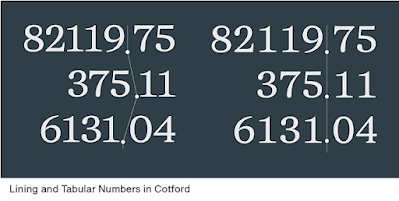
We have uppercase and lowercase letters, but we also have uppercase and lowercase numbers – though they aren’t called that much today.
We also have numbers specifically for tables.
MyFonts walks you through the helpful varieties of number forms.
• • • • •
This abstract looks at people who authored oral presentations at an oncology conference. I think it shows that people who present posters are more likely to keep presenting at the meeting for five consecutive years than people who gave an oral presentation? But I find the way things are described a little confusing.
• • • • •
A compilation of ways that data visualizations can be misleading. Hat tip to Alberto Cairo.
And that’s all for this month!


No comments:
Post a Comment