
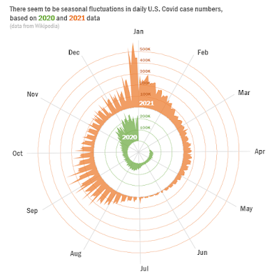
Opinion is split on this New York Times graph:

This spiral is showing the same thing as this:

A lot of people were dunking on the circular top graph. Zach Freed, who wrote, “Literally no reason to make this graph into a spiral.”
But several data viz folks perked up to defend it (here, here, here, here, here, here). (I’m not pasting in the quotes because I want to finish this post.)
And there are already remixes floating around. Amerlia Wattenberger has several.
I am more on the “detractor” side than “supporter” side. To me, this looks a lot like being different just for the sake of being different. And I don’t like that distance from center seems to be purely arbitrary.
Yeah, but we’re talking about the graph and not the data or the ideas in the article.
It’s like when CERN announced the confirmation of the Higgs boson on slides using Comic Sans. Suddenly, people were talking about the typeface and not the data or the significance of the discovery.
The big potential advantage of a circular graph is that it is the best way to show circular data. If the big point of the graph was to explore whether COVID-19 was seasonal, yes, then this would start to make a lot more sense.
But that’s not what the article is about. Besides, even if the point was, “COVID-19 sure looks seasonal, peaking in December,” that’s n = 2 in any case.
I think Alyssa Fowers’s point that this is at the top of an op-ed article is relevant. I don’t think this is meant to show data; I think this is intended as an illustration that is based on data. I am willing to be the phrase
“Spiralling out of control”
was uttered at some point in a story meeting. And that was the driving force leading to this graph.
Regardless of whether this plays in the “paper of record,” where people are expected to be able to spend all the time they want poring over it while sipping a hot beverage, I absolutely would not recommend this kind of graph on a conference poster.*
One of the main reasons we standardize graphs is that you don’t have to re-learn and decipher graphs anew every time. In a poster session setting, where people are busy and distracted, it’s a little rude to foist a non-standard graph on your audience if another type of graph is a much more common way of showing the data.
* Unless you were trying to show seasonality. And if you were trying to show seasonality, I would explictly annotate that on the graph.
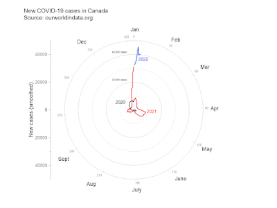
Update, 8 January 2022: This makeover from Joe Travers is closer to what I might do. I would want some way to put the two years on the same scale, though.
Another update, 8 January 2022: I should be writing a syllabus, not remixing graphs. Yet here I am.
This is a quick and dirty proof of concept. Yes, I know the months are sloppily positioned. Yes, I know there are other things that need fixing. But I was too curious what a circular plot looked like.
Dates are a pain to work with. Spreadsheets and graphing software really, really, really want your dates to include a year and add one if you don’t. Not to mention leap years, like 2020 was.
The spiral graph was by Gus Wezerek and Sara Chodosh, though
it's not clear if one or both were responsible for this particular
graph.
External links


No comments:
Post a Comment