
Today’s poster comes from Vladamir William. It was presented at 2021 De La Salle University Research Congress in the Philippines back in July. Click to enlarge!

I appreciate that this summary is less that 3 minutes long!
Vladamir wrote:
I wanted to highlight as much as possible the readability of the text when read on a screen, and put emphasis on the figures; opting to exclude any redundant design elements, and choosing a color scheme similar to my University's colors. I used Keynote for this poster, using the standard A0 size set by the guidelines.
(Note to North Americans: A0 is a standard paper size in many nations It’s about 33 by 46 inches.)
The fundamentals of this poster are sound. It’s aiming for visuals and the layout is clear.
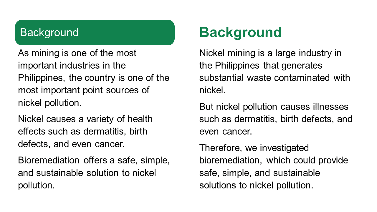
Vladamir described the colour scheme as following the institution’s colours. This makes for consistency, but the green is very saturated and intense. The bars for the headings carry a lot of visual weight. I worry that they are drawing too much attention to themselves.
Below, I try removing the boxes and making the heading text bold and green.
De-emphasizing the heading slightly would make the callouts, currently in boxes with dotted red lines, stand out a little more.
The two callouts look a little different. The “Objectives” callout has rounded corners, while the one in the Results section has squared off corners. It would be nice to have both the same.
The results showcase one number: 587 ppm of nickel. Immediately below that, the callout provides context for that number, which is good. But putting the comparison in a callout disconnects the two numbers, which is less good. It makes it not obvious that the two are connected.
One possible revision might be to put something like, “Microorganisms tolerated over 7× more nickel than typical soil concentrations” as the graphic representation. Then, fine print could give the detailed numbers. For example, “Nickel in soil: 4-80 ppm. Nickel tolerated: 587 ppm.”
Finally, the “Future directions” list strikes me as a little busier than it needs to be. Big green checks, and highlighted text, and a shadow box behind each list item.

Let’s see what happens if we pull back on one of those three.


I like the checks and think those alone might do the job. But something that removing the other colours does make much more obvious is that the text is not aligned.
Here’s how those changes play out when you put that section back in context. Here’s no shadow boxes...

And no highlights.

The checks alone do the job, but that might be a little sparse and uninteresting. Particularly because the tan highlights are used above, in other parts of the poster. The highlights in the “Future directions” helps bring some balance in colour, so that the tan isn’t all stuck up at the top.
Sometimes the posters that show preliminary data are the best posters because they are not burdened down by too much stuff.


1 comment:
Hi. We are Providing Admission in Bachelor of Education B.Ed , M.Ed , BBA , MBA in various indian universities. i thanks to admin to provide space to explore my views.
Post a Comment