This poster is courtesy of Emily Goblirsch, presented at the Arizona Psychology Undergraduate Research conference (AZPURC). Click to enlarge!
I like how the subject of the poster, writing and note-taking, is reflected in the design. But it does so subtly and never detracts from the main text. Some lines and circles recall looseleaf paper, and a handwritten style typeface used for the title and headings (Ink Free).
Ink Free is a little thin, and I might have looked for a typeface with a little more heft to it. The samples of handwritten fonts below show a couple that hold up a little better from a distance.
Because this meant to look handwritten, I’m not sure if the slightly off-center placement of the headings is intentional or not. The arrows is the except below are equal length.
When you are going for a hand drawn look, it’s okay to have things imperfect. But if so, you want to do things to show that imprecise placement is clearly deliberate.
There are three main colours on the poster. There’s a tan for the heading and callouts, and red and blue in the diagrams. In both, red codes for “self-explain” and blue represents “note taking.” But despite representing the same things, the colours are not the same. The colours in the bar graph are notably brighter and more saturated than in the Venn diagram.
Here’s a remake with the colours made consistent.
The fainter colours still hold up because the bars are large enough that they still read clearly from a distance.
The “Purpose” block might make more sense if it came before the “Methods” block. I think the main reason “Purpose” is where it is is because of how the the “Materials” blows out in a callout to the right, underneath “Purpose.”
Speaking of “Methods,” Emily wrote that she disliked the top of the methods section.
Emily wrote:I find it crowded, especially the “)” next to the blue line. It was unfortunate though, because the only way I could edit it to look less crunchy was a smaller font, which would stand different from the rest of the poster's font size and format.
Crowding is one space is often alleviated by editing someplace else. For instance, I might look to recover space in the “Background” section. The extensive use of bullets (circles, and greater than symbols, and numbers) chews up vertical space for little benefit.
Speaking of bullets, I’m not sure why text in Venn diagram needs bullets.
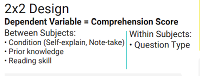
But to return to the problem of the “2×2” design (which should use a multiplication symbol instead of a lowercase letter “x,” by the way), the methods might parallel how the data are shown in the results. Show it’s a “two by two.”
| Self explanation | Note taking | |
|---|---|---|
| Text based | ||
| Inference based |
The empty cells could include a prediction, like “Highest score predicted.”
Of course, if you show results in a table, what do you need the bar graph of the same data for? And vice versa. I would prefer to keep the bar graph and remove the table in the “Results” section. Not sure if the table in the methods would still work as well.
Emily also took advantage of the online format:
Since this was an online poster, I made it “interactive” by having the references hyperlinked to the actual paper I’m citing. You just have to click on the small numbers that represent the citations. I felt like it would be odd to have a whole section for references when it was an online presentation (and we had to do the poster format).
(The images of the poster here on the blog are not clickable.)


No comments:
Post a Comment