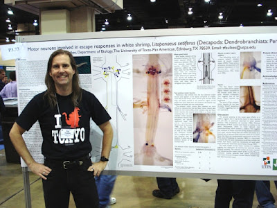
I want to explain something about the frontispiece to the Better Posters book.
The poster shown there is bad. I’ve said as much in this blog post.So why, in a book about improving posters, is the very first one a reader is likely to lay eyes on, a bad example of the format?I included that picture not because of the poster, but because of the presenter, which is to say me.
The picture is not a recent one, so I suppose some people might think I picked it because of ego: that I wanted to show myself younger than I am today. (Maybe there is a little of that. I do like how I look in that picture! And it’s got a favourite nerdy T-shirt that I don’t have any more.)
But I chose that picture as the frontispiece because that photo captured how I feel in a poster session. Happy, excited but not tense, and just... in my element. (And was even before I started blogging about conference posters!)
For many people, presenting posters is not a happy experience. For one reason or another, hey are stressed, they are tense, they are frowning.
I chose that photo because it shows the feeling I want anyone to have during a poster session. It’s the enthusiasm for the poster session that I wanted to share in the book.
Related posts
Critique and makeover: Shrimp MoGs (rhymes with “rogues”)


No comments:
Post a Comment