31 March 2021

Three things are at the core of good science communication

Very interesting report here about science communication. It tried to develop a scheme to asses what makes for good science communication, and came up with this summary diagram.

12 quality indicators for science communication. Central three pillars are trustworthiness (scientific, factual, balanced, transparent), style (clear, coherent, spellbinding, interactive), and connection (targeted, impactful, relatable, responsible).

The three key elements for successful scientific communication are (slightly paraphrased):

  1. Trust.
  2. Style.
  3. Relevance.

Most of these principles are applicable to communication between scientists, not just from scientists to non-scientists. 

To think about this in terms of conference posters:

Professional societies are usually going to trust other members (even students) by default. You have a leg up there.

Style... well, that’s why this blog exists. Many people struggle with style, but it is a solvable problem that you can address if you learn some basic skills.

For a conference setting, I suggest one tweak to the principle of connection (or relevance, as I called it above). I would rephrase “Connection with the society” as  “Connection with community.” 

“Society” is too big and nebulous. “Community” is smaller and more manageable. In particular, when trying to communicate with other scientists, you should be thinking about “Connection with your research community.”

Lots of posters (and presentations and papers) fail to gain an audience not because the science is bad, but because they don’t address the ongoing discussion within the community.

For example, if you are in a biomedical research community with a few well-studied model organisms, you are going to face a big uphill battle if your project is using a non-standard organism. 

For example, if there is some ongoing controversy in your field, you are going to have an easy time attracting an audience if your project addresses that controversy. In the last year, it was easy to get eyeballs on a scientific paper: just make sure it was about COVID-19 in some way.

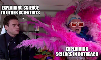
And while talking about the importance of understanding your community:

Elton John as "Explaining my science to the public" and plain dressed main as "Explaining my science to other scientists"

From here.

Hat tip to Jordan Pennells. 

External links

How to improve science communication? Consider these 12 guiding principles

30 March 2021

When can you read the Better Posters book? Update!

While I encourage you to support local bookstores and my publisher (who, let’s recall, is offering 30% off when you pre-order when you use the code “POSTERS30” at checkout), the reality is that we all know who the gorilla in the room is when it comes to books.

King Kong

(And not just any gorilla, but a 102 m tall gorilla.)

A couple of notes arising from the retailer pages for the book at Amazon, Chapters, and Barnes & Noble.

  • Retailers are currently showing the release date at 24 May, 2021. I checked with the publisher, and the book should be in the US on April 29, and make its way out within a couple of days. So you may be able to get your book earlier than the retailers are saying.
  • There will be ebook editions for Kindle, Kobo, and Nook!
  • Amazon and Chapters has pages from the book you can preview! Check them out!

External links

Bookshop.org page for Better Posters (hub for local retailers)

Amazon page for Better Posters

Chapters page for Better Posters 

Barnes & Noble page for Better Posters


29 March 2021

Why better posters mean better research

26 March 2021

The Better Posters book is on its way!

It’s happening! After a year’s delay, the Better Posters book is shipping – at least, my copies are!

Your parcel will be dispatched soon! Contents: Books.

Of course, I’m still having mild panic about shipping my book at a time when world shipping is getting totally messed up by the flipping Ever Given container ship blocking the Suez Canal.

Evergreen container ship stuck on Suez Canal.

Are any copies of my book on the Ever Given? Almost certainly not. Is this the biggest problem of having one of the world’s major economic shipping lines fubar’d? No it is not. Is this still freaking me out a little? Yes it is.

Come on, little tractor! Free the Ever Given!

Small tractor at base of Evergreen, dwarfed by ship's hull.


25 March 2021

Link round-up for March 2021

The Perseverance rover team hid a message in the rover’s parachute. You can encode a message at Encode Mighty Things website. Here’s one I did:

 
I’ll save you the stress of trying to decode it. It’s just an ad for the Better Posters book. 

• • • • •

Animate Your Science has some advice on picking typefaces for posters. I agree with most of their advice, except this: 
 
Every time a scientist uses Comic Sans a graphic designer dies
BUT there is one exception. That is if your poster IS a comic!
If that’s the case, go for it! In this context Comic Sans is perfect and it would almost be a crime not to use it.

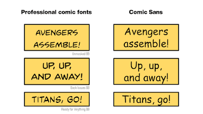
Emphatic no here. Using Comic Sans in a comic style is actually worse than in a non-comic style. Because people know what comics should look like, and they know they have never read a comic that was set in Comic Sans.
 
Compare some superheroic phrases in professional comics typefaces and Comic Sans. 
 
Comic phrases in professional comics fonts and comic sans

 
It’s painful to see the life leeched out of the words when they appear in Comic Sans.
 
I love handwritten fonts and comic book fonts. If you want to do them, do it right and get a font that pros use.

• • • • •

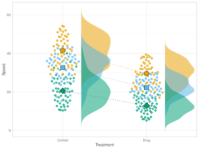
Super Plots of Data is a nice web tool for making distribution plots. There gave you some sample data that shows its features:

Dot plots of data with means and distributions


There is a technical paper about this here.

18 March 2021

Using “Two wides and a tall”

I’m red-faced. I’ve perpetuated a myth.

Since most people fashion their posters in blocks, I’ve said and written that people should avoid the “two wides and a tall” layout.

Poster layout with two wide blocks stanked on top of each other on the left and one tall block on the right.

The conventional argument against it is that English readers are taught to read left to right, and from top to  bottom. But the “two wides and a tall” layout, the argument goes,

Poster layout with two wide blocks stanked on top of each other on the left and one tall block on the right. The upper left block contains "Which way do I go?" with arrows pointing to the remaining two blocks.


Neil Cohn tested this. His research showed that when readers come across this layout, the vast majority (over 90%!) of people read down. And this is with no other cues, just panel placement.

So if you do use this layout (which I still dislike for a number of other reasons), there is a clear message: expect your readers to read down and block it out accordingly.

Poster layout with two wide blocks stanked on top of each other on the left and one tall block on the right. The upper left block contains. "Go down, not right."


External links

Dispelling myths about comics page layout

11 March 2021

Type as technology

1957 Chevy.
Australian science communicator Dr. Karl tells a story of going on vacation in the United States. They rented a classic 1957 Chevy and were going to drive the length of Route 66.

Sounds romantic and adventurous, right? It started off great. 

But it turned out the classic car was... not very comfortable. And it tended to break. It wasn’t just that the car was old. It didn’t have the same level of engineering that we’re used to. I don’t think they finished the trip in the classic car.

Now, at some level, it’s easy to look at a car and say, “Cars haven’t changed much. Still the same old internal combustion engine. Steering wheel, gas, and brakes are all in the same place.” It’ kind of easy to overlook all the decades of little refinements that make modern cars just a better driving experience.

The same is true of type. You can pick up a book from a hundred years ago and still read it easily. You might think that there has been no significant changes in type over time. But just like modern cars are better built and engineered than decades old cars, modern typefaces are often better designed than old typefaces.

Character sets are bigger. OpenType has more options than TrueType. The letter forms are more likely to incorporate fine-tuning in shape and spacing and clarity. I bet that new typefaces are more likely than old ones to distinguish the uppercase letter “I,” the lowercase letter “l,” and the number “1.” 

Besides the letters themselves, typefaces change because of the medium they appear in. The fonts used for phone books had to take into account that the paper was so low quality that the ink would bleed.

Many fonts appearing in computers today are the same as ones that appeared in computers of the 1990s. Screen resolution was a fraction of what it is now. Comic Sans was designed for low resolution screens, and looks the worse in higher resolution. 

Operating systems have tended to update their core fonts, but sometimes these are not obvious. Arial recently got a redesign, but the update was released as Arial Nova instead of upgrading the font package.

Just like the 1957 Chevy has that classic appeal but is under engineered by today’s standards, old fonts with that classic appeal might be better replaced with new fonts that do the job better.

Which is a very long winded way of saying:

Switch your damn fonts. I’m tired of looking at Calibri all the time!

Photo by Brent Moore on Flickr. Used under a Creative Commons licence.

05 March 2021

Who is the Better Posters book for?

01 March 2021

One dozen years!

Birthday cake with candles for "12".

The Better Posters blog is now twelve years old! And with the Better Posters book coming out next month, I think I can safely say that this coming year will be big and bright for this blog!

Thank you for your attention!

Photo by Pewari on Flickr; used under a Creative Commons license.