Showing posts sorted by relevance for query layout. Sort by date Show all posts

18 March 2021

Using “Two wides and a tall”

I’m red-faced. I’ve perpetuated a myth.

Since most people fashion their posters in blocks, I’ve said and written that people should avoid the “two wides and a tall” layout.

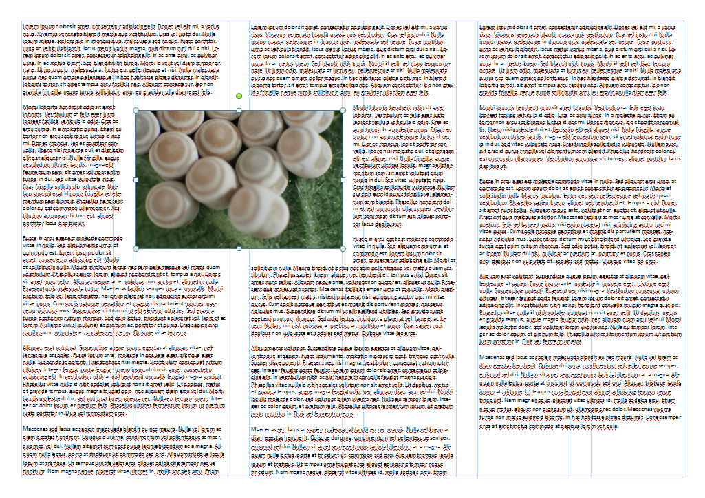
Poster layout with two wide blocks stanked on top of each other on the left and one tall block on the right.

The conventional argument against it is that English readers are taught to read left to right, and from top to  bottom. But the “two wides and a tall” layout, the argument goes,

Poster layout with two wide blocks stanked on top of each other on the left and one tall block on the right. The upper left block contains "Which way do I go?" with arrows pointing to the remaining two blocks.


Neil Cohn tested this. His research showed that when readers come across this layout, the vast majority (over 90%!) of people read down. And this is with no other cues, just panel placement.

So if you do use this layout (which I still dislike for a number of other reasons), there is a clear message: expect your readers to read down and block it out accordingly.

Poster layout with two wide blocks stanked on top of each other on the left and one tall block on the right. The upper left block contains. "Go down, not right."


External links

Dispelling myths about comics page layout

29 October 2009

Critique: Ape scapula

I stumbled upon this poster while reading the blog Anna’s Bones. She described as being finished “just in the nick of time.”

Ape scapula poster
A few more hours, and a stronger editorial hand, probably would have been welcomed.

As for the title, I’ve talked before about the use of using all capital letters and why sentence case is often preferable.

I haven’t written about the use of institutional logos very much. I understand that researchers are proud of their institutions, but ask this. How many logos of institutions other than your own do you recognize? Does it really help people to recognize who you are and what you’re about?

This is an example of a problem with institution logos. Where do you put them? Here, the logo breaks the symmetry of the title bar and makes it lopsided.

Ape scapula poster critique
The three column layout is reasonably clean, although it would be preferable if all three columns were the same width. The widest center column has quite a bit of white space compared to the ones on either side, so it probably would have been possible to even them out.

Perhaps the biggest deal breaker for this poster – the one thing more than any other that is likely to make someone walk past – is the forbidding amount of text the outer two columns. The amount (lots) and size (small) is not assisted by the complete absence of any paragraph indents, which makes the text look even more like a intimidating, uniform block of gray, rather than words conveying information.

I have mixed feelings about the boxes around each section of text. In general, I think a strong layout does not need them, but I don’t mind them too much here, given the rest of the layout. In this case, taking them away doesn’t appear to help much.

Ape scapula poster without boxes
If anything, removing the boxes exposes some of the weaknesses in the layout. For example, it becomes more noticeable without the boxes that the text in the lower right doesn't align with the text above it.

In the modification above, I also changed the title to sentence case and removed the logo to see how it would look.

21 August 2014

Critique: Megafauna

This week’s poster is from Benjamin Seliger, and is used with his permission. Click to enlarge... or perhaps I should say, “megasize.”


I would stop at this poster if I saw it at a conference. There is much to like about the design. The visuals are very strong and very prominent. I love the pictures of the megafauna, the plants, and the maps. There is not too much text.

This poster accidentally demonstrates the power of proximity and white space. When I glanced at this poster, I thought, “This is a very nice two column layout.” But I should have thought, “This is a nice two row layout.” This poster is meant to be read across first, not down, which is the opposite of what I thought from a glance.

I am supposed to see the poster elements in this grouping:


But instead I see this grouping:


The problem arises because there is a wide, generous margin between the columns, but almost none between the rows. We group things that are close together. The authors have tried to signal that these are in rows using horizontal dividers, but the “signal” from the wide margin in the middle is completely overpowering that from those skinny little lines.

That the headings are not that much bigger in size than the subheadings is not helping matters. Compare the size of “The data” to “Joshua tree” underneath it. The “Joshua tree” and “Honey mesquite” subheadings are reinforcing that this is a two column layout instead of a two row layout. I also wonder if flipping the text position (above the animal picture, but below the plant picture in the top row) is contributing.

Fortunately, the solution is simple. Make the margins between the rows bigger than the divisions between the columns. Here’s a quick and dirty revision:


Margins beat lines and boxes in signalling the organization of your material.

07 June 2012

Critique and makeover: Aptamer biosensors

I won’t go easy on this poster just because it has a crustacean on it! Today’s poster is from Jon Ashley, and is show here with his permission. Click to enlarge!


Those big boxes drawn in heavy black lines were my first problem. The lines were so thick that they draw attention to the inconsistencies in the boxes. Round corners are a problem, because you want each corner to have the same degree of “roundness.” This was done in PowerPoint, and PowerPoint automatically scales the round corners by some automatic amount with the size of the box; not sure how. Consequently, when you put two boxes of the same width, but different height, next to each other, they don’t match.

This can be fixed. Click on the box, and you’ll see a little yellow diamond on the upper left side.


You can drag that to the left or right to adjust the amount of rounding.

Besides the plague of boxes, distortion and cramming are the other two culprits here. To check if a picture has the right proportions, right click it, open “Format Shape,” and look for “Size.” Under “scale,” make sure the height and width percentages are the same!


I sat down and tinkered, with my main goals being:

  • More white space;
  • More consistency in text (mostly left aligned, less random bolding);
  • Lining things up slightly more.

I didn’t want to mess with the initial layout decisions or change the style of the poster. I just wanted to clean it up. If you look closely, you’ll see I didn’t get rid of the boxes. They are thin gray lines instead of thick black ones. I found that because the background went almost white in the middle, I wanted a very light line to demarcate the box and the background when you got up close.

This was the result:


The first poster looks intimidating to me. This one looks inviting to me. But it’s all the same material, with the same layout. I still have concerns with the layout (the layout of the Methodology section is still weak, and so on), but I am always stunned by just how much improvement you can make just by making a few small changes, like lightening up boxes.

Related posts

Boxism

30 May 2025

A quick way to assess posters

"A rubric for poster assessment" on a graphic background.
If you are looking for a rubric to assess conference posters quickly, this might fill the bill. This rubric has gone through a couple of versions. This is the most recent, presented on a poster this summer and archived on ResearchGate.

There are four categories:

  • Layout
  • Science-based order (IMRAD)
  • Use of graphics
  • Central message communicating (Wordy and / or busy)

Each of these categories gets a score from one to four, with one being worst (“Poor”) and four being the best (“Superior”). I’m going to present the criteria for each score in lists. At the end of this post, I’m going to put a version of this table that looks horrible on the blog, but that you can cut and paste easily.

Layout

  1. Poor: Neither clean nor straightforward
  2. Sub-par: Much left to be desired / better (4 column?)
  3. Acceptable: Some left to be desired / better (3 column?)
  4. Superior: Information clean, straightforward, organized

Science-based order (IMRAD)

  1. Poor: Much disorder/chaotic, no references
  2. Sub-par: Some disorder (or missing), no references
  3. Acceptable: Disorder and references or order without references
  4. Superior: Good order and one or more references

Use of graphics

  1. Poor: Visually unpleasant
  2. Sub-par: Much left to be desired / better
  3. Acceptable: Some left to be desired / better
  4. Superior: Visually helpful, eye catching, pleasant to eyes

Central message communicating (Wordy and / or busy)

  1. Poor: Very distracting and hard to review / understand (‘wall of text’; very busy and / or very wordy)
  2. Sub-par: Distracting and hard to quickly review/understand (majority was text; busy and / or wordy)
  3. Acceptable: Decent communication (some wordiness but could be quickly reviewed / understood)
  4. Superior: Concise communication (neither busy nor wordy, use of bullet points, easy, and quick to review/understand)

Table showing rubric for poster assessment. Categories are "Layout," Science-based order," "Use of graphics," and "Central message communicating."

 Now that you know what the rubric is, let me address who developed rubric, how it was developed, and why I’m writing about it.

Michael Peeters and colleagues have published a trio of papers, likely with more to come, developing and testing the rubric presented above. The papers mostly revolve around ensuring that the rubric above is reliable. If you are not in developing and validating assessments, the technical details in the paper probably need not concern you.

They also compare their rubric to two other methods of assessing posters: a more detailed, analytic rubric, and a more holistic assessment. The rubric presented above gives similar results to the analytic rubric, but the analytic rubric takes so much longer to score that is may not be practical. The holistic rating scheme was faster yet, but the reliability took a hit.

The bottom line to date: This rubric is a good mix of reliable and practical.

I’m interested in research on one of the new posters, which uses this rubric to try to tease apart what people are responding to when they make decisions about whether to give posters a “1” or a “4” in each category.

The team find three things lead to higher scores. In no particular order:

  1. No abstract! (I’ve been beating that drum for years.)
  2. Having references.
  3. Having a QR code. (This puzzles me. Sure what the code is used for should matter?)

The poster also indicates poster type matters, but doesn’t go into details.

References

Khadka S, Holt K, Peeters MJ. 2024. Academic conference posters: Describing visual impression in pharmacy education. Exploratory Research in Clinical and Social Pharmacy 13: 100423. https://doi.org/10.1016/j.rcsop.2024.100423

Peeters MJ, Gonyeau MJ. 2025. Comparing analytic and mixed-approach rubrics for academic poster quality. American Journal of Pharmaceutical Education 89(3): 101372. https://doi.org/10.1016/j.ajpe.2025.101372 

Peeters MJ, Cor MK, Castleberry AN, Gonyeau MJ. 2025. Comparing holistic and mixed-approach rubrics for academic poster quality. American Journal of Pharmaceutical Education 89(4): https://doi.org/10.1016/j.ajpe.2025.101379

Peeters MJ, Kaun MA, Schmude KA. 2025. Poster type enhances academic conference poster quality. AACP Annual Meeting 2025. https://www.researchgate.net/publication/391907265_2-yr-RevisedMAR_AACP2025 (ResearchGate login)

Peeters MJ, Cor MK. 2025. Academic conference poster quality rubric Version 2.0. AACP Annual Meeting 2025. https://www.researchgate.net/publication/391907268_MAR20_AACP2025 (ResearchGate login)

External links

Michael J. Peeters home page

Michael J. Peeters on ResearchGate

Rating Score Layout Science-based order (IMRAD) Use of graphics Central message communicating (Wordy and / or busy)
Poor 1 Neither clean nor straightforward Much disorder/chaotic, no references Visually unpleasant Very distracting and hard to review / understand (‘wall of text’; very busy and / or very wordy)
Sub-par 2 Much left to be desired / better (4 column?) Some disorder (or missing), no references Much left to be desired / better Distracting and hard to quickly review/understand (majority was text; busy and / or wordy)
Acceptable 3 Some left to be desired / better (3 column?) Disorder and references or order without references Some left to be desired / better Decent communication (some wordiness but could be quickly reviewed / understood)
Superior 4 Information clean, straightforward, organized Good order and one or more references Visually helpful, eye catching, pleasant to eyes Concise communication (neither busy nor wordy, use of bullet points, easy, and quick to review/understand)

04 June 2009

Review: Preparing Scientific Illustrations

When I was starting this project, I thought, “I should read what books there are on the subject.” And I came up nearly empty. One of the few to pop up when searching for “research posters” or “scientific posters” was Preparing Scientific Illustrations. The subtitle includes the title of this blog, so how could I not look at it?

This book was written in the mid 1990s, and it has not aged well. There are many references to computer and printing technology that is almost dead and buried. For example, I haven’t thought about Letraset or lettering machines in ages, but they feature here.

As for posters, this book was pretty clearly written before the introduction of many large plotter printers into universities and graphics shops. The underlying assumption seems to be that a poster will have to be produced and tacked up piecemeal. “Piecemeal” also a good description of some of the examples of poster layout shown (this one from page 144):


There is little indication that the author is thinking about a grid, which is the foundation for poster layout. The layout shown is scattered and disjointed, with strange gaps between sections and uneven columns. The flow of reading is certainly correct.

There is good advice in this book. For instance, there is a reminder for posters that many of the audience have reached “bifocal age,” as Briscoe puts it, so making lettering large is of the utmost important. Nevertheless, once you sift through the outdated information, the advice that is left feels insubstantial. There are many declarations, but no exploration of underlying principles of graphic excellence. Consequently, Preparing Scientific Illustrations does not fare well when compared to something like Edward Tufte’s The Visual Display of Quantitative Information.

References

Briscoe MJ. 1996. Preparing Scientific Illustrations: A Guide to Better Posters, Presentations, and Publications (2nd Edition). Springer-Verlag: New York. Amazon

28 May 2009

Critique: SoDA

The commercial printer, PhD Posters, has a gallery where this is described as, “One of the best I’ve ever seen – perfect balance of color and line. Even the figures match the color scheme!” (Click to enlarge.)


This is a very nice poster indeed. The consistent colour scheme is indeed a simple, but underused element of poster design. It indicates that the authors honed their graphics specifically with the poster in mind, and that they didn’t just dump figures prepared for a journal article or slide onto the poster.

Is there room for improvement? Maybe some small ones.


The column widths are uneven. The width of the first column is shown by the horizontal cyan bar in the left and center columns. Fortunately, in this case the unevenness is so slight that it’s not noticeable at first. Still, it’s surprising given how much attention has been paid to the poster.

Otherwise, the major question is whether so many lines are necessary. The layout is so crisp that nobody is likely to have any problems following the flow through, making the numbers unnecessary. Similarly, the horizontal diving lines seem to serve little purpose. The vertical dividers are more understandable, given that the authors chose to set their text ragged right.

Finally, some figures are set up in boxes, but others are not. And the line heaviness of the boxes are inconsistent, with the ones on the right more prominent that the one at bottom center.

Here’s the poster with some of these possibly extraneous elements removed.


I’m not sure whether the edited version is a substantial improvement, but I think it does point out that when the basic layout is solid, a reader doesn't need a lot of help in deciding what to read next and won’t be confused about which elements belong together.

The gallery has many other interesting posters, with some innovative layout designs.

10 January 2019

When posters fail

When a poster fails, it’s usually because it failed early in the design process.

Years ago, I showed this poster:

Poster overflowing poster board and spilling onto floor

It does not matter whether this poster does a lot of the detail work right. It does not matter how good the layout is, or how good the typography is, or whether the colour scheme is consistent and pleasing to the eye, or whether there is enough white space. None of that matters.

The authors of this poster doomed it at the very beginning, when they picked a page size... and got it wrong.

In my experience, there are two places where posters fail early on.

On the content side, people do not edit enough. They want to include everything, rather than focusing on one thing, and the poster suffers.

On the design side, people do not make a grid. They start drawing boxes without any underlying thought to structure, and treat their data like some sort of jigsaw puzzle to fit together.

I was reminded of the while I was making a poster for the Student and Post-Doctoral Affairs Committee (SPDAC) for the recent Society for Integrative and Comparative Biology (SICB) meeting in Tampa (#SICB2019 on Twitter).

This poster was not a typical data-driven poster. Authorship was on my mind, and I wanted to do some consciousness raising about this issue to early career researchers.

What struck me was how little the poster changed from beginning to end. You can see this in the animation:

Animation of SICB authorship poster creation

Here are a few frames from that process. I had created a six column grid template for a poster class I was doing for SPDAC:


I decided to used that as a basis for a three column layout. And I knew what kind of graphic I wanted*. And those were apparent in the very first stages of layout, shown below:

Draft one of SICB authorship poster

Even as the poster is filling out, the underlying structure stays the same:

Draft two of SICB authorship poster

And here is the final version:

Final version of SICB authorship poster

Looking at it now, I should have made the title bigger. Oh well.

I have noticed a similar pattern when I’ve created animations of my design process before (here and here). This first one from 2015 keeps the same five column structure throughout the design process. A second one (from 2017) has a little more movement early on, but quickly settles down.

While you can see in the animations that a lot of time is spent tinkering. But the late stage tinkering is the polish that will differentiate the “okay” from the “excellent.”

It’s the early stage decisions that make the difference between “competent” and “embarrassing,” “okay” and “crap,” “success” and “fail.”

* From this blog post: 


(T)wo chess pieces suggest conflict. But if you know how knights move in chess, the reality is that neither can capture the other. In other words, from the point of view of those pieces, it’s a “no win” situation.
I think that represents most authorship disputes pretty well.

Related posts

Posters should not be usable as drapes
A poster with no conference, or: What I made in that #SciFund poster class
Critique: Sand crab summer

09 July 2009

Critique: Oligonucleotides

This poster, by Peter Guterstam and Ülo Langel, was featured on ePosters.net as an award winning poster at a conference in September 2008. Typically, such awards are given for the science as well as the graphics, but here, let’s examine it for just the visual impact.

Guterstam and Langel poster
From the point of view of pure visual impact, this is very disappointing.

The first author’s name is underlined in a couple of places. Underlining is not a good way of emphasizing, because the horizontal line obscures the shape of the descending letters. Bold or italicizing is usually better. Perhaps the conference organizers specified that the presenting author must underline the name?

The layout is unattractive, with a strange split between a two column layout at the top and a three column layout underneath. This might work if there were better alignment, but the margins of the top columns are wider than those of the bottom.

The flow is so poor that the authors had to draw a dividing line – a zigging, zagging, dividing line – to show readers where to go next and prevent someone from wandering into the figures accidentally.

Similarly, having the conclusion in the middle of the poster is rather strange. Normally, people will be looking for the end of the poster in the lower right hand corner. That’s where we end up every time we read a page of a book or magazine or newspaper.

The text is large and mostly quite legible. If the text is high contrast enough to be printed against a blue background, however, why are the figures printed in black ink against a white background? For that matter, why is the table set in serif font when the rest of the poster is set in sans serif?

Guterstam and Langel poster critique.jpg
Finally, the figure captions are in odd places, and generally do not leave enough space between the figure and the text. This is particularly true in the lower left hand corner. The text and picture almost touching in the horizontal is more puzzling, given that there is a fairly large gap above the picture.

01 March 2018

Critique: RNA capping

Today’s contribution comes from Melvin Noé González. It was presented at an RNA meeting at Cold Spring Harbor Laboratories. Click to enlarge!


He writes:

Through the years I experimented with various templates for poster presentation, and I’m proud to say I’m really happy with how this one turned out. As you will find, I used a piece of advice you mentioned in one of your posts regarding a short summary section — and people loved it! I was approached by several people just because they thought the layout was cool, even though I wasn’t related to their research.

I’m always glad to have feedback that advice works!

The title bar works well, by presenting everything cleanly. The logo is sensibly over to one side, and blends into the background. The authors names are prominent, with institution and contact information legible, but low key.

This poster is well organized, which helps walk you though what is maybe a little too much material. The numbers by each heading ensure you don’t get lost.

Some of the layout would benefit from a little more tweaking. The spacing between the boxes is inconsistent. The margin above the “Graphical summary” are wider than the margins between the “Background” boxes and the data boxes on the right.

There’s one place where this poster goes off the rails. Fortunately, it’s down in the fine print section, in the acknowledgements and references. While I appreciate how beautiful that three-dimensional molecular structure is, and how much it adds visually to the poster, it does terrible things to the text around it.


It’s tearing that text apart.

When we read, we expect related text to be close together. When I look at the “Acknowledgements,” I see two blocks of text that I want to read separately.


But how you are supposed to read the acknowledgements is far more complicated. What I thought was the first sentence of the first text block is the third fragment of the entire acknowledgements section.


Just when I think I have gotten used to the lines broken into two pieces, the second to last line gets split into three pieces.

The same thing happens in the references, with a DOI number danging far from the “doi:” text identifying it.

Wrapping text around an object can look graceful and elegant. But you cannot just “set and forget” a setting in your layout software. You have to be willing to go in and adjust things by hand to avoid these kinds of problems.

02 December 2010

Grids on grids

You can’t go too far wrong with a three column grid on a poster.


If it’s very wide poster, 5 or 7 or some other odd number of columns might be appropriate. But I will admit, a straight three column grid can all get just a little... rectangular.


Here’s a trick I learned from the Babylonians. The Babylonians are the ones we have to blame for our twelve hour days. The Babylonians like counting in twelves, rather than ten. Ten can be halved... or divided into five. Twelve can be divided into two, or three, or four, or six. Much more practical.

Create a grid that can be divided in lots of different ways. Or, to think of it another way, create a primary grid (three columns) and lay a secondary grid on top of that. Here, a two column grid superimposed on each main column. That is, six columns total.

Now you’re still following a grid, but you have more options for placement, and you can create a little more visual interest without sacrificing a disciplined layout.


You see this technique from time to time in journal articles, which might have a two column text layout, but will occasionally throw in a figure that is two-thirds of a page wide.


Better to make a complicated grid than abandoning a grid.

23 April 2020

Are posters right for online meetings? Thoughts from The Allied Genetic Conference virtual poster session #TAGC20

I have been watching many academic conferences move to online presentations this year with great interest. I want to see how they are going to do it and how well each format works.

In my Twitter feed today are discussions from The Allied Genetic Conference (#TAGC20). They have made their content free for anyone to view. Their poster session guidelines are here.

TAGC is handling their poster sessions by having people upload PDFs of their posters to Figshare, which has created a special collection for posters from this meeting. All the posters are available to view now, and no more can be uploaded. You can search through categories, or by keyword. (Zero hits for “crustacean” – d’oh!)

Here is an example of a poster where the presenter, Katja Kasimatis, recorded a ten minute walkthough to go with the PDF. Abigail Feresten did both a two minute and a ten minute version of her walkthrough (I think the short version was part of a “Poster preview” that is mentioned on the session guidelines but not completely explained.)

Finally, there will be Q&A sessions next week. I’m going to try reaching out to presenters to see how it goes. The FAQ notes there these Q&A sessions are not going to be archived.

Poster Q&A sessions will not be made available beyond the live discussion, so presenters may choose to discuss data in those sessions that they are not comfortable publishing on their poster.

The TAGC FAQ contains some interesting advice about format.

Although any dimensions can be used, remember that attendees will be viewing posters on their computer screens. ...

We recommend arranging information blocks like

1 > 2 > 3
4 > 5 > 6
7 > 8 > 9

instead of the print poster tradition of

1 4 7
2 5 8
3 6 9.

In other words, layout your poster in rows instead of columns. This makes sense, as the idea is that you are going to scroll down, and you don’t want people to have to scroll back to the top of the page all the time.

But if you’re going to do that... why not just a single, continuous column?

The TAGC20 advice on layout, probably without them realizing it, strikes at the heart of something I have been thinking about a lot with online poster sessions.

What, specifically, makes an online poster presentation a “poster”?

In this format, you are first uploading a document to Figshare. Why make that document mimic a single large piece of paper? Why not just upload a manuscript?

In this format, you have the option of uploading a video walkthrough. Why show section after section of a single large page? Why not just upload a slide talk?

The conference poster has always been a strange hybrid format that was born out of necessity more than anything else. If conferences go ever more online (an existing trend that the COVID-19  pandemic is only accelerating), we should not continue to have posters just because, “We’ve done it that way for decades.” Maybe there is no need for posters to continue in virtual conferences.

External links

TAGC Virtual poster session guidelines
TAGC Figshare collection

10 January 2013

Review: Writing in the Biological Sciences

I was sent a copy of Angelika Hoffmann’s new book, Writing in the Biological Sciences, by the publisher, unbidden. It’s been long enough that I initially forgot I wrote almost the same thing a couple of years ago, almost to the day, when I got a book called Scientific Writing and Communication, by the same author. I reviewed that here.

I had forgotten the previous book when I first opened this one. So, as I often do, I looked for a whether there was chapter on posters – there was. I got about four lines in before I started arguing with the author in my head. And looking back at my review of the previous book, it’s the same point: putting abstracts on posters. And I don’t understand why she says that posters don’t have Discussion sections....

Based on the poster chapter, and the comparative thicknesses of the two books, Writing in the Biological Sciences seems to be a cut down and slightly revised version of Scientific Writing and Communication. The poster chapter is short, just 12 pages out of a 290 page book, which is shorter than the 16 devoted to posters in Scientific Writing and Communication. The artwork is black and white, and a few of the graphics have changed. The sample layout is not the same one I showed in my earlier review.

There is a “Useful resources” section with four links, with horrible long URLs, that were checked in... October 2011. Given that when I reviewed the previous book, many of the links were dead, so I checked again. After over a year of lead time, guess what? The first link is to Colin Purrington’s now-dead site at Swathmore College (but a new version is here). I’ve typed the links to the other three so you don’t have to:

Everything in my review of Scientific Writing and Communication, I will stand by for Writing in the Biological Sciences. There have been some changes, but no substantial improvements.

Reference

Hofmann, AH. 2013. Writing in the Biological Sciences. Oxford: Oxford University Press. 290 pages.

Related posts

Review: Scientific Writing and Communication
Review: A Short Guide to Writing About Biology (Seventh Edition)
Review: Scientist’s Guide to Poster Presentations

External links

Book website

Companion site to book (not active as of 8 January 2013)

13 March 2025

Critique: No grave mistakes

This poster comes from Spencer Moore. Click to enlarge!

Poster titled "Stone Testimonies: The Archaeology of LDS Symbolism in Mountain View Cemetery."

I’m super pleased to have posters that are not from the traditional sciences. This one is off to a good start. 

This posters had a big advantage, because the research itself is about the use of imagery. That can provide entry points for a viewer. If I were browsing in the conference hall, I would look at this and be convinced I could get something useful in five minutes.

The top of the poster features a curve that is reminiscent of the top of many grave markers. I am torn between making the visual connection to a stone stronger, or leaving it subtle.

The first place I would look for improvements is in the layout of those graphics. For example, here’s a close up of the lower left corner:

Examples of Momon imagery take from gravestones.

I want to see those symbols positioned more carefully. Currently, they are different shapes and sizes, and only the top edge of the second row aligns. Let’s try a couple of different grids.

There are nine image, which would suggest a three by three grid. The top image is so wide that it will not make it easy to make every image the same width. So to create an orderly grid, we want all the smaller images to be an even fraction of the top one (e.g., one third, one quarter).

Here is the first version I tried. The layout created a space in the lower right, where I put a description of figures.

Mormon imagery from gravestones in four rows and three columns, with the caption in the space in the lower right.

The images in the bottom rows are not the same height, so I filled in the background with a similar colour using the eyedropper tool. (Other tricks to harmonize shapes in a grid are in the Better Posters book!)

Here is another option:

Mormon imagery from gravestones in three rows and four columns, with the caption in the space in the lower right.

Speaking of alignment, it would sure be nice if “Background,” “Analysis,” and “Discussion” were all on the same line instead of “Analysis” dipping below the other two. There are lots of other places where more attention to alignment would significantly improve the poster.

If I were making deeper revisions, I might try to put all the imagery together, instead of one set in the left column and another set in the right column.

Another possibility to clean-up the images is being more selective. For instance, on the left side, there are four images of temples. True, they are different temples, but maybe only one is needed to represent that category. Similarly, there are four examples of "linguistic symbolism" on the right. Maybe one is enough.

The central figures both show the same thing: an increase in Mormon symbols over time. Again, maybe only one is needed. Alternately, maybe try to change the second graph to emphasize the increase in the types of symbols, not just the raw number of them.

Both graphs might have an indication when two events mentioned in the introduction happened: temple construction in 1945, and the change in church teachings in 1972.

As for the text, I’m not a fan of the bullet lists, particularly using the visually complex “black diamond minus white X” (❖). 

The “Background” section currently lacks a clear problem that explains why the research was undertaken. The “Discussion” section suggests a possibility when it mentions, “The frequency of LDS symbols indicated increased community representation before it was reflected in the census.” Oh, now why would that be? Can we see some census data in the “Analysis” section for comparison?

The “Methods” are so short and simple that they might be moved into figure captions.

Before and after comparison of nine images of Mormon grave symbolisim. Left: Images not aligned in a grid. Right: Images aligned in a grid.

After I shared an earlier version of some of these comments, changes were made. Click to enlarge!

Poster titled "Stone Testimonies: The Archaeology of LDS Symbolism in Mountain View Cemetery."

 Definitely better!

Thanks for reading, and remember: Make a grid whenever you can!

29 April 2010

Poster real estate

Not all the “real estate” on your poster has equal value.

The upper left hand corner of your poster, just below the title, is Boardwalk. The lower left hand corner is Mediterranean Avenue.

The vertical dimension is the most important consideration in determining the prime real estate on your poster. That key space on the poster is a band from about five to five and a half feet off the ground. That is normally considered to be eye level for a large number of people. Your poster may not hit this exactly, because of the particular mounting scheme at your conference.

Assuming you put your title at the top, and that your poster has a standard horizontal layout, this means that the most valuable space on your poster is from the top of each column, to about a third to a halfway down the column.

Eye level is the place where people standing and walking by will look the most, so you want to put your best material there. If you have a three column grid, for instance:

  • Top left: Put a compelling question that your research asks.
  • Top center: Put your key results.
  • Top right: Put the take home message.

The title of a poster is usually a bit above eye level. This is great for people walking by, because they will be able to read your title even if you have a crowd around your poster that are listening to your presentation in rapt attention. But the very top of your poster is usually a little too high for someone actually reading the poster. Your title works like the highway sign for a gas station of fast food restaurant: you want someone to be able to spot if from a distance, but don’t expect them to look at it once they get there.

The bottom of the poster, below eye level, is the least valuable region of the poster. People will tend to overlook material there, unless you draw it to their attention. And everything there will be harder to read, because it’s farther away from the eye.

Those regions are good for the details that aficionados and experts might insist on seeing, but that aren’t critical to the story you’re telling. Again, assuming a three column layout, it might look something like:

  • Bottom left: Detailed methods.
  • Bottom center: Supporting results.
  • Bottom right: Acknowledgments to funding agencies and references.

The horizontal position of material on the poster, which not as critical as the vertical, still comes into play. The left side is more valuable than the middle or the right side, because that is where people automatically look when they start glancing over your poster.

So in that upper left side, you want to have an entry point that is attractive, punchy, concise; a conversation starter that draws someone in.

That lower right corner, the lowest value real estate, is a natural place for “fine print” that is necessary, but that people rarely read.

Related posts

Entry points: Five ways to make your posters more inviting

04 August 2011

Link roundup, August 2011

Over the last few weeks, I’ve seen various article that weren’t quite enough to trigger off my own post, so a linkfest is in order!

Layout


Jim Campbell discusses a comic page layout that doesn’t work.

Less relevant to posters, but also worth checking out, is the problems emerging from forgetting that people read left to right.

Typography


There are certain epic battles that just never end. Kirk versus Picard. Coke vs. Pepsi. Serif versus sans serif typefaces. This lengthy post, however, has more research ammunition to back it up than you usually find in this debate. I like this assessment of the problem near the end:

What initially seemed a neat dichotomous question of serif versus sans serif has resulted in a body of research consisting of weak claims and counter-claims, and study after study with findings of “no difference”.

Graphs


For those looking for new ways to present numeric data, check out the
slopeograph.

Conferences


The new president of the Animal Behavior Society describes how to judge a poster competition. I am interested that she thinks the content should be the only thing posters should be judged for:

What should the criteria of excellence be? I think there is only one: the best, most creative, innovative science.

QR codes


At Museum 2.0, Nina Simon talks about how she used QR codes in museum displays. Many of the issues she describes are exactly those faced by people who want to enhance their posters. Her tip? Don’t just put the code: tell people what they’ll get!

23 April 2009

Set your own

Most posters for presentations are made by amateurs. They are made by researchers or students or other professionals who have never learned how many picas to an inch.* That’s perfectly understandable, and I don’t expect every poster presenter to embark on a detailed study of typography before drawing up a poster. But recognizing that there is a body of knowledge, a discipline of serious craft around typesetting and layout created by disciplined practitioners must only help.

QuotesHere is a list of things that make professional typesetters cringe, over at FontFeed. This list includes capitals for emphasis, incorrect dashes, dumb quotes (smart quotes shown), and more.

The one guideline that is contentious for poster layout is whether or not to justify the text. On a large poster with multiple columns, there may be advantages to the crispness of justified text. The trick becomes finding a good balance in column width and font size. More on this later.

* Six.

05 October 2023

Critique and makeover: I love that word, “Reform!”

In my new job as Program Director of DORA, I didn’t think that I would have many opportunities to scratch my itch for poster making. 

I was delighted when one of our colleagues, Alex Rushforth, said he was presenting a poster at the International Conference on Science, Technology and Innovation Indicators (STI) conference in Leiden last week. It’s an early look at DORA’s next major project, Reformscape.

This is what he emailed (click to enlarge):

Draft poster for Reformscape

Alex admitted that he didn’t have a great artistic eye, and invited other members of the Reformscape team to help out. Little did he know that one of the members on the team had literally written a book on the subject of conference posters!

It was very clear what Alex was trying to do. He had tried to lay out a straight forward two column poster in portrait orientation. The problems were simple but easy to solve: the boxes weren’t aligned, the rounded corners were awkward next to the rectangular graphics, the title didn’t pop, and the colours were not working.

And I... perhaps got a little carried away.
 
In very short order, this is what I emailed back to the Reformscape team.

Revised poster for Reformscape

Being consistent

What made this a quick revision was that I had been working on a style guide for DORA and Reformscape. A style guide is just a document that spells out common visual elements like colour values, fonts used, and so on.

The existing DORA logo and website led the way on the look. The DORA website uses a lot of black, white, and gold. (You can see that in a website screenshot in the lower left corner.) Those colours get used again in Reformscape and in the poster. The website mostly uses the Lora typeface (freely available), and that was also used in the poster.

Columns, not boxes

To simplify the poster, I made the implied two column layout an explicit two column layout by consolidating the boxes. I threw in a thin gold dividing line just for a little visual interest.

Giving the title punch

I had designed a wordmark for Reformscape, which Alex hadn’t seen yet. 

Reformscape wordmark

Again, it uses the DORA website colours and fonts. “Reform” is in Rutan, and “scape” is in the aforementioned Lora.

So it made sense to include that and put it up at the top, big. The institution logos were at the top, next to the title. They were drawing too much attention, so they got moved down to the bottom and shrunk slightly.

To distinguish the authors from the main body of the poster, I made that gold. I rounded the upper corners just to provide a break from the rectangular shapes on the poster.

I try to keep decorations to a minimum, but there was enough space in the upper right corner for another visual element that will be used for Reformscape. Our partner, the TRAFIK design team, had created a graphics that were based on a glowing gold version of the DORA logo.

Reformscape wordmark over glowing orange DORA logo

I love 😍 them, so I put one in.

Alex Rushforth presenting Reformscape poster

Luckily, the rest of the team liked the impromptu revision! 

P.S.—Reformscape will be launching before the end of the year! If you have questions about it, email reformscape@sfdora.org!