11 May 2010
So you need a typeface?
The “So you need a typeface?” flowchart is taken from here from designer Julian Hansen. Click to enlarge.
It’s a fun graphic, but alas! There is no “research poster” starting point. Either “infographic” or “newspaper” might be good starting points if you want to try it for your poster.
P.S. – If in doubt, use Helvetica. And not that Arial knock-off, either; Helvetica.
It’s a fun graphic, but alas! There is no “research poster” starting point. Either “infographic” or “newspaper” might be good starting points if you want to try it for your poster.
P.S. – If in doubt, use Helvetica. And not that Arial knock-off, either; Helvetica.
06 May 2010
Maestros wanted
I’m looking for inspiration.
I’m looking for talent and craftsmanship.
I’m looking for people whose posters consistently stand out.
People who give good consistently talks can become well-known for doing so. People who make consistently good posters... I can’t think of a single one.
Beautiful slide decks even have their own archives. For instance, I recently discovered Note & Point, a self-described collection of slideware slides “looking that much better.” I’m sure there are many others.
But there isn’t anywhere you can go for a similar gallery of really knockout conference posters. You can find good posters at ePosters and the Pimp my Posters Flickr group, but those have different mandates, really. The former is a general archive, the latter a testing ground.
That’s why I would like your help. If you know a colleague who is great at making posters, please let me know. If you find a single poster somewhere that is just a masterpiece, send me the link. I’d like to start featuring their work, finding out what they do to make great posters, and sharing that with you.
Wearing a black tuxedo is admired, but in no way required.
I’m looking for talent and craftsmanship.
I’m looking for people whose posters consistently stand out.
People who give good consistently talks can become well-known for doing so. People who make consistently good posters... I can’t think of a single one.
Beautiful slide decks even have their own archives. For instance, I recently discovered Note & Point, a self-described collection of slideware slides “looking that much better.” I’m sure there are many others.
But there isn’t anywhere you can go for a similar gallery of really knockout conference posters. You can find good posters at ePosters and the Pimp my Posters Flickr group, but those have different mandates, really. The former is a general archive, the latter a testing ground.
That’s why I would like your help. If you know a colleague who is great at making posters, please let me know. If you find a single poster somewhere that is just a masterpiece, send me the link. I’d like to start featuring their work, finding out what they do to make great posters, and sharing that with you.
Wearing a black tuxedo is admired, but in no way required.
03 May 2010
Survey: What do you use?
This week marks the last week of classes for many academics. This means that conference season will soon go into full swing. Many posters will be designed, printed, and presented in the next few months.
To better understand the needs of poster makers, I have started a poll that will run through summer. You can see the poll over on the right side of the screen. The question is simple: What software do you prefer to use to make conference posters?
Please take a second to vote – assuming, of course, that you actually make posters! (I can’t image why you’re reading if you don’t, but what you do on your side of the phosphor dots is your business.)
Additional: If your preferred tool isn’t listed, please vote “Something else” and leave a note in the comments, or email me.
Update: The poll is now closed, and the results are here
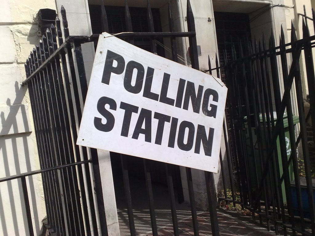
Photo by secretlondon123 on Flickr. Used under a Creative Commons license.
To better understand the needs of poster makers, I have started a poll that will run through summer. You can see the poll over on the right side of the screen. The question is simple: What software do you prefer to use to make conference posters?
Please take a second to vote – assuming, of course, that you actually make posters! (I can’t image why you’re reading if you don’t, but what you do on your side of the phosphor dots is your business.)
Additional: If your preferred tool isn’t listed, please vote “Something else” and leave a note in the comments, or email me.
Update: The poll is now closed, and the results are here
Photo by secretlondon123 on Flickr. Used under a Creative Commons license.
29 April 2010
Poster real estate
Not all the “real estate” on your poster has equal value.The upper left hand corner of your poster, just below the title, is Boardwalk. The lower left hand corner is Mediterranean Avenue.
The vertical dimension is the most important consideration in determining the prime real estate on your poster. That key space on the poster is a band from about five to five and a half feet off the ground. That is normally considered to be eye level for a large number of people. Your poster may not hit this exactly, because of the particular mounting scheme at your conference.
Assuming you put your title at the top, and that your poster has a standard horizontal layout, this means that the most valuable space on your poster is from the top of each column, to about a third to a halfway down the column.
Eye level is the place where people standing and walking by will look the most, so you want to put your best material there. If you have a three column grid, for instance:
- Top left: Put a compelling question that your research asks.
- Top center: Put your key results.
- Top right: Put the take home message.
The title of a poster is usually a bit above eye level. This is great for people walking by, because they will be able to read your title even if you have a crowd around your poster that are listening to your presentation in rapt attention. But the very top of your poster is usually a little too high for someone actually reading the poster. Your title works like the highway sign for a gas station of fast food restaurant: you want someone to be able to spot if from a distance, but don’t expect them to look at it once they get there.The bottom of the poster, below eye level, is the least valuable region of the poster. People will tend to overlook material there, unless you draw it to their attention. And everything there will be harder to read, because it’s farther away from the eye.
Those regions are good for the details that aficionados and experts might insist on seeing, but that aren’t critical to the story you’re telling. Again, assuming a three column layout, it might look something like:
- Bottom left: Detailed methods.
- Bottom center: Supporting results.
- Bottom right: Acknowledgments to funding agencies and references.
The horizontal position of material on the poster, which not as critical as the vertical, still comes into play. The left side is more valuable than the middle or the right side, because that is where people automatically look when they start glancing over your poster.
So in that upper left side, you want to have an entry point that is attractive, punchy, concise; a conversation starter that draws someone in.
That lower right corner, the lowest value real estate, is a natural place for “fine print” that is necessary, but that people rarely read.
Related posts
Entry points: Five ways to make your posters more inviting
22 April 2010
Critique: Crustacean nociception
These are two poster versions of a new paper I co-authored that just came out this week in PLoS ONE. * They provide a nice “before and after” snapshot of my progress: the first poster was done about a year before I started this blog, and the second poster was done about a year after I started it.
The first was done for a summer meeting of The Crustacean Society in 2008. This was printed at 48” × 42”. (Click to enlarge.)
In hindsight, the problem with this first version of the story is easy. Too much text! We definitely fell prey to the “Thinking it out on the page” syndrome. Too gray, too intimidating, too tight. Only half an inch between columns? What was I thinking?
This new version was done for a local biomedical ethics conference that took place last week. (Click to enlarge.)
I made both posters in Microsoft Publisher, starting with a three column grid. But that’s almost where the similarities end. I’m much happier with this new version. There are a few experiments for me on this poster; I tried some things that I’d only blogged about. I’m still trying to figure out how many worked.
The print size for this second one actually smaller; 48” × 36”. And it has more data. But by cutting the text down, using more white space, larger text, larger graphics, and using the space better, it looks roomier that its predecessor.
The lobster picture in the upper right provides an entry point into the study that is easier to understand than a paragraph of text, and is a good conversation starter. And thank goodness for Creative Commons licenses, which allowed me to use the picture from Flickr.
Remembering how professional typesetters complain that most amateurs don’t leave enough space between the lines, the spacing is 1.25 lines apart rather than single spaced.
I tried the trick of highlighting a few key phrases to make the poster easier to scan quickly. For instance, you’ll see “pain is complicated” in the introduction, and “no evidence of nociceptors” in the discussion set in bold. I thought about putting those highlight phrases in different colours, but decided that could be too gaudy.
While I usually recommend using a white background, I took a risk and put in a very light backdrop of swirls. It's sufficiently subtle that it’s barely visible on the reduced image here, although you can almost make it out as a light texture. I’m still not convinced I got it quite right, but I think it adheres to the “do no harm” maxim, at least.
The biggest weakness is the data in the right-most column, which is smaller than I’d like. It would have taken three rather fiddly adjustments to get it to where I wanted it. First, I would have shrunk the Acknowledgments and References text. Second, I'd have moved the two figure (each a 3 × 3 grid itself) from sitting beside each other to being on top of the other. That would undoubtedly have not fit, given their current proportions, so I'd have to go back to the original files and resize both of them to be shorter.
Another little subtlety that I would fix (though you may not be able to see it) is that most of the poster text is set in Gill Sans. The exception is the figures, which are in Arial. This was not deliberate; it was because the figures were made for the PLoS ONE paper, which requests Arial. I just forgot to change from Arial to Gill Sans, which I should have done. Having everything in one typeface would make it more cohesive.
I’m reasonably happy with how it turned out, but I was under a time constraint, so this poster is not as polished as I’d like. Every time I look at the poster, I see more little ways that it could be improved. To paraphrase something once said of art, "A conference poster is never finished, merely abandoned.”
* If the topic interests you, the paper is open access, and freely available for all to read. I’m doing more blogging about the science in this paper, and some of the associated “backstory,” at my other blog, NeuroDojo.
Reference
Puri S, Faulkes Z. 2010. Do decapod crustaceans have nociceptors for extreme pH? PLoS One 5(4): e10244. doi: 10.1371/journal.pone.0010244
The first was done for a summer meeting of The Crustacean Society in 2008. This was printed at 48” × 42”. (Click to enlarge.)
In hindsight, the problem with this first version of the story is easy. Too much text! We definitely fell prey to the “Thinking it out on the page” syndrome. Too gray, too intimidating, too tight. Only half an inch between columns? What was I thinking?
This new version was done for a local biomedical ethics conference that took place last week. (Click to enlarge.)
I made both posters in Microsoft Publisher, starting with a three column grid. But that’s almost where the similarities end. I’m much happier with this new version. There are a few experiments for me on this poster; I tried some things that I’d only blogged about. I’m still trying to figure out how many worked.
The print size for this second one actually smaller; 48” × 36”. And it has more data. But by cutting the text down, using more white space, larger text, larger graphics, and using the space better, it looks roomier that its predecessor.
The lobster picture in the upper right provides an entry point into the study that is easier to understand than a paragraph of text, and is a good conversation starter. And thank goodness for Creative Commons licenses, which allowed me to use the picture from Flickr.
Remembering how professional typesetters complain that most amateurs don’t leave enough space between the lines, the spacing is 1.25 lines apart rather than single spaced.
I tried the trick of highlighting a few key phrases to make the poster easier to scan quickly. For instance, you’ll see “pain is complicated” in the introduction, and “no evidence of nociceptors” in the discussion set in bold. I thought about putting those highlight phrases in different colours, but decided that could be too gaudy.
While I usually recommend using a white background, I took a risk and put in a very light backdrop of swirls. It's sufficiently subtle that it’s barely visible on the reduced image here, although you can almost make it out as a light texture. I’m still not convinced I got it quite right, but I think it adheres to the “do no harm” maxim, at least.
The biggest weakness is the data in the right-most column, which is smaller than I’d like. It would have taken three rather fiddly adjustments to get it to where I wanted it. First, I would have shrunk the Acknowledgments and References text. Second, I'd have moved the two figure (each a 3 × 3 grid itself) from sitting beside each other to being on top of the other. That would undoubtedly have not fit, given their current proportions, so I'd have to go back to the original files and resize both of them to be shorter.
Another little subtlety that I would fix (though you may not be able to see it) is that most of the poster text is set in Gill Sans. The exception is the figures, which are in Arial. This was not deliberate; it was because the figures were made for the PLoS ONE paper, which requests Arial. I just forgot to change from Arial to Gill Sans, which I should have done. Having everything in one typeface would make it more cohesive.
I’m reasonably happy with how it turned out, but I was under a time constraint, so this poster is not as polished as I’d like. Every time I look at the poster, I see more little ways that it could be improved. To paraphrase something once said of art, "A conference poster is never finished, merely abandoned.”
* If the topic interests you, the paper is open access, and freely available for all to read. I’m doing more blogging about the science in this paper, and some of the associated “backstory,” at my other blog, NeuroDojo.
Reference
Puri S, Faulkes Z. 2010. Do decapod crustaceans have nociceptors for extreme pH? PLoS One 5(4): e10244. doi: 10.1371/journal.pone.0010244
15 April 2010
Review: Presentation Zen Design
The Presentation Zen blog was one of the biggest inspirations for Better Posters. As you can imagine, I was very much looking forward to Garr Reynold’s new book, Presentation Zen Design.The book’s title hinted that it would contain more lessons that could be applied to poster design than its predecessor, Presentation Zen. This was correct, although the balance in Presentation Zen Design is still more towards slides in particular than design generally than I expected. And there are big chunks of the book that are really about delivery of the presentation more than the design of the presentation, like a sidebar by entrepreneur David Rose.
Of particular interest to people making posters are discussions about the use of:
Type. Sample quote:
Too many choices often leads to hurried and arbitrary decisions about what typeface to use. So having six to ten typefaces that you understand well and use often is a good base from which to start.
Colour. Sample quote:
Presenters can improve many visuals just by using three basic color combinations based on the color wheel: monochromatic, analogous, and complementary.
Data presentation. Sample quote:
The hardest thing to do is to edit yourself – to stop adding more. It’s up to you to make the tough decisions about what to include and what to leave out.
Space. Sample quote:
Contrast is indeed fundamental to good design, and without white space, good contrast cannot be achieved. The leading cause of lack of contrast is clutter. Too many layers of visual complication make contrast weak, if it even exists.
Focal points. Sample quote:
The important thing to know is that if you use images of people – whether you intend to for the image to be a focal point – you must know that this is where people are going to look first.
There’s so much good stuff in those single sentences, imagine what having an entire book of that is like. It’s clearly written, well illustrated, and has a wonderful feel that it was written by someone who is sincerely trying to help.
I wouldn’t recommend it if you just wanted to figure out how to do a poster presentation. If you do poster presentations, however, you will in all likelihood also have to do talks routinely, too. If that’s the case, this book will serve you well.
Reference
Reynolds G. 2010. Presentation Zen Design. Berkeley: Peachpit Press. ISBN: 978-0-321-66879-0 Publisher’s website; Amazon
13 April 2010
Easy truths; design is dying; perils of stock photos
I’ve been meaning to point to Easy = True at the Boston Globe.When people read something in a difficult-to-read font, they unwittingly transfer that sense of difficulty onto the topic they’re reading about.
The Dying Art of Design is a brilliant article over at Smashing Magazine. Here’s a little quote to whet your appetite:
Simple imitation completely misses the point of what made the original great.
Finally, Fair Trade Photographer looks at the perils of stock photography.
I suspect many businesses are unaware that the photos their designer has sold them are spread a-dime-a-dozen across the web.
Before you hop on the web to find graphics for your poster, remember that you can only fool some of the people some of the time...
All give you lots to think about.
Subscribe to:
Posts (Atom)