One of the things I tried to do in the Better Posters book was to think about how a poster session feels for someone who is not a young healthy white man. I wish I had read this article on stuttering / stammering in conference settings before the book went to the editor.
Excerpt:
Conferences that value more than just talks are pretty cool. By this I mean ones that give travel support to poster presenters, not just those who give talks. These conferences build decent poster halls, and they don’t encourage meals during poster sessions.
From this article, it’s not clear if a poster or an oral presentation is better for people who are not fluent in speaking. On the one hand, poster presentations do not limit time. On the other, you are often trying to manage several conversations in front of a poster at once, and you can’t as easily plan and practice a talk.
But thinking about this is so important. Because issues with verbal fluency isn’t just about people who stutter. It’s about people who are not familiar with the language the conference is being held in, or any number of other issues that can lead to speech issues.
Speaking of overlooked access issues...
• • • • •
Chartability is a tool for working with web page accessibility. But there might be a few lessons to think about with posters. The background provides substantial evidence from the academic literature that accessibility tends to focus strongly on visual accessibility. Everything else barely gets a mention.
You might want to check this out if you ever want to archive your poster online. Have you ever tried to read one of your works with a screen reader? I tried once, and it was informative.
• • • • •
New paper on teaching how to make posters dropped:
Belilos E, Kamande S, Morrison M, & Malmut L. 2022. Teaching poster design to enhance research presentation quality at academic conferences: a guide for educators. Postgraduate Medical Journal: postgradmedj-2022-141889. http://dx.doi.org/10.1136/pmj-2022-141889
Paywalled, unfortunately.
• • • • •
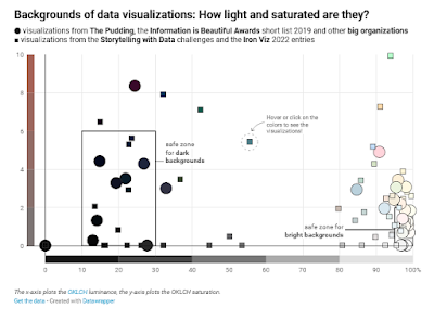
Backgrounds on posters are tricky. I’ve seen many that try to make it far to complicated and it quickly becomes unreadable (text on top of photos, for instance). I avoided backgrounds and just went with white for a long time, but that’s kind of boring.
Lisa Muth has analyzed backgrounds in data visualizations, and many of the lessons apply for posters.
TL;DR:
Your background color should be desaturated, and either very bright or very dark. If you want to be sure, use a warm, very bright, desaturated background color.
• • • • •
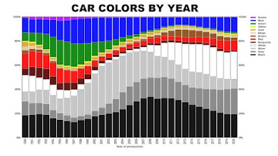
Speaking of colours, this Twitter thread points out that the world appears to be less colourful than it used to be. Monochrome cars used to be less than half of cars sold, but are now three quarters of cars sold.
Big losses in green and big gains in white. Having owned a white car, I cannot quite see the appeal. Dirt shows up instantly!
Many more examples in the thread. I may be guilty of contributing to this, because I so often see colours used so badly that I tend to warn people to tone them down.
• • • • •
Free book! Free, I say!
And it’s Fundamentals of Data Visualization.
• • • • •
A Twitter thread on why so many designs are looking alike.
This is a complex issue, related to industrialization, pervasiveness of internet, style trends, and just that some designs work better than others.
• • • • •
I have seen a lot of badly used colour gradients on posters. This article describes how to make your gradients look better. The secret is to avoid a grey-ish “dead zone” in the middle.Fin Moorehouse also wrote a Twitter thread elaborating some of these ideas about how to make good gradients. Many comments that are also informative, such as how gradients look to colourblind individuals.
And that’s it for this month!


No comments:
Post a Comment