
It’s instructive to look at how academics present their results compared to journalists. Compare!
Original article title:
“He who pays the piper calls the tune”: Researcher experiences of funder suppression of health behaviour intervention trial findings
Nineteen words, two part title divided by colon, containing a cultural reference that may not familiar to all.
Original data:

It’s presented in an 8×8 table in fine print.
Now see how Nature reported on it.
News article title:
Health researchers report funder pressure to suppress results
Eight words. It’s shorter than the article title, even if you took out the quote. It’s clearer than the article title.
Revised data:
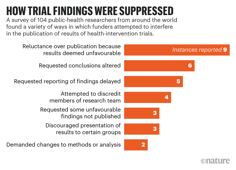
The table has been replaced by an easy to read bar graph. The graph has a clear and bold take-home message. Yes, there is less information. It’s effectively a 2×8 table, but it is easier to read and understand.
Too many conference posters look like the journal article. Posters will be better if they look more like the Nature article.
External links
McCrabbe et al. 2021. PLOS ONE 16(8): e0255704. https://doi.org/10.1371/journal.pone.0255704
Watson C. 18 August 2021. Nature. https://doi.org/10.1038/d41586-021-02242-x


No comments:
Post a Comment