

René Campbell shows off the before and after of one of her old posters:
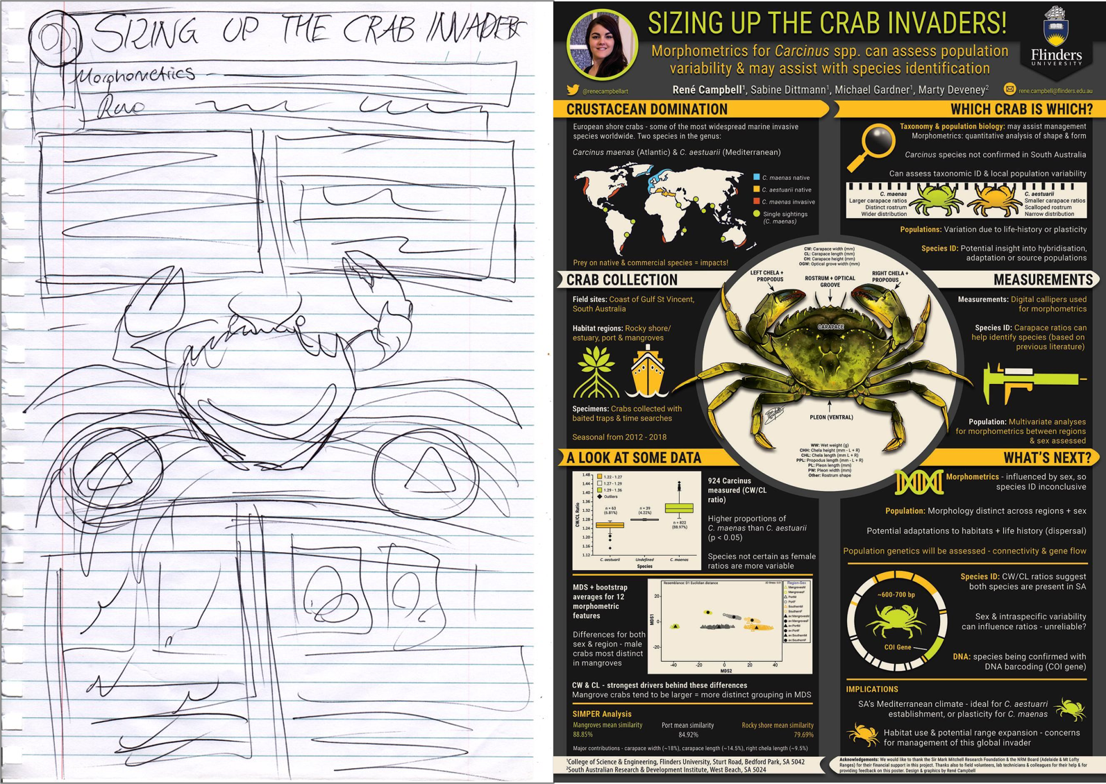
She noted that she didn’t remember doing the sketch at all!
• • • • •
As goes Microsoft, so goes academia. At least in regard to design.
For years, we’ve looked at a lot of posters and slide talks that looked kind of similar because they all used Calibri, because it is Microsoft’s default font in Office.
Calibri’s days as default are numbered. Microsoft has announced it will be retiring Calibri as their default Office font. Click to enlarge to see the candidates to replace it.

Skeena looks closest to Calibri.
Bierstadt looks like a Helvetica imitator (and the name doesn’t exactly roll off the tongue).
Grandview looks tiring for extended blocks of text because of its angles and high x-height.
Tenorite’s geometry appeals to me in the way Futura does.
Seaford is my current favourite.
• • • • •
An instructor shares students’ comics about making comics.

• • • • •
Fog City Gothic is a new typeface based on San Francisco street signs.

Not in contention to replace Calibri.
• • • • •
We know that graphs be be art. But did you know they can also be furniture?

Made by Deneuse Andamidiya.
• • • • •
Next month: The Better Posters book arrives in your hands!


No comments:
Post a Comment