Dave Rubenson explores the differences between a presentation and a journal article. Much of the advice applies to posters, except moreso.
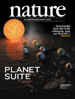
One of the criticisms I've occasionally heard levied about the kind of artwork we do for exoplanets is that they look so real, people might not understand that that's not an actual photo of the planet....
But there is this question of if you make the artwork not as compelling, given that you can just walk into the theatre and see three different movies that are all taking you to really awesome looking worlds, do you go ahead and try to match that level of enthusiasm and do something very realistic that pulls people in, with the fear of being too realistic and maybe people walk away with a misconception that we've actually visited these places, versus maybe doing something less compelling but then it maybe won't suck people into the story.
Looking for a concise summary of your work for your poster title? Try TLDR.
Jeffrey Perkel and Richard van Noorden wrote a news feature about this work. The technical paper is available here.
It tried the abstract, introduction, and conclusion of one of my papers. The result, alas, didn’t even scan.
Lepidopa benedicti from South Padre Island, Texas, on the western coast of Gulf of Mexico acts as a population sink.
Sigh. A species cannot be a population sink. Clearly a work in progress. But promising!
• • • • •
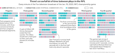
The site’s creator has been talking trash about public health. Not cool, Nate. But he is not the only one creating content on the website, so it’s worth a peak to look at the end of year round-up of Fivethirtyeight’s weirdest and best charts of 2020. I like this one showing how boring gridiron (also known as American football) truly is.
The little red lines are when the ball is in play.
• • • • •
An end of year round-up of data visualizations. This is a lengthy “meta-round-up.” That is, it’s a list of lists. Will take a while to work through these. You were warned. But if you have the time, there are some fine insights in there.
Hat tip to Melissa Vaught.
• • • • •
Good bye, 2020! Let’s hope that 2021 brings much more joy than just the publication of the Better Posters book!


No comments:
Post a Comment