I thank Stephen Herd for taking pity on me after I complained about lack of material and sharing some of his old posters. Click to enlarge!
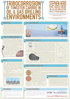
The poster was designed to print on A0 paper (for those in North America, that’s 33.1 inches by 46.8 inches).
The individual graphic elements were created in Adobe Illustrator. Stephen then assembled them in Adobe InDesign.
I think it’s worth pausing for a second to talk about InDesign.
I’ve met a good chunk of people over the years who at least know about Illustrator. I’ve seen a lot of very nice posters made entirely in Illustrator. I’ve made poster in Illustrator as part of a class I did for #SciFund.
InDesign is desktop publishing software. Desktop publishing software is something that few academics apparently know about, let alone use. Over the years, I’ve long been surprised that Microsoft’s desktop publishing software, Publisher, isn’t used more for posters. QuarkXPress is less popular than it was, but is still very much around.
Graphics software like Illustrator or CorelDraw are focused on creating an individual image. They aren’t as concerned with their placement on a page, and particularly a series of pages. The line between “graphics” and “layout” has gotten incredibly blurry, but doing page layout in a graphics program or PowerPoint is a kludge. Desktop publishing programs have print considerations “baked in,” which is probably why Publisher has often been my “go to” for posters.
Eep, that was more a moment than a second. Back to Stephen’s poster...
Stephen wrote (lightly edited):
Two area of focus were finding a more interesting way to present the title and making each section digestible. Even after I thought I minimised the words, people still read only a few sentences here and there.
I completely agree with Stephen’s analysis. Looking at it in reduced size on the blog, the title pops. It’s one of the strongest visual elements of the poster, which is exactly what you always want.
The res of the poster looks wordy. The text fades to nothingness in the main body. This is partly due to the thin lines in the font used (Gill Sans Light, I think).
From a distance, the imminent collision between left banners and the boxes to the right is also immediately noticeable.
This is not as noticeable when you look at the image enlarged, which just goes to show you need to look at your poster at a very small size to see how it holds up.
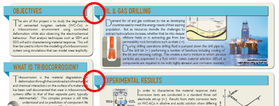
Similarly, there is a lot of detail in the illustrations. It is a little hard to judge just how close you would have to be to be able to make it out.
The positioning of some the elements within the boxes become more apparent when you zoom in. Above, you can see how close the text comes to some of the images. (By the way, text wrapping is one of those features that desktop publishing software has that graphics software often does not.)
Stephen has a nice colour selection on this poster, too. He writes (lightly edited):
Because Stephen was nice enough to send me two posters, I will look at his second – and much more ambitious – poster next week!One of the first things I do in my poster is decide on a colour palette. These usually consist of three colours, plus two or three shades of each colour. This helps to build consistency across the poster and hierarchy into the different elements. I ensure that diagrams follow this colour palette to help keep the content cohesive and reduce items that stand out too much on the page due to their colours.


No comments:
Post a Comment