
A recent episode of the podcast 99 Percent Invisible looked at the rise of grocery store brands, and spent a lot of time examining generic brands.
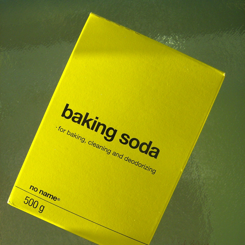
The example pictured is from No Name line of products from the Canadian supermarket Loblaws. In the late 1970s and 1980s, Loblaws started these generics as a cheaper alternative to national name brands.
Of course, this “anti-brand” is in fact an instantly recognizable brand. The moment something becomes the subject of jokes, which No Name has often been, that’s a culturally significant brand.
Marketer Terry O’Reilly says of the No Name design:
You don’t have to pay for the mass advertising and all the design work and all the marketing that goes on behind that jar of jam. All you should be paying for is the jam. And Nichol called that “brand tax.”
This No Name attitude is shared with a certain section of the scientific community who declare that scientific papers are mere “ads for data.” These are the ones who thumb their nose at reviewed, editing, proofreading, and typesetting. None of that should matter, only the jam / data matters.
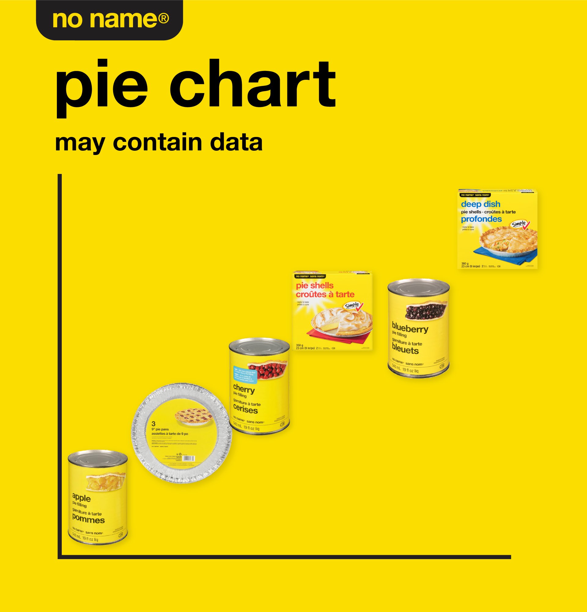
And No Name’s ultra minimalist design also reminded me of... the billboard style poster.

On his original YouTube video, part of Mike Morrison’s argument for the billboard style poster was that people making posters (usually students and other early career researchers) shouldn’t be spending the time for the design work on a poster. Call it the “design tax” instead of a brand tax.
I couldn’t resist doing this:

But the 99 Percent Invisible podcast goes on to describe how the generics, like No Name, started to lose appeal. Loblaw’s kept No Name, but started a new, upscale line called President’s Choice. It was led by a chocolate chip cookie, The Decadent.

President’s Choice was a 180° pivot from No Name. As much as No Name reveled in DGAF minimalism, President’s Choice reveled in slick design.
Both were created for the same stores, but as of now, President’s Choice became the more successful model. If you live in the United States, you might see the Walmart equivalent, Sam’s Choice.
And the moral of the story for posters is:
There is no optimal design. No Name and President co-exist in the same stores. One does not drive the other to oblivion.
Many people like nice packaging. As much as some researchers are say they only care about content – the only thing that matters in the jam in the jar or the data in the graph – when people vote with their dollars, they quite often choose the thing that has put more effort into the packaging.
To some degree, the billboard style poster demonstrates that same trendline. If you haven’t looked at the material on the Open Science Framework lately, the current template is up to version 43. The number of styles is more varied and the designs are more sophisticated. For something that originally billed itself as something fast and time saving, a lot of effort has gone into refining the design for more uses for more people.
Update: No Name has an A+ Twitter game.
External links


1 comment:
Interesting link to branding. I generally agree with your claim that both generic and custom solutions can co-exist. There may be levels of resources that scholars can devote to scholarly communication and BetterPoster may be catering to the masses. I think your blog and upcoming book cater to the other end of the spectrum (those with design skills or interests and time/energy to spare).
So where are the intermediate options? For posters, slideshows, or blogs, can we develop a set of "pseudo-templates" that guide users to good design choice and allow for customization without spending a great deal of their resources? Or perhaps an online course that moves scholars between stages across their academic training? That would mean that one spends undergrad and masters on templates, PhD coursework on an intermediate option/pseudo-template, and post-doc/professorial experience on custom solutions.
I look forward to working in the latter stage and reading your book.
Post a Comment