Hat tip to Janet Stemwedel for realizing:
Thing I haven't seen yet this pandemic but which I suspect already exists: cloth face masks made from old cloth conference poster.When I tweeted I would pay money for that, Alexandria Hughes replied with the picture above. Outstanding!
Possibly with matching sundresses.
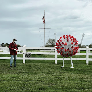
And the end of April, Amy Frietag posted some art that cropped up in her neighbourhood, saying “Sure is a sign of the times.”
I’m fascinated by this, because it shows the power of a visual.
The sculpture is obviously showing the SARS-CoV-2 coronavirus. But SARS-CoV-2 didn’t really exist in the public imagination even a few months ago. If you had put up a white ball with red spikes in February or even March, I doubt people would have thought, “coronavirus.” It’s because of the illustration made by CDC illustrators Alissa Eckert and Dan Higgins that we now have a shared visual “identity” for the virus.
And it is definitely the Eckert and Higgins illustration that is the source material here. Because a virus doesn’t have colours. There is no particular reason to make a sculpture of the virus white with red spikes, except because the CDC illustration is white and red. Eckert and Higgen chose those colours to signal that the virus was a serious threat, not because there was any scientific reason to pick them.
So research conferences are cancelled. Now what?
Hat tip to Melissa Vaught.
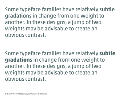
How to use bold type effectively.
That’s only one example; the article has more!
• • • • •
Make your own Penguin Classic book cover.
This was only done as a demonstration! I have been loving working with Pelagic Publishing!


1 comment:
Link to bold type post is broken for me
Post a Comment