

I personally cannot think of any anecdotes or data supporting the contention that excellent graphics have significantly advanced or hindered individual researcher's careers (e.g., grants or papers rejected just because some aspects of typography or design were so bad). If anyone knows any examples, I would love to hear them!
On a larger scale, some might argue that the quality of graphic design has neither significantly advances or substantially hurt science communication. Here, there may be some examples of the importance of strong graphics.
Climate scientist Michael Mann’s graph of historical global temperatures might be an positive example where a technical graph helped the cause of science communication by breaking into public awareness and advanced political discussion.

This visual made the point stick with people in a way that “unprecedented rapid change in earth’s temperature” never did. It was so memorable that even it got a nickname (the “hockey stick” graph).
On the negative side, Edward Tufte’s short book, The Cognitive Style of PowerPoint (later incorporated as part of Beautiful Evidence), provided a compelling case that the default design of PowerPoint slides may have contributed to the explosion of the space shuttle Challenger.
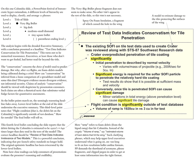

Tufte’s argument is that the design of the slides are so bad that they diverted attention from the deep problems facing the Challenger launch. While there were clearly a lot of management problems at NASA the contributed to the explosion of the Challenger and the death of her crew, the argument that this contributed isn’t easily brushed aside.
External links
PowerPoint does rocket science


1 comment:
I agree that visual design is important. Most readers and listeners appreciate the time taken to design an aesthetically pleasing slide deck/poster/paper, though they are not always trying to do the same. The problem is mainly due to the tools and examples we have access to. There are so many design possibilities when designing a PowerPoint, poster, or sci comm article that people take the path of least resistance. Because most people do this, each field is cluttered with badly designed posters and papers. Having a gallery of stellar exemplars to be inspired by may help in this regard. Imagine a special website containing excellent slide decks from conference talks, posters, papers, sci comm articles, etc (Dribble for scientists). Short tutorials guiding scholars along the path to creating their own documents would be a nice addition to this.
Post a Comment