29 April 2022

Conference dress codes, or, “Twitter outrage of the day”

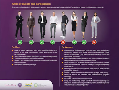
Making the rounds on Twitter today an image of a dress code for a physics conference. Here’s the top result as I write this. Click to enlarge.

The top tweet from David Smith calls it, “the most ridiculous thing I've ever seen.”

Now, as someone who became an academic precisely because I hated the thought of wearing ties, I get it. I get the resistance to policing appearance. I get the social media outrage that this image has generated.

But here’s the original image from the conference website. While the image above has the conference website embedded in it, the website is printed a bit small, and a lot of tweets (including the top one) did not include a clickable link in the tweet.

Notice that the image has been cropped. It’s missing its top half.

The full image appears to show two points that seem pertinent to the discussion (if I understand correctly).

  1. This code applies only to the opening ceremony.
  2. A member of the host country’s royal family is attending: Her Royal Highness Maha Chakri Sirindhorn.

So perhaps the conference organizers are not being the super strict fashion police that the cropped image suggests? And this kind of feels like a manufactured controversy?

Whatever you may think of royalty, people are usually expected to act in a particular way around political leaders. A certain level of formality is expected.

If a head of state or someone in a similar position were coming to an academic conference (maybe even strolling through a poster session!), would it be reasonable for the conference organizers to require their attendees dress a particular way? For example, “No sweat pants,” “No sandals,” “Shirts with buttons for men,” or what have you?

I am currently running a couple of polls about this on Twitter, so will update this when I have results.

It’s also worth noting that this kerfuffle about a dress code is happening in a country that is not mostly white and anglo.

Update: Poll results are mixed and seem to be sensitive to exact phrasing. When I asked if it's okay for organizers to put in a dress code if there was a visiting head of state during a poster session, most said “No.” When I asked if there was a head of state visiting your lab, most said they would dress up.

Petra Boyton tweeted what may be a good summary:

- dress codes are important
- we don't discuss researcher clothing in the context of respect, dignity, accessibility, inclusion and safety enough
- this area is more complex than we know and deserves more attention
- you are fabulous whatever you're wearing #ResearchTip

28 April 2022

Link round-up for April 2022

How many visitors can you expect to your poster in a virtual conference? This paper suggests about 10.

Six hundred ninety electronic posters (ePosters) were visited by over 7,000 unique visitors. Each poster was viewed on average by 10 ‘visitors’. Visitor number per poster concentrated in the range between 6–20: 344 posters received 6–10 visitors and 244 posters were viewed by 11–20 visitors. Posters across the tracks received quite even attention with the exception of Track 9, which was for student ePoster competition and increased visits from judges(.)

It’s not clear how generalizable that number is. This analysis is from exactly one conference with a little under 2,000 attendees. The authors do note, however, that any number is better than an in person conference, where organizers have zero knowledge about what posters and sessions were popular.

• • • • •

A paper on creating an inclusive online poster session.

(O)ur survey data indicate that 70% of 198 survey respondents attended the virtual poster session. Of these respondents that attended the session, 100 attended as viewers only (72%), 7 as presenters only (5%), and 32 as both viewers and presenters (23%). Most survey respondents (96% of viewers and 77% of presenters) indicated that their experience either met or exceeded their expectations. While in-person poster sessions were still preferred (slightly or strongly) by both attendees (45%) and presenters (54%), surprisingly, some attendees and presenters (23%) enjoyed virtual sessions and in-person sessions equally. Furthermore, 32% of respondents who viewed posters and 23% of respondents who presented posters expressed either a strong or slight preference for virtual poster sessions.

Their tips:

  1. Use combined asynchronous and synchronous sessions
  2. Use short video or audio introductions
  3. Use Zoom features that allow attendees to enter and exit breakout rooms for synchronous sessions
  4. Use video and live demonstrations on how to use the different poster platforms
  5. Expand poster submission timeline to enable organizers to share virtual poster sessions with conference attendees earlier
  6. Have a smaller number of posters per session or topic room
  7. Incorporate volunteer attendees and topic-based virtual synchronous sessions
  8. Provide online etiquette guidelines

• • • • •

What drives changes in the “look” of graphics? The article, “DALL·E 2 and The Origin of Vibe Shifts”, argues that for websites, great photos suddenly became easy to get... and were promptly abandoned, because they no longer signaled “high end.”

• • • • •

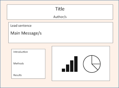
The new book A Roadmap to Successful Scientific Publishing has one section of one chapter about conference posters. I can’t say that the illustration of a poster “sketch” fills me with confidence:

Generic poster layout

I understand this isn’t meant to be a fully formed poster, but it wouldn’t have been difficult to at least align the sections.

The text is a little better. It does emphasize simplicity, but promotes things like a “lead sentence” under the title to grad attention (can’t that just be... the title?) and bulleted lists.

26 April 2022

Graphic design basics: Expressive typography

Poster for Carbon: The Unauthorized Biography
 

In the movie Carbon:The Unauthorzied Biography, the filmmakers asked, “What does carbon sound like?” 

“Carbon Rising” is such a beautiful and surprising piece. This is carbon's journey through the purest air of the southern hemisphere off the southern coast of Tasmania.

I think what we were trying to do with “Carbon Rising” is establish this sense of flight. How do you do that musically?

What does carbon look like as a character? 

Do you know that I've made carbon a character in the film, carbon is a person? ... With a gender, it's a she, using that device to join the dots across time and space and have a different relationship kind of open up with us, with the audience, with carbon, to see carbon differently, and perhaps some respect for carbon.

Filmmakers have different problems and solutions than those working with print, but the basic problem is a great one to think about for any designer.

What does some abstract thing look like?

Here’s a basic exercise in graphic designers: 

Make a word look like the thing it represents using type.

Here’s a simple example.

Word "Thick" in thick letters and word "Thin" in thin letters
But the challenge increases – and gets more interesting! – as you move away from the literal to the conceptual.

Foe example, how would you typeset “major histocompatibility complex” (often abbreviated MHC)? Your first thought might be that a technical, multi-syllable word doesn’t lend itself to expressive type.

This is a molecule in out immune system. Our immune system keeps us safe, so that’s a keyword I can play with. That leads me to think of a font that is a little rounded, with soft corners. 

The phrase "Major histocompatibility complex" in Jumble typeface.

This typeface above, Jumble, might be a little too casual. 

The phrase "Major histocompatibility complex" in Arial Rounded typeface.

 Arial Rounded MT Bold has the soft ends to the lines that I am going for. But because it’s part of the well used (overused) Arial family, it has less character.

The phrase "Major histocompatibility complex" in VAG Roundedtypeface.

 This one is in VAG Rounded BT. I like this. It is too heavy for some purposes, but there are other weights that might be more appropriate.

Another approach. The major hisocompatability complex is known for being, well, complex. To be more precise, it is polymorphic – many forms. So that is another direction that one could go. HelaBasic is a typeface where letters take many forms of line width.

The phrase "Major histocompatibility complex" in HelaBasic 300typeface.

There aren’t right or wrong solutions to these, but the point is to try using type in new ways. Get away from the well worn system defaults like Calibri and Arial and Time New Roman and Helvetica.

External links

Carbon - the element with a nice voice (In Canada, Carbon: The Unauthorized Biography is streaming for free on CBC Gem.)

14 April 2022

Posters are big in Japan

A forthcoming article about conference presentations is remarkable. It is the first paper I have ever found to show a greater probability of a poster being published than a talk.

The publication rates for posters was 23%, which is not super high, but it is almost double the publication rate for oral presentations, at 12.7% (374 presentations all told).

I’ve perused a great many papers on this, including a systematic review. And I just want to say it again: no other paper has ever shown posters were more likely to be published than talks.

The authors have read the same systematic reviews I have and know that this is an odd finding. They speculate that it is because oral presentations from this meeting included opinions and experiences that don’t lend themselves to peer-reviewed papers. I do not find this particularly persuasive.

External links Yoshida et al. Publication rate in English of abstracts presented at the annual meeting of the Japanese Society of Psychiatry and Neurology. Psychiatry and Clinical Neurosciences: In press. https://doi.org/10.1111/pcn.13351 Related posts The poster to publication puzzle (With stats and graphs and everything!)