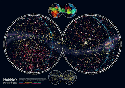
Let’s start the year with this awesome interview with Nadieh Bremer. Nadieh has created very intense, high data density visualizations. For example, check out her plot of astronomical 🌗 data. What started as an illustration turned out so well it has become a for sale poster.
Nadia routinely works with huge datasets, and this article is a great look into her process. Excerpt:
“The reason I only create very rough outlines at the beginning is that data visualization stands and falls with the data itself,” Nadieh points out. “You can have a great idea but when you plug in the data it sometimes doesn’t work at all, because of outliers in the data or other quirks that you hadn’t considered during the design process. When you work with big datasets, you can only guess at the start.”
Hat tip to Anneli Joplin,
• • • • •
Windows users, did you know pressing the “Windows” key and a period in combination brings up an emoji menu? Now you do. You’re welcome.
• • • • •
That’s all for now!


No comments:
Post a Comment