Inspired by adorable tiny glassware (so much tinyness), Lauren Gonzalez created this mini lab, complete with mini posters.
So, who will be the first to stage a mini conference? Magnifying glass included with attendance fee.
• • • • •
This is an excellent analysis of a an excellent graphic abstract (that could have been a poster):
Structure - although the graphic has a nice informal feel too it, the structure is sound. The dotted line are subtle, but help the eye realise where the sections are.
The title - I like this a lot, the type, the fact that it’s on a a silhouette of a tetrapod, it stands out really well (despite not being at the top of the graphic).
The section headings - notice the creative font use is restricted to titles, the shapes fit the type nicely, see how they’re all slightly different too, both in shape and colour. The language is simple and direct.
Emma has visualised the Paleobiology database nicely, but rightly chooses not to force “Statistical & phylogenetic methods to mitigate sampling biases” into a graphic. The text communicates better than any icon could.
Visit the thread for a Q&A with creator Emma Dunne. Hat tip to Anne Hilborn.
• • • • •
Chris Gunter asked “How does one travel with a poster tube?” and got many helpful replies.
• • • • •
In an age of global climate change, it’s worth asking if you need to fly to conferences. New research suggests not.
(T)his preliminary evidence suggests that there may be opportunities, especially for academics who study topics related to climate and sustainability, to reduce their emissions from air travel while maintaining productive careers.
• • • • •
Oh, this figure is shocking. Make sure your figures do not become the brunt of internet humour.
• • • • •
Criticism is an integral part of this blog, and design. With that in mind, I think this attitude from Neil Gaiman is useful:
It’s one of Gaiman’s Laws of Art: “When anyone tells you that they had a problem with something, they are very probably right. When they tell you how to fix it, they are very probably wrong.”
This week’s contributor is Purav Patel. Click to enlarge!
Purav writes:
It combines some elements from Mike Morrison’s better poster, Bret Victor’s Seeing Spaces poster, and my own touches.
If displayed in physical form, I would print a very large poster to see the smaller cells more easily. The Post-It notes are for viewers to write some comments/feedback after the presentation. A template and associated files are on the OSF website.
It’s interesting that Mike Morrison’s YouTube video is influencing poster creation even though it’s only been out for a few weeks. And we haven’t even hit peak conference season yet.
This poster is an interesting attempt to fulfill the needs
of different readers simultaneously: the ones who are happy to read on
their own and the ones who want “the tour” from the presenter.
I like that this poster cleanly and clearly separates the columns. The wide margins signal that each column is serving a different purpose. The headings on the left and right spell out what each column is for.
The
downside of “two posters in one” is that there is a lot here, and it
does not look like a quick read.
Fortunately, Patel isn’t afraid to leave some white space down at the bottom, which provides a bit of lightness to the poster. All the logos and QR codes are sensibly placed down in the bottom corners, too, where they won’t distract from the main content.
The left and right corners mirror each other, which is a nice touch. I don’t mind the redundancy, because it does mean that if someone is working on the left side of the poster, someone on the right is easily able to snap a QR code without disturbing the other reader.
The downside of this style is that the central point, “Machine learning enhances perceptual fluency in chemistry,” gets a little lost. That title is in a bigger block than the headings on either side of it, but it’s short-changed by the diagram on the right taking up space. The diagram isn’t adding a lot of context or information.
Extending the blue title bar and putting the diagram on top of it makes the title carry more visual weight, and solves an alignment problem at the same time. All the bars now align on the right.
The low contrast between the purple on blue downplays the diagram and creates some unintended striping effects. Either a different diagram or a little colour change might help. I am tempted to removed the diagram entirely.
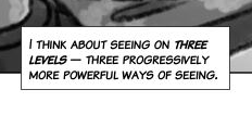
The brush-style type is clearly taken from the “Seeing spaces” poster, referenced above. In the “Seeing spaces” poster, the brush font is paired with a more traditional “speedball” comic lettering for the main text. The comic font has no lowercase, but it does allow for emphasis.
Notice how “three levels” is a little bolder and a little more slanty. (The “I” should have crossbars on top and bottom, though.)
In Purav’s poster, the brush-style is used throughout, and it hurts the poster’s readability. It’s a much narrower typeface, which tends to make sentences look more like grey lines a series of words. The font has no lowercase. The font has no emphasis or variation.
This poster is further from the comic style than the “Seeing spaces” poster, so there is no strong reason to use a typeface that emulates hand lettering here. A condensed font with lowercase letters might be a better choice.
An extremely large take away message in the middle. This is the biggest difference between Morrison’s design and most academic posters.
A structured abstract in a sidebar on the left.
Fiddly bits for superfans and aficionados in a sidebar on the right.
A QR code in the bottom middle.
While I don’t share his deep pessimism about poster sessions, particularly presenting (“nothing's worse than presenting a poster”), Morrison’s design is thoughtful.
In particular, it takes the principle I have often espoused that “Nothing should compete with the title” and “The title is 90% of your communication effort” and runs with it. The central take home message acts as the title of the poster.
Morrison does include space for “Title” on the left sidebar, but a title is superfluous with this massive take home message. Besides, most titles are not one word, and the space any typical poster title would use in that left sidebar would probably be significantly larger than shown here.
I admire the push to summarize the work in a single sentence. But let’s be honest. Getting to that single sentence is... very hard. Many academics, trained in nuance and exceptions, struggle to cut words.
The design does make a few assumptions that might not always hold.
First, near the end of the video, Morrison simulates a “walkthrough” of a poster session with this billboard format.
In the next screen, a few real academic posters are going to move past you at a walking pace. See how much information you can absorb. Now try these same posters you just saw translated to the new design. Now, this is gonna be a little unbelievable and jarring at first, because when people see this, they don’t believe that these clear findings came from the posters they just saw, but they did.
Here’s a screenshot of this demo. Notice anything? Anything missing?
People.
There are no people. There are no presenters or audience members. This is an empty room. In most sessions, there will be people that can potentially block the view of the bulk of the poster, where Morrison recommends putting the take home message.
Morrison’s portrait version of the poster fixes this.
But it looks much more like a more familiar poster format.
Second, Morrison proposes colour coding the backgrounds.
I think it would be extra efficient to use colours that prime people’s expectations about what type of poster they're about to see, because they’ll notice the colour first. Like, we could use green for empirical studies, because they’re the most common; blue for theory; red for methods, and; yellow, the most attention-getting color, for that rare and wonderful intervention study.
While colours do have things that they suggest, colour associations are usually derived from nature (reds and oranges and yellows are “hot” because they’re the colour of sunlight and fires; greens and blues “cool” because of plants, sky, and oceans) or associations drilled in from an early age (red for “stop” and green for “go”).
I think you would get confused looks if you asked people, “What colour do you associate with ‘theory’?”
The coding system suggested by Morrison would be arbitrary. The only way they would be meaningful is if the organizers set them out in advance, and aggressively enforced them. Most conference organizers are very “hands off” with posters.
This sort of colour coding isn’t very friendly to people who are colour blind. (Hat tip to Alex Merz for the reminder.)
Third, it assumes no audience member ever plans what posters to visit in advance. In Morrison’s description, the only way people find posters that interest them is by wandering the halls. There are no online lists of titles and abstracts ever mentioned.
As an audience member, you have the power to make best use of your time by searching out what posters you want to visit before the conference. As a presenter, you have the responsibility to respect people’s time and be able to tell them what’s going on in a few minutes.
Morrison wants someone to walk through a poster session and quickly get something meaningful from every poster. But there are meetings where the sheer number is still going to make that impossible (like the massive geology and neuroscience meetings). Preparing in advance is almost the only way you can get something meaningful from the meeting.
Fourth, Morrison puts a lot of stock in QR codes. I have written about them often on this blog. I have seen far more people put QR codes on posters than I have ever seen people taking pictures of them. Whatever their value in theory, they seem to be little used in practice.
In his PowerPoint template file, Morrison says of the “ammo bar” on the right hand side, “Keep it messy! This section is just for you.” If you truly want something that is “just for you,” keep it off the poster. Put it in a notebook or leave it on your tablet. Otherwise, people can see it, they will look at it, and they will be judgey about what is there.
It’s like an artist who shows work they are not happy with in an exhibit or display. If you show bad work, people will think it’s because you can’t tell the difference between the good and the bad. It’s not a good strategy.
Morrison, like many academics, is very focused on written content. Yes, there is a lot of paring down that written content to the essentials, but it’s still reading, and reading is hard. And when you see his walkthrough of a poster session, the overwhelming impression is sentences on blocks of colour. And all the type is the same basic sans serif. It is visually dull.
Morrison’s approach underestimates the appeal of visuals. I suggest pairing the big take message with a big inviting picture.
In this revision, I have moved the title up, so it’s always visible above people’s heads. The space saved is used for a big, bold picture that relates to the topic, so people can tell visually what the poster is about. The colour of the title bar is picked up from the picture with the eyedropper tool. The QR code is moved over to the “fine print” are in the lower left.
And while we’re at it, let’s move the typography out of the 1980s and into the 21st century by replacing tired old Arial with Source Sans Pro.
Both fonts are straightforward sans serifs. Source Sans Pro has the advantage of making the differences between some letter forms more distinct, notably lowercase “L” and capital “I”. You could certainly make bolder type choices that might give the poster more personality.
Also note that in revising the poster’s take home message, I was able to shorten it from twelve to eight words, a 33% savings, with no loss of meaning. Being concise is hard, even when you are deeply focused on it.
I suspect that some will argue that a poster should be all about the data.
So why do I suggest a photo and not the all important data? Because data alone usually render a poster anonymous.
Both this poster and the one before it might be about lobster size, but you can’t tell that at a glance from a scatter plot.
Reading words is hard. Interpreting graphs is harder. A scatter plot can represent ten thousand things. Data doesn’t signal at a glance what the topic of the poster is. See the discussion of Scott McLeod’s “big triangle” for more.
A wall of data points is not better than a wall of text.
Mike has provided templates here, and is working on a study validating this design. He is looking for grad students to participate. You can email him at Mike.A.Morrison@gmail.com.
Update, 19 April 2019: I received reports of this poster “in the wild” from Jeremy Cain:
Jeremy is not an academic, but his girlfriend is. He relayed her experience:
She told me that for the whole time she was standing at her poster, presenting, she wished her graphs and plots were larger. ... Every one of those posters, she actually didn’t know what they were about right away because there was no title at the very top and people were standing in the way.
Mia de los Reyes is today’s contributor, with a pair of posters for perusal. Since both have similar styles, I’m going to mostly talk about both in one go at the end. Click to enlarge the first one!
This had a more general audience, hence the “take-away points” box. I know that boxes are sometimes overdone, but I personally like the way they help me organize the flow of the poster.
Mia’s use of boxes works, I think, for a few reasons. One is that the lines making up the boxes aren’t black. When I see boxes on posters, the lines making them up are often black, and it creates a very strong visual impression because the lines are so high contrast. On both posters, the lines are in the same colour palette as the rest of the poster. That makes the box draw less attention to itself, and makes the division between spaces less abrupt.
Mia also takes care to ensure the edges of the boxes align, and the spaces between the boxes are even.
Mia’s use of the limited colour palette is intentional.
(I also like the “paint chip” look of using a spectrum of colors from a single color palette. I got the color palettes in these posters here.)
As with the first poster, Mia finds places to improve. In this second poster, an equation didn’t print as well as it might have.
On both, she wrote:
I wish I’d been a bit more creative with fonts! I used Avenir for everything but now wish I’d attempted a nice serif font for the headers.
I like both these posters, but there is an effect that I can’t quite put my finger on. They look better to me at far away than up close. They closer I get, the more cluttered they feel. They may purely be a matter of adjusting the point size down a hair, and maybe widening the margins between graphs and text ever so slightly.
Another thing that might help open up the space a little is to remove the top and left axes on the graphs, particularly on the second poster. They create a box where there is no need for a box, particularly since the graphs are all enclosed in boxes.
External links
The automated Twitter feed for this blog (@Better_Posters) is currently down.
I had logged in to make a few cosmetic changes to the feed. When I did, I was prompted to add a birthday, so I picked the day the blog went live. Little did I know that since this was ten years ago, it didn’t meet Twitter’s minimum age requirement of 13. This instantly got the account locked.
I have put in a service ticket, and will post here when the feed is back.
Academic conference posters are often ugly, with tiny text, confusing layouts, and dubious colour schemes. This blog and book is about making posters informative and beautiful.
This blog usually updates on Thursdays.
Not the viral video. That’s #BetterPoster (singular) on social media.
“Great blog with constantly updated resources.” - The Scientist magazine
“The ‘Go To’ place to send students when they start preparing posters for their first scientific meetings” – Bora Zivcovik
“I wish there were more blogs on this subject(.) Mostly because most scientific poster presentations are absolutely ghastly. Not just bad, or unseemly; ghastly.” – RobertSOakes
“I want to passive-aggressively run around poster sessions putting up Post-it notes with his url on every poster.” – Dominque
“Better Posters blog is A - MAZE-ING” – A. Roehrich
“I find the Better Posters site comforting. I can’t possibly be as bad as some of them there.” – Anne Jefferson
“@DoctorZen's Better Posters Blog is blowing my mind. Love it! #useful” – Elizabeth Sargent
“It’s @DoctorZen’s better poster blog’s fault as to why my poster looks classy & timeless.” – Ricardo Vilain
“Was man alles beachten muss, um ein gutes Poster abzuliefern, an dem die Kollegen auch stehen bleiben, kann man im Blog Better Posters lernen(.)” – Alles was lebt
“recommending reading @doctorzen Better Posters Blog to sci presenters. And anyone who will listen.” – @andrea1
“Should be compulsory reading for academics.” – @sthcrft
“Better Posters blog dispenses solid (much-needed) advice; recognises synergy between aesthetics+info” – Jason Priem
“I’m loving @DoctorZen’s http://betterposters.blogspot.com/ & happy to find I’ve been following the rules! Will show this to ALL students.” – @_modscientist_
“Just put up my poster, it looks fab thanks to @DoctorZen!” – @_modscientist_
“Make sure you read http://betterposters.blogspot.com” – @boris_gorelik
“Conference season is descending upon us, and @DoctorZen's blog will save scientists a lot of grief” – Andrea Wishart
“It's super useful especially to those of us who have a hard time figuring out what is awesome and what is eye-bleedingly terrible.” – Miriam Goldstein