30 January 2020

Link roundup for January, 2020

This article asks what research into user interfaces can teach basic scientists. Excerpt:

Unfortunately, it is difficult to get in the mindset of your reader or audience. It requires forgetting about the science you’re presenting. ... It would be like illustrator Martin Handford looking for Wally (Waldo to North Americans) after having just drawn the picture himself.

"Where's Wally?" with Wally in red striped sweater

You know each bit of context for each bit of your research, but your audience does not. So you need to continually make this context evident.

And another:
Think about going to a restaurant. Obvious parts of the experience are how good the food was, how friendly the server was, and the total cost. But other little things can undermine an otherwise good experience. Was it hard to find a place to park the car? Were there awkward gaps between different meals arriving? Was it hard to get the bill or the server’s attention?

In a scientific paper, spelling and grammar mistakes should be minor annoyances, yet they undermine our confidence in the rest of the results. We’re all familiar with this point and often go to great lengths to avoid typos. Less appreciated, however, are other minor yet important aspects. Remove redundant labels from multi-panel figures. Use correct characters rather than easy replacements (a hyphen isn’t a minus sign). Take care in whether or not you should be using italics. Just generally pay attention to detail.

The article also links out to Laws of UX, which is also pretty good. (At least some of those “laws” made it into the Better Posters book manuscript!)

Hat tip to Stephen Heard.

• • • • •

Most academic conferences are organized by scholarly societies. Indeed, for many members, conferences are the society. This article on why scholarly societies are making themselves useless contains a couple of items relevant to this blog:

Seven obsolete features still found in learned societies:

3. Poster sessions with no digital archive

Posters are a good way to show off work in progress, and an opportunity for small-group interactions. They do take a significant amount of time to produce, so they deserve a permanent home on the internet. If the way you do your poster session is obsolete, you can fix that. Find an open online platform for poster sharing and use it well.

I do not agree or endorse every idea in this article, but it is a great conversation starter. Hat tip to Bruce Caron and Michael Eisen.

• • • • •

This article on data visualizations came out last November, but I only discovered it this month. Excerpt:

(S)cience is littered with poor data visualizations that confound readers and can even mislead the scientists who make them. Deficient data visuals can reduce the quality and impede the progress of scientific research. And with more and more scientific images making their way into the news and onto social media — illustrating everything from climate change to disease outbreaks — the potential is high for bad visuals to impair public understanding of science.

The problem has become more acute with the ever-increasing amount and complexity of scientific data. Visualization of those data — to understand as well as to share them — is more important than ever.

I agree with much of this article. It does tend to assume that all articles are journal articles, however, that are printed in high resolution and that people have an indefinite amount of time to example. Bar charts and pie charts come up for the usual flogging, albeit with a little more nuance than usual. Hat tip to Echo Rivera.

• • • • •

This is a nuanced blog post from Richard Gao about the complexities of “selling your research.” The take home: without a problem, nobody cares what you have. Excerpt (original emphasis):

What was really helpful for me was ... reconceptualizing this act of manufacturing a research gap as selling a problem, instead of selling a product.

Hat tip to Justin Kiggins.

• • • • •

A couple of weeks ago, I argued that societies with best poster competitions should do more than just announce winners at the meeting. They should showcase winners on their website. The Association for Public Policy and Management did that!

Below are brief videos from our partners at the American University School of Public Affairs with the winners, moments after they were told about their award.

It would be better if the full posters were on the site, but it’s a start! Hat tip to David Johnson.

• • • • •

When making a poster, you may want to use stock photos for some reason. These are just a few of the stock photos from the Canadian agency that regulates Canada’s top level internet domain, the “.ca”. They are reminder that stock photos offer a revealing, if strange, view of the world.


Look, I’m Canadian. I know I haven’t lived there full time in a while. But these are not my memories of the place. Hat tip to Ryan Merkley.

• • • • •

MyFonts has an overview of typographic trends to look forward to this year. According to them:

The hippest new designs fall into five categories:

  • Geometric sans
  • Swashes and alternative characters
  • Soft fonts and friendly faces
  • Inlined, engraved, and delightful
  • Square sans

23 January 2020

Critique: Narcissus, portrayed by fish

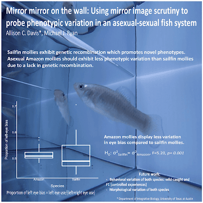
I didn’t get a chance to talk in person to the creator of this poster, which was a fabvourite of mine merging from SICB 2020 (which I mentioned last week, and will have more to say in weeks to come). But Allison Davis was nice enough to respond to my email and send along her poster and some comments. Click to enlarge!

Poster titled, "Mirror mirror on the wall: Using mirror image scrutiny to probe phenotypic variation in an asexual-sexual fish system"

Allison wrote:

This is the first poster I’ve made, and my advisor told me to follow a minimalist style as it encourages people to talk to you. I did notice that not many people followed this style at the conference, so I was a bit worried about how it would be received, but many people came up and started their conversation with how much they enjoyed the poster.

This poster reminded me a lot of one by James O’Hanlon, which I’ve featured here before. A full bleed photo, a question, a single graph in the lower left corner, and a single take-home message that answers the question in the bottom right. Allison wrote that this similarity is purely coincidental.

As for making it, finding a good image that popped was difficult (especially since fish never want to cooperate), but the more difficult aspect was constructing concise sentences that actually conveyed my punchlines. It’s definitely easier to write more!

That editorial focus helps make this poster sing, but that too many poster presenters shy away from. Particularly at SICB, I saw lot of posters that were busily trying to cram the results of at least four experiments on to a single poster. Many posters would be improved mightily if they could just decide on one experiment and have that take up most of the poster.

Perhaps the main thing I would like to do is to soften the portions of the picture that overlap with the figure and text. In the all-important title, all the instances of the word “mirror” run over a series of light to dark colour chages, all in sharp focus.

We associate sharpness with a single focal place where our attention is focused. Things in the background are out of focus. So when crisp intersecting lines or images overlap, it can add visual confusion. Blurring out the background creates a clearer impression of which is in the foreground, and which is the background.

Here’s one I did earlier, as they say on the television shows:


If you click to enlarge, you’ll be able to see that the books on the shelf below the quote are in sharp focus. The books behind the quote are not. They’re blurry. They’re also a bit darker. It makes the text more distinct and easier to read.

For similar reasons, I would have liked the box plots to be filled with a colour so that they stood out more against the photo background. Here’s a quick revision:


This is not necessarily the best or only colour the boxes could be filled with. But the fill makes the graph stand out as clearly part of the foreground and makes it more visible and “read” better from a distance.

External links

Conference posters: Less is more!

16 January 2020

The view from SICB 2020: Fabrics!

I recently attended the Society for Integrative and Comparative Biology conference in Austin (#SICB2020 on Twitter). I saw hundreds of posters spread across three days of poster sessions, and am here to tell you what sights my eyes have seen.

There seemed to be an uptick in the number of posters printed on fabric, “synthetic cloth,” and other foldable materials rather than traditional paper. I went through the first three poster sessions and tried to count every poster that was not on paper. About 10 percent of posters (82 of 774) were fabric or similar.

But what was interesting, though, was that different fabric posters looked different. Often quite different. This is something I’d noticed before, but this was the first time I thought to ask people where they got them printed.

I talked to dozens of people, and a few trends emerged.

Logos of Spoonflower, MakeSigns, Genigraphics, PosterPresentations

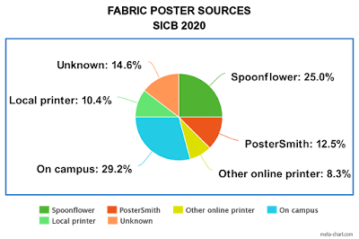
Spoonflower was the most popular source for fabric posters by a long ways. They printed 25% of the posters that I was about confirmed the printer by talking to the presenter. I saw more posters that I suspected were by Spoonflower, but couldn’t find the presenter to ask.

Pie chart showing source of fabric posters at SICB 2020

Spoonflower was the most distinctive looking product. I was able to predict with high accuracy which posters had been printed by Spoonflower by the second poster session. Unfortunately, the distinctive look of Spoonflower posters was not necessarily a positive look. They almost all sagged, and badly.

Poster printed by Spoonflower, showing sagging and distortion from fabric stretching

Many people said they loved Spoonflower because it was cheap. The cost I heard most people quote was about US$20. I think this may be a good case of, “You get what you pay for.” You buy cheap, you get cheap, and it looks cheap.

Spoonflower also has many fabrics, and it was not always clear which people had used (maybe their satin?). Different fabrics will probably give different results.

In fact, one of the best looking fabric posters was a Spoonflower poster. It had almost no sagging on the board. The secret? Corinthia Black hemmed the poster to creating a more rigid seam that held its shape. Her poster was cotton, so she ironed it, and the cotton held up to the ironing well.

PosterSmith was the second most popular single vendor, but had half the number of punters (12.5%) as Spoonflower. Their posters tended to crease or wrinkle rather than sag. At least one person said their poster’s colours didn’t quite look the way they expected.

PosterPresentations, MakeSigns, Genigraphics, and possibly PosterPrint * each had one customer.

The biggest surprise from talking to presenters was how many fabric posters had been printed by their institutions. Over a quarter (29%) were done entirely on campus. This large fraction was not because one large institution sent a lot of people to this conference. The fraction was almost all single posters printed on site by their institutions.

I had not expected that many universities to invest in this sort of non-standard custom printing. But the variety of product was large, and each institution has its own printing quirks. One person said their campus-printed poster smelled a little like fish. (At a biology meeting, some might consider that a feature rather than a bug.)

Ten percent of posters were done by various local printers from where ever the presenter was from. People may use local printers more for SICB than many other conferences, because the meeting is held so soon in January. Many people cannot opt to print their posters on their campus, because all their facilities close for the December holidays.

About 15% of people I talked to did not know where there posters were printed! These were usually students, who designed the poster, but had handed the file over to their professor for printing.

While I felt a little embarrassed for asking about the poster printing rather than the science, many people were happy to talk about how they made their posters. One person said he was more excited to talk about how he made the poster than the project. The project was challenging and the error bars in his graphs were big. I told him, We’ve all had projects like that.”

• • • • •

This was the first SICB conference since the “billboard” style poster was introduced on YouTube last year. It was not a popular format in Texas, with less than half a percent (~0.3%) of posters using the style (3 of 774 posters over three sessions).

• • • • •

* I say “Possibly” here, because I have “PosterPrint” in my notes, but the linked page appears only to offer canvas on frames, not fabric.

09 January 2020

Critique: Bee DNA

Today’s poster comes from Mark Davis. This was, as far as I can tell, presented at a US Department of Defense (DoD) environmental restoration workshop last December. Click to enlarge!


This poster was designed by Danielle Ruffatto.

I spotted Mark’s poster on Twitter, and invited him to submit to the blog. It stood out from a lot of posters because of how it used the zone of the poster sitting at eye level. No text. Just a solid banner of visual delights from one side to the other. The pictures are not laid out in a grid – they are different heights and widths – but it doesn't matter because all the outer edges align.

The right half of the photo banner has a pointer leading down to “Phase II.” It’s not entirely clear what the relationship between those pictures and the “Phase II” section is.

The lack of an underlying grid makes me a little more uneasy in the bottom section where the main text resides. The varying widths of the text sections bothers me a little. For example, the “Methods” section is not quite twice the width of the “Objectives.”

When varying column widths, I like when they are clear multiples. The “Objectives” section is the narrowest, and could be used as the basis for other sections. If the “Methods” section was exactly twice the width of the “Objectives,” it might make for a slightly cleaner layout. That there is a decent amount of what space under each section indicates there is a little room to play.

The typography is sharp throughout. I like the combination of the plain type for the main text with the condensed font for the title and headings. Bolding is used judiciously for emphasis. The use of drop caps for numbered lists in the “Objectives” section is very slick and well done. It would have been nice is the “Methods” list had the same format.

The graphs in the results are nice, but would benefit from a little more colour or heavier line weight or something to make them “pop” against the background. From a distance, they fade away to near invisibility. And again, the graphs don’t align with the bars of pictures above them. In the reduced thumbnail above, the graphs look like empty space at a glance.

I like the marginal dividing lines between the sections, but they don’t align with the lines between the photos above them.

While the logos are in the appropriate “fine print” section, I would have liked it if they were the same height.

The “Acknowledgments” are likewise in a good position, but the line length is around three or four times longer than ideal.

This is a strong poster in concept that is well executed, particularly in the typography.

02 January 2020

Critique: Dangerous LDL

New year? New decade? Whatever. We have business to attend to!

This week’s contribution comes from Jessica Schubert. She gave this work at the 2019 European Society for Cardiology conference. This is one of the bigger conferences, with over 30,000 participants (or, as Jessica put it, “kind of a big deal”). Click to enlarge!

Poster titled "Is low LDL dangerous?"

Jessica writes:

The most useful input from my peers was seeing what kind of poster I didn’t want to make. I found a really great website called Canva, which I used to make the poster. I don’t think I’ve seen you mention it.

I have not mentioned Canva before, so am happy for the pointer. You can use a limited version online for free, or pay a subscription fee for a “Pro” version with more features.

Canva screenshot showing infographic templates

Canva seemed geared towards beginners. There are a lot of templates for calendars, cards, brochures, handouts, and so on. It feels a little bit like Microsoft Publisher with the type and variety of templates. I haven’t had time to dig into all the features, but may do so in a later post.

Getting back to Jessica’s poster, the title bar is one of the strongest things about it. The title pops out, thanks to both its size and the highlighting of the word “dangerous.” It’s big and red and you can’t miss it. It might be even stronger, though.

One of the basic exercises of graphic design is, “Use a type that represents what the word shows.” For instance, I think most people would agree that the type on the left doesn’t represent the feel of the word as well as the words on the right.


The colour and heavy weight for “dangerous” are right, but the letter forms are not. They are round and soft, which most reader as “safe” or “non-threatening.” I would have liked to see “dangerous” set in type that was even more angular and aggressive.

The deft use of red continues in the highlighting for the headings. Again, the jagged stripes fit with the “danger” from the title. It makes it very easy to identify the sections. I would have liked the headings to be a bit bigger to more clearly differentiate them from the text.

I also like that the sections are descriptive (“LDL in the real world”), rather than generic (“Introduction”).

There’s a few places there might be some improvements.


The positioning of the logos, particularly the right “UCR” on, seems far to close to the author lines. It’s puzzling given how much white space is available and how the poster generally provides enough white space.

The alignment could be more consistent and tighter. The margins between the text columns isn’t even, although it’s so close I had to check! The intrusion of the graphs at the bottom into the column margins is another place where making edges line up could significantly improve the look of the poster.

I like the idea of using colour in the table to group columns, but using light colours makes it a bit hard to read.

Finally, there isn’t anything visual on the poster than tells me what it is about. That graphic elements, that is that table and line graphs, are generic.

Posters are a visual medium, and it is helpful to have an image that can set it apart. That might be hard to do in a very focused meeting where most of the topics are the same. But in a large one with tens of thousands of participants, a specific image is incredibly helpful.

I admit that I don’t know what image I would use. A cholesterol molecule is one possibility, although the differences between HDL and LDL might be too subtle. Jessica’s solution was to make the title so short and punchy that it can serve as that entry point, and that might be the best option in this case.