You have a survey that asks people, “Yes” or “No.”
These are two mutually exclusive categories. There is no third option, like “Unsure.” Therefore, if you know that 35% of people picked “No,” you know that 65% of people picked “Yes.”
The math is irrefutable. The math is trivial. So it doesn’t matter which value you report, right?
Well, no, as the American network ABC found out over the weekend. The network tweeted:
JUST IN: Roughly one third of the country opposes Pres. Biden's decision to recommit to the Paris Climate Accord and rejoin the World Health Organization(.)
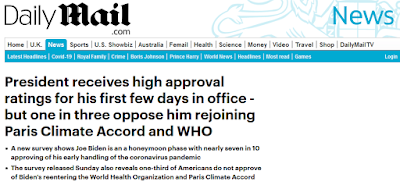
This generated a huge amount of pushback, and the tweet was deleted. There is still a news story on the main website, but the “one third oppose” made its way to the UK newspaper The Daily Mail.
President receives high approval ratings for his first few days in office - but one in three oppose him rejoining Paris Climate Accord and WHO
So even though it’s simple math – if one third opposes, then two thirds support – putting the nos in the headline treats the opposition as though it were the important thing.
But a bloody awful lot of people online looked at that and said, “Two thirds support is huge, especially considering that there is so much polarization in America that the country just narrowly avoided an armed insurrection n January 6, 2021.”
Maybe the one third opposition is the right thing to emphasize. But then
again, maybe not. Is it high? Is it low? Is it likely to go up or down?
But this example shows how choices about presentation dramatically shift the emphasis, and therefore, the implications that people take away from it. Data are supposed to help be a way to understand the world, and we are always looking for how they fit in cause and effect relationships.


1 comment:
Seth Godin speaks more to marketing, but I think it holds for other sectors too: “If you don’t have a point of view when you present data to someone else, you’re only doing half the job.” https://overcast.fm/+L0YXqtWWk/21:37
Post a Comment