27 August 2009

Don’t hold my hand

ResearchBlogging.orgErren and Bourne (2007) offer 10 tips for poster design. But as is often the case, there is a point I will contend. They write:

Guide the reader with arrows, numbering, or whatever else makes sense in getting them to move from one logical step to another. Try to do this guiding in an unusual and eye-catching way.

You should not have to guide your reader. Having to do so is indicates failure of design. Audience members at a research poster session are experienced readers, and are smart enough to know and follow the conventions established for the written English language that are all around them. Signs, magazines, newspapers, movie credits, comics, blogs, and get along perfectly well without “unusual and eye-catching” directives to show the next step in the sequence.

You can use layout so that people can read through your poster without resorting to explicit directives as to where to go next.

Fantastic Four art by Jack KirbyLet’s look at this page from the king of comics, Jack Kirby. It’s a grid of two columns and three rows of squares, and the spaces between panels don’t provide a clear clue to the reading sequence.

In theory, you could either read this as two top-to-bottom columns, or three left-to-right rows. If Kirby followed Erren and Bourne’s advice, there would be arrows running between the panels, or numbers in each panel, so that readers could follow this page.

Yet even young readers know to read the panels in rows.

The placement of the word balloons is the key to reading sequence. When you’re reading the first panel in the upper left corner, the next closest balloons are to the right, not down, thus encouraging the correct reading sequence. Many of Kirby's pages are laid out this way: The word balloons running almost straight across the top of each panel, in close proximity to each other. The artwork underneath distances the balloons from each other in the vertical dimension, making a reader less likely to wrongly follow down first instead of to the right.

And the moral of the story is: Put related objects close to each other.

In a poster, well defined white space can serve the role that art does here. Clear bands of uninterrupted white space can be strong cues to the reader as to the direction of the reading flow.

Reference

Erren, T., & Bourne, P. (2007). Ten Simple Rules for a Good Poster Presentation PLoS Computational Biology, 3 (5) DOI: 10.1371/journal.pcbi.0030102

Related links

How to: Balloon placement
by maestro comics letterer, Todd Klein

24 August 2009

Poster makeovers?

Trinny and SusannahAt Mind the Gap, Jennifer Rohn mentions a title that set my mind ablaze with possibilities:

Science PR: do we need a Trinny and Susanna for scientists?

Not sure why the link in the Mind the Gap post doesn’t lead to a post with that title, but no matter.

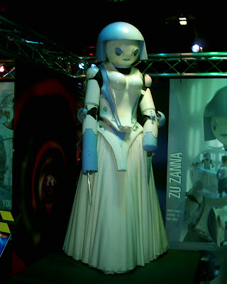
I’d heard about this duo Trinny and Susanna before as the original What Not To Wear team in the UK, and as the inspiration for robots in Doctor Who (below), before finally seeing them in Making Over America last Friday. And I can see why they are so popular: They’re good at what they do.

I wouldn’t want to do what Trinny and Susannah do for scientists’ dress sense. But I would love to take their approach for scientific presentations. I would love to go to a big conference like Neuroscience, find posters that just makes you go, “This is not helping!” and take the presenter through the whole cathartic process of critiquing and rebuilding the poster from the ground up.

I don’t think it would make great television, but it just might work as a social event at a conference, if done with humour and with the right format.

Link love

Editor of Open Lab 2009Over at Neurotopia, SciCurious has many fine tips for poster presentations. It’s an extended repost, and you may want to hit the earlier one for the comments. Sci’s perspectives are well worth checking out.

And yes, Sci is the editor of the next Open Laboratory 2009 anthology. If you aren’t familiar with this project, check here to see the posts nominated so far. (Warning: The Better Posters blog is not responsible for any declines in productivity suffered from incessant browsing of fine science blogging.)

20 August 2009

Is there anything new to say about graphs?

For a blog about poster presentations, a medium that is most associated with scientific and technical discourse, I haven’t written much about the element that most researchers consider to be the heart of their poster, the data.

The reason for that is most data are presented as graphs, and it’s very hard to find anything substantive to say about graphs that Edward Tufte hasn’t said already. Tufte has written four rightfully famous books about graphs, and for any researcher doing technical data displays, they are must reads. These four books are:


  • The Visual Display of Quantitative Information

  • Envisioning Information

  • Visual Explanations

  • Beautiful Evidence


These books are not without flaw (I reviewed Beautiful Evidence at my other blog, NeuroDojo, here), but they provide an invaluable starting point for thinking about graphs, charts, and related visuals. And Tufte is, of course, not the only person who has written on the creation of technical graphs. While I may not be able to say more, I do have some recommendations.

First, replace tables with graphs. Almost any information than can be placed in a table can be shown in a graph. Tables require more reading and interpretation, whereas graphs are more likely to serve as an “entry point” for your audience.

Second, make graphs just for your posters. Many people recycle graphics prepared for journals or slides. Figures for journals often have to be printed in black and white, but there is no reason a poster figure should be so limited. Additionally, journal figures can be very detailed, because a reader can examine them at his or her leisure, whereas you may have only a few minutes with a fellow researcher at a poster. Figures for slides are often too low resolution to be enlarged for printing on a poster. Both could be in proportions that are completely inappropriate for the layout of your poster.

Remember, only you can prevent graphs that look like this ending up on your poster!


(Shudder.) Hat tip to Garr Reynolds for drawing attention to that last graph on Twitter.

18 August 2009

What do you do with the poster?

Nature PrecedingsYou’ve lugged your poster all the way to a conference, given your talk, had people compliment you on how beautiful it was, to which you say, “Thank you! It’s all thanks to the Better Posters blog,” lug it all the way back home...

And then what?

Not so long ago, almost all you could do was maybe to hang it up in the corridor of your building. Now, there are a few archive sites for them. I’ve dipped into ePosters.net for some poster critiques, to name one.

Nature has recently launched a site for pre-publication results called Nature Precedings. The Ecological Society of America recently sent out an email following their annual meeting encouraging participants to consider archiving their talks and posters. ESA secretary David Inouye cited these advantages:

  1. You can cite it in job applications or grant proposals.

  2. You can point prospective students to it, as well as anyone who wasn’t able to make it to your presentation or poster during the meeting.

  3. It’s free to post the presentation, and you won't have to worry about archiving it elsewhere or maintaining it on your own server.

  4. We may in the future be able to link these archived presentations to the online meeting program.

  5. Historians of science and future students of ecology will be pleased to have the additional source material when they’re writing their books about you.


That said, there are some potential disadvantages. The biggest one is that archiving something could run you into problems with editors when you try to publish. Currently, most journals abide by the Ingelfinger rule, named after Franz J. Ingelfinger, the editor of the New England Journal of Medicine, who declared in 1969 that they would not consider a paper for publication if its results were published elsewhere. Although conference abstracts are usually not considered a problem, archiving a complete presentation is new. It’s not clear how editors might react.

Of course, you can always archive your work after the paper is accepted for publication.

13 August 2009

Entry points: Five ways to make your poster more inviting

Puls BiznesuPoster presentations are often crowded, often busy spaces with many people who have never met you or know with your research.

What do you have on your poster that beckons someone to come closer?

What on your poster might reach out to someone strolling by to lean in and have a second look?

Jacek Utko is a designer, best known for his work on Eastern European newspapers, who has been mentioned on this blog before. He argues that such questions are not simply some sort of cheap salesmanship, but necessary for people to connect with content.

People need entry points to text. People look at headlines. People avoid long stories. There are many proofs for this, such as eye-tracking research.

I am somewhat cautious about over-interpreting research when it comes to design, but Utko’s remarks are helpful ways to think about poster design. What kinds of entry points can you have on a poster?

Here are five suggestions to make your poster more inviting.

  1. Pictures: Use a big, high quality photo that relates to your topic. In biology, one of the simplest entry points can be to have a big picture of the organisms you are working on. Graphs might work as an entry point, but tables almost certainly would not.

  2. Headlines: This is not just the title, but section headings, too. Have you considered something more descriptive than the stock phrases used from journals? “Introduction.” “Methods.” “Results.” “Discussion.” Section headings might become a little like...

  3. Pull quotes: These are frequently used in newspapers and magazine. They’re one or two juicy bits in a story, set off from the rest of the text in large type, that give a bit of a teaser as to the content of the interview. But apart from the occasional descriptive section heading, I have never seen them used in posters.

  4. Circles: “The human eyes loves the circle and embraces it,” writes Kimberly Elan in her gook Grid Systems. Maybe this is why bullet points have proved so popular. Considering that posters are built around rectangles shapes, having a circles somewhere in the layout might attract more attention than you think.

  5. White space: Don’t underestimate the intimidation factor of a poster that is chock-a-block with text. Leave some breathing room.

08 August 2009

Free fonts

Ripe sampleSmashing magazine provides a list of superb free or cheap fonts for you to try. As the comments note, some of these are not for commercial use. Plus, these are in a variety of formats that may not be useful to all users. In come cases, Mac users are out of luck. In some cases, you have to know what OpenType is.

Hat tip to Garr Reynolds.

Pictured: Ripe font.

06 August 2009

Type crimes: Species names

My major academic research concerns crustacean nervous systems, so I was very interested in a recent article on for the electronic journal JoVE (the title is derived from the acronym for Journal of Visualized Experiments) on the stomatograstic nervous system in crabs. You’ll have to trust me when I say that in my field, that preparation is famous for its elegance and notorious for its difficulty. The picture gives only a hint of how many fine placements are required.

As I was watching the video, I noticed how the article title was typeset.

Cancer Borealis Stomatogastric Nervous System Dissection.”

And I cringed.

Now, that may look fine to you, but as a biologist, there are rules about writing species names. They have two parts – check. They are always set in italics – double check. The first part of the species name, for the genus, is capitalized – check. The second part of the name is entirely lower case – fail!

In our department, we harass students about the correct way of writing species names. Not setting a name in italics is an amateurish mistake, and we hound students relentlessly on it. It’s probably the few typographic guidelines that they ever have to contend with.

If you’re not a biologist, how does this affect you? It probably doesn’t. The point of this example is that a decision about casing introduced an error. Perhaps a minor error, but an error nonetheless.

Capitalizing only the first word, as here, is usually called sentence casing. Capitalizing every word in a sentence is called headline casing. If you want to set something in headline case, check that you’re not violoating any other rules. Ask why you want to use headline case. Is it just for emphasis? Because there are other ways that can be achieved, such as with font size, weight, colour, and so on. None of those would violate the rules for species names.