28 September 2023

Link roundup for September 2023

Best poster prize ever

Kristen Zuloaga wrote:

My 8 year old judged posters from my lab and Zuloaga lab at local Society for Neuroscience conference.

My grad student Emily Groom won him over with mice being stressed because they couldn’t play with their friends. 😂

Poster award made by eight year old poster judge

• • • • •

Clair Sewell shared her slides and notes from a presentation on “Creating an effective conference poster.”

While slide decks alone are not as good as when accompanied by a presenter, the information here is generally quite good.

• • • • •

Had a few YouTube videos on poster design lately, the latest of which is from Cooked Illustration:


• • • • •

New paper shows that in dentistry, posters are less likely to match the final publication than oral talks are.

The authors explain this as a function of differences in peer review:

(O)ral presentation abstracts were subjected to rigorous expert review and had higher study quality and scientific priority than poster abstracts, which made higher consistency of oral presentation abstracts.

Again, this pattern has been shown many times. 

Wang G, Chen J, Li H, Miao C, Cao Y, Li C. 2023. Reporting inconsistency between published conference abstracts and article abstracts of randomised controlled trials in prosthodontics presented at IADR general sessions. PeerJ 11:e15303. https://doi.org/10.7717/peerj.15303

• • • • •

A case study in using Adobe XD to create and host a poster session. 

Gehling R. 2023. From teacher to learner: Using digital technology to enhance authenticity and engagement in poster presentations in the classroom and online. Proceedings of The Australian Conference on Science and Mathematics Education. https://openjournals.library.sydney.edu.au/IISME/article/view/17571

• • • • •

Angela Collier articulates some of the problems with violin plots. I get that sometimes you want to show unusual distributions. But as Angela says, we have a simpler graph for that: a histogram.

There is a lot more critique here, much of it funny, and much serious too.

23 September 2023

Why does my poster look different when it’s printed full size?

Maureen Stone was on a recent episode of the Policy Vis podcast talking about the intricacies of colour. 

I’ve talked here about how designing a poster on a computer screen is so different from a printed poster. The light source is a big difference, and the resolution of screen is too. But I hadn’t often considered the size of the screen.

That was brought up in this segment of the interview:

Maureen Stone: Well, so I call that problem color and size, and it’s a really well known color perception phenomenon. So I’m going to give people a little bit of a geek definition, color is not how you create it, it’s not the RGB value, it’s how you perceive it; and how you perceive it depends on a lot of factors, we know it depends on background; and it turns out, size is a huge factor, so if you ever think about, you know, you ever go paint a room, and you got the little paint chips, so that’s a good color, and then you spread a bunch on the wall and say… 

Joel Schwabish: Yeah, have experienced several times, yes. 

Maureen Stone: Well, I didn’t know that it would apply to DataViz, but, in fact, it does. 

Joel Schwabish: Right.

Maureen Stone: And so, the real problem is technically what happens is that as the stimulus is the thing you’re looking at gets smaller, the color appears less vivid, less colorful, okay? And as you shrink them way down, pretty soon you’re just getting kind of warm, cool colors.

We see bigger colours as brighter colours.

A computer screen might be what, two feet wide? A printed poster might be four, six, or eight feet wide.

So something that might seem appropriately subtle on your small computer screen could seem garish when its area is four to eight to sixteen times bigger.

One way to test this might be to print just a small letter sized piece of the poster, but print it at full size, so you can get a better sense of how the colours will play.

External links

 Policy Viz podcast #244: Maureen Stone

16 September 2023

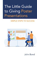
Review: The Little Guide to Giving Poster Presentations

Cover to "The Little Guide to Giving Poster Presentations"
The Little Guide to Giving Poster Presentations is well named. It is, indeed, little.

Perhaps too little.

John Bond’s book weighs in at 150 pages, and they are kind of small pages, too. A fast reader can probably skim through this in a day without too much trouble. That this is a quick read is not necessarily a bad thing. Part of it is because Bond’s prose is clear.

Unfortunately, the book’s treatment of its subject also encourages skimming, because sometimes there isn’t as much depth as you would hope for.

Posters are a visual medium, so you might that a book about posters would be illustrated. But you don’t get to a diagram until Chapter 11. There’s one more figure in that chapter, and then nothing. And they aren’t in colour, either.

Sometimes, Bond even draws attention to the “little” of the title. In Chapter 21, he writes:

Information regarding color choices for charts and graphs could fill a whole chapter or even a book (and likely does).

But then, having drawn our attention to the rich subject of colour use in data visualizations, Bond ends the chapter a couple of pages later. Without pointers to other resources. (The book’s references are few and far between.)

There are some bright spots. This is the first book about conference posters that mentions the changes to the academic conference scene wrought by the ongoing covid pandemic. I also appreciated a section about how to estimate costs of attending conference, which I don’t remember seeing in other poster making resources.

While I craved more depth, I don’t fault most of the recommendations that Bond makes. The advice is consistently good. Bond feels more comfortable with writing: the book devotes three sections about planning and writing, but only one section to design, and one to presenting.

Bond’s book will help those who read it, and I am sure some readers will appreciate its readily digestible format. And the book contributes to the push to try to get people to take posters more seriously. There were next to no books to conference posters for so long that I’m pleased to see more arriving in this space

References

Bond J. 2023. The Little Guide to Giving Poster Presentations. Rowman & Littlefield: Lanham. https://rowman.com/ISBN/9781475870152/The-Little-Guide-to-Giving-Poster-Presentations-Simple-Steps-to-Success

07 September 2023

You are not “too good” to give a poster

Recently, Franck Marchis wrote:

Received an email from a senior scientist (over 65 years) suggesting he might skip a prominent international conference if given a poster presentation. The sense of entitlement was palpable.

Posters are not just for early career researchers. And if you ever think you don’t want to do a poster because you are just beyond that point now... please check your ego.

Case in point.

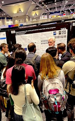
Nobel laureate John O'Keefe presenting a poster at Neuroscience meeting in 2016


This is from the 2016 Nueroscience meeting, and the gentelman presenting the poster is John O’Keefe. For those of you not in the neurobiz, he won a Nobel prize in medicine or physiology a little less than two years before this picture was taken.

  Picture by Lucie Low.

And lest you think this was some weird, on off event... no! It was not! Here is O’Keefe again just last year:

Nobel laureate John O'Keefe presenting a poster at Neuroscience meeting in 2022

Picture by Timothy Bredy.

I don’t know how I missed these.

External links

The Nobel Prize in Physiology or Medicine 2014 press release