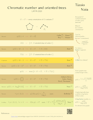
Today’s contribution is from Tássio Naia. It was recently presented at the 14th Latin American Theoretical Informatics Symposium. Click to enlarge!
I’m pleased to have a poster than leans more towards the math side of research, because I don’t see a lot of contributions from that field!
For equations, careful typesetting matters. The alignment of the central symbols is well done here.
The banding to emphasize the different equations also works. It seems the idea is to distinguish “Theorem,” “Conjecture,” and “Corollary.” I do wish the “Corollary” didn’t share a colour with a “Theorem” band (two above it). Presumably the idea was to prevent three rows of the same colour.
Tássio was nice enough to not only send the poster, but a little explanation of how it came to be.
There was little information about how the poster was going to be viewed (other than “it will be read on a screen”). Because of this, I did not worry about using a darker background color, or about using small margins.
I also considered that it would be easy to reach me even outside of poster presentation time-slots, since you can search for people by their name and open a chat window.
I went for very little text, even though that meant that statements were more on the symbol-heavy end of the spectrum (hopefully not too much).
For online posters, a portrait format works well because scrolling down is easier than scrolling sideways. Similarly, a single column works better than multiple columns because you don’t have to scroll back up to the top.
Because downward flow is expected, the arrows in the sidebar threw me.
We expect arrows to lead us in a sequence, but both break the expected reading conventions. I think they would make much more sense if the arrowheads were on the other end of the arrow.I like the feel of the main column being the formal presentation. The smaller lefthand column feels like marginalia. In particular, the slant on “maybe true” gives the side text an informal feeling I like. I would have been tempted to set the lefthand column in a good handwritten font to push that feeling a little farther.
Something that the image file here on the blog can’t show is the use of links in the poster. There is a link to the conference website, to references, and Tássio’s home page. Because there are clickable links, and the poster is viewed online, it’s not clear to me if there is any benefit to using a QR code in addition to a standard hyperlink to lead to references.
I would also like “References” to appear closer to the QR code so that it’s more obvious what the QR code is supposed to lead you to. The dot leader is meant to connect the two, but distance breaks the visual link between the two. There is an advantage of using dot leaders when you have lists with varying item widths. Maybe less useful for single items.
You can see more posters from this conference here.
More submissions from mathematicians would be most welcome!


1 comment:
Dear Zen,
Thank you for your insightful feedback on the poster!
Great point about the arrow (it completely escaped me). I also agree
that a handwritten font for the "marginalia" would have been nice
(except for the equations).
I can say why a Theorem and a Corollary are coloured differently: the
colour is supposed to emphasise the results which are new (my
contribution to the problem) - while also preventing consecutive
blocks of the same colour (in fact, I played with the ordering of
things until that was the case... and this wouldn't have happened, I
probably would have used darker lines to separate distinct
statements).
Best wishes, and keep up the great work!
Post a Comment