Showing posts with label Better Posters book. Show all posts

24 May 2025

Happy fourth bookiversary to the Better Posters book!

I can’t quite believe it’s been four years since the Better Posters book was released.

And I am even more incredulous that it’s been bought and even read by some people that I personally don’t know! It is still a thrill whenever I see someone hold up a copy in a Zoom call or say that they have a copy.

It is not to late for you to write a review on your favourite book site, ask your local university or college library to get a copy for their collection, or maybe even buy a copy yourself!

Thank you for your support! 

As for me, today I have been celebrating by writing a full slate of blog posts for next week. Five new posts! Two new critiques, one short but oh so cute post, a massive link roundup, and a big post about how to crush a poster pitch session!

06 June 2022

Listen to the ABT Time podcast

ABT Time podcast. The world never has to be boring.
The most recent podcast interview to cover the Better Posters book is on the ABT Time podcast, episode 39, hosted by Randy Olson.

“ABT” in ABT Time is the abbreviation for “And, but, therefore” – the key words for making a concise narrative.

The ABT structure features prominently in Better Posters because it is an powerful tool for encapsulating a project in a sentence. It’s often hard at the start of a project to know what the most important thing will be, and you have a lot of narrative chaff at first. An ABT sentence just cuts away the chaff.

As with some of the other podcasts, this one is more wide ranging than just posters and just narrative. I’ve crossed paths with Randy a few times, so we got to have a little fun in the conversation.

The ABT Time podcast should be available wherever you get your podcasts (Apple, Spotify, YouTube, etc.).

External Links

ABT Time #39 on ABT Agenda

17 May 2022

The Scholarly Communication podcast

Scholarly Communication podcast logo
I’m fortunate enough to be on the Scholarly Communication podcast with Daniel Shea! (I think it’s episode 91, but they don’t number them by default.)

While the ostensible reason I was on was to talk about the Better Posters book, the conversation ranged widely. Daniel and I talk about narrative, collaboration, and efficiency in the realm of academic communication more generally.

Here are a couple of posts I mention during the interview.

First, this is the post where I talk about my wariness anyone says, “We need to do a better job training Ph.Ds in...”.

Second, this is the post where I talk about how my writing class completely, totally, 💯 rejected the idea that storytelling has any place in science. So storytelling is dead, long live narrative.

You can listen at the New Book Networks website or probably any other place you get your podcasts (like Stitcher).

External links

Scholarly Communication podcast home

Scholarly Communication: Better Posters

03 May 2022

Lecture Breakers #121

Lecture Breakers logo
I’m on the Lecture Breakers podcast this week!

I saw host Barbi Honeycutt on a YouTube video, and heard about her work with teaching in alternative formats besides lectures. I reached out to see if she was interested in chatting about using posters for teaching without realizing she had already a great blog post on the topic herself.

I had a blast talking with Dr. Honeycutt, and I hope the fun comes through on the show.

In preparing for the interview, I listened to a few episodes of the podcast, and I am now a regular listeners. If you are an educator, do yourself a favour and subscribe to this podcast. The enthusiasm is high, the questions are smart, and the guests are thoughtful educators. It’s a great listen for anyone teaching in higher education.

Related posts

Using poster assignments in courses

External links

Lecture Breakers #121 (link to podcast on Apple; also available on other podcast services)

6 Ways to Use Teaching Posters in Your Course to Increase Student Engagement (2019)

30 November 2021

Interview on the PolicyViz podcast

I recently spoke to Jon Schwabish (author of Better Data Visualizations, reviewed here) on the PolicyViz podcast, and I’m happy that the episode is now available wherever you listen to podcasts! 

Jon is a great person to talk to, and his questions got me thinking about some new topics that I hadn’t considered before.

This season, Jon has been experimenting with a video version of the podcast. I already knew of my bad speaking habits as an interviewer on audio (I go on tangents way to easily, I start sentences without knowing where they’ll land), but now I get to see entirely new bad habits (looking away from the camera, shifting my weight).

The show notes also contain a complete transcript in case you read faster than I can talk.

Related posts

Review: Better Data Visulizations

External links

PolicyViz podcast Episode #206: Zen Faulkes show notes 

08 June 2021

Better Posters book reviews

"Every lab should have a copy of Better Posters." - Stephen Heard, Scientists Sees Squirrel

 In this post, I’ll be compiling reviews of the Better Posters book.

Reviews are extremely helpful to get the word out on books. I thank everyone who takes a few moments to review or rate the book.

June 2021

Better Posters: Zen Faulkes on ways to rescue the poster session by Stephen B. Heard at the Scientist Sees Squirrel blog. Excerpt:

I’ll cut to the chase here: this book is great.

Good Reads reviews for Better Posters. (As of this writing, there is only one review. But it’s early days yet!)
 
July 2021

Book review: Better Posters by Kristen Birney at the Data Ab Initio blog. Excerpt:
Better Posters aims to be a definitive reference on the academic conference poster... and I think it succeeds.
• • • • •

August 2021

Book Authority Best New Academic Research Books
Better Posters is featured as “7 Best New Academic Research Books To Read In 2021.”

• • • • •

November 2021

Jon Schwabish says:

Even though it’s specific to this one part of data communication, I think there’s a lot going on here that a lot of us can learn about data communication.

 • • • • •

December 2021

David Schulz writes:

I believe it will become my go-to recommendation for those who are creating scientific posters.  No other book (even mine) has this depth of analysis(.)

Catherine Scott says:

I highly recommend this book(.) I credit award winning posters made by me an my mentees with the advice given therein!

• • • • •
 
March 2022
 
The Exploring Chiro podcast says:
It should be a must read for graduate students and researchers.

Sarang Park, manager of the I Am SciComm account (where I have hosted), said, completely unprompted:

His book Better Posters is fantastic - I can’t recommend it enough.


• • • • • 

February 2024

Conservation Biology includes Better Posters in its “Noted with interest” book review section. It says in part, “This excellent book is useful and enjoyable to read.” Hat tip to Sarah Stott for spotting that and alerting me!

• • • • •
 

2026 

Jennifer Motl wrote on LinkedIn:

Highly recommend this book! It’s hard to find evidence-based methods to communicate science, and this is the perfect blend of strong design principles, practical methods, and experience from scientific meetings. Love it!

If you spot a review to include here, please email me the link at BetterPosters@gmail.com!

07 June 2021

About that frontispiece...

I want to explain something about the frontispiece to the Better Posters book.

Presenter, Zen Faulkes, in front of a poster.

 The poster shown there is bad. 

Poster about shrimp motor neurons.

I’ve said as much in this blog post.

Poster of shrimp motor neurons with criticisms written on it.

So why, in a book about improving posters, is the very first one a reader is likely to lay eyes on, a bad example of the format?

I included that picture not because of the poster, but because of the presenter, which is to say me.

The picture is not a recent one, so I suppose some people might think I picked it because of ego: that I wanted to show myself younger than I am today. (Maybe there is a little of that. I do like how I look in that picture! And it’s got a favourite nerdy T-shirt that I don’t have any more.)

But I chose that picture as the frontispiece because that photo captured how I feel in a poster session. Happy, excited but not tense, and just... in my element. (And was even before I started blogging about conference posters!)

For many people, presenting posters is not a happy experience. For one reason or another, hey are stressed, they are tense, they are frowning. 

I chose that photo because it shows the feeling I want anyone to have during a poster session. It’s the enthusiasm for the poster session that I wanted to share in the book.

Related posts

Critique and makeover: Shrimp MoGs (rhymes with “rogues”)


18 May 2021

The Better Posters book has shipped!

Yesterday, a good friend of mine posted this on Facebook:

Better Poster book in a box

Proof of life!

That’s right, the book has shipped early!

You still have a few days to “pre-order” the book from the publisher at a 30% discount. Use the code “POSTERS30” at checkout.

Edit: And friend of the blog Melissa Vaught got hers!

Keep those pictures coming! I love them!

13 May 2021

Solving the Pokémon problem for posters

My editor on the Better Posters book forwarded the copy of Jon Schwabish’s book Better Data Visualizations. (I have not read it yet, but hope to soon!) If you remember of one the rejected cover designs I posted a while back, it’s fair to say we dodged a bullet by changing my book cover.

Covers of Better Data Visualization and Better Posters

Similar titles, concept, colour scheme, and layout? These covers would have had the Pokémon problem.

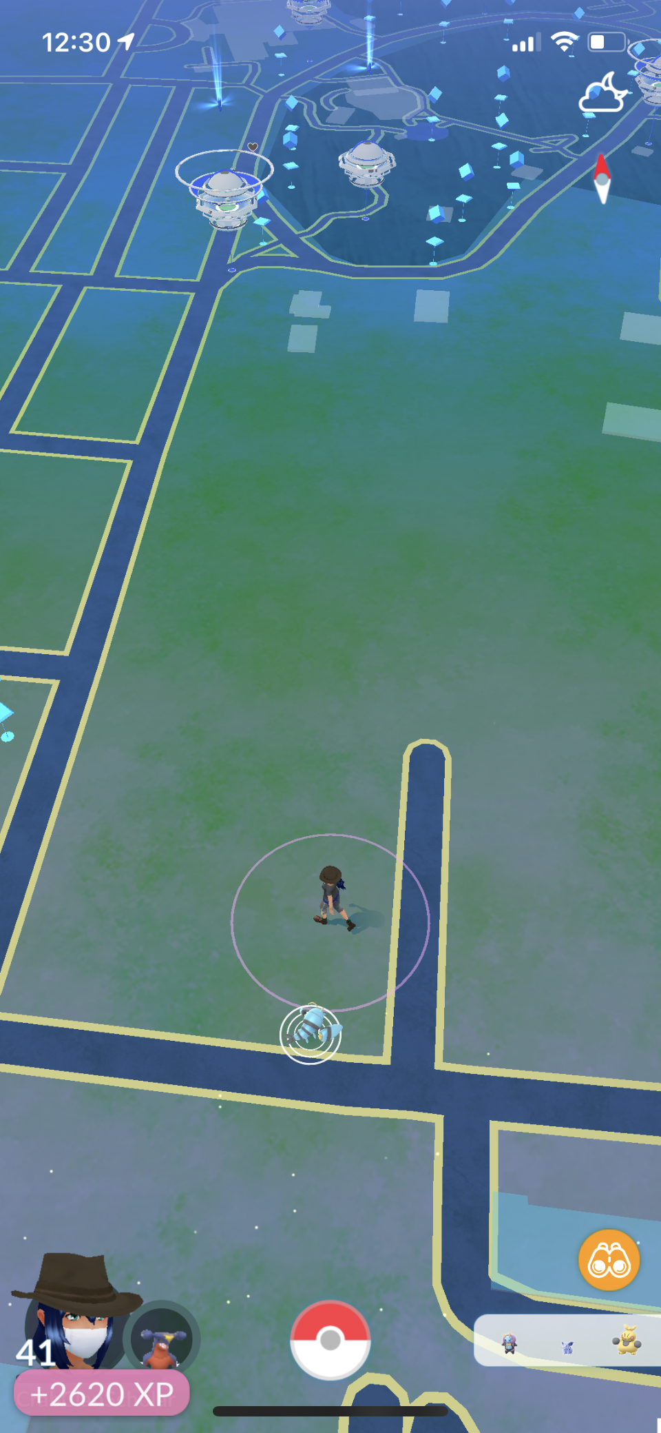
I play Pokémon Go. I have a dog and it gives me something to do while I walk. When you’re playing, you usually see a screen something like this:

Pokémon Go screen showing Clauncher

When I saw a screen like the one above, I thought, “Ooh. What’s that?” The game periodically introduces new Pokémon, and one of the newer ones (shown above) is a new snapping shrimp inspired Pokémon called Clauncher.

Clauncher

I study crustaceans, so obviously a lot of the crustacean inspired Pokémon are my favourites.

But what struck me when I was looking for those first few Claunchers was how obvious it was when the first one popped onto my screen that I had never seen it before

The more I thought about it, the more I realized how brilliant the Pokémon designers are. When you’re playing, you need to clearly distinguish different characters. Those characters are appearing as just a few pixels on the screen. 

Even though these are all nominally “cat Pokémon,” it’s easy to recognize them as different kinds of characters. 

Cat pokémon.

Conference posters suffer badly from the Pokémon problem. 

There is a lot of sameness on those poster boards. I remember someone saying that if you image search for “Good conference poster”...

Google image search for good conference poster

and then search for “Bad conference poster,” the results look... almost the same.

Google image results for bad conference poster

How do the Pokémon designers do it? Mostly they pay attention to colour and shape. Some Pokémon are light, some are dark, some are striped. They generally don’t have subtle differences (though some of the shiny ones are quite a bit like the normal ones). They colours and patterns are big and bold.

But even if you saw them in grayscale or in outline, each Pokémon cuts a different silhouette. 

As a poster maker, you’re probably going to have a rectangular poster. But you can pay a lot of attention to the shapes within your poster. Things that are not rectangular are going to make a strong impression and distinguish your poster from the crowd.

Having a strong colour scheme is even better. You can see the colour of something from a long way away, long before you can see any detail. When I walk through poster sessions, many posters are black text on a white background. 

Magazine cover and black text on white background
 

In big sessions, though, there is often someone who has a black poster with white text, and it just pops out. 

Magazine cover and white text on black background

But that is still monochrome. When I have images, I like to use the eyedropper tool to take something from the image and make it the dominant colour for the poster.

In this example, I sampled the yellow in the glowing ball.

Magazine cover and black text on yellow background

But I could have easily pulled from the dark blues in the background.

Magazine cover and white text on blue background

Even though all four have the identical content, nobody would mistake one for any of the others if they were hanging up in the poster hall.

This is one of the reasons conference templates create problems for presenters. For a local student conference, I once provided  all the student with a template of black text on white background. It’s the most readable, right? It was bad, because it was so monotonous to look at.

So to get back to the cover of my book and Jon’s book... it would have been a disaster for both of us if my cover had stayed the same. It’s enough that the topics and title are similar, but if those covers had been so much alike?

I think there would have been a lot of readers who would have confused our books. People would have thought, “Well, I am going to show data, but where’s the stuff on posters?” Or “Man, I’m show slogging through a lot of poster stuff to learn a little about data visualizations.”

And the moral of the story is: Look for ways to make your poster as distinct as a Pokémon!

Related posts

Sunday scraps: Second book cover draft

Sunday scraps: Third book cover draft

External links

Pokécrustacea: the crustacean-inspired Pokémon

08 May 2021

Custom Better Posters bookplates

Bookplate saying "Ex libris", "With the gratitude of the author" and "Pelagic publishing".

Here’s one for the book nerds.

For people who ordered the physical copies of the Better Posters book, I have a little something for you. I have just ordered some custom bookplates for you!

Some of my friends told me they want signed copies of the book. I personally am not all that interested in packing up books and hauling them to the post office or where. But sticking bookplates in an envelope? That I can do!

These will probably arrive slightly after the book does. (Grading my classes kept me from being slightly more prompt about this. Sorry.)

If you want one, show “proof of life” (that is, a picture of your copy of the book) on social media (Twitter, Instagram, Facebook, or wherever). Email me the link at BetterPosters@gmail.com and include your mailing address. Pics of the book next to pets, in cool places, or by smiling faces are appreciated but not required.

While I freely admit that this is a bit of a marketing gimmick, the bigger thing I hope to get out of this is to see the book out in the world and in the hands of people who I hope will find it useful and enjoyable.

18 April 2021

Sunday scraps: Third book cover draft

 We went through a few iterations of the “icon” cover that I showed last week.

Unused Better Posters cover concept in yellow


I asked to see a few colour variations and got them.

Unused Better Posters cover concept in blue

The red was my favourite.

Unused Better Posters cover concept in red

Some subtleties that I appreciated: 

The crayfish / lobster icon, a nod to my own area of biological research.

The flow of icons from top to bottom sort of follow the poster making process. The things you observe as a scientist are up at the top. The tools that you use to make a poster are down at the bottom.

The cover designer went back more to the concept of “make the cover a poster” is a less literal way than I had first tinkered with.

16 April 2021

Conference posters books: the numbers

Scientist’s Guide to Poster Presentations: 128 pages. Academic & Scientific Poster Presentation: 170 pages. Better Posters: 305 pages.

As far as I know, there have only been three books specifically about conference posters ever. I wondered how they compared.

Title Author Year Pages Figures
Scientist’s Guide to Poster Presentations Peter J. Gosling 1999 128 ?
Academic & Scientific Poster Presentation: A Modern Comprehensive Guide Nicholas Rowe 2017 170 26
Better Posters: Plan, Design, and Present an Academic Poster Zen Faulkes 2021 305 153

I’m not saying mine is the best. But it it is the biggest to date.

Related posts

Review: Scientist’s Guide to Poster Presentations

Review: Academic & Scientific Poster Presentation: A Modern Comprehensive Guide

References

Gosling, PJ. 1999. Scientist’s Guide to Poster Presentations. Kluwer Acedmic / Plenum Publishers: New York. https://doi.org/10.1007/978-1-4615-4761-7.

Rowe N. 2017. Academic & Scientific Poster Presentation: A Modern Comprehensive Guide. Springer: Cham, Switzerland. https://doi.org/10.1007/978-3-319-61280-5

11 April 2021

Sunday scraps: Second book cover draft

This is another early cover concept for the Better Posters book.

Much better than my “cover that looks like a poster” effort. But more iterations were to come...

09 April 2021

Poem for my publisher

I was a little miffed when I saw this book coming out from my publisher, Pelagic Publishing.

A Natural History of Insects in 100 Limericks book cover

I was like, “Whoa. I never knew rhyming verse was an option!”

I might have written a very different book if I’d known that.

There was a publisher named Pelagic
Whose name just might have been tragic

“What's the wide open seas

Got to do with books, please?”

“Who cares? We'll still work our magic!”

08 April 2021

Respect for posters

This is what respect looks like.

"Paris 1900: The Art of the Poster" book cover

I stumbled across this retrospective book that examines the advertising posters of Paris’s Belle Époque. It includes the work of artists like Alphonse Mucha and Henri de Toulous-Latrec. 

We often separate work done for art work done for galleries or museums as “fine art” (or simply “art”) and work done for advertising as “illustration.” But with time, those distinctions dissolve somewhat. It didn’t matter that these posters were created as advertisements for products and theatrical shows instead of fine art meant to hand in a gallery or a home.

Imagine the loss if only the work these artists created for galleries was deemed worthy of that treatment. We got lucky that these works were preserved at all. We can thank French poster collectors for that.

Likewise, in academic work, we separate work published in journals or books from work presented at conferences, particularly posters. But while the Parisian posters are now recognized as work worthy of preservation, curation, and scholarship – both as a window on history and as artwork of interest in its own right – academic posters are not so recognized.

While the Better Posters book is primarily a “how to,” I hope that one of the secondary purposes is that it starts to create some kind of record of conference posters. We need more.

06 April 2021

The unboxing of the Better Posters book

 Advance copies arrived yesterday!

Better Posters book in box

Love to say more, but I have lectures to prepare!

05 April 2021

Writing a “forever book”

It's only forever, not long at all
One of the things I aspired to do in the Better Poster book was to come as close as I could to writing a “forever book.” 

I think I spotted the phrase in something written by Edward Tufte; maybe in his forum. Certainly his book The Visual Display of Quantitative Information (1982) feels valuable more than 40 years on.

So in the Better Posters book, I tried as much as possible to think about general principles. I didn’t want to delve into the details of how to align things in PowerPoint. I wanted this book to have a long shelf life. I didn’t want it to be like the first book on poster design I reviewed in the early days of this blog: it hadn’t aged well and felt horribly dated.

I knew “forever” was going to be impossible. But I had my eye on the long game. I was hoping I could write a book that would still feel current and useful in, say, 2030. At least.

Of course, we all know that pandemic hit in 2020 and that conferences (and therefore poster sessions) as we knew them stopped. The pandemic accelerated trends that I thought might be ten years away and pushed them to now.

So it will be very interesting to see if the book will be overtaken by events. Can any book about pre-pandemic events still feel fresh and relevant in a post-pandemic world?

We shall see.

Related posts

Review: Scientist’s Guide to Poster Presentations

04 April 2021

Sunday scraps: First book cover draft

“The cover should look like a poster,” my editor said.

“That’s... a completely logical idea,” I said.

I mocked up this.

Needless to say, this is not a very good book cover. I doubt I would have sold a single copy if this had been the cover. This is why you work with professionals, people!

02 April 2021

Rejected blog names

For a while, I thought about whether I should give the Better Posters book a different title. Ultimately, I decided it made sense to keep the phrase “better posters” as the title. Enough people have visited this blog that I thought it made sense to keep the little itty-bitty brand. 

But if things were a little different twelve years ago, I might have a different title for the book.

Poster Bliss
This blog almost got called Poster Bliss instead of Better Posters.

One of the big inspirations for this blog was Garr Reynold’s Presentation Zen blog. I liked the idea of trying to do for posters what Garr was doing for presentations. And that led me to think about naming the blog similarly to Garr’s: [Presentation form] [Word indicating calm and enlightenment].

I kind of liked the title (still do!), but I decided against it. From imperfect memory, I thought it was maybe a little too presumptuous and ambitious. Plus, it was a little too similar to Garr’s blog.

That Mike Morrison converged on the phrase when he created the #BetterPoster hashtag on Twitter was kind of proof positive that the phrase was a good one – even if people sometimes muddled his efforts and mine!

I think “better” ended up encapsulating the spirit of this project. I’ve said from time to time that this blog isn’t Perfect Posters or Excellent Posters, it’s Better Posters. I never try to destroy someone’s style, but I try to find ways to improve what is already there. It’s just about trying to make posters a little better than they are now. Constant improvement is the samurai way.

01 April 2021

David Tennant in places where he shouldn’t be, poster edition

Better Poster book cover with David Tennant added

Happy April Fool’s Day!